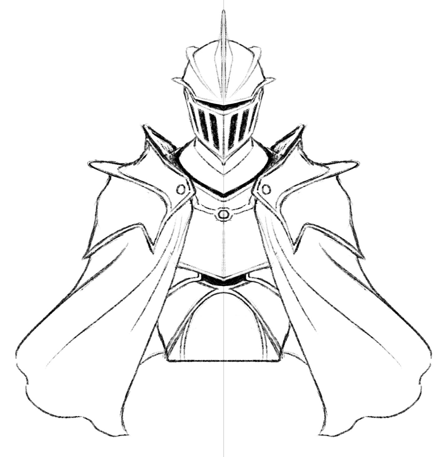
Hi, I'm Harry
I'm an illustrator learning game development.
Thank you for your time.
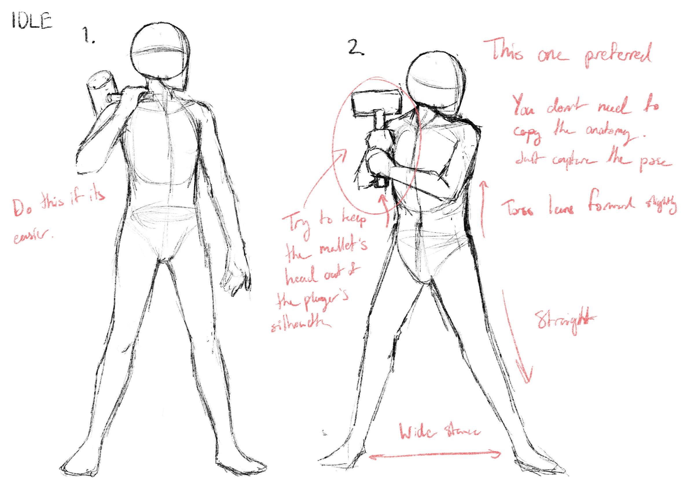
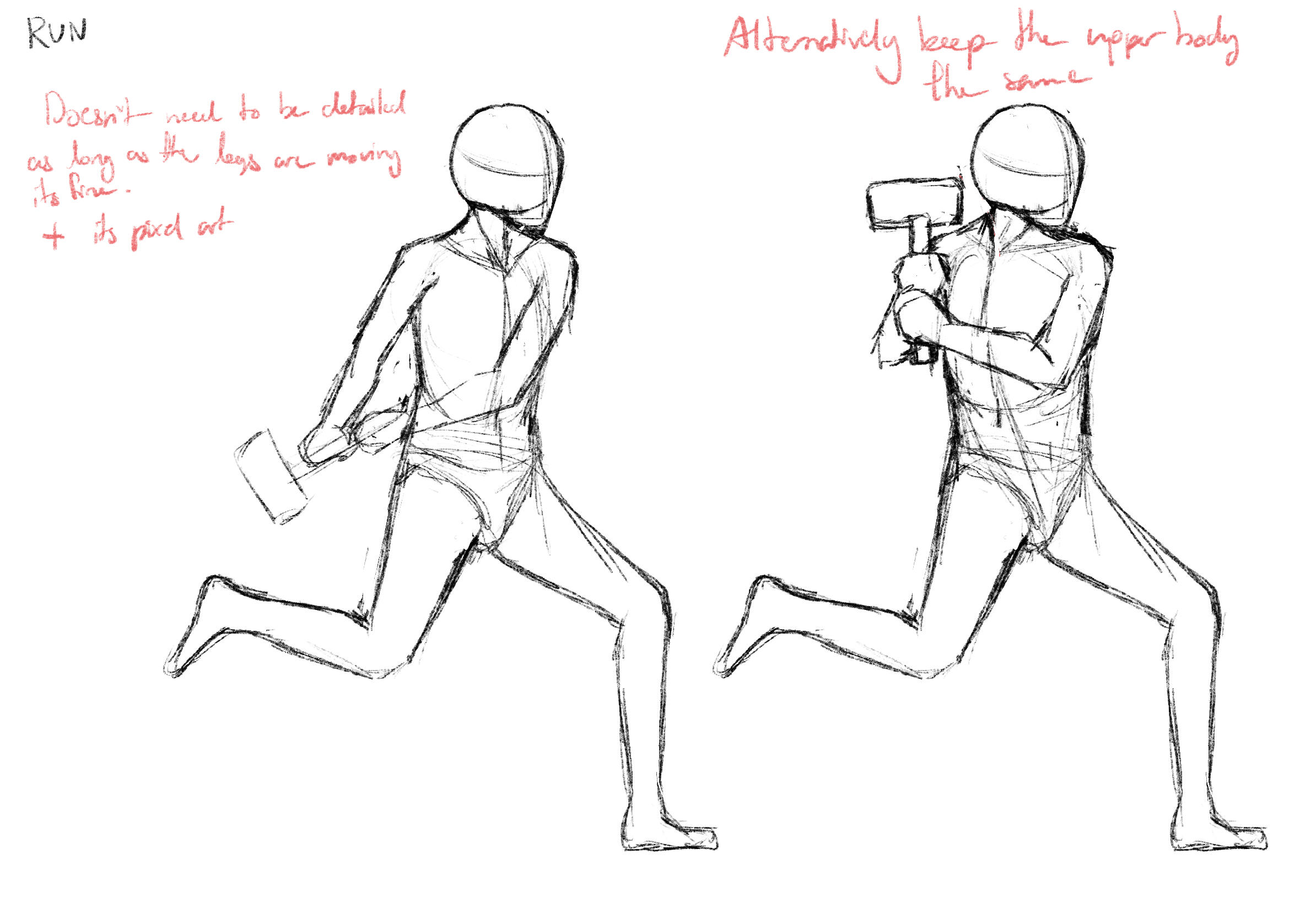
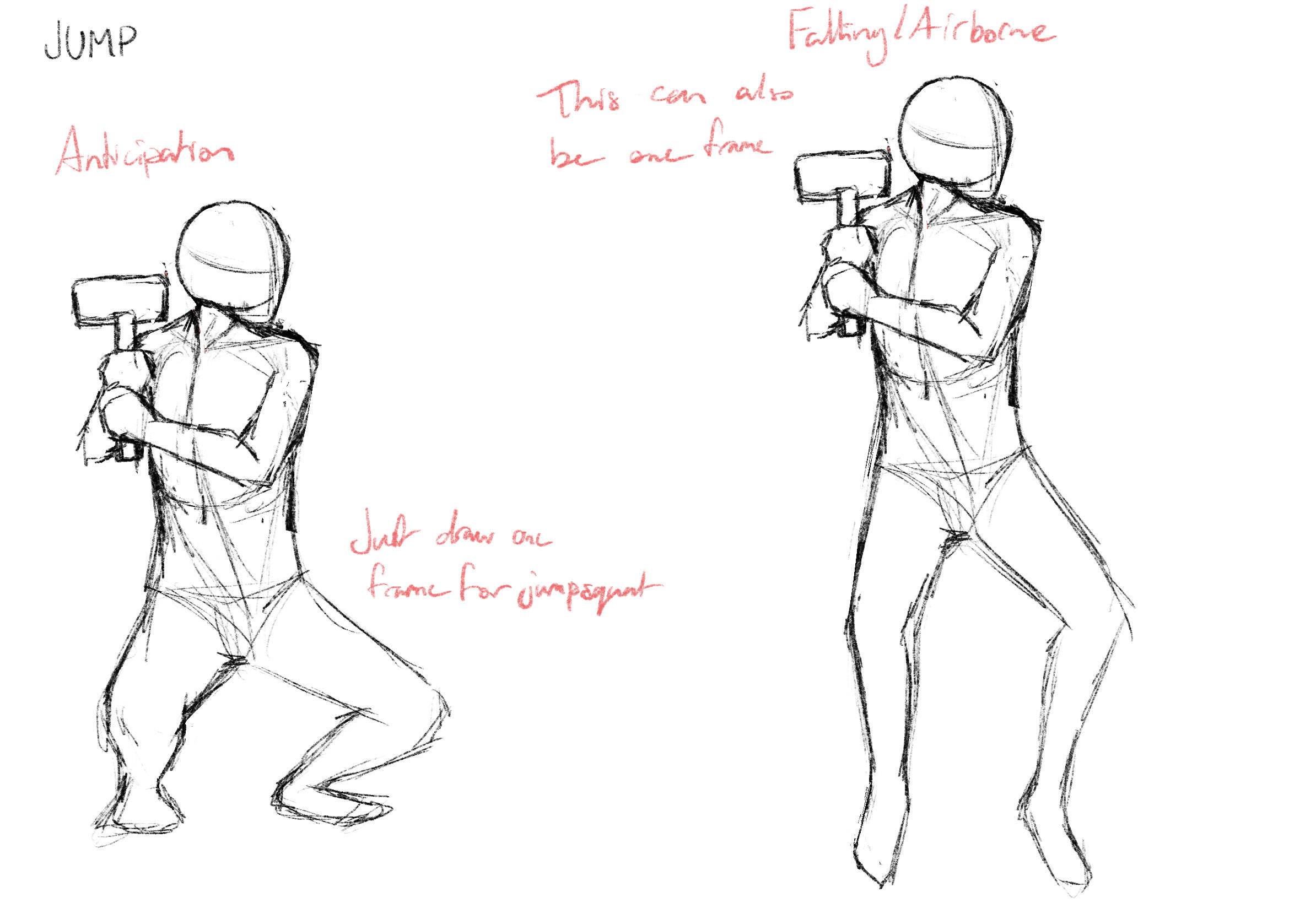
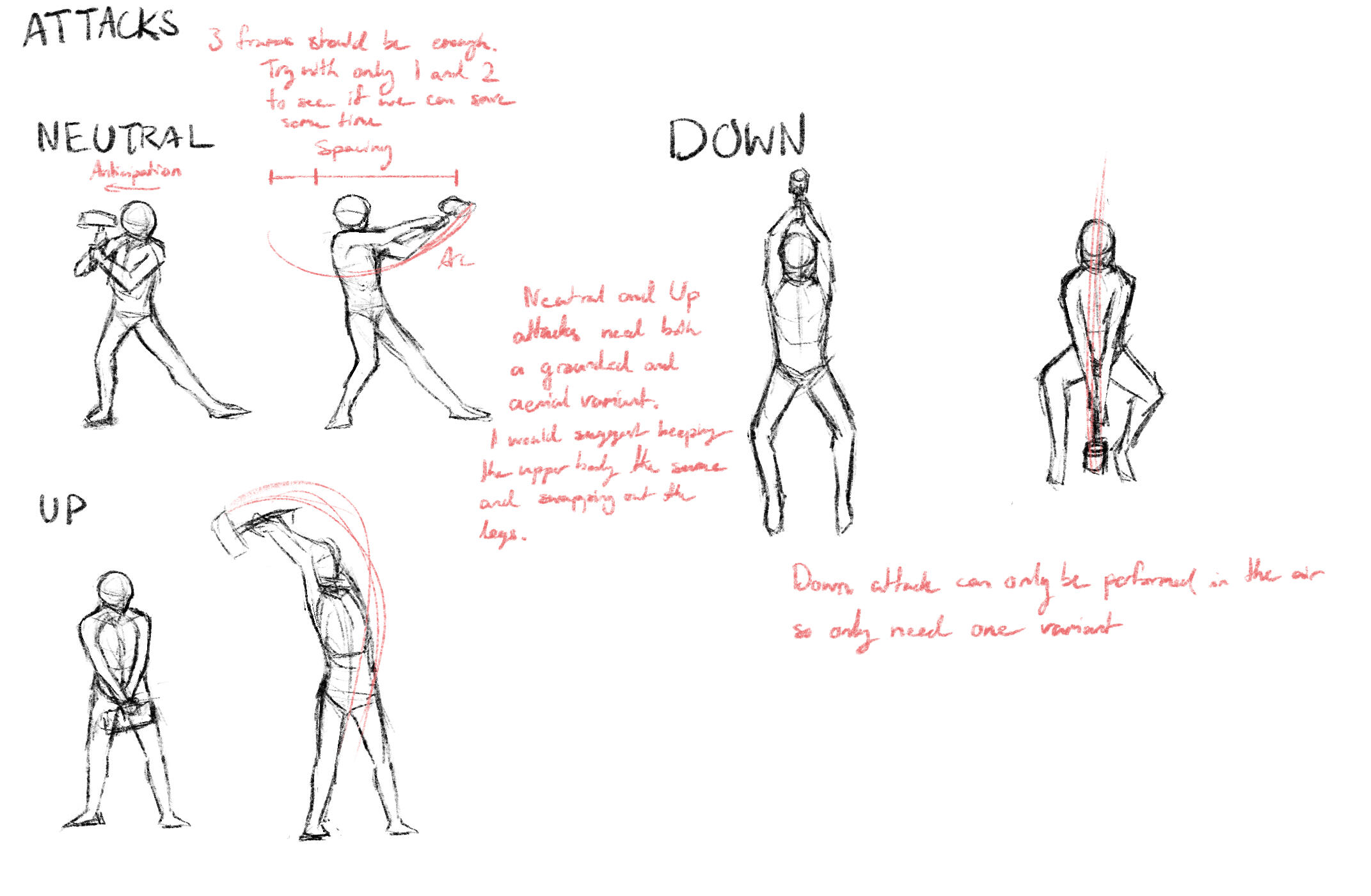
GAME JAM #1
Space Invaders 3D
Theme: Atari Remake
Solo Project
GAME JAM #2
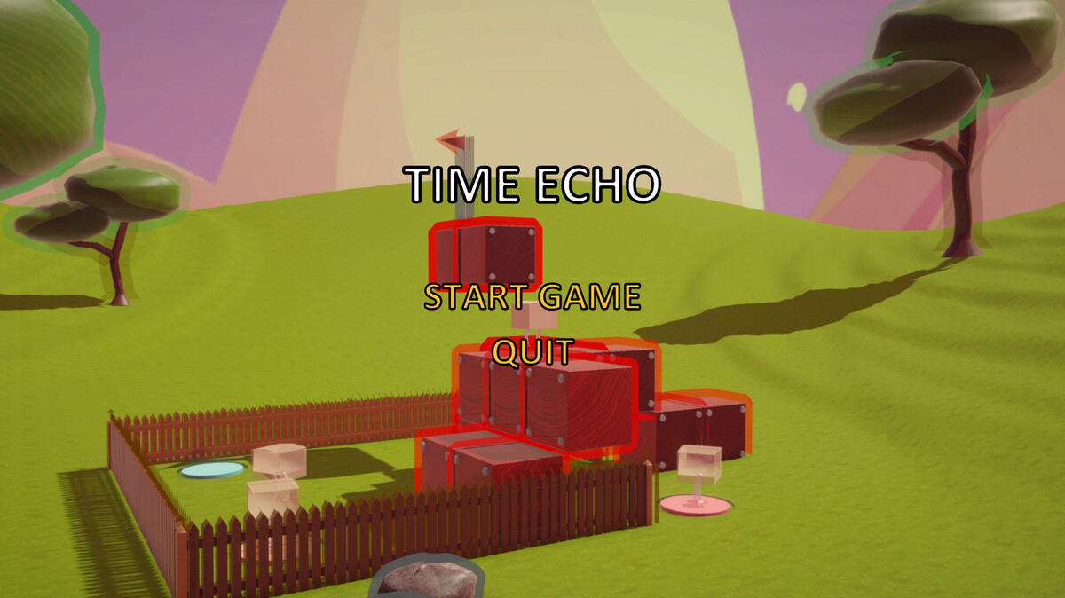
Time Echo
Theme: 10 Seconds
Shader, Level Design, UI
GAME JAM #3
Trash Master
Theme: Pick Me Up
Map Design
UNREAL ENGINE
Environment Design
Solo Project
MULTIPLAYER GAME
Don't Stop Smithing
Programming, Environment Art, Sound Effects, UI
CAPSTONE Semester one
Souls-like Game
Preproduction
CAPSTONE Semester two
Souls-like Game
Art Direction
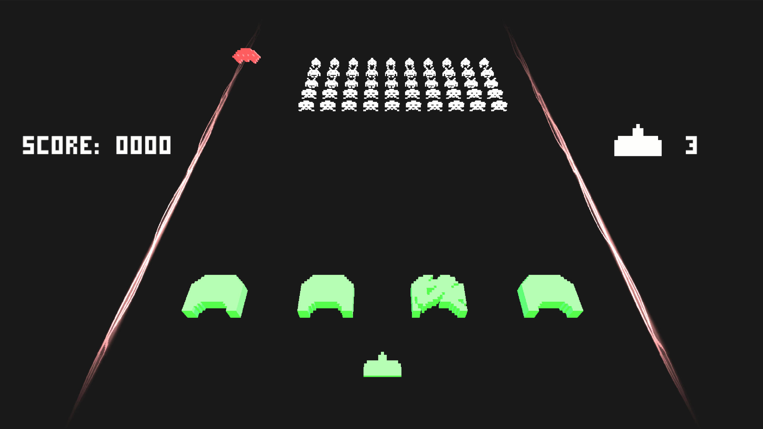
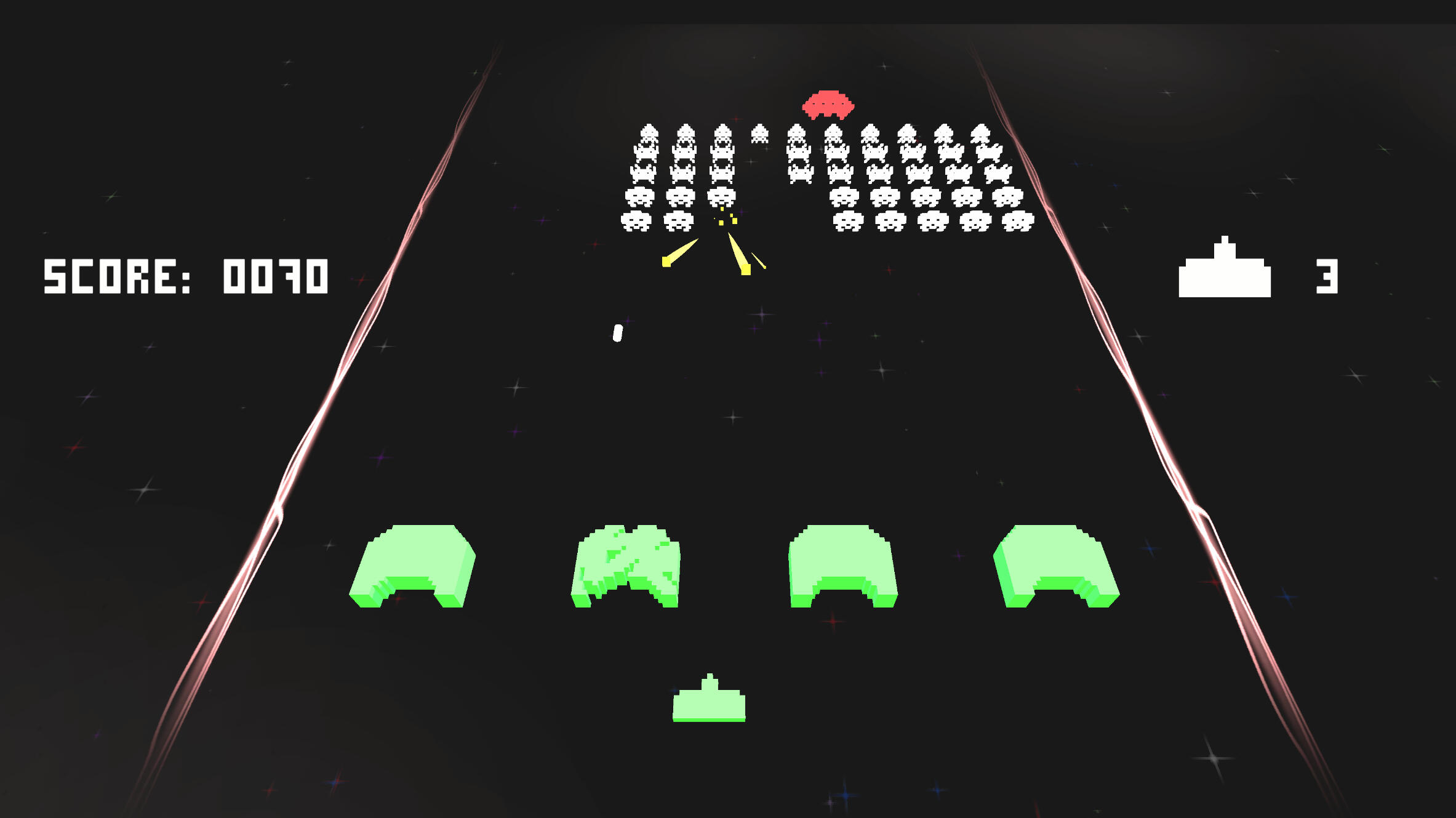
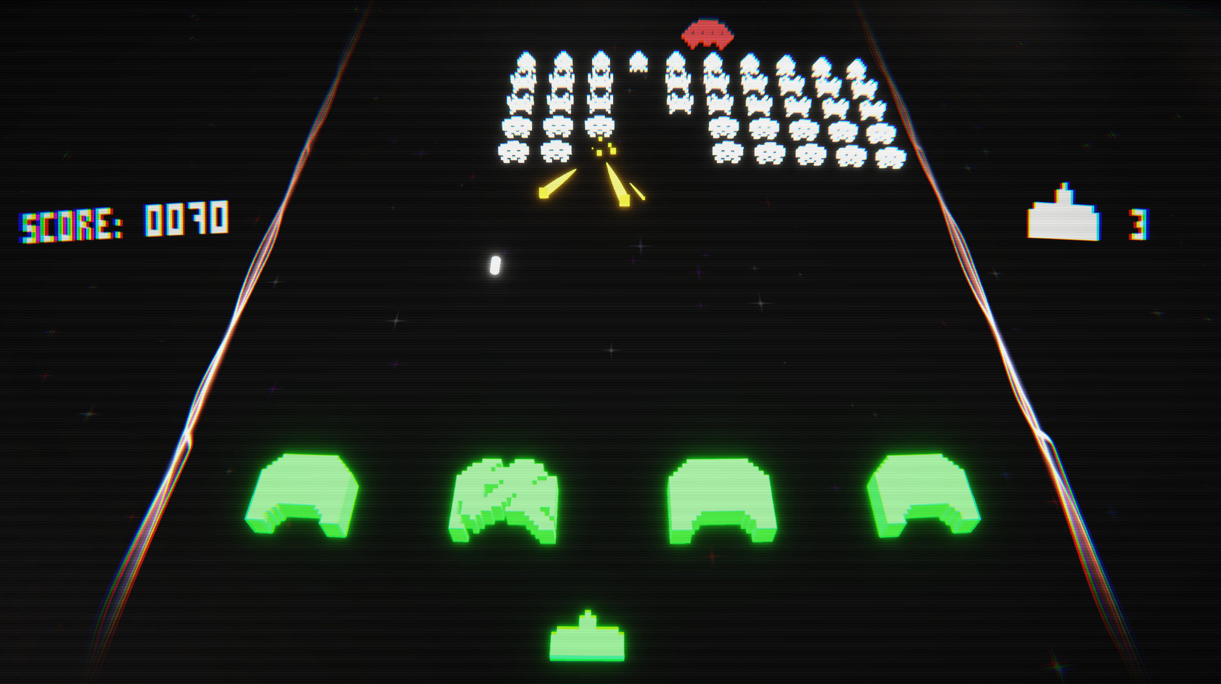
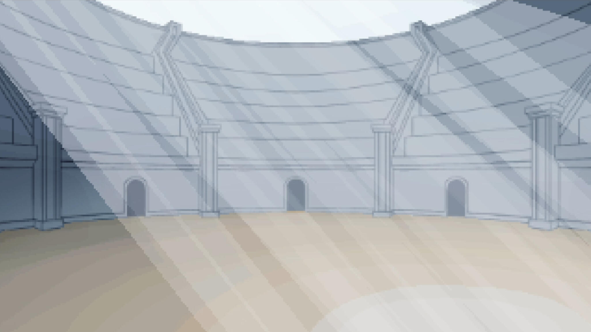
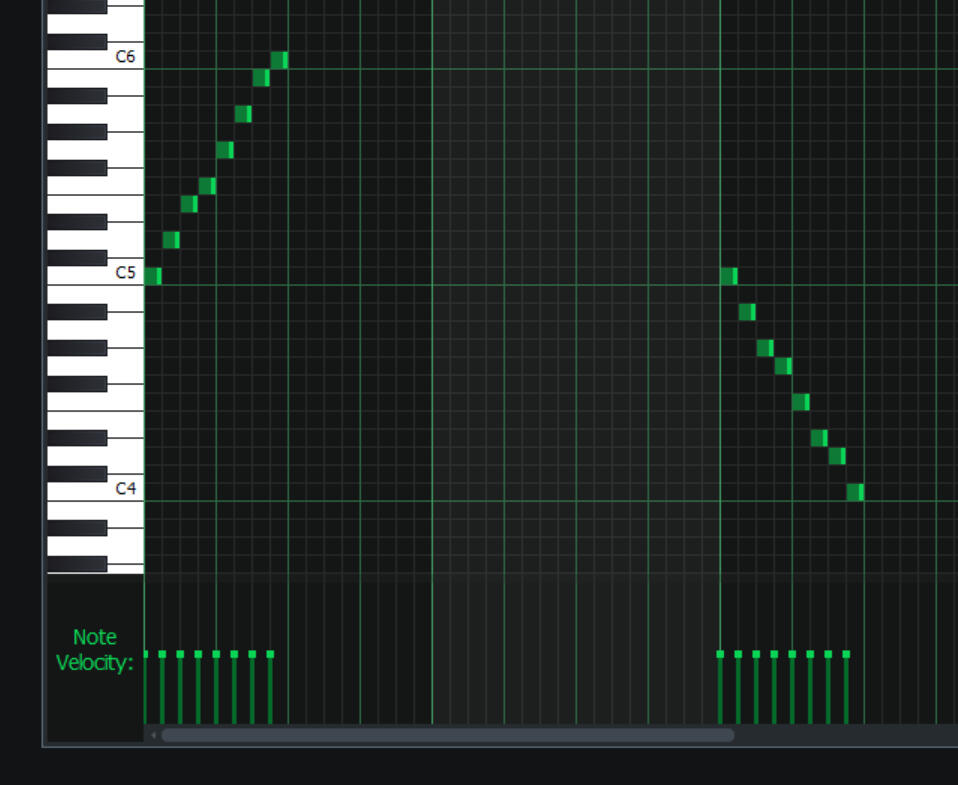
Space Invaders 3D
Code
This project started following a tutorial by Zigurous on YouTube. However as an inexperienced coder I turned to the source code on GitHub to add features not present in the video tutorial.
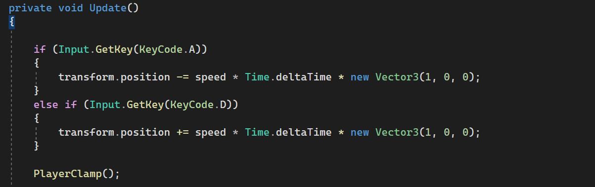
PLAYER MOVEMENT
Zigurous's script uses ViewportToWorldPoint to detect the edges of the screen where the Invaders change direction and advance one row. This doesn't work with a perspective camera.
I clamp the position of the Player using a minimum and maximum x position.

Additionally my movement script is different, as the player did not move with the original code.
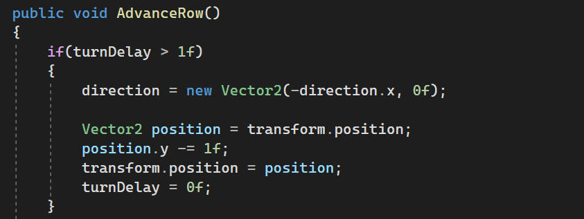
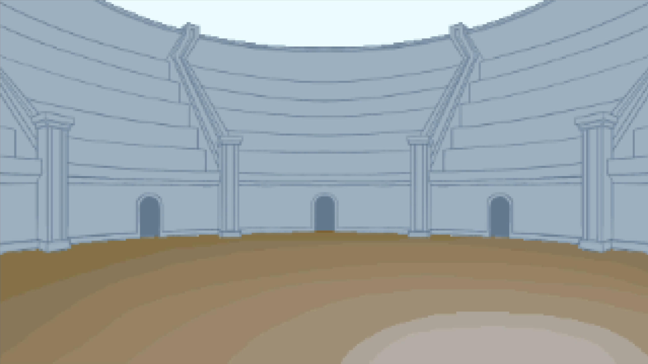
Invader Movement
Like the original player script, this uses ViewportToWorldPoint to detect the edges of the screen where the Invaders change direction and advance one row.
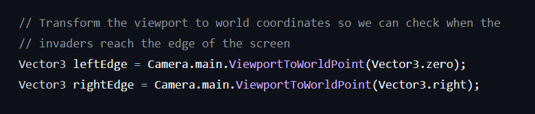
In my script I detect when any Invader collides with a box collider with the SideBoundary layer. However, as there are multiple rows of Invaders, this caused a bug where the Invaders would advance five rows down due to all five rows colliding.
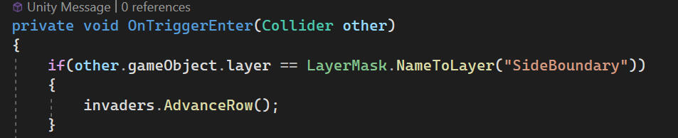
My solution to this was to add a floatturnDelay which would reset itself to 0 when the function is called.
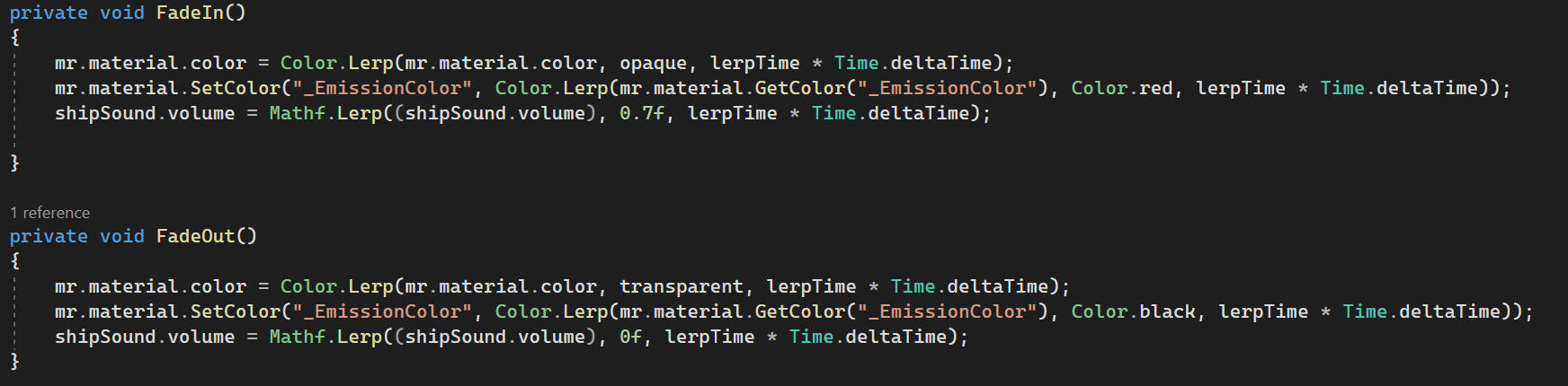
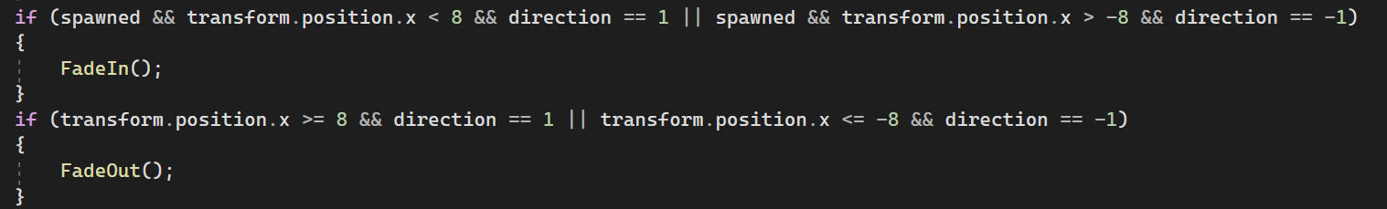
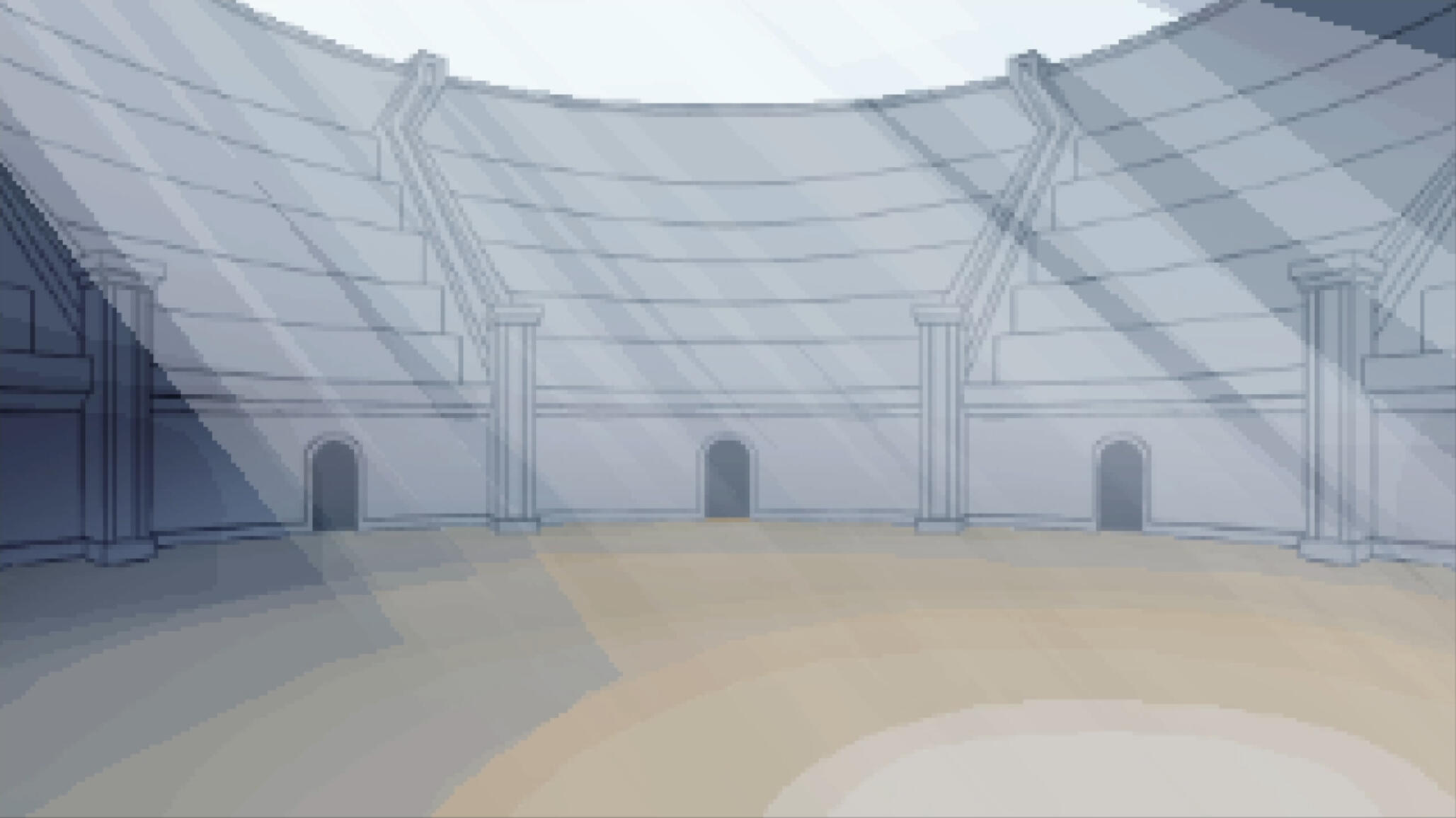
MYSTERY SHIP
Again, Zigurous uses ViewportToWorldPoint to spawn the ship offscreen. Again, this doesn't work with a perspective camera. Spawning offscreen also wasn't an option for me because the ship would spawn well before it was interactable on a 16:9 display.
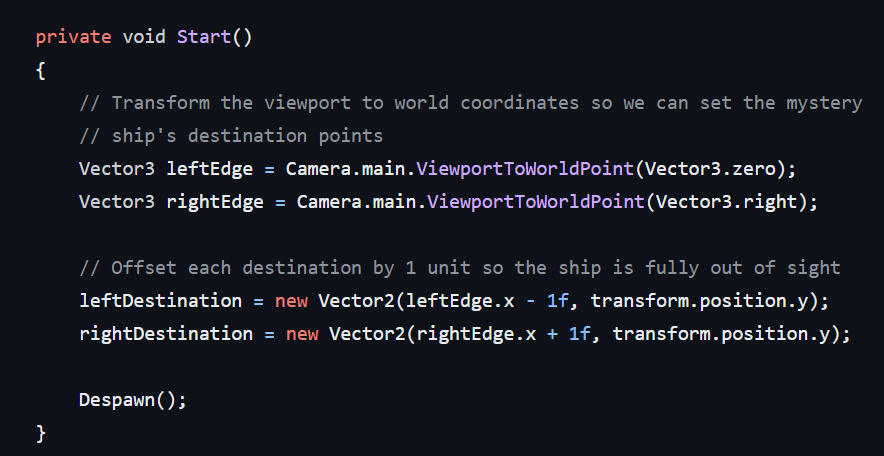
I opted to manually set the spawn positions just outside the play area.
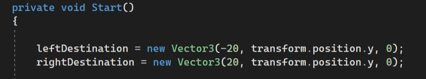
This meant that the ship would be spawning on screen, so I wrote code to fade it's transparency and emission in and out as it spawned and despawned. This was determined by its direction and coordinates.
Visuals
3D Models
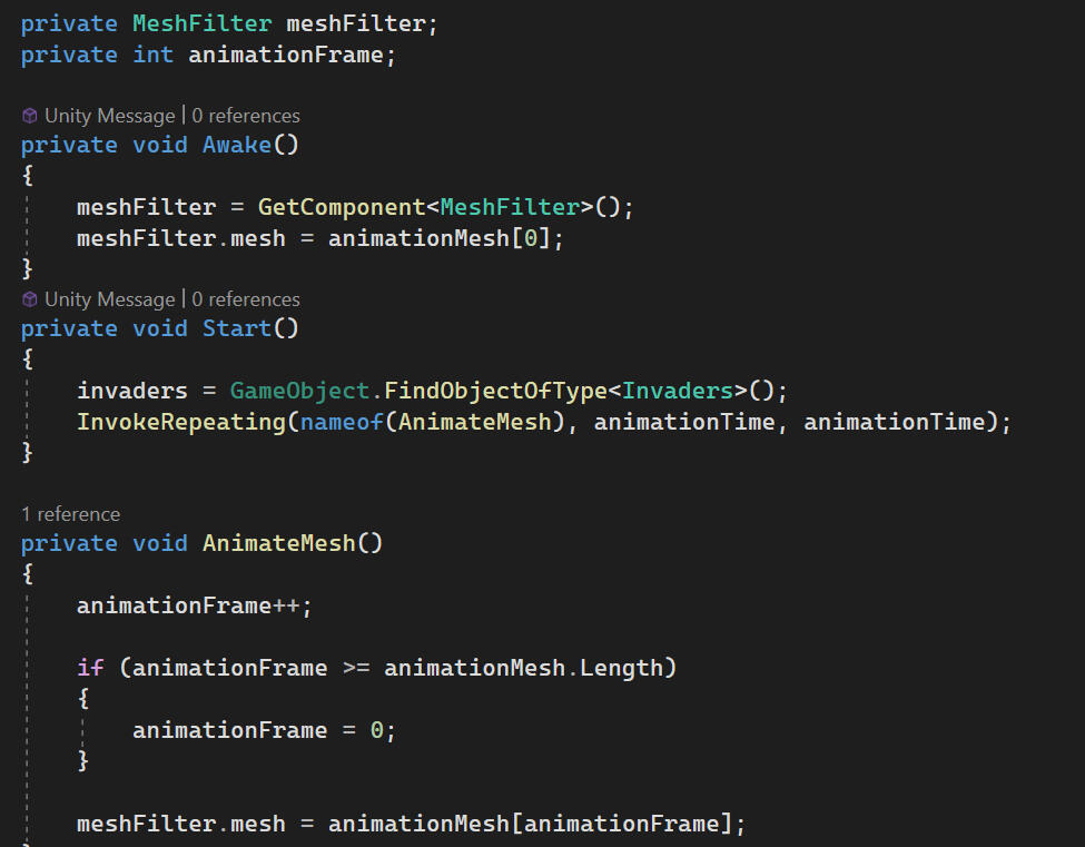
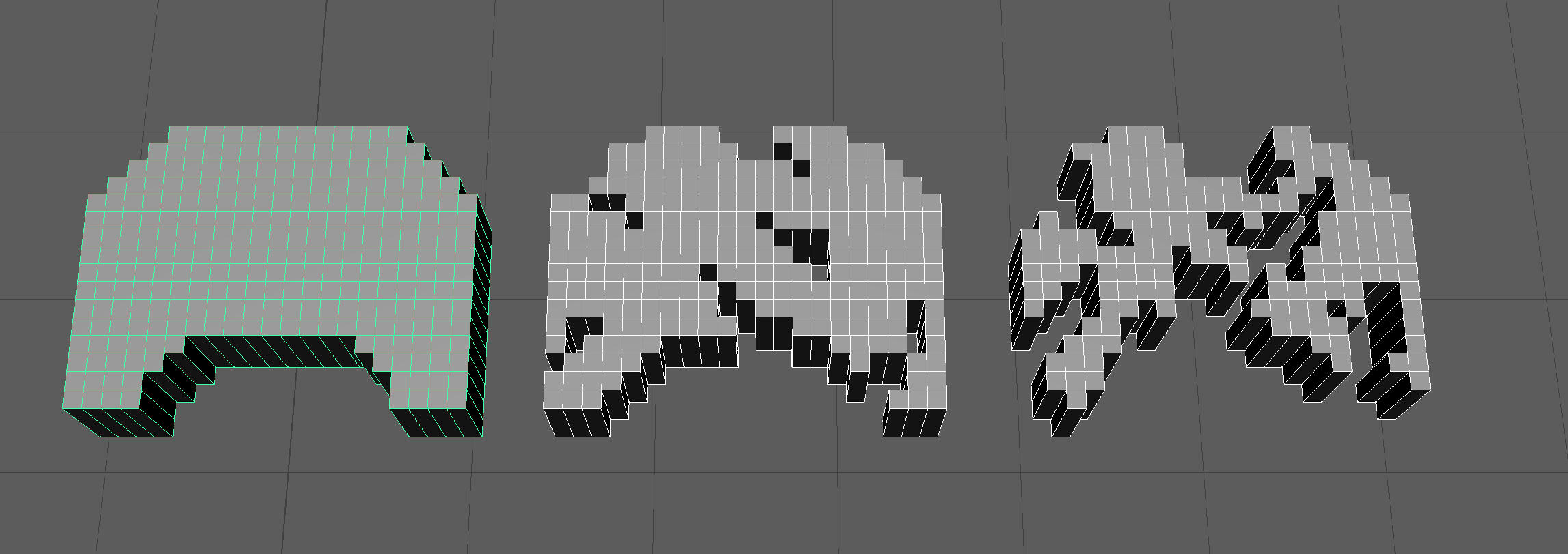
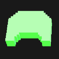
For every sprite in the original game, I remade them as 3D models in Maya by making planes with the correct dimensions and subdivisions, deleting unneeded faces, and then extruding the models out to the same height.
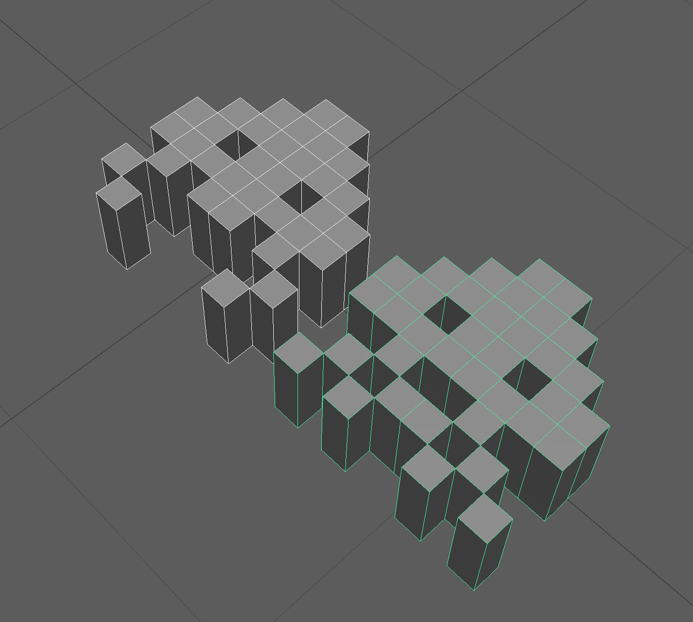
The GameObject swaps models on each animation cycle. The code is the same as Zigurous's but adapted to use 3D mesh.
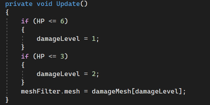
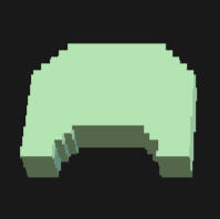
A similar technique is used for the bunker's damage. The model is swapped when the bunkers health drops below a certain point.
Materials
The materials have a pale base colour. The saturation is provided by emission and bloom in post. When the base colour is fully saturated, turning on emission makes the object appear as a solid colour.
base colour
emission
post processing
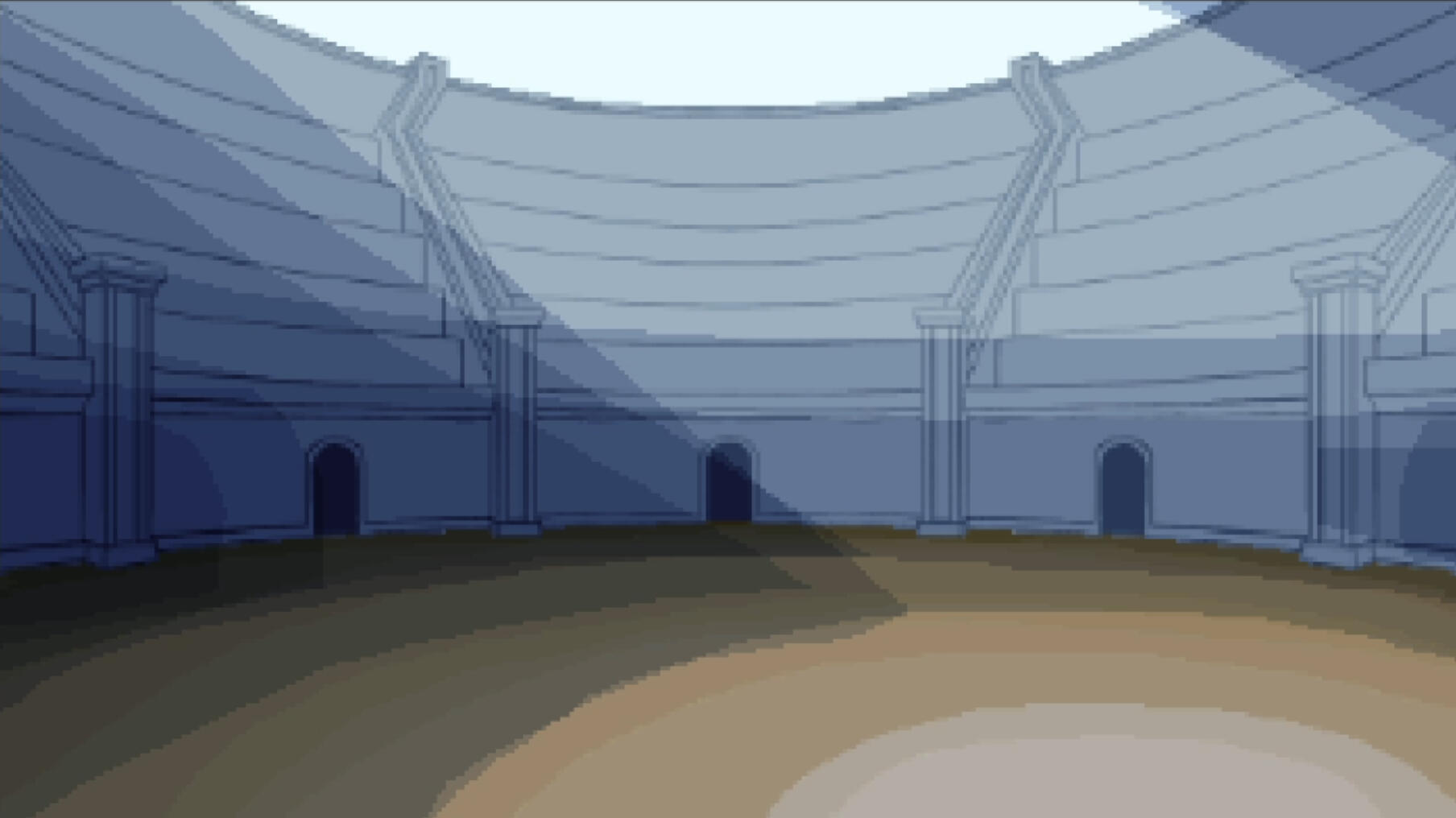
Boundaries
The play area isn't confined by the edges of the screen, so I needed some visual indication of the edges. I made lasers to define the play area.
I followed this tutorial to make the beams using a VFX graph to spawn the beam.
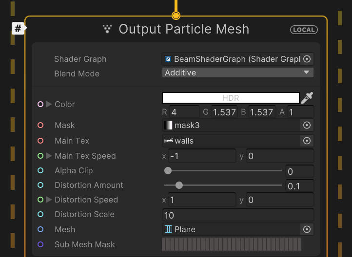
The shader graph allows for adjustments to distortion, colour, and scroll speed.
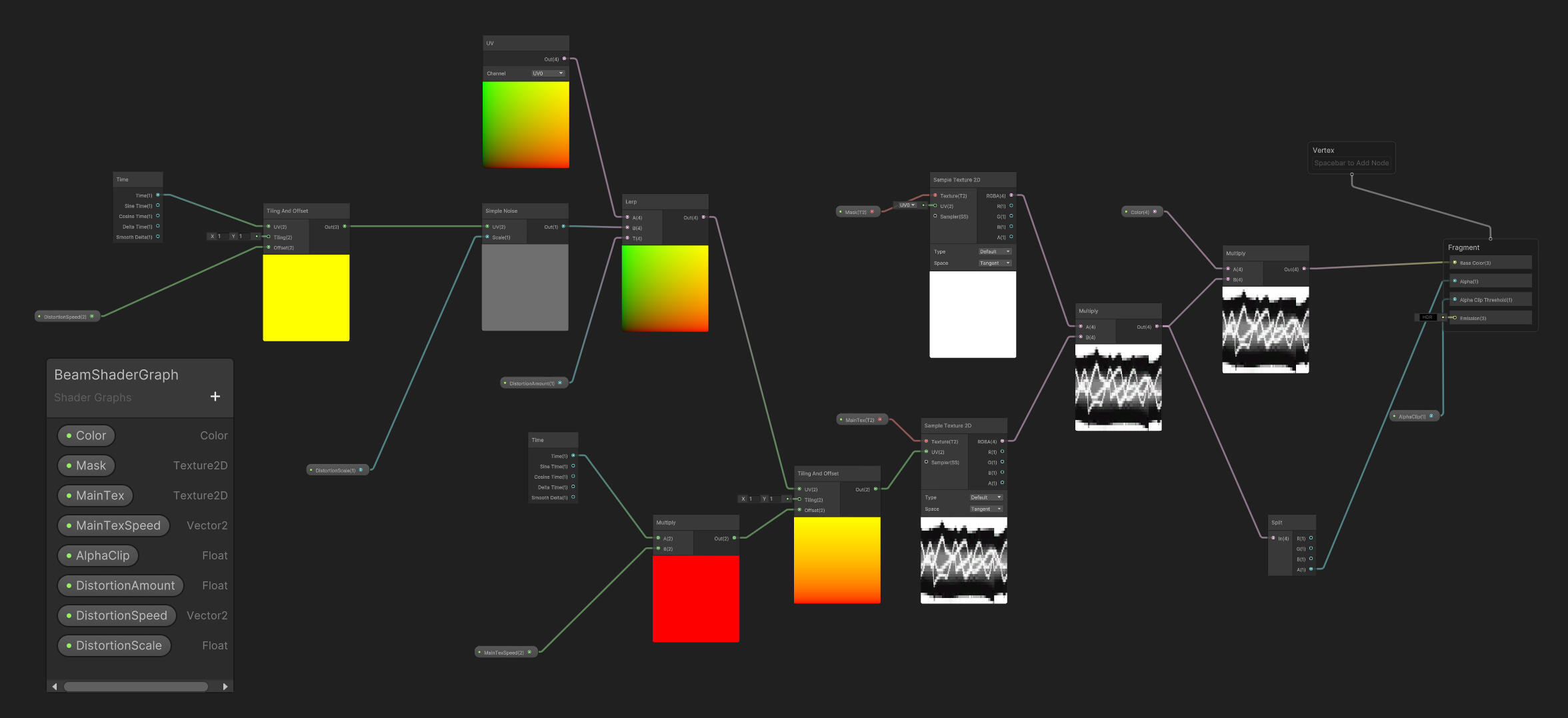
The texture for the laser was drawn in Photoshop.
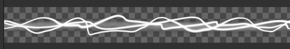
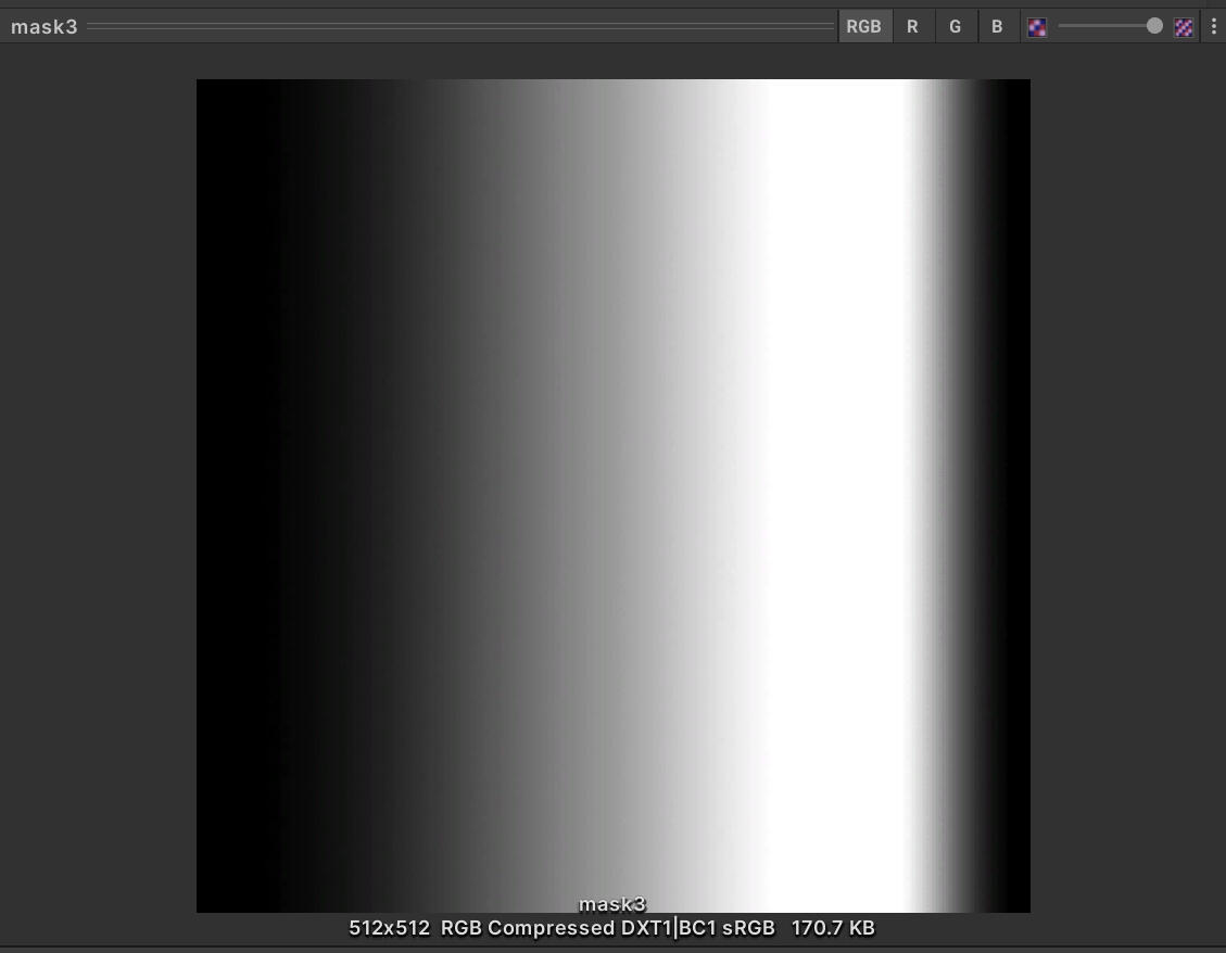
The edges of the laser fade out with a gradient mask.
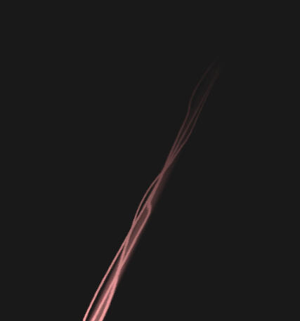
Finally, I adjusted the scale of the laser over time so it would shoot out smoothly upon starting the game.
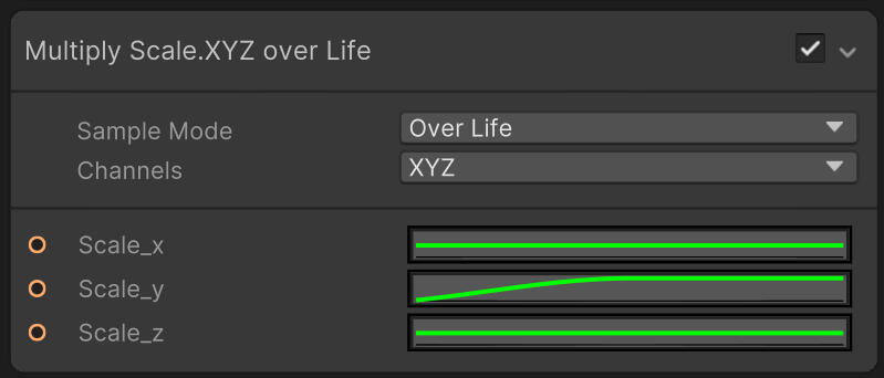
Particles
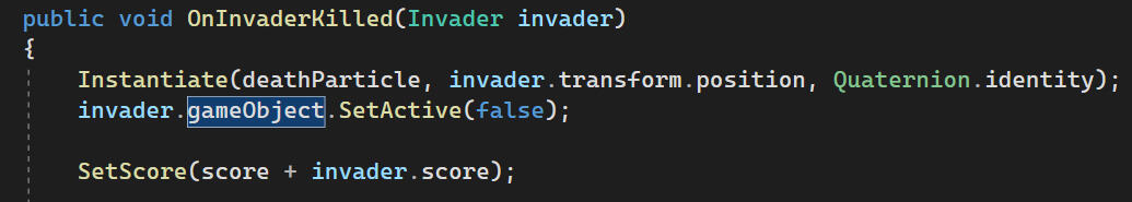
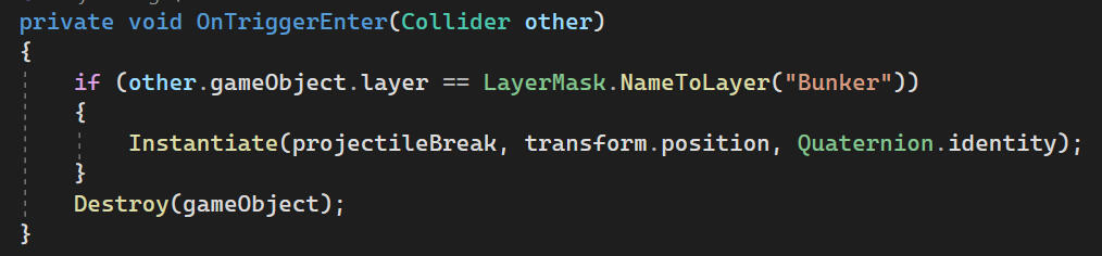
When a projectile collides, it will spawn a particle effect. I made an effect for collision with a bunker and for destruction, using Unity's particle system.
They both work the same way, spawning cube meshes with trails. These are then saved as prefabs and instantiated when needed.
Destruction
Projectile
BACKGROUND
The background is made up of two layers. On the bottom is a layer of haze, and on top is a layer of stars. These are placed on a 3D plane in the scene.
haze

haze + stars
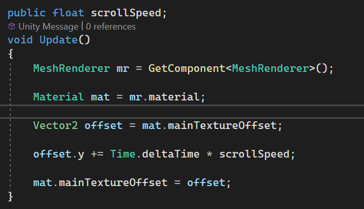
The background is scrolled and looped with code.
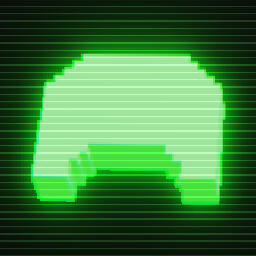
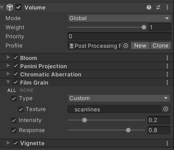
Post Processing
I achieved a CRT effect using a global post processing volume. The texture for the scanlines was found on a YouTube tutorial.
before
after
Menus and UI
MENUS
The menus and UI use the same fonts (converted to TextMeshPro) and icons as Zigurous's project.
The main menu has a start button and a quit button.
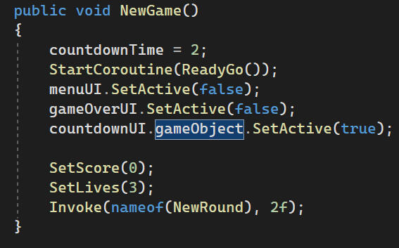
The start button runs NewGame() which starts the coroutine for Ready/Go.
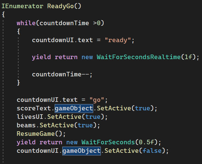
I use WaitForSecondsRealtime here because this coroutine can also be started when the game is paused and the time scale is set to 0.
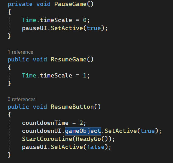
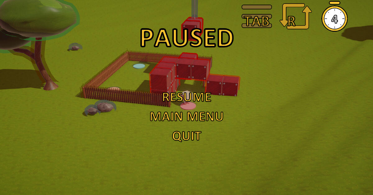
The pause and game over menus are also similar to the main menu.
Code for the pause menu
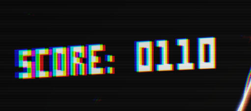
HUD
The code behind the score and lives UI is identical to Zigurous's.
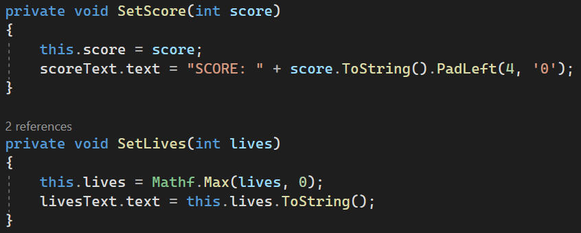
Canvas render mode is set to "Screen Space - Camera" so all UI elements are affected by post processing.
Reflection
This game jam has improved my coding skills a lot. While I did technically copy the source code from Zigurous, I made sure to read it and understand it so I could make the changes I needed to. I'm also proud of my solution to the pause menu, even if it is a bit messy. I also became more comfortable with Unity's post-processing and effects features, which I think will be a crucial skill for any games I make in the future.
Time Echo
Shaders
Toon Shader
The game was originally intended to look bright and colourful. This is present in a piece of concept art I made as reference for the shaders.
The shader was built from this tutorial and the settings were tweaked to achieve the desired result.
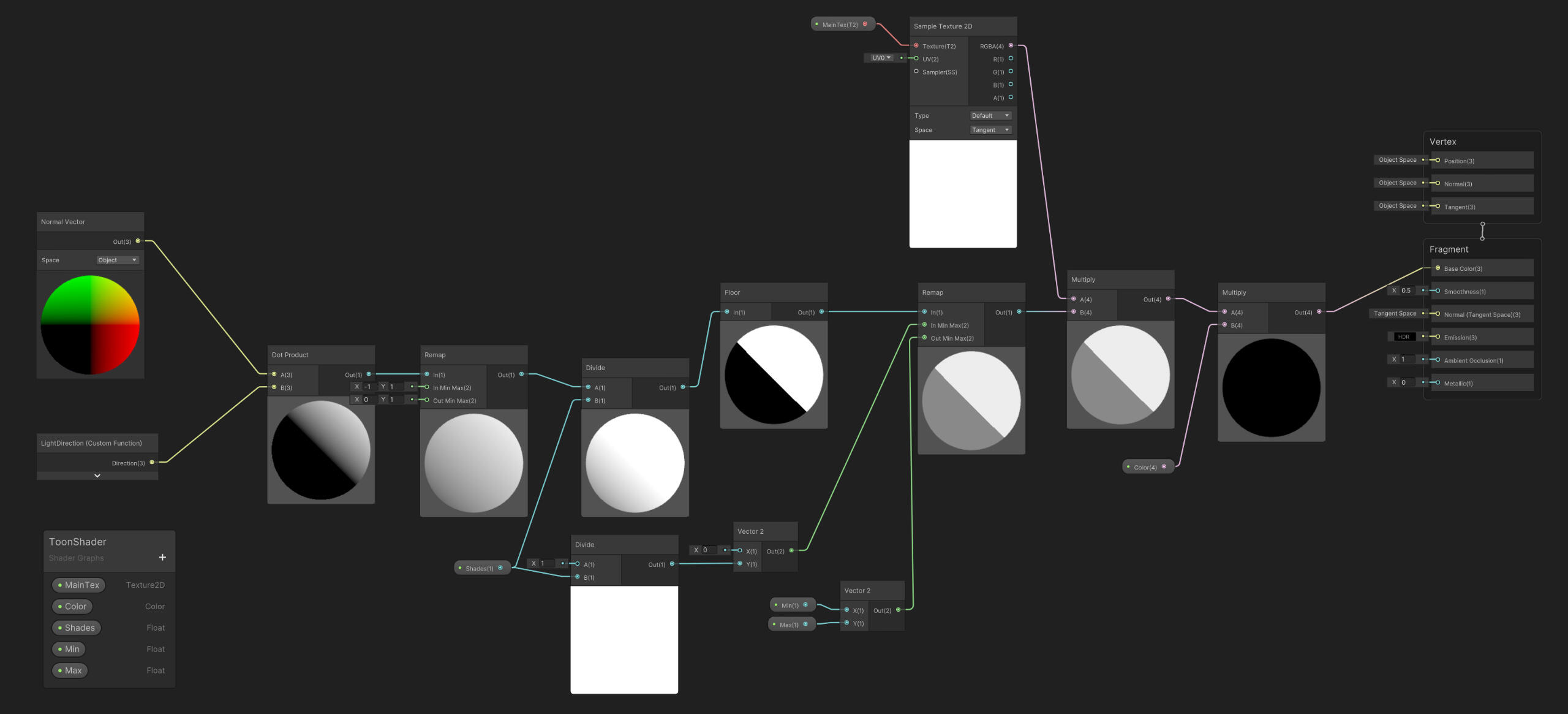
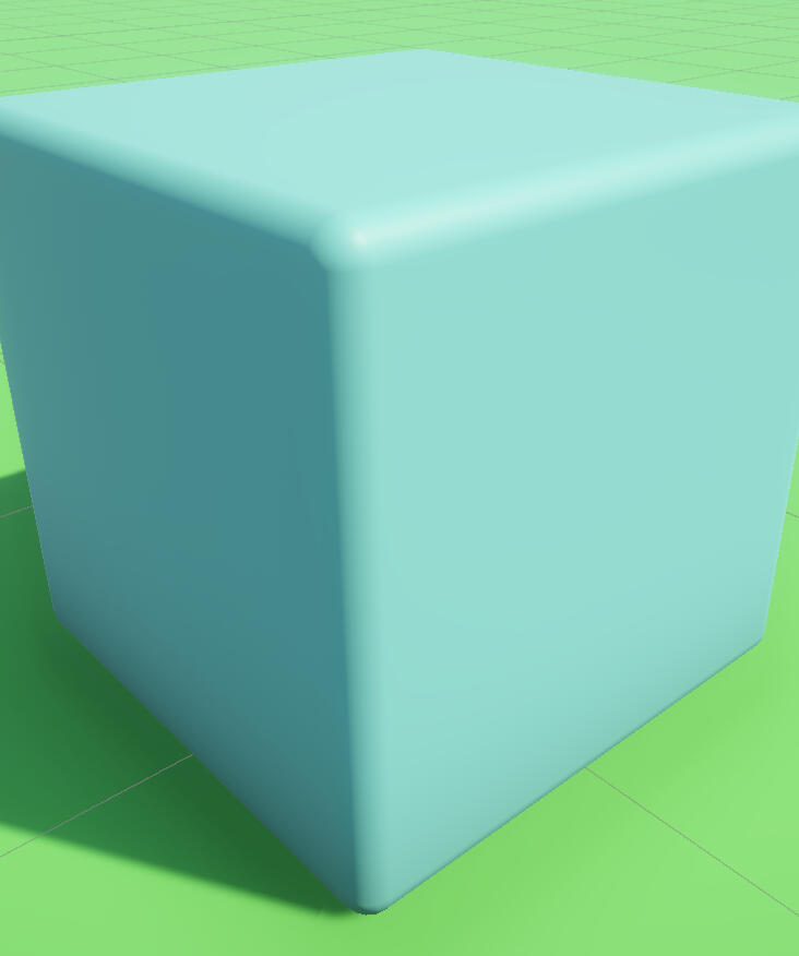
Initially the shader graph was unlit, but I couldn't get the edge highlight I was looking for, so the difference between it and a URP Simple Lit material is very subtle.
Toon unlit
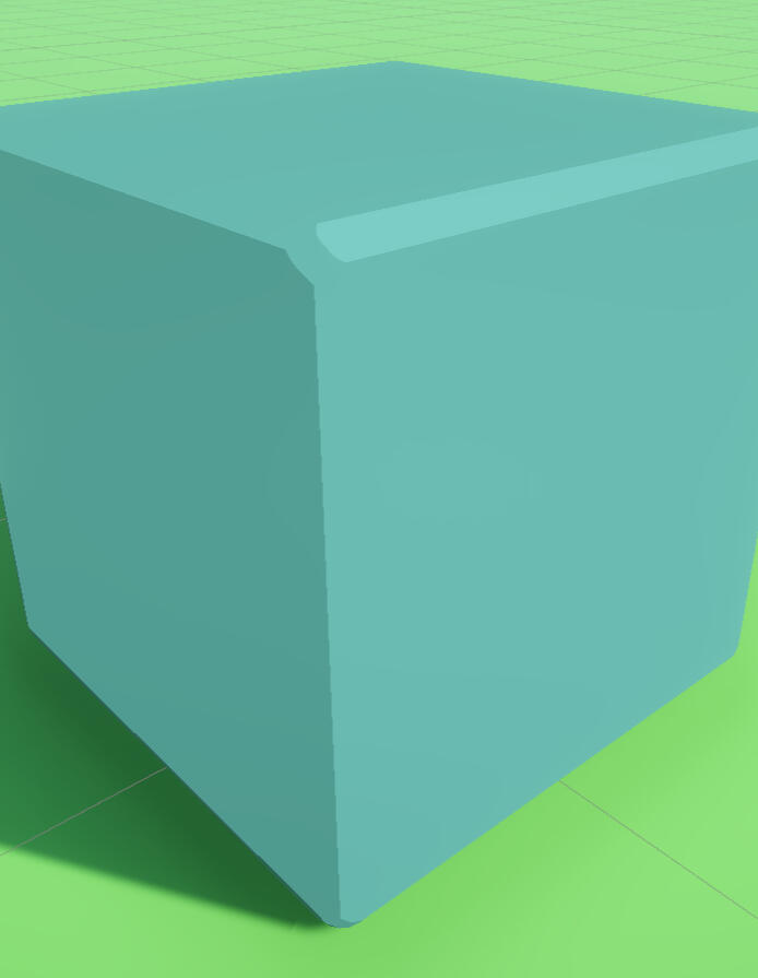
Toon lit
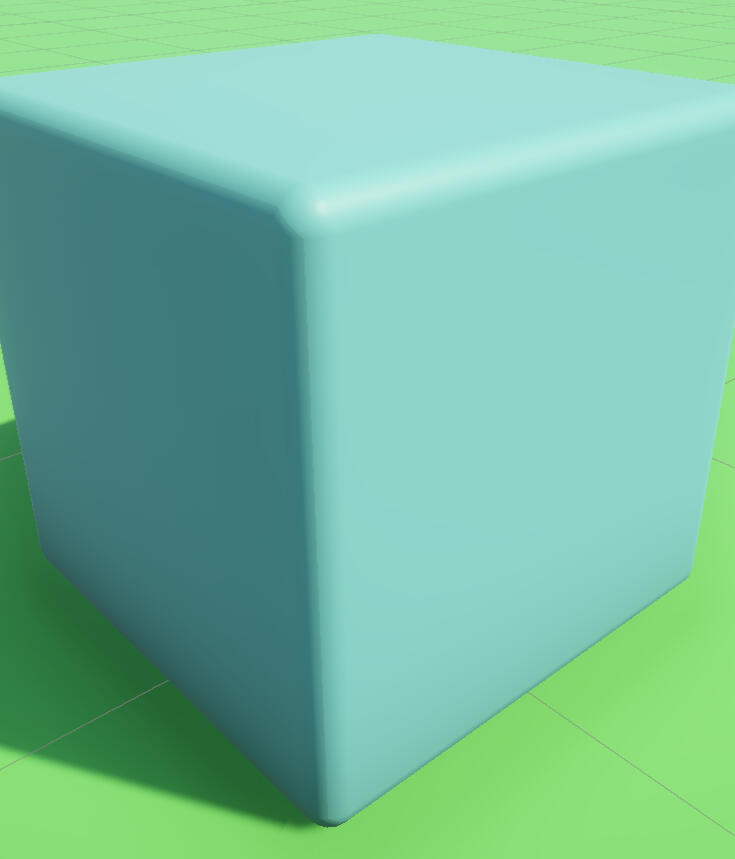
URP simple lit
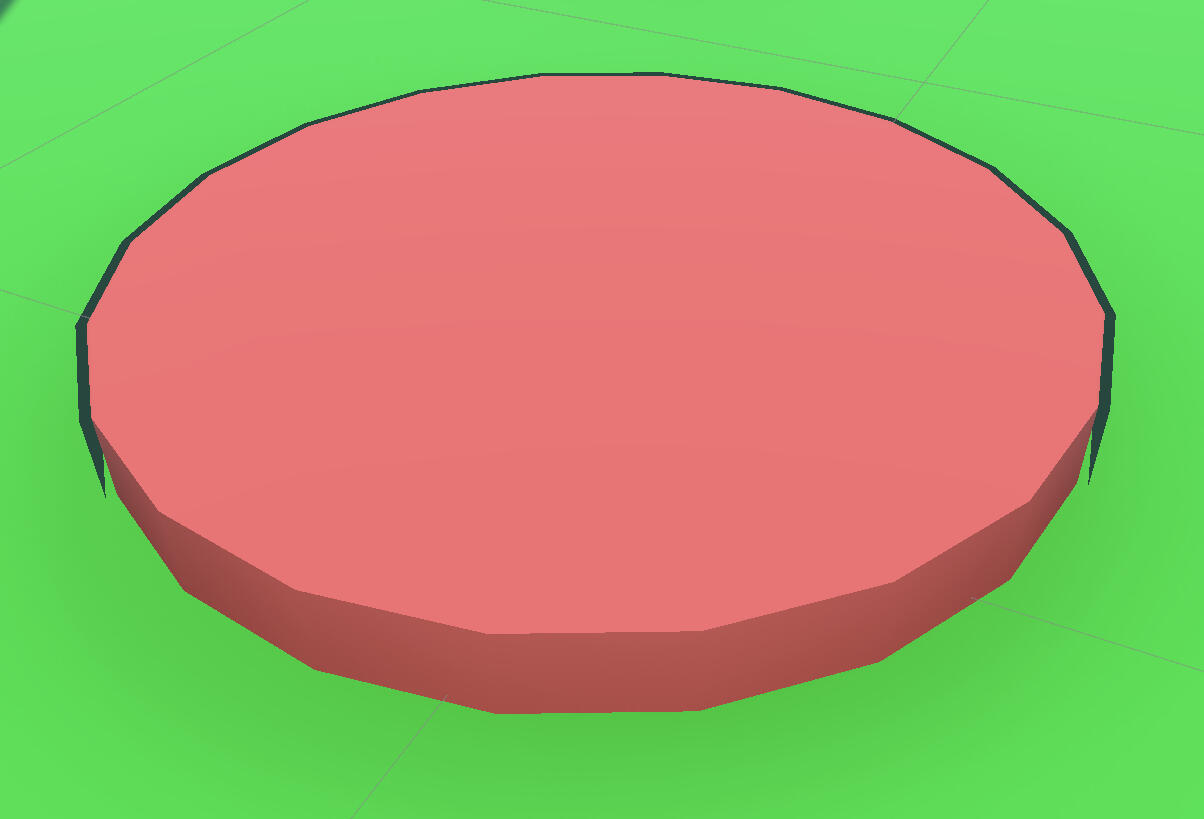
OUTLINE SHADER
An outline was added around the outside edges of objects with the inverse hull method.
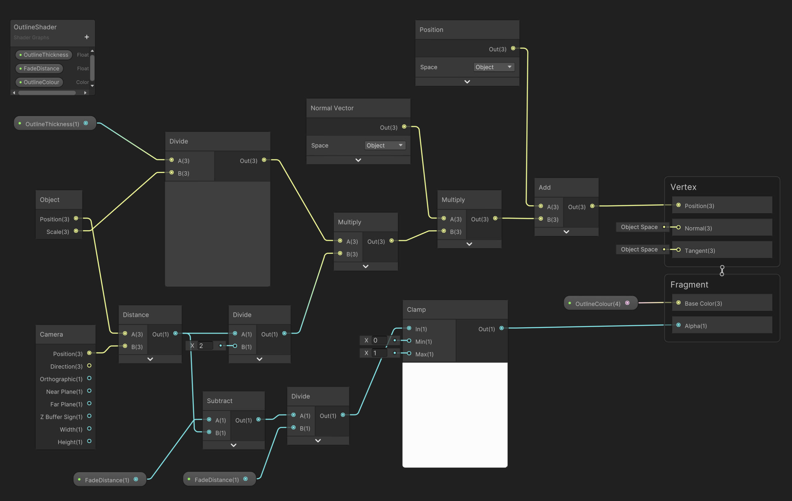
This was the intended result for the visuals of the game.
The inverse hull method wasn't perfect, as intersecting meshes would cut through the generated outline.
If I do outlines again, I think I'd like to try a fullscreen post processing shader.
Menus and UI
Menus
The coding behind the menus is re-used from my Space Invaders 3D Project
UI Icons
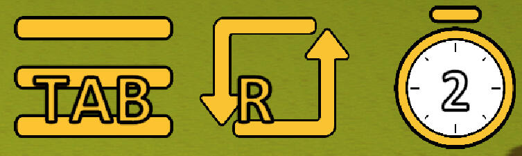
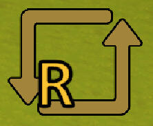
I made a few draft reset icons for feedback from my group members. They liked the square designs with the smaller R.
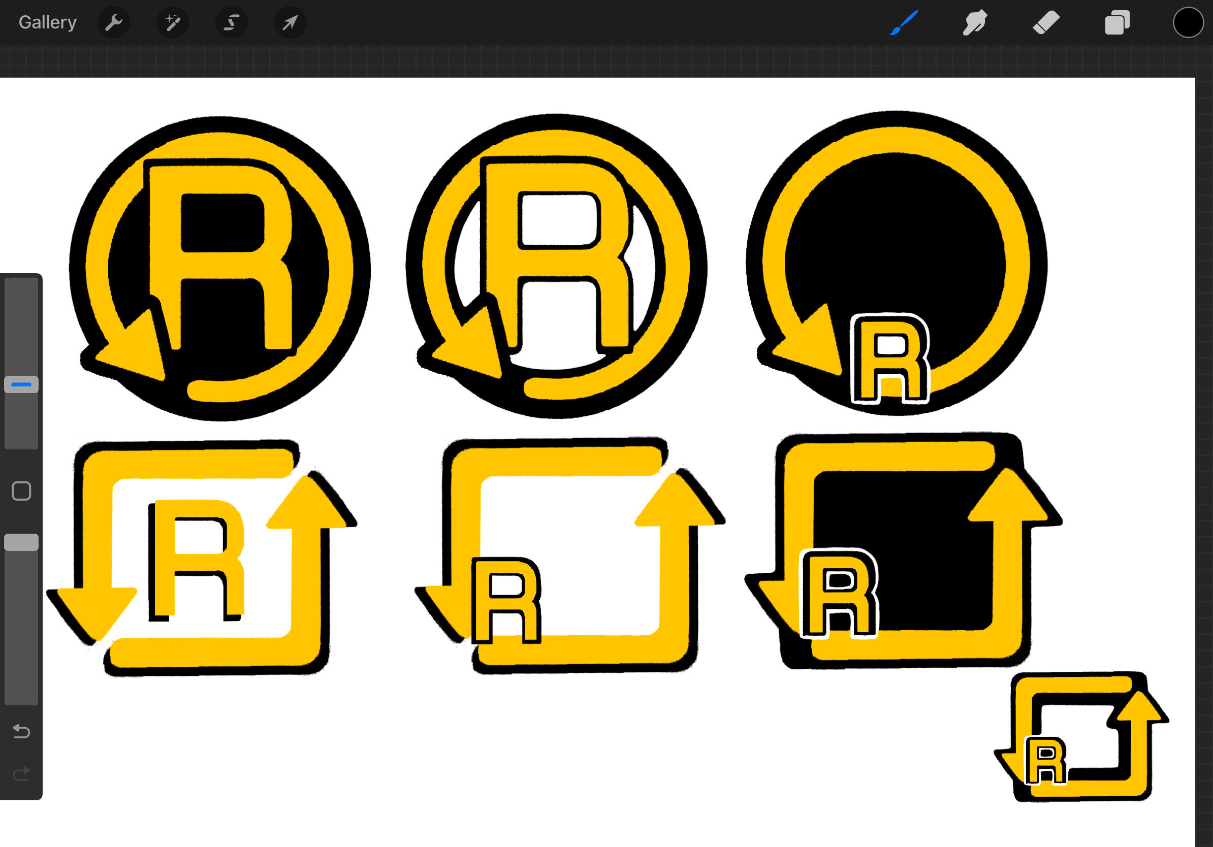
I then made the icons in Illustrator for the final game. The Tab and R icons have a variant that displays upon keypress.
Level Design
Rules
Because of the limited time frame, we decided that the puzzles would need to be simple. Additionally, the levels had to be traversed from start to finish in under 10 seconds.
I drew the concept art below to present both the visual style and puzzle idea to my group members.
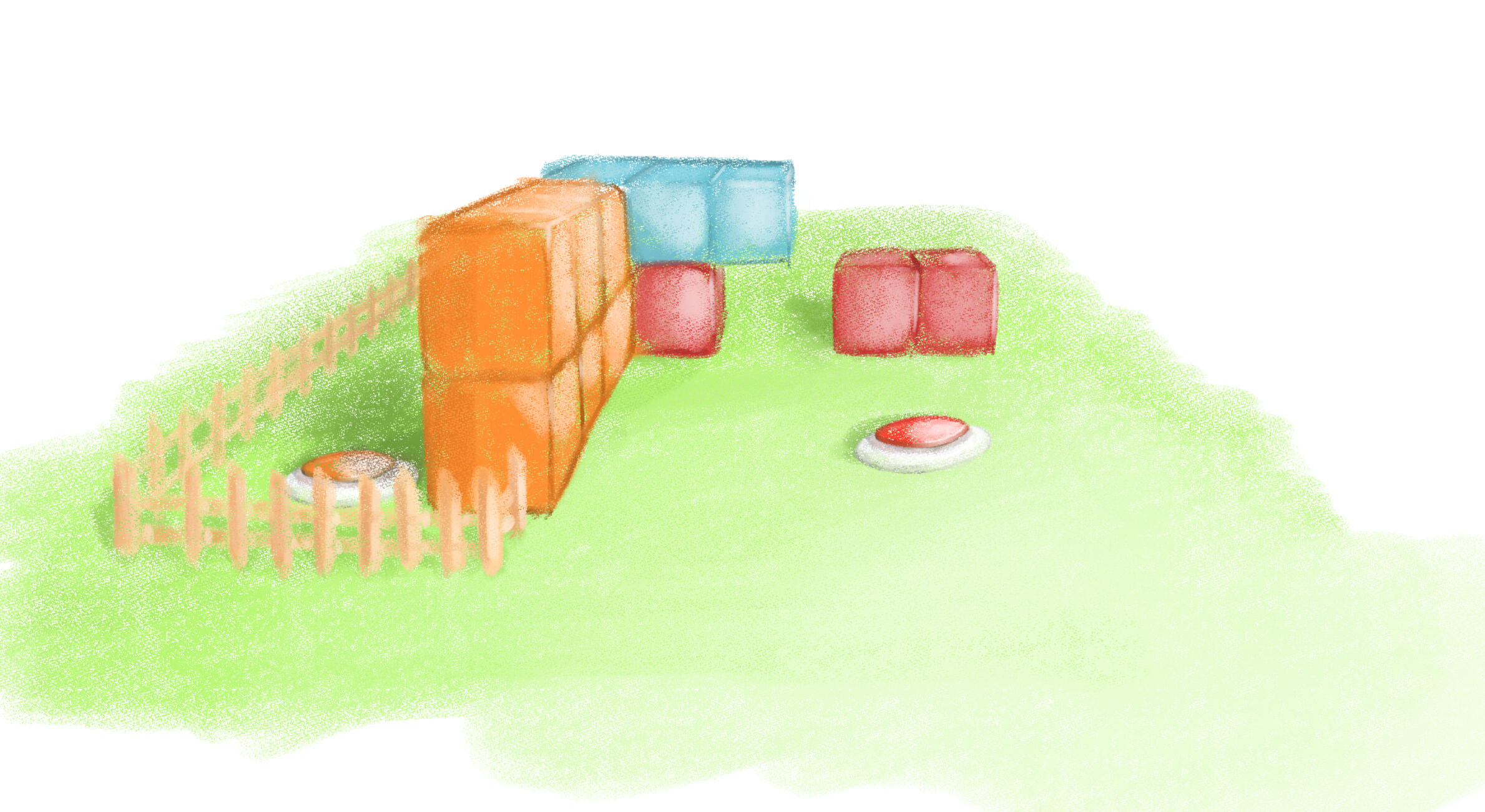
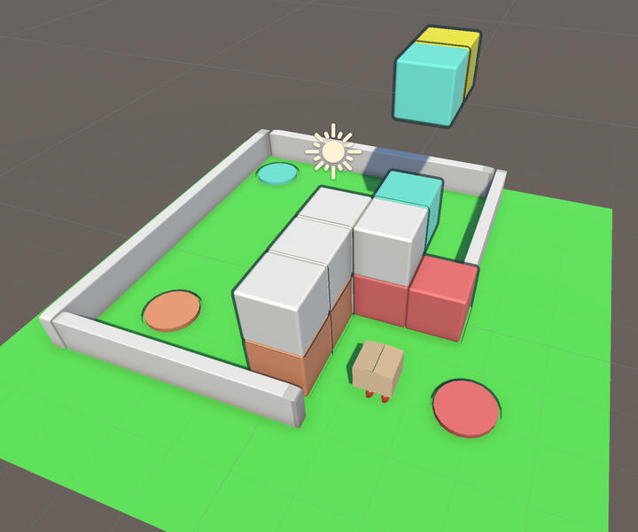
We agreed on buttons/pressure plates that would move blocks to open the path to the end.
Basic Puzzle
I made a puzzle using colour-coded buttons and blocks. Red opens a gate. Orange makes a platform. Blue requires timing on a previous clone to lift the player to the finish.
Test
Final
Reflection
This game jam helped me learn a bit more about shaders in Unity. My execution of the outline shader was a bit disappointing, but I know now that I can apply full screen post processing effects. I'd like to try that in the future. My level design was also quite poorly done. I colour coded the blocks and buttons to make it intuitive, but the timing challenge required by the blue button makes it more trial and error. There's also a lot of waiting involved between each step, which slows the game down a lot. I think the concept has potential, but our execution of it here was not that good. I don't have much to say about the UI design. It was rushed and it looks rushed.
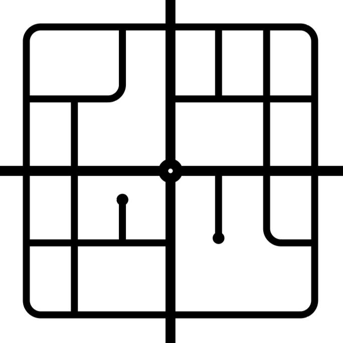
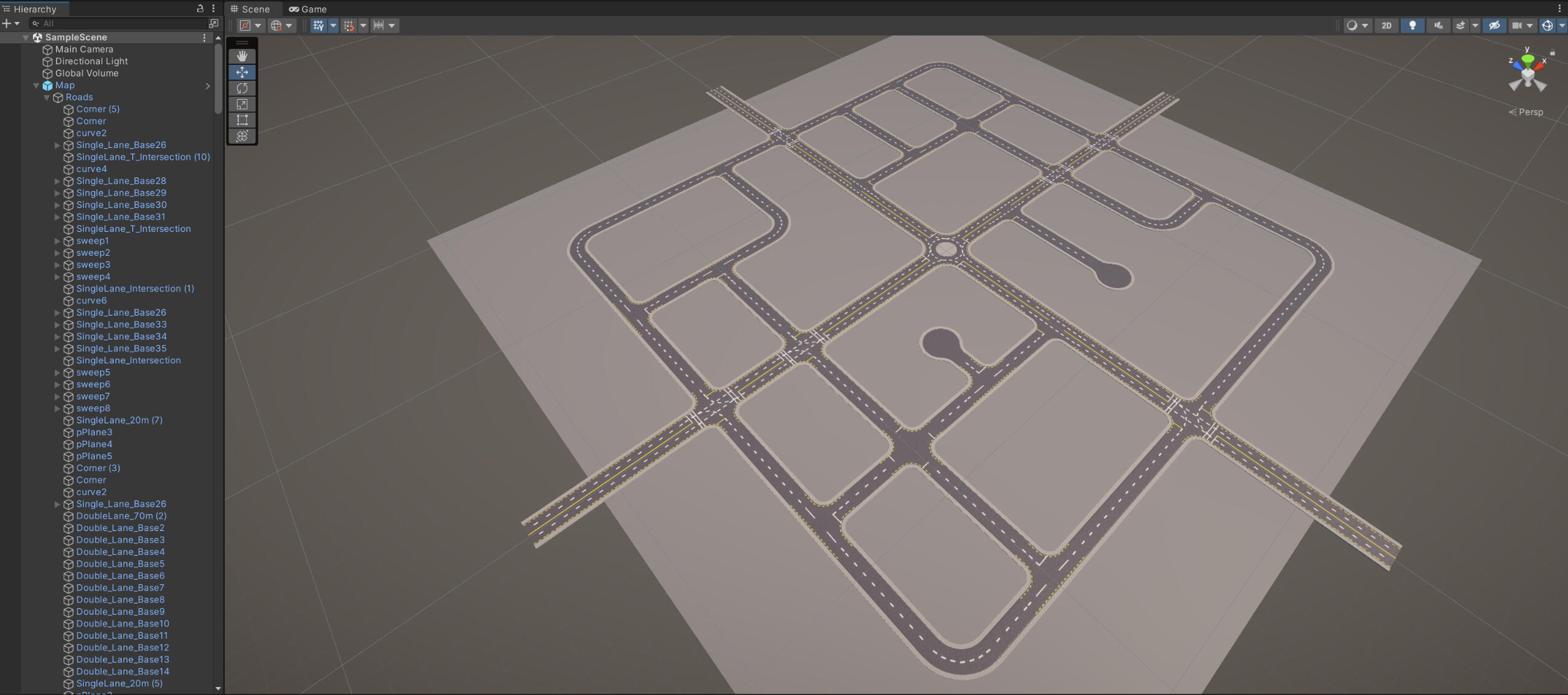
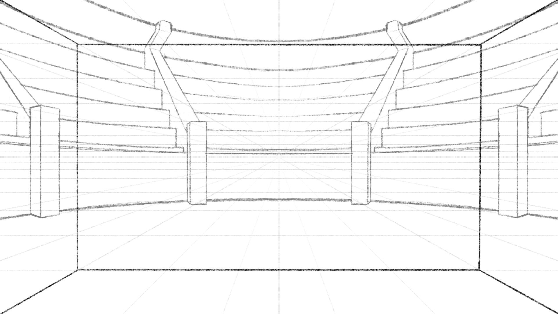
Trash Master
Map Design
Layout
Layout
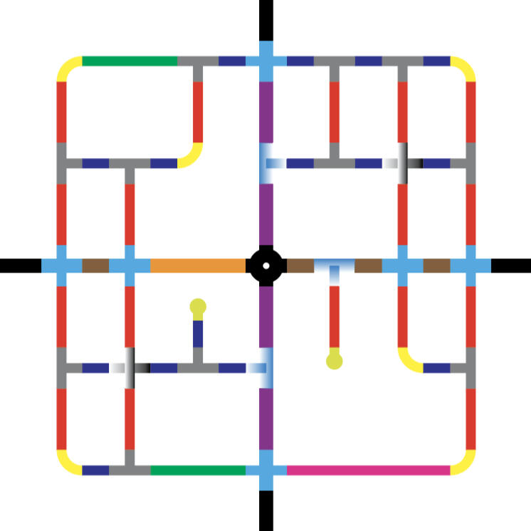
We decided as a group that the map would be a small town to cut back on assets and development time. We decided to do an urban grid with two main roads joining in the centre with a roundabout.
I made the sketch layout as starting point. My group liked it a lot and found no immediate issues or areas for improvement, so we stuck with it. I then remade the map to scale in Illustrator.
sketch
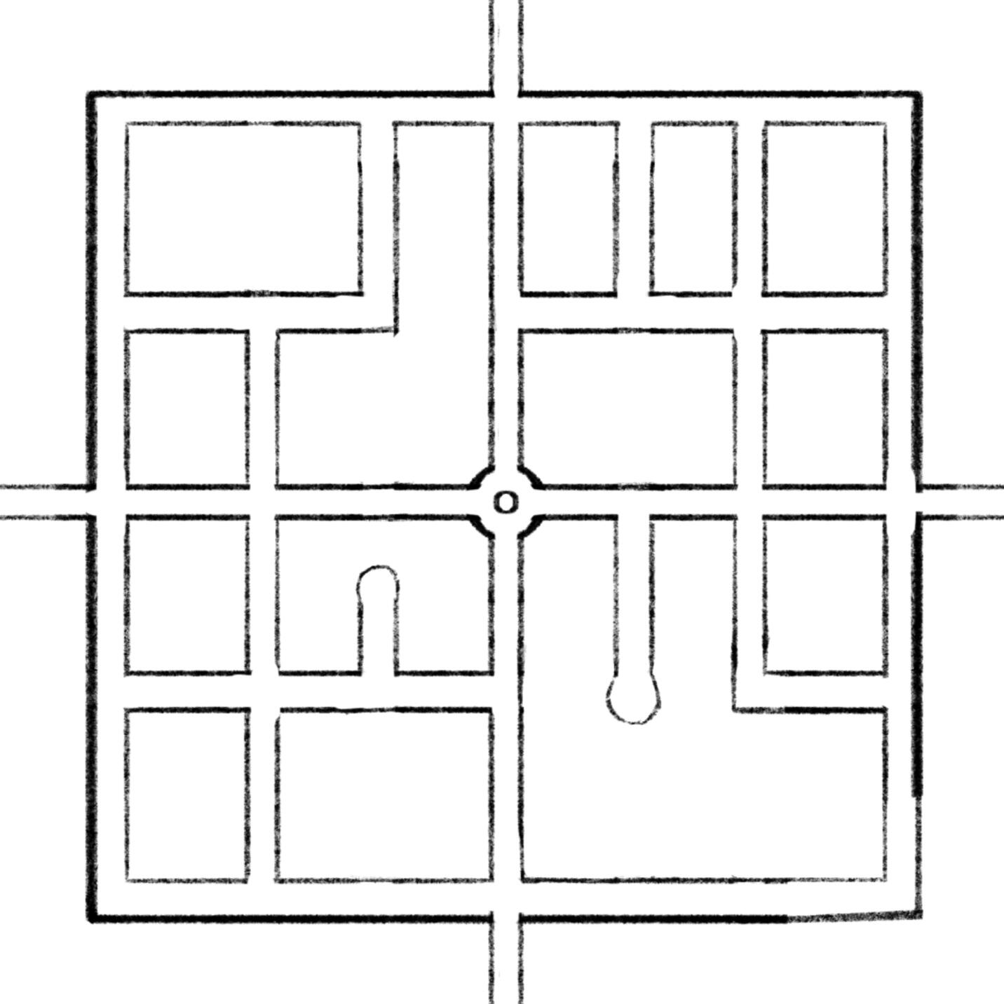
Final
The distance across is 300m. At a constant 100km/h you would cover the distance of the map in about 10s, but this doesn't account for acceleration or the actual top speed of the truck.
I made a quick mock-up of the edges of the road to get an idea of the scale of the map and the truck.
test mesh
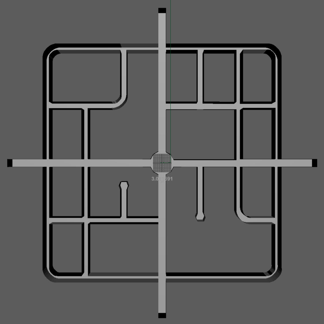
Truck Test
The walls didn't include anything beyond the roads (like the footpath) but we felt that the size of the map was okay.
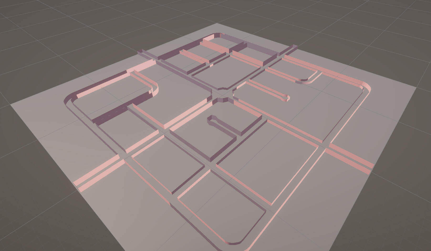
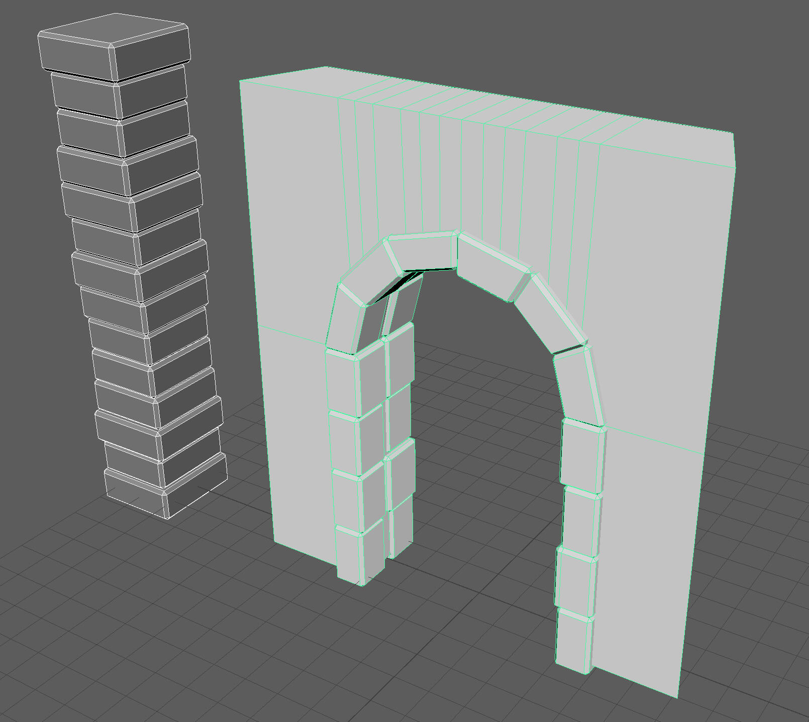
Modelling
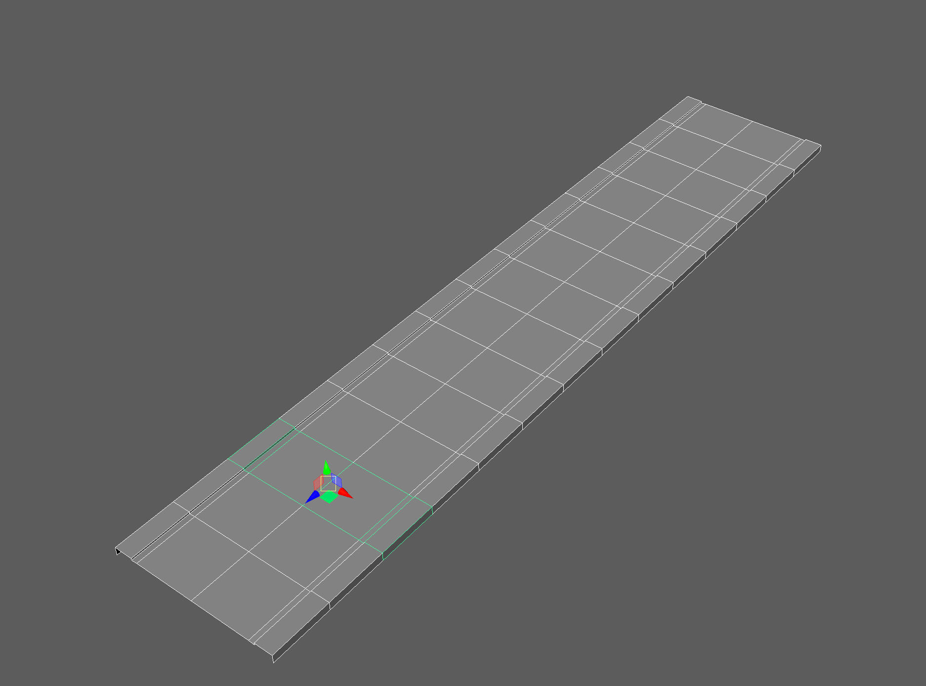
I separated the map out into modular parts so I could fit the whole map onto a single texture.
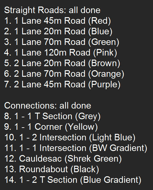
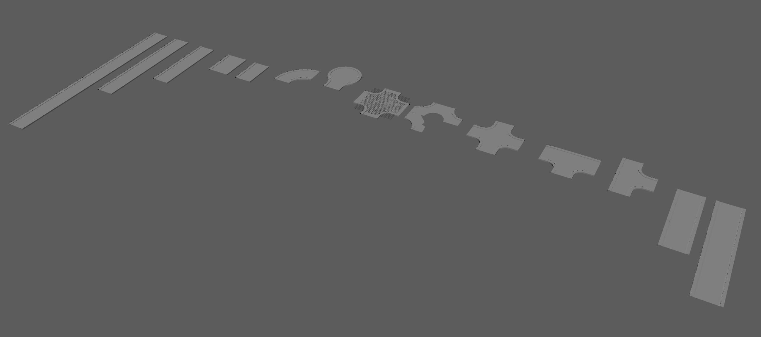
For the intersections and corners, I made them starting from a 5m base of the corresponding road widths. I drew an arc of the correct radius (all the visible curves in the image below) and swept one half of the road along the path to create the bends. I then mirrored the mesh and snapped and merged vertices accordingly. This resulted in a single complete mesh.
For the straight roads, I made a huge oversight. I made them by vertex snapping multiple 5m chunks of road together, so for example in this 70m road, there are 14 separate meshes. This resulted in occasional performance dips in game (at least on my computer). What I should have done instead would've been to join each section to make a single mesh and then cut the UV into individual shells per 5m section of road.
Texturing
Each model was unwrapped starting from a camera based UV from the top orthographic view. I lay out all the UV shells onto a single texture atlas with the same texel density.
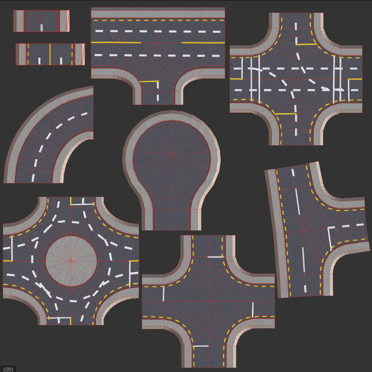
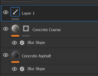
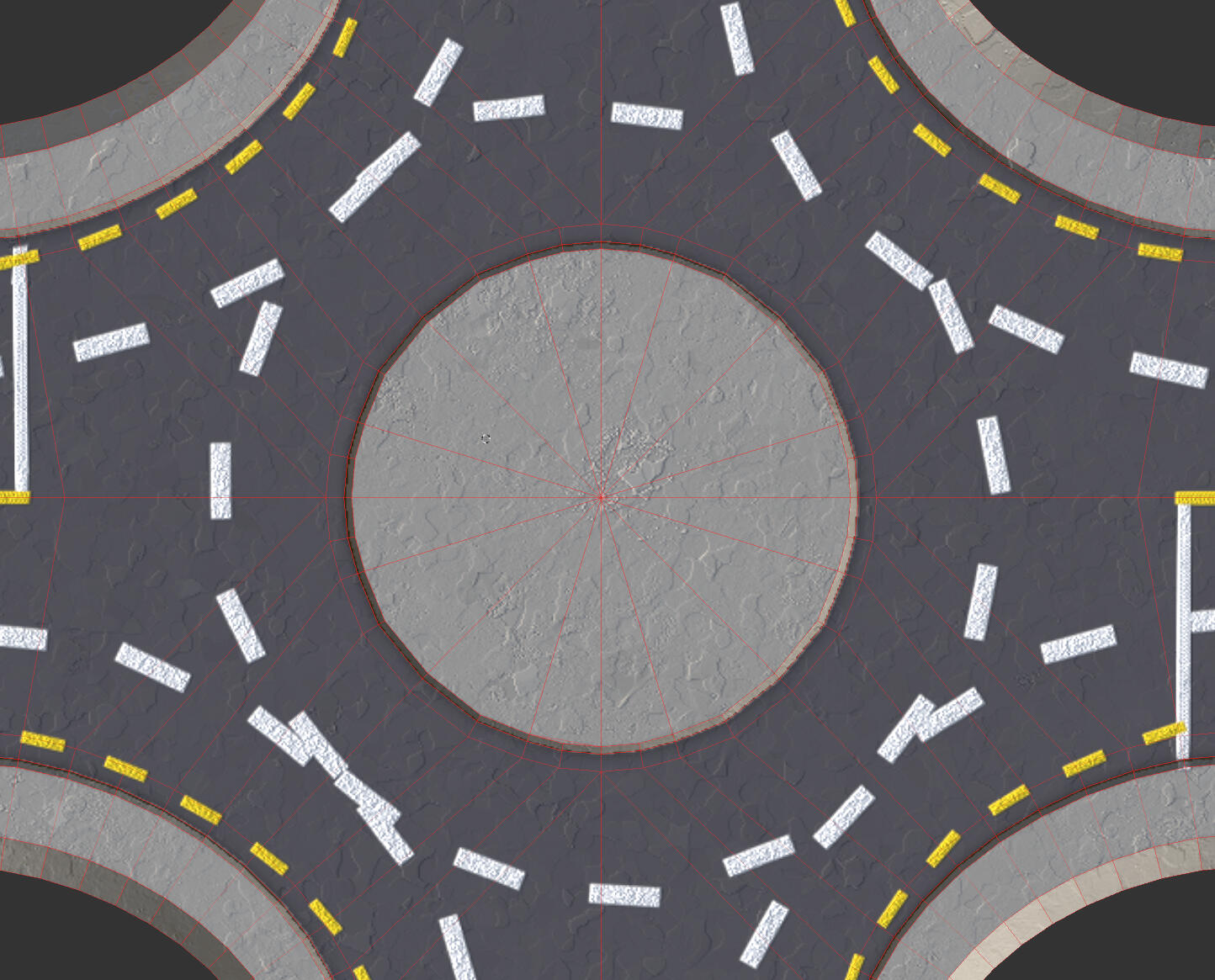
The texturing work here is very simple. There are two fill layers masked the the road and footpath, and a paint layer for the road markings. The fill layers have a blur slope filter on them to smooth out the fine detail to a more stylised "cartoonish" look. This fit the low-poly aesthetics more neatly.
While the straight lines are good, the curves which I drew by hand vary in quality, which is especially visible on the roundabout. I should have looked into a better way to do it.
Assembly
Each part of the road was vertex snapped together. My dimensions and prior planning were all correct so there were no gaps. My only issue is with the optimisation problem mentioned earlier.
Reflection
I think I did pretty well for my first time designing a modular map. My maths and calculations for dimensions were perfect from the start so the process went smoothly. By keeping the map simple with no changes in elevation, I was able to focus more on learning to use Maya. My layout and texturing were approved by a friend in urban planning. I didn't document this very well, but I looked at existing towns on google maps and used NZ roads as reference, so I was happy to hear that I did well. I should've combined the meshes at the end for optimisation.
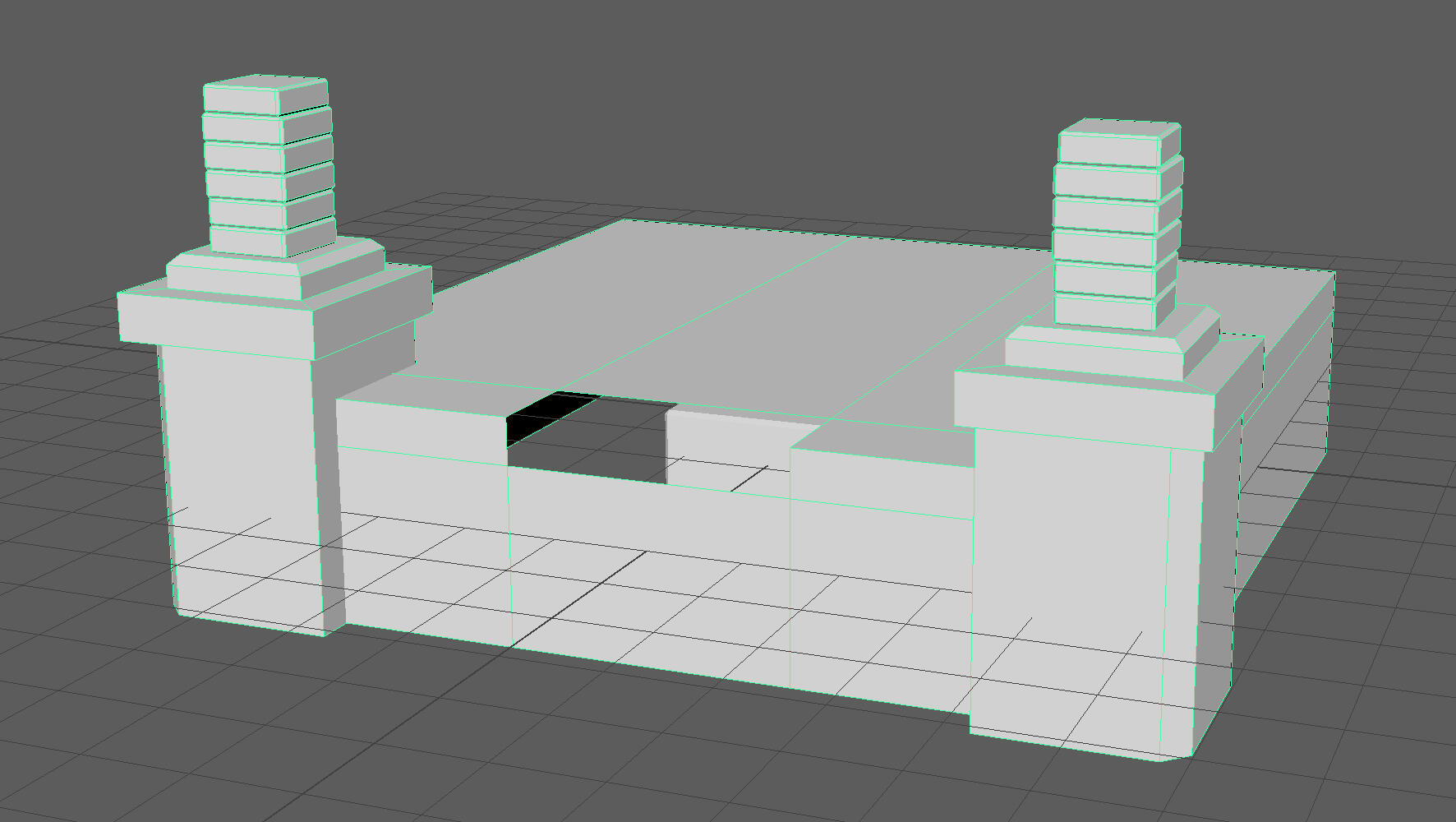
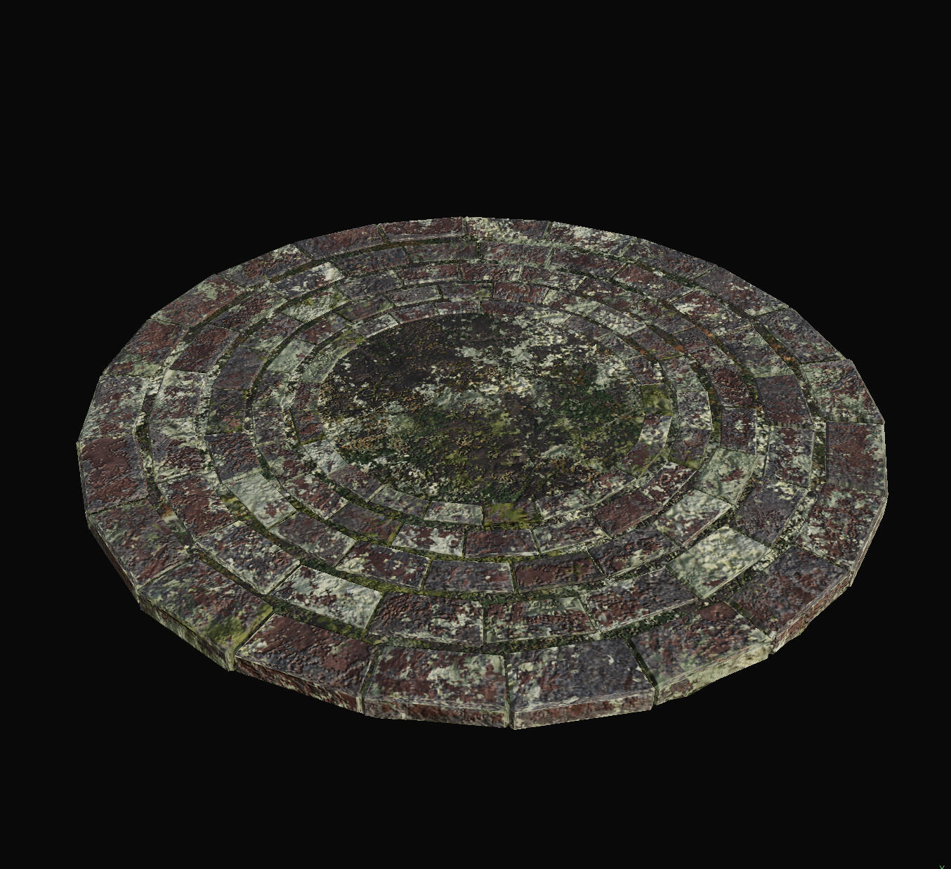
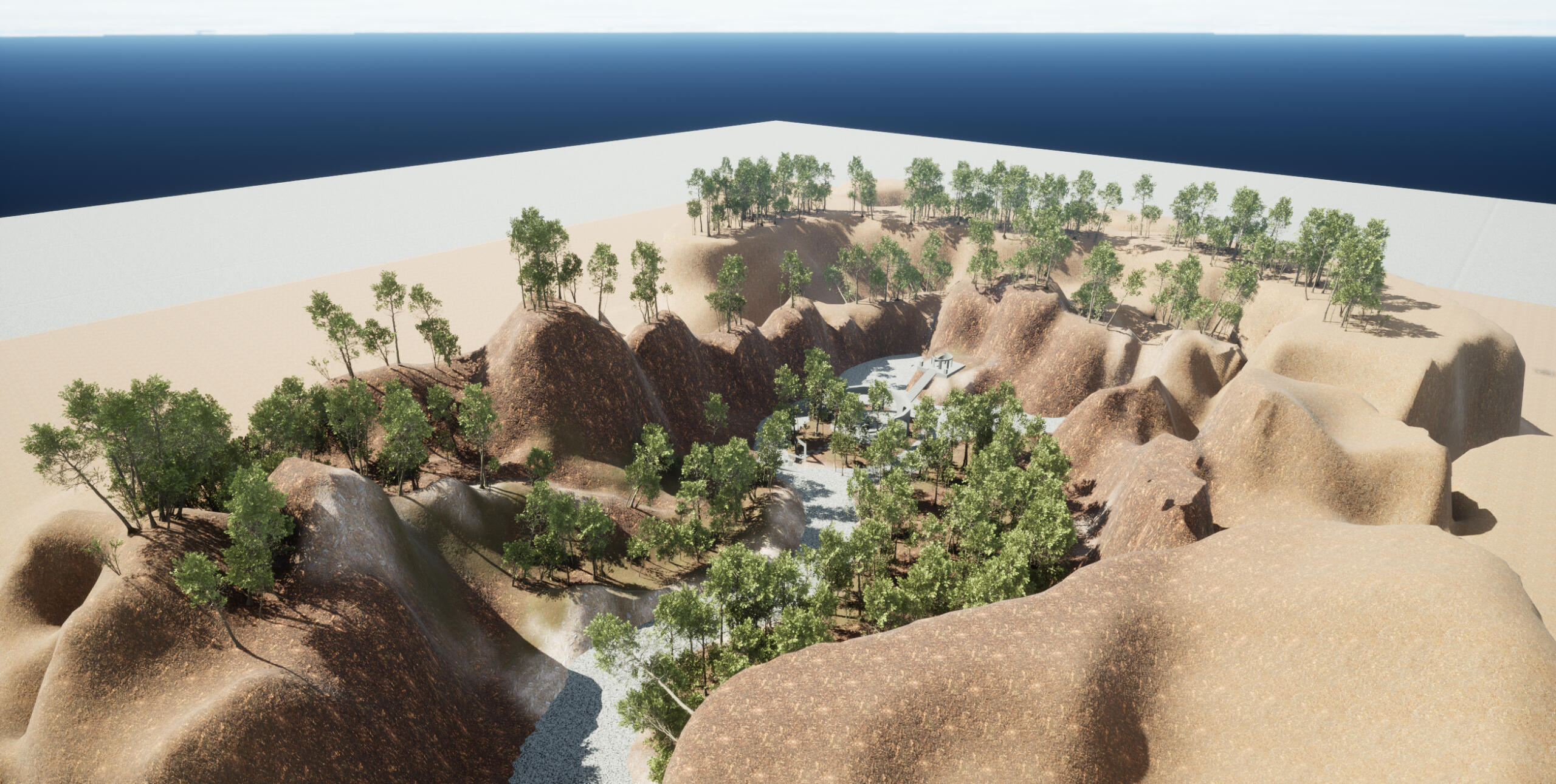
Environmental Design
Planning
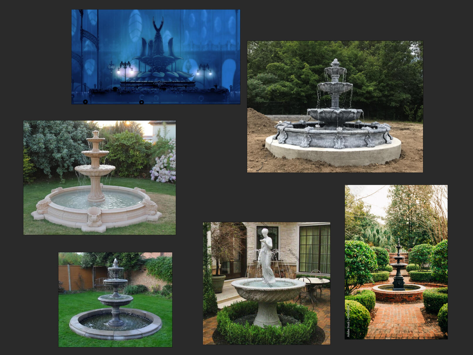
Inspiration
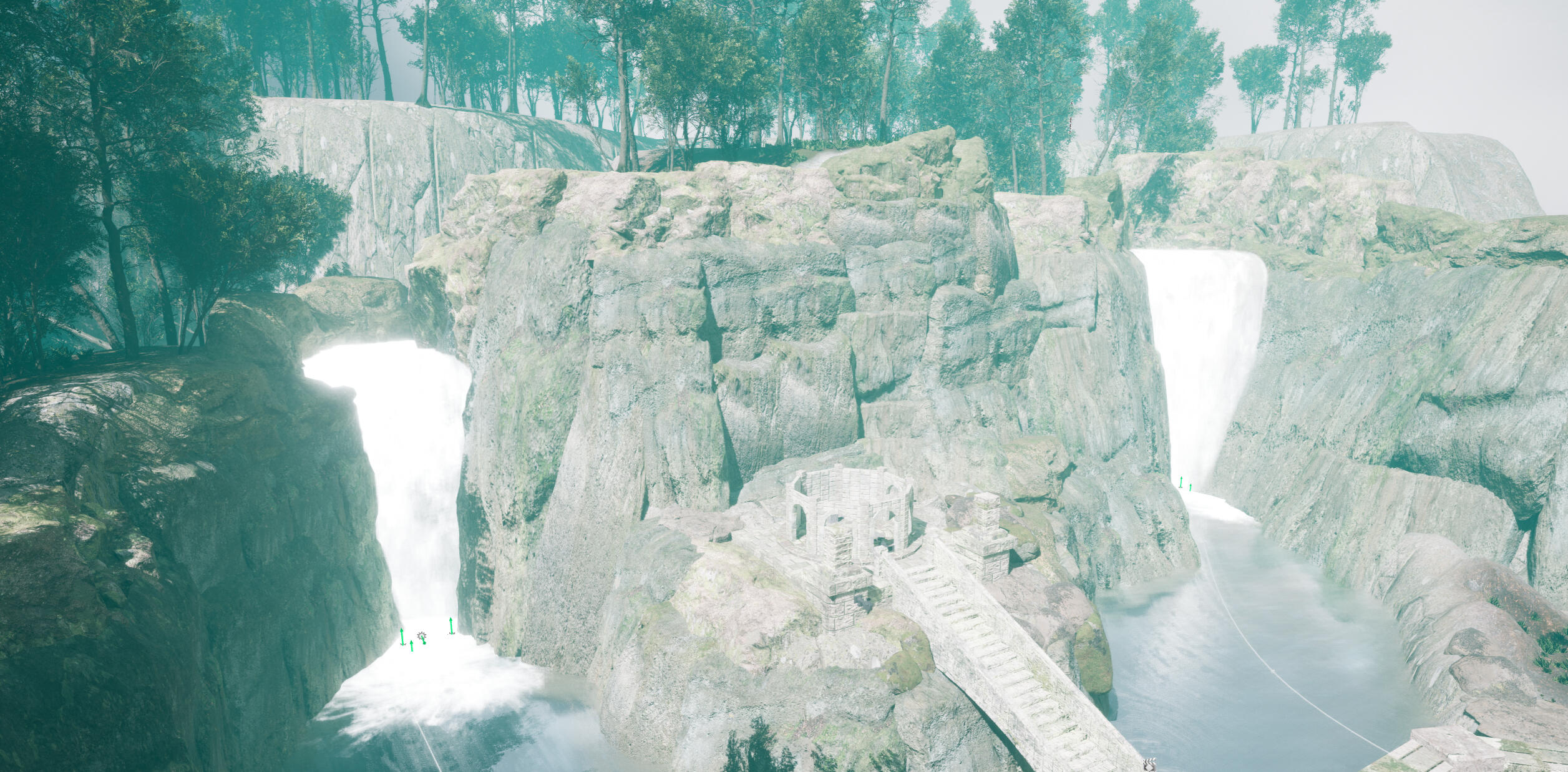
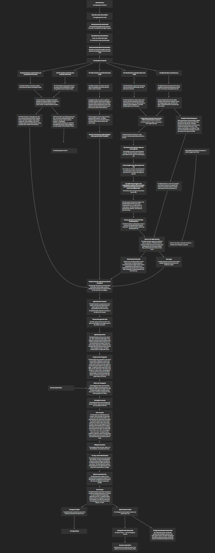
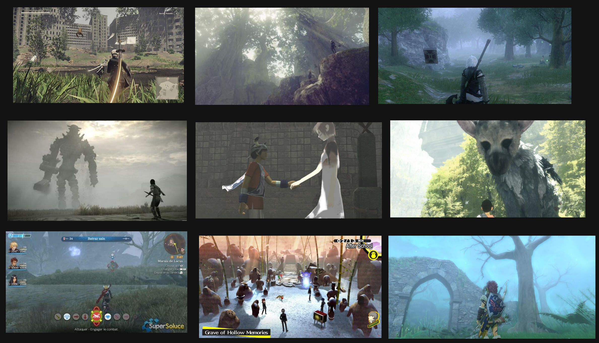
For some reason one of my favourite things is water fountains. I really like water fountains and I don't know why, so I wanted to include one in my environment. The game environments I remember the best are those of BotW/TotK, and Nier Automata. I decided to take screenshots from some of my favourite locations as inspiration.
I particularly like the look of the Forest Kingdom from Nier Automata. The blinding white skylight makes a very visually striking environment, shining between the trees and in stark contrast to the rocks and cliffs. This coupled with the overall low saturation makes a more solemn scene. A number of these examples are places of worship or holiness (statues, monuments, etc.). Many of these holy/sacred locations are symmetrical. Both of my example games are set in a post-apocalyptic world, so I wanted to try incorporate that aesthetic into my environment as well.
THEMES
- Post-apocalypse/abandoned with signs of past civilisation. Heavily inspired by the Forest Kingdom by Nier Automata.
- Ancient/primitive. As overdone as it is, I think there is a certain charm to older architecture, and having it in a damaged state makes it more intriguing (questions like who/what kind of people lived here, what happened here, how long has it been, etc.)
- Secluded, sacred grounds. Religion and history a big part of culture, and including hints about these give insight about the people of the game world.
- Fountain. I like fountains. Also commonly adorned with statues, and a symbol of wealth in older times. Maybe the people who came to worship here were high-class, or maybe royalty.
GREYBOX
I started by blocking out the locations of each object. Originally I wanted to have a section off to the right, which would add make the environment asymmetrical and more interesting in the context of a video game.
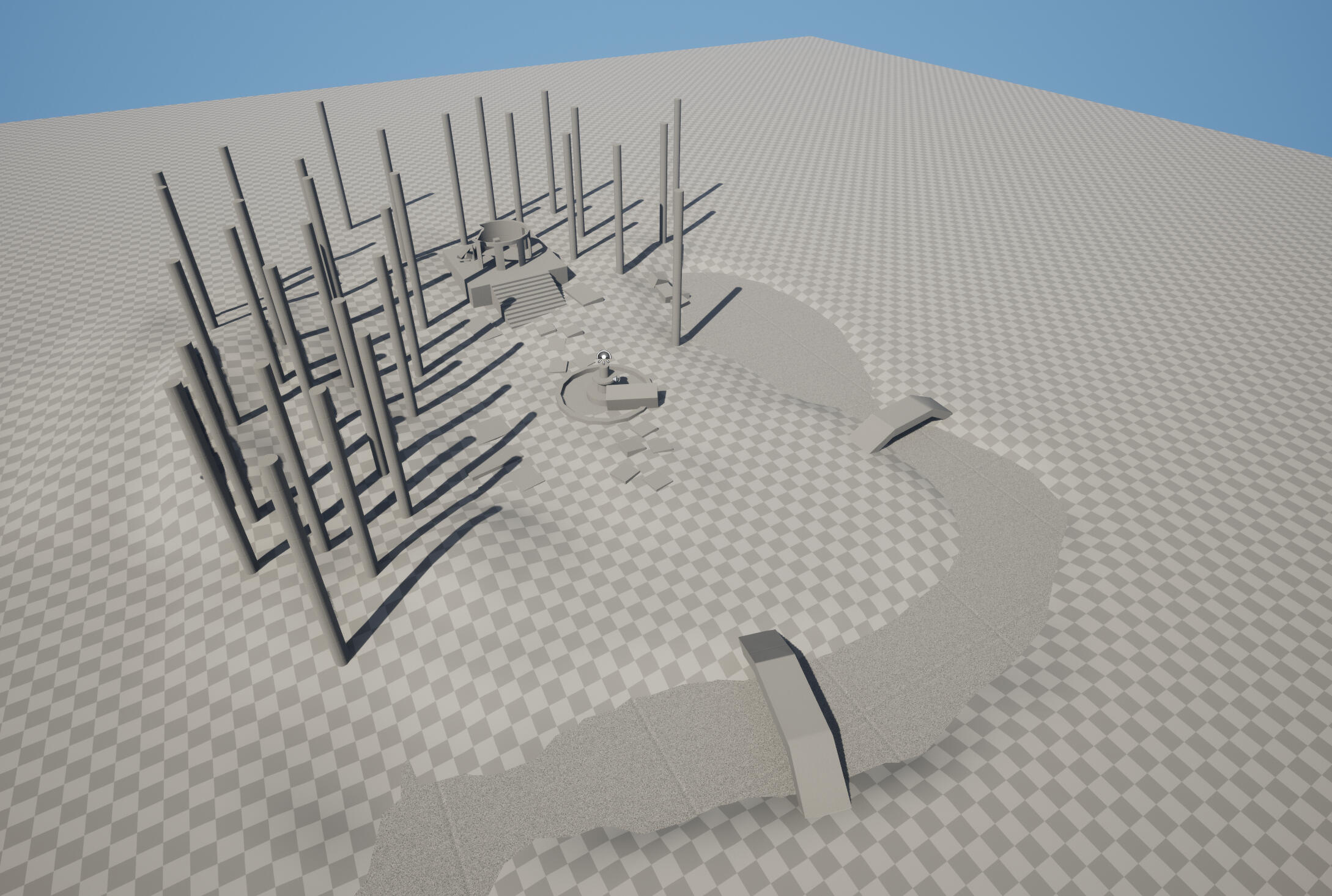
I later removed it as I didn't think I'd finish in time. To make the environment more interesting I made some changes to the elevation of the environment.
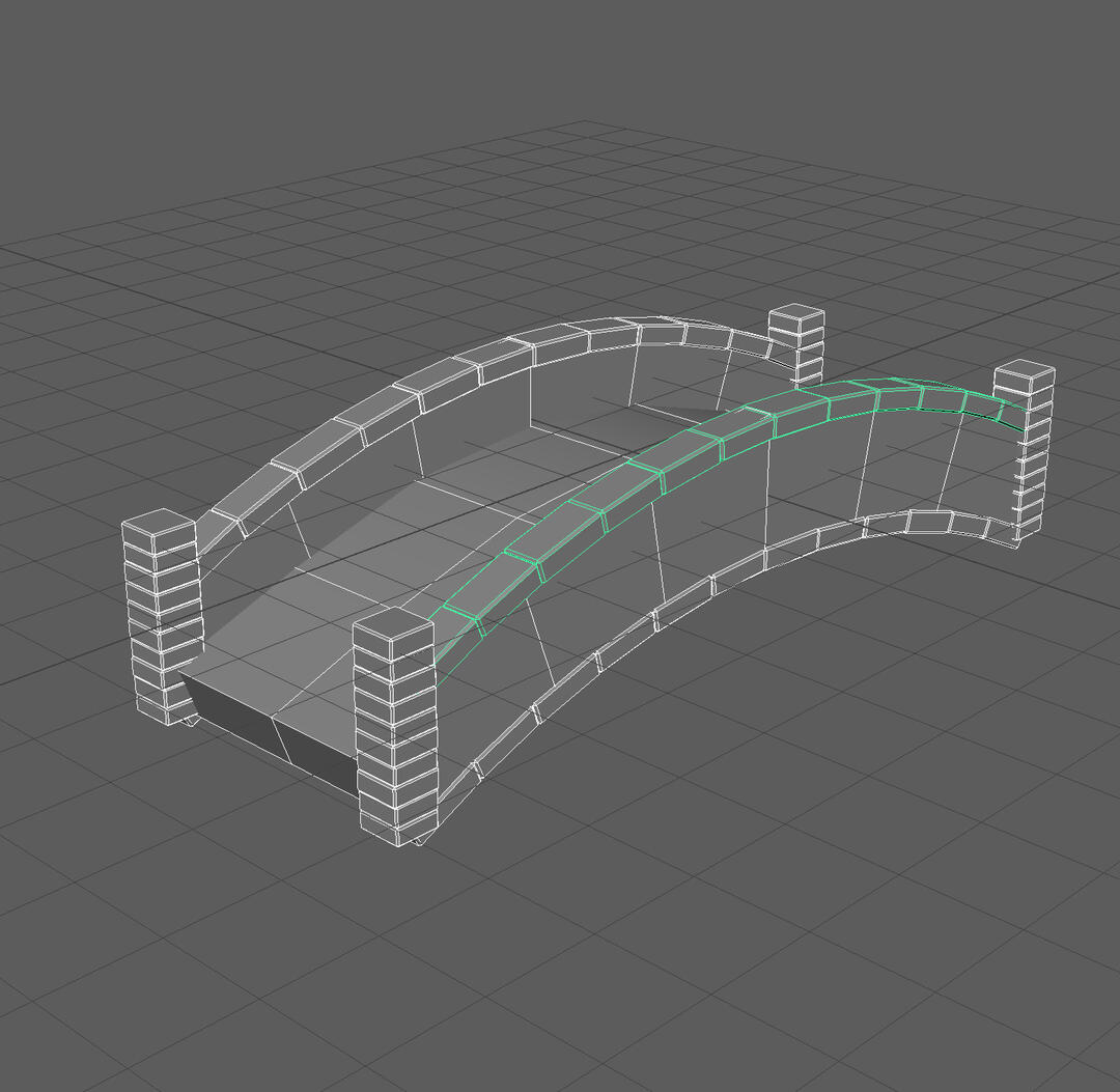
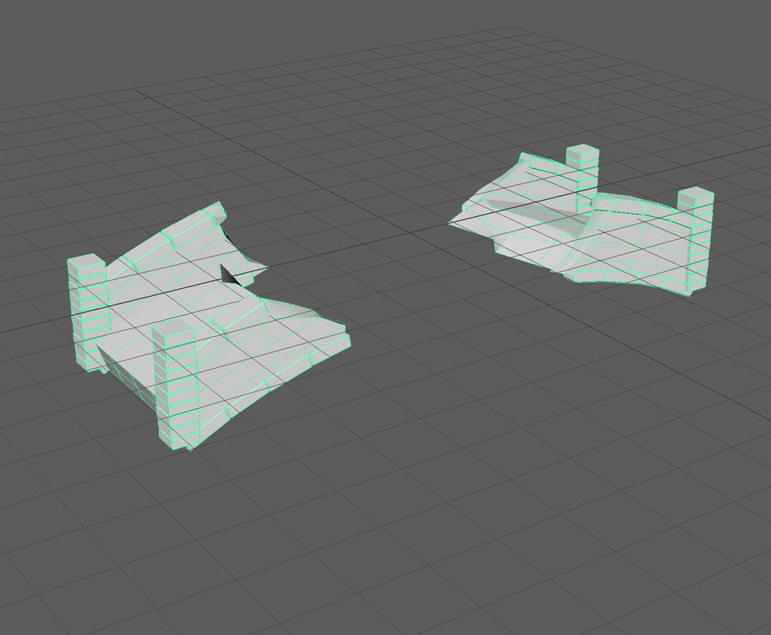
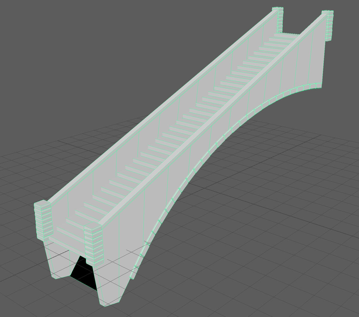
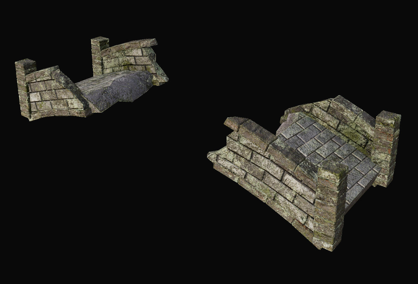
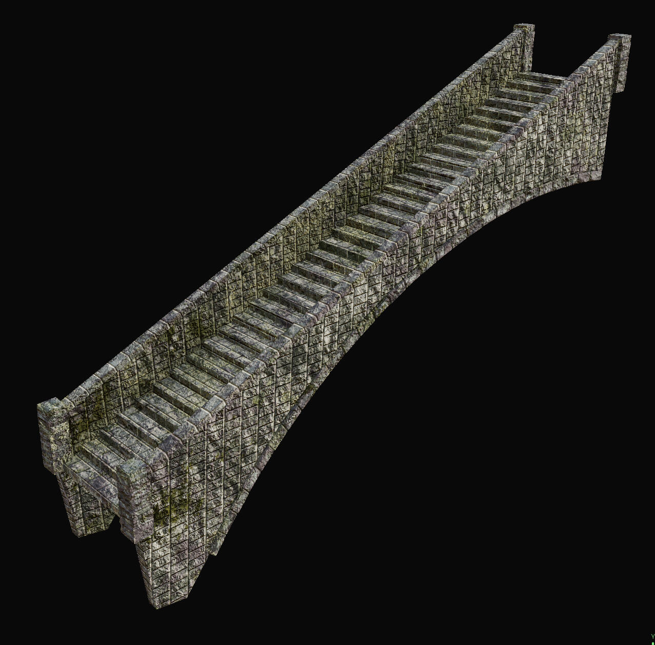
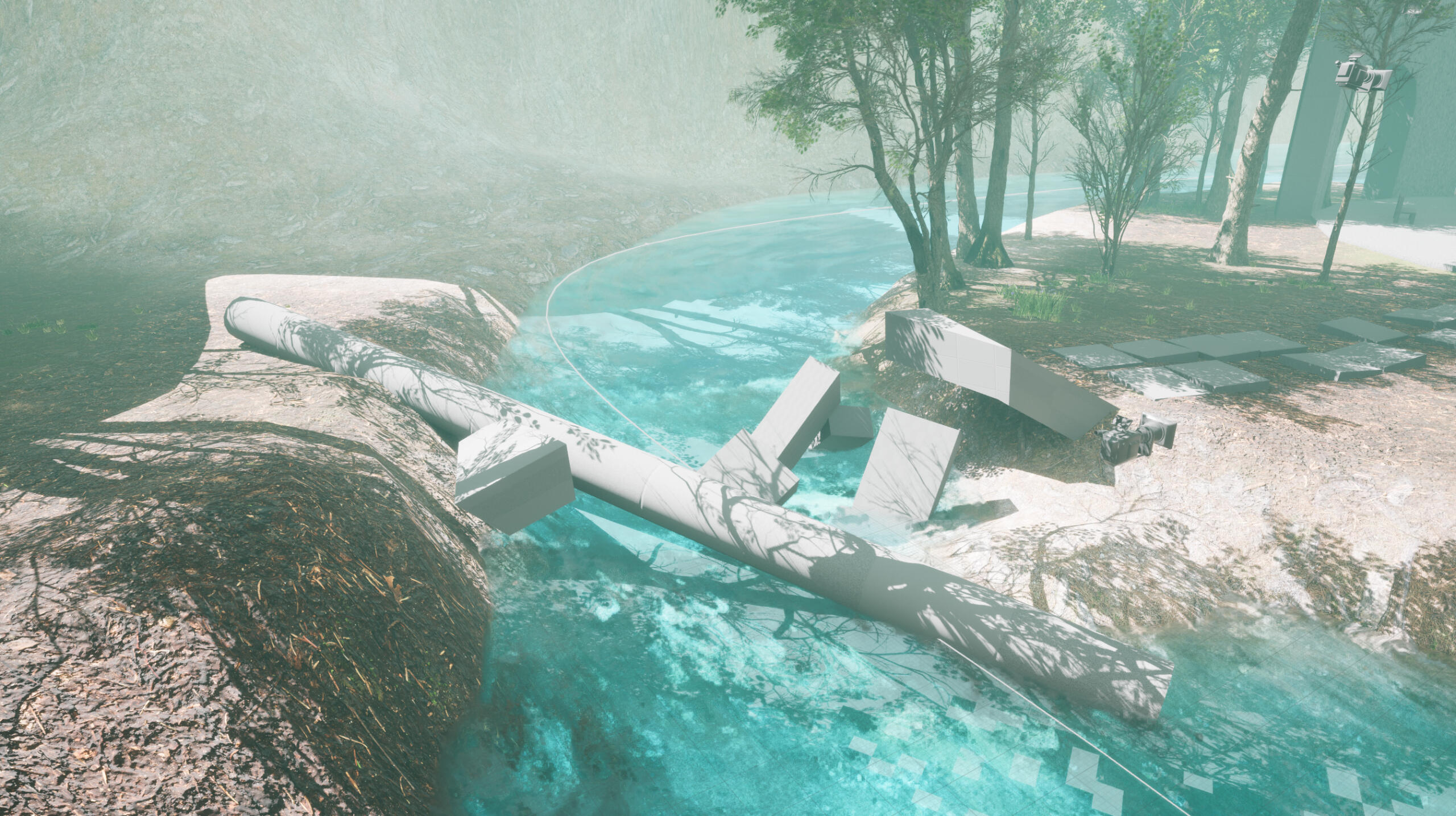
I wanted to show the age of this location through the style of architecture, and the amount of damage and wear. Fallen trees and tall forest will also emphasise the secluded/abandoned nature of the environment, implying it has been unattended by humans for ages. I destroyed the bridge and left it unrepaired to really hammer that idea home.
Asset Creation
MODELLING
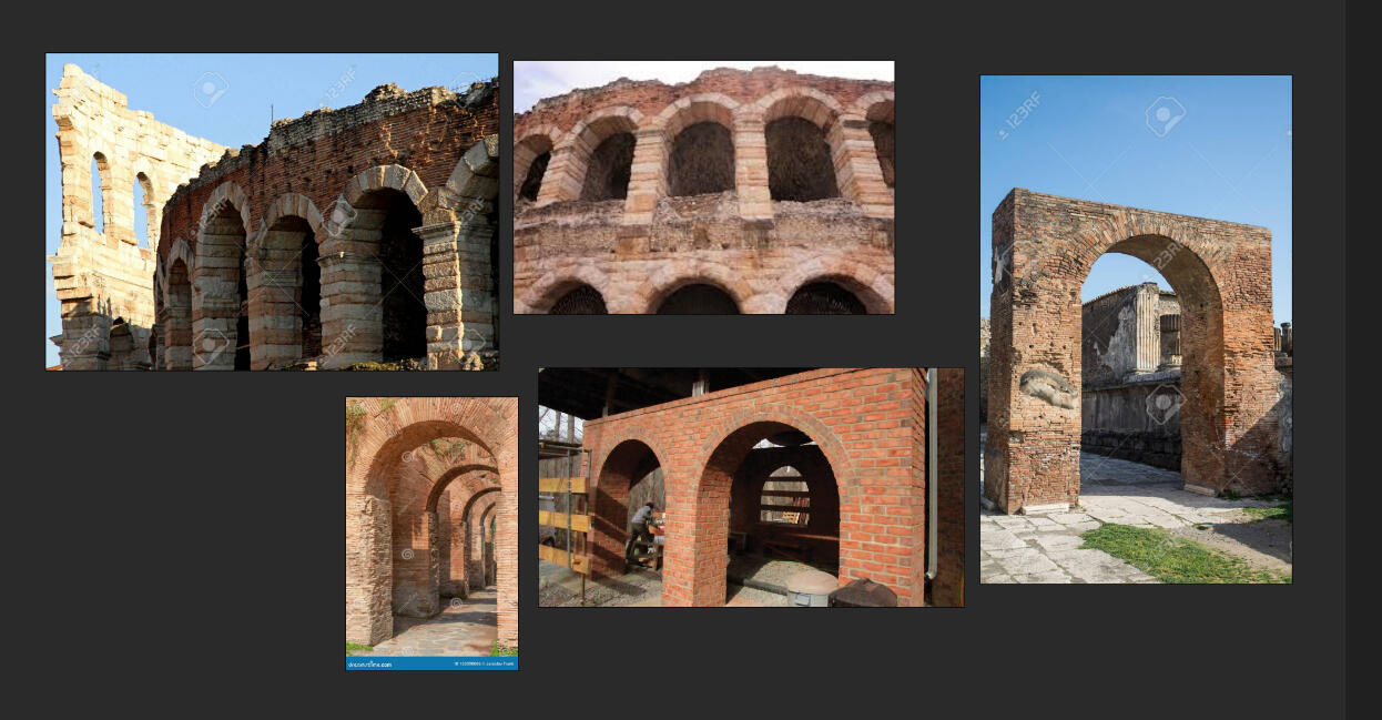
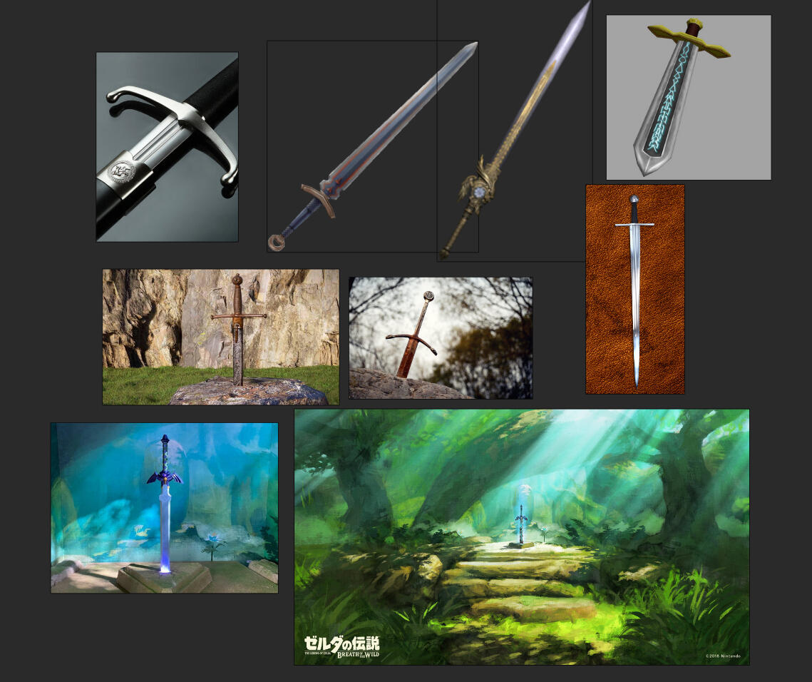
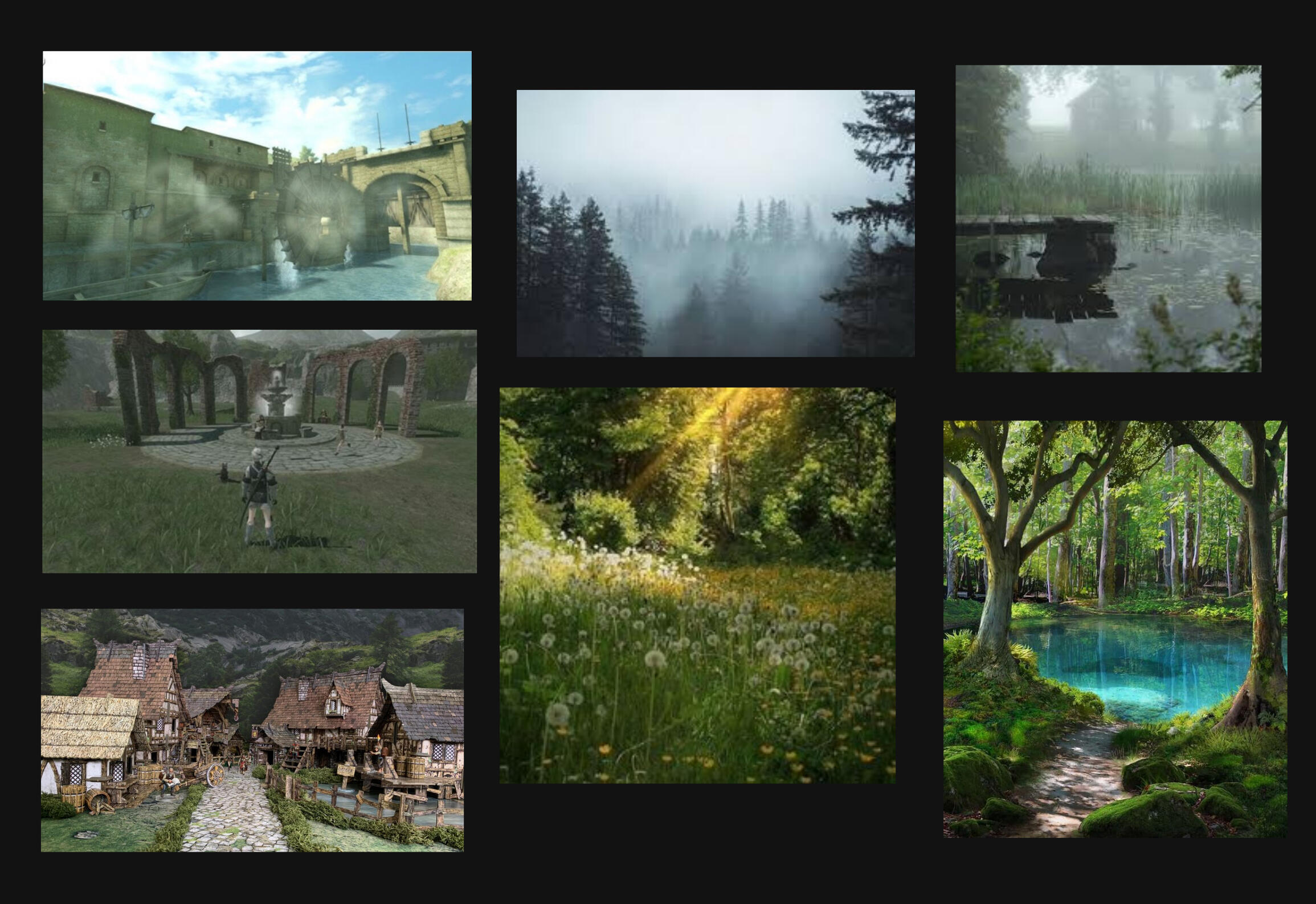
I began by finding references images to help me create my models with accurate proportions, and maintain a consistent architectural style.
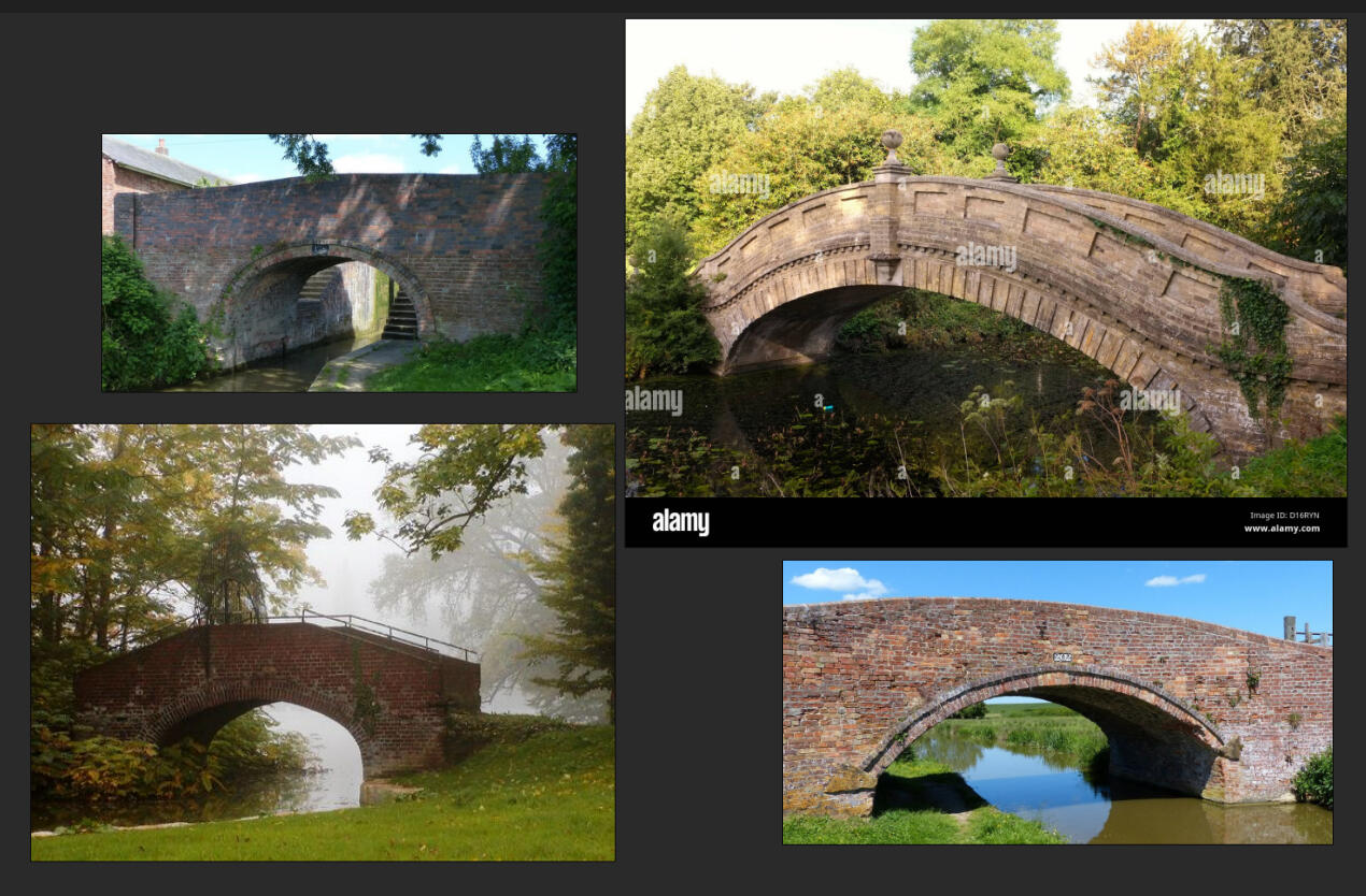
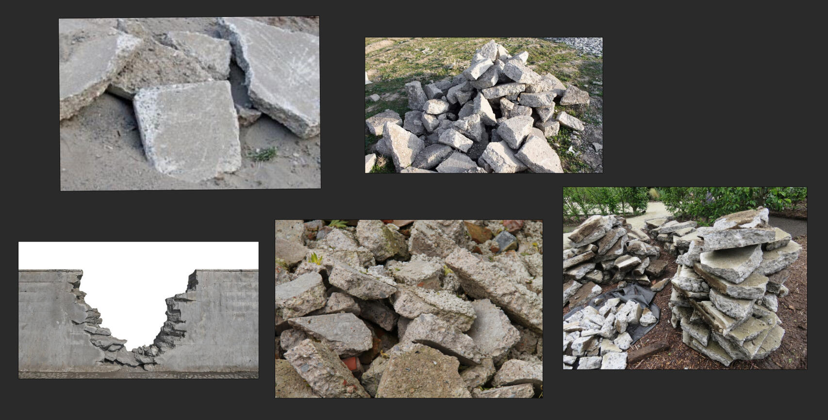
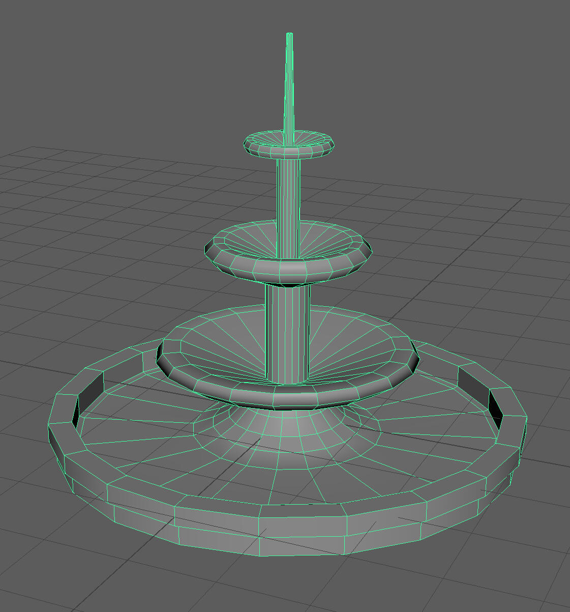
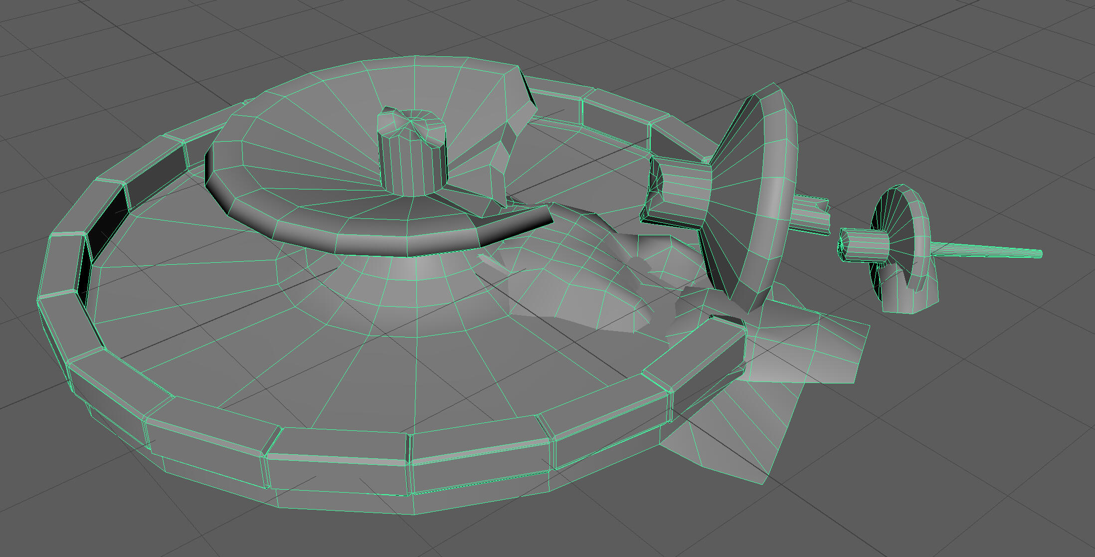
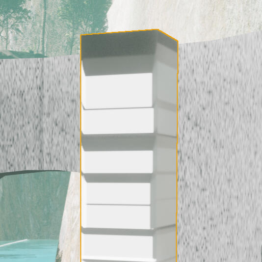
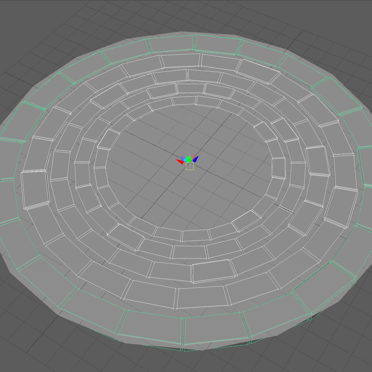
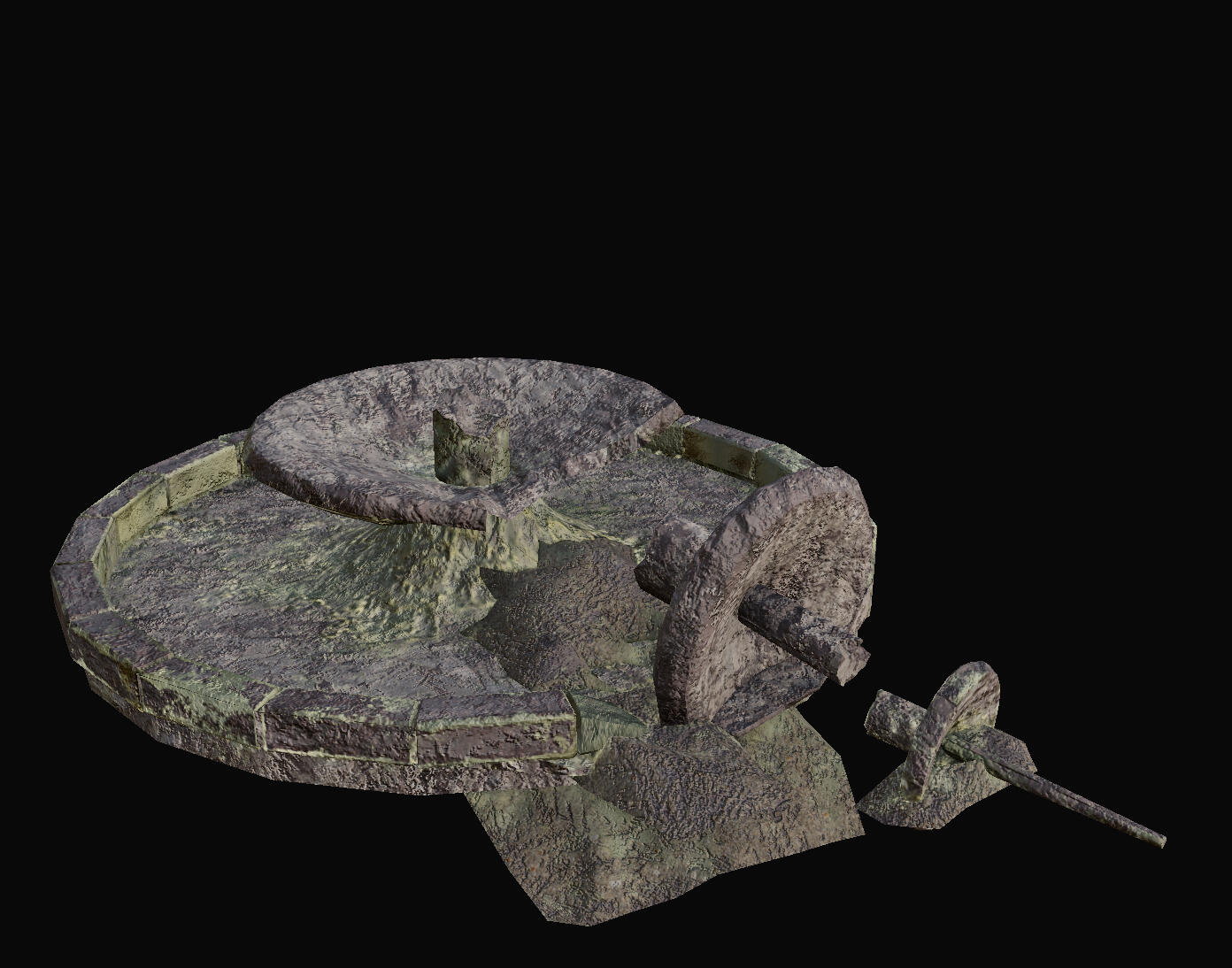
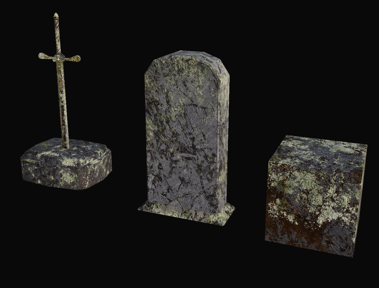
From here I went straight to 3D modelling in Maya, starting with the fountain. I modelled the full fountain with proportions according to the reference images before separating the spire and adding some planes for rubble.
The planes I used to act as rubble were edited manually, though I should've used a noise displacement map to speed up this process.
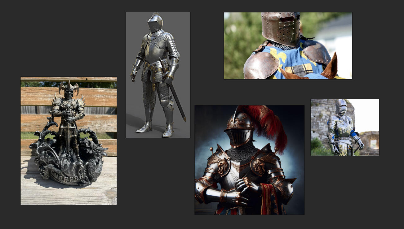
I originally planned to make a statue on top of the fountain, and made this sketch as reference. However, I ended up dropping this idea as I didn't feel like I had enough time. It also started as a full-body statue, which was then reduced to a bust to save time. By that point I realised a bust would be unlikely to fall unless the support beneath it was too thin, so I just made a normal fountain.
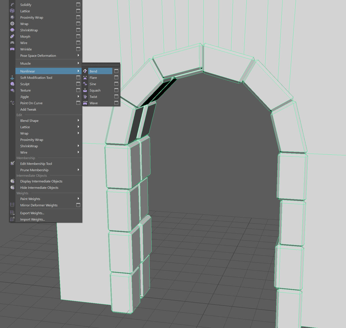
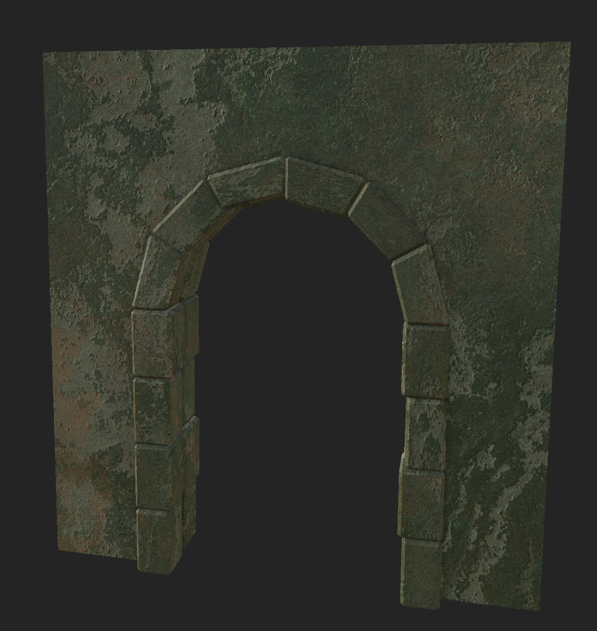
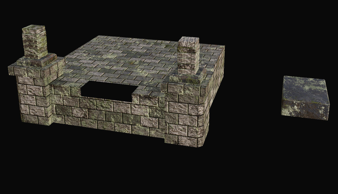
The arches were modelled as modular parts. This was done to save time, but I think that if I had more time I would've only had one more damaged variant.
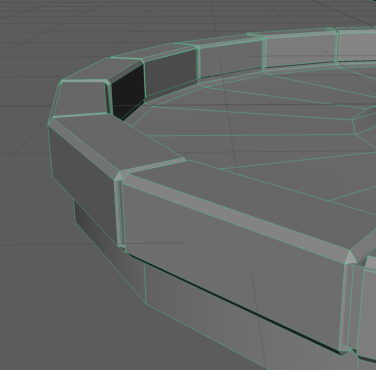
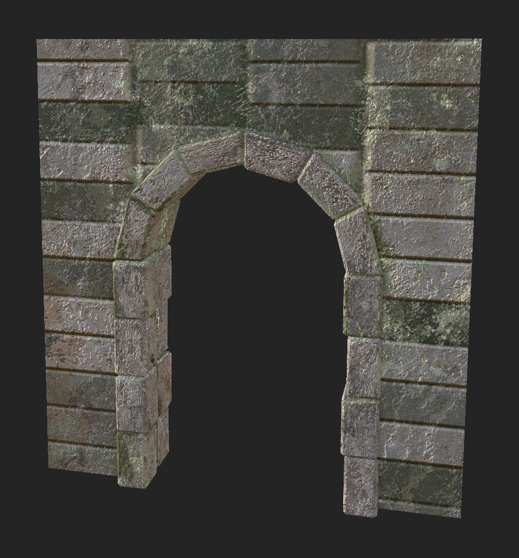
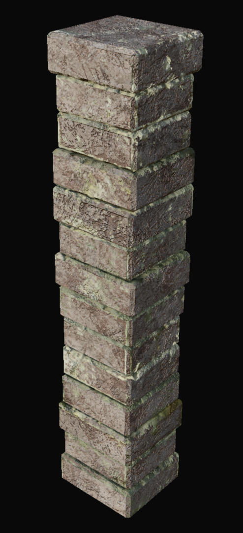
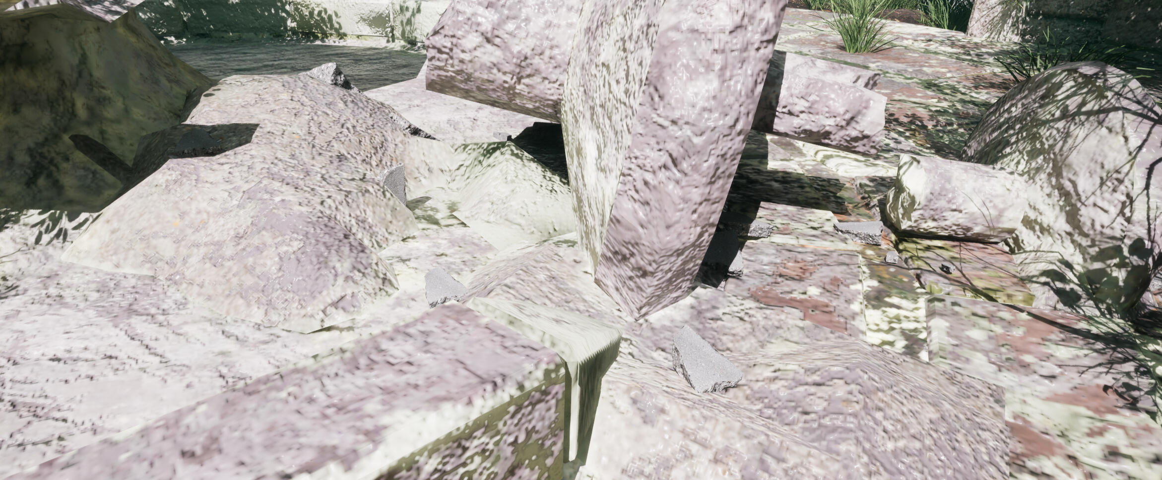
Originally I modelled the bricks with the intention of baking the normals onto a lower poly mesh. The result was poor, either due to the non-uniform protrusions, or due to incorrect settings on my part. I ended up keeping the modelled bricks, which sacrifices optimisation for better visuals. In hindsight, if I had added a bit more geometry to the low-poly mesh to more closely match the shape of the bricks, it probably would have worked better.
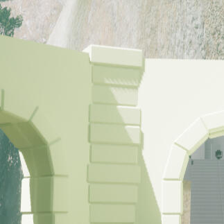
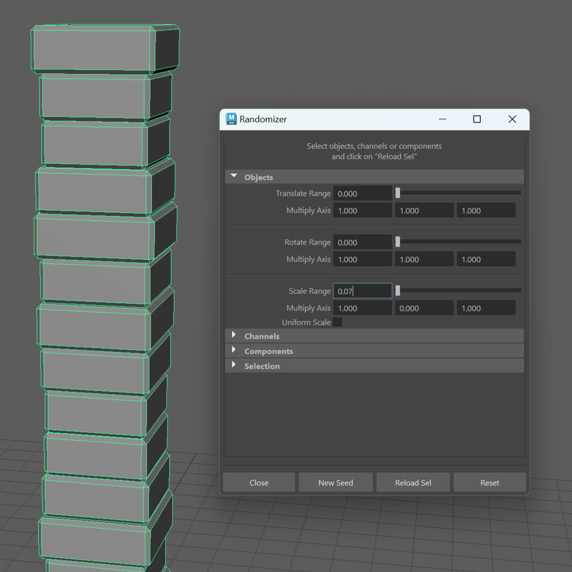
To model the bricks I resized a cube and duplicated them all vertex snapped at the edges. I then used Maya Bonus Tools which adds a randomise transforms function. I locked the transforms in the axis they were aligned in so they wouldn't clip into each other, then combined them and added a bevel. For the curves along the arches I used the nonlinear bend tool.
Because I liked the appearance of the modelled bricks, I ended up reusing this technique throughout all of my models. I was aware this was poorly optimised, but I decided to move on as I was running low on time.
The smaller props were modelled separate from the structures/buildings, and they all share the same UV Tile.
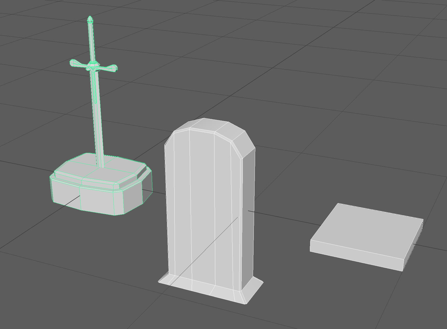
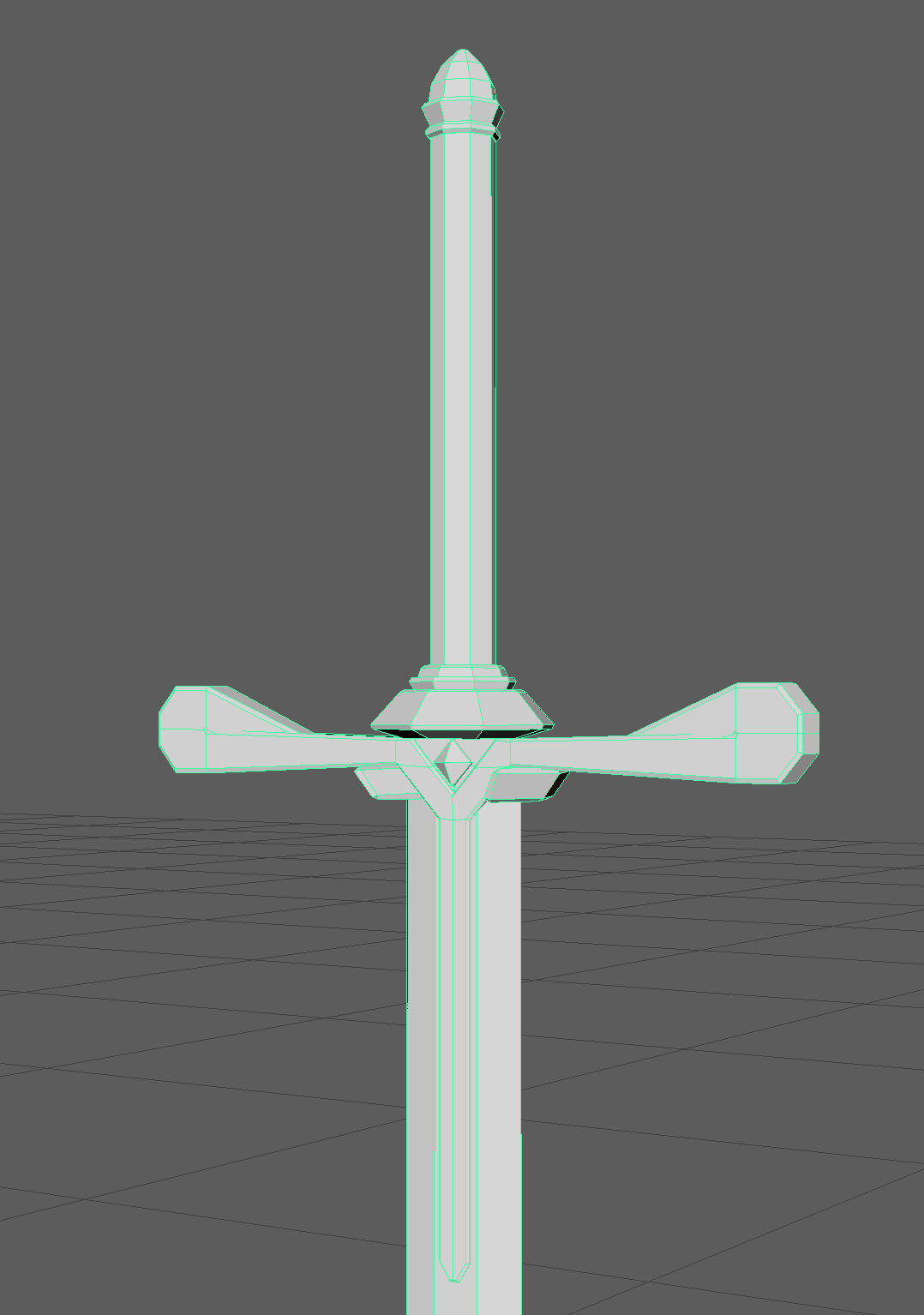
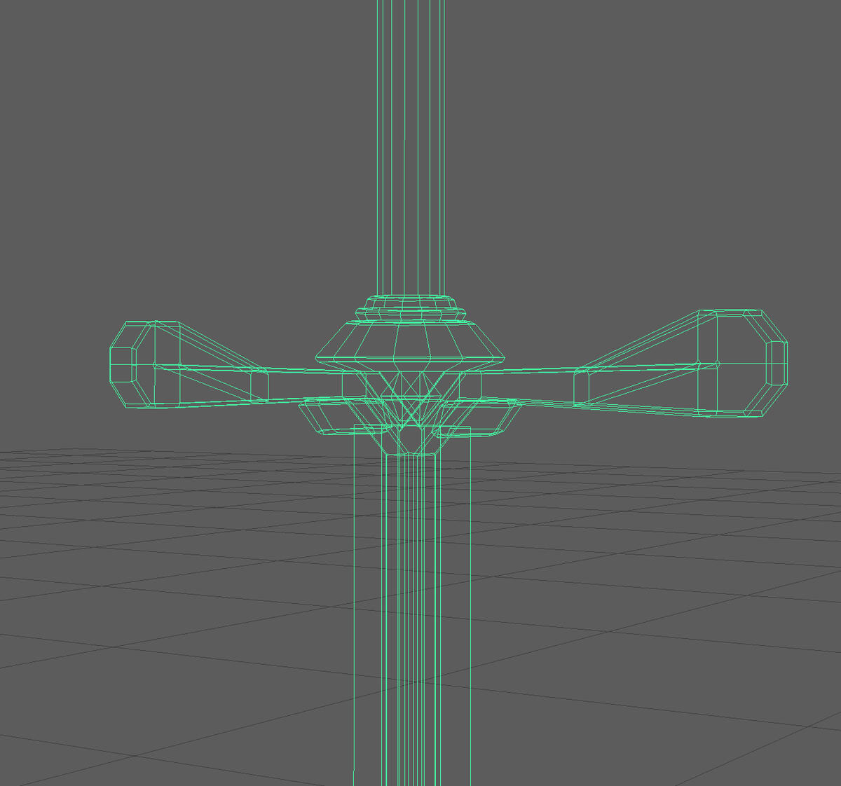
The sword is the most detailed model I made, but I tried to keep the design simple. To make modelling easier I modelled each part of the hilt and handle separately and combined them into one mesh at the end.
TEXTURING
Texturing each model was a rinse/repeat of the same techniques, which was done to keep a consistent look across each model.
At the bottom is a base layer of a dark green clay terracotta material. The other parts are given a folder to give each section slightly different colours.
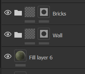
Everything is given a top colour of a pale sand coloured clay terracotta layer. The flat surfaces are given a brick generator mask with partially randomised height. Another layer on top has a brick generator with the same settings in the height channel. All other channels are disabled. This is reflected in the normal map when exporting.
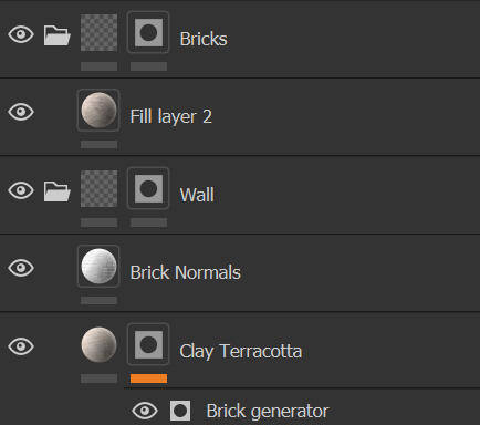
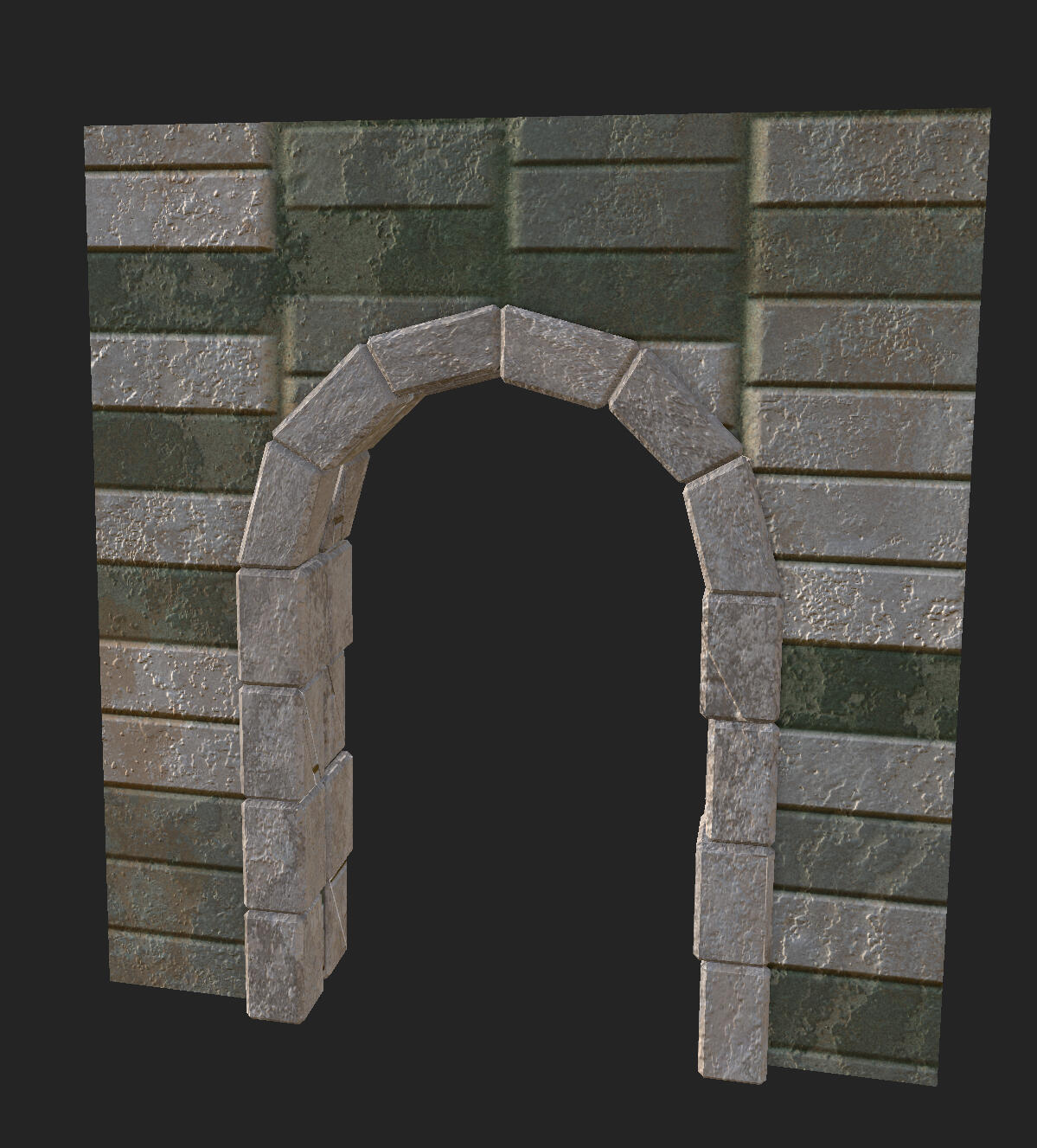
Both are given a layer with a slightly darker terracotta and a generator mask. This adds some subtle signs of wear.
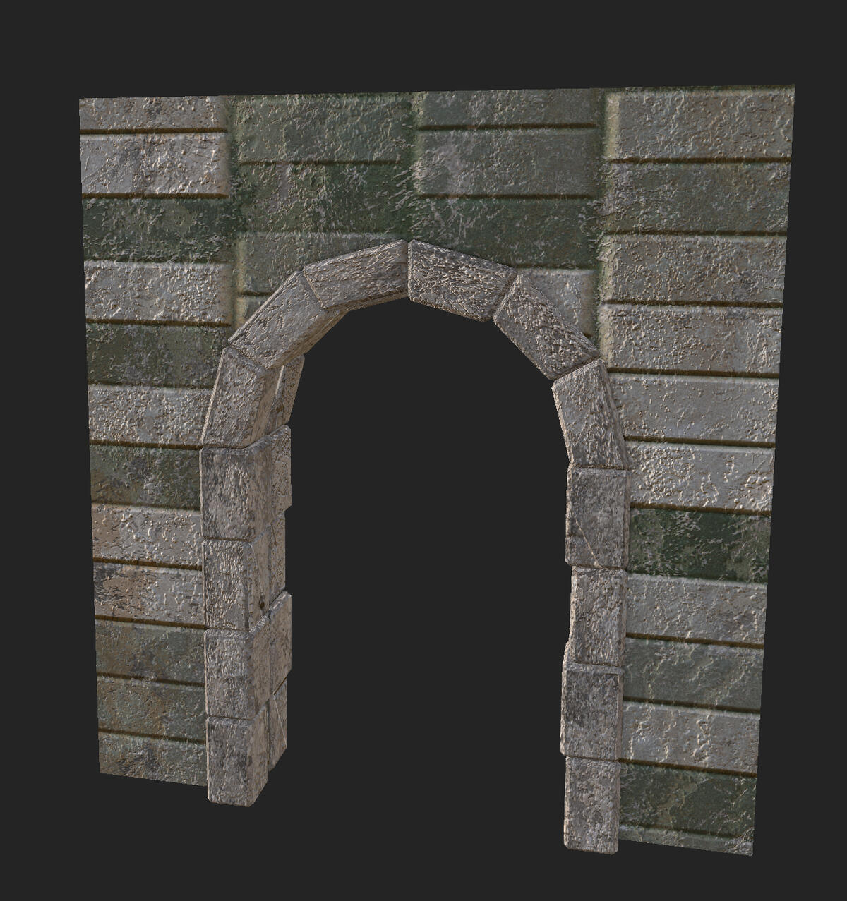
The models are then finished with a layer of moss with a generator mask.
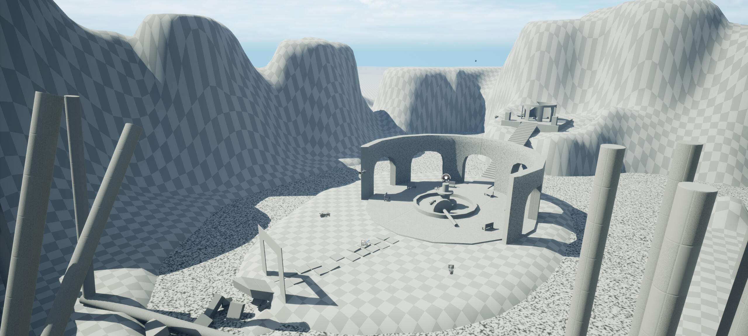
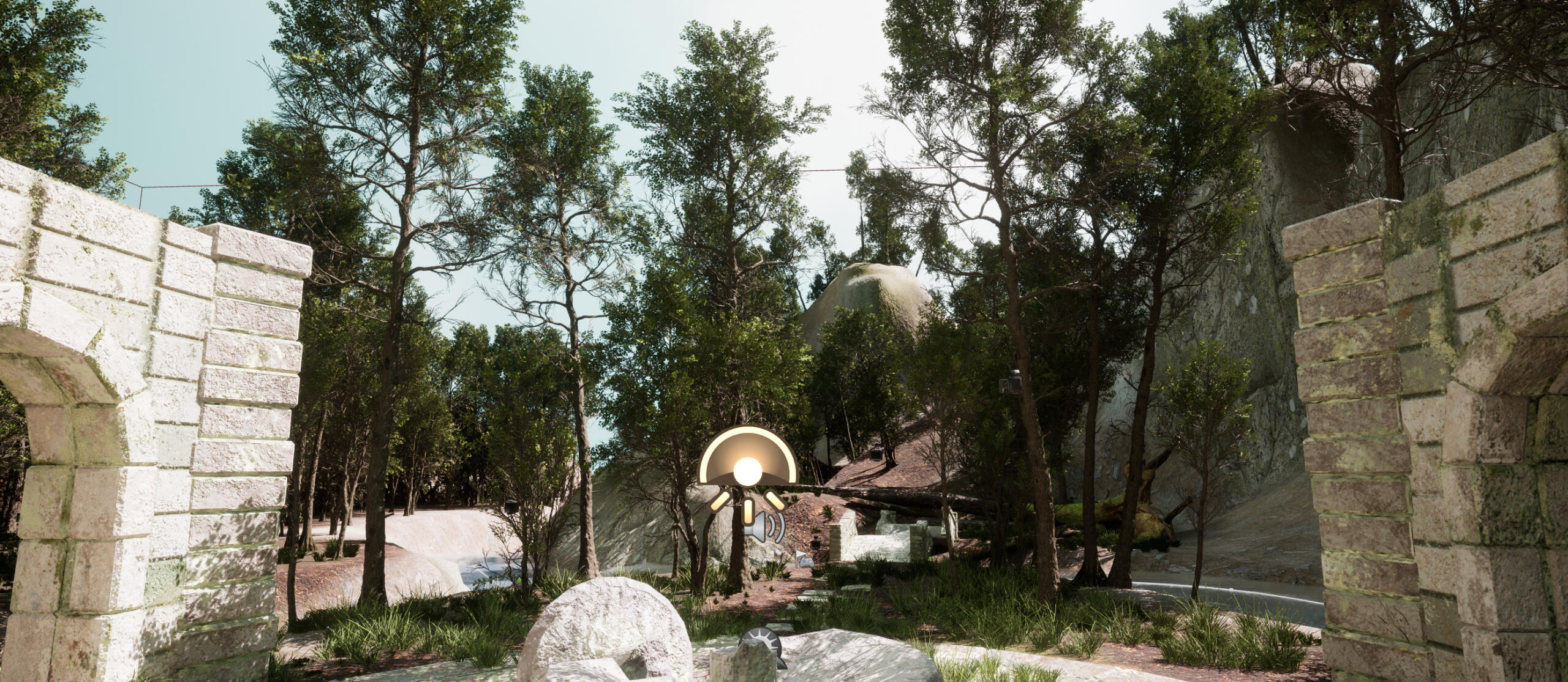
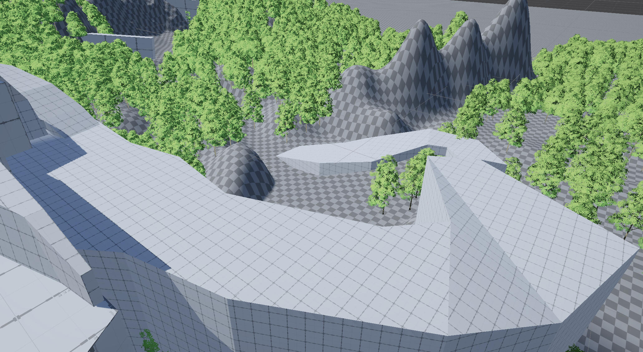
Environment
landscape
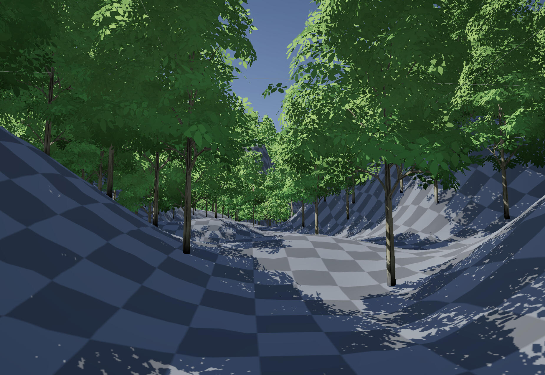
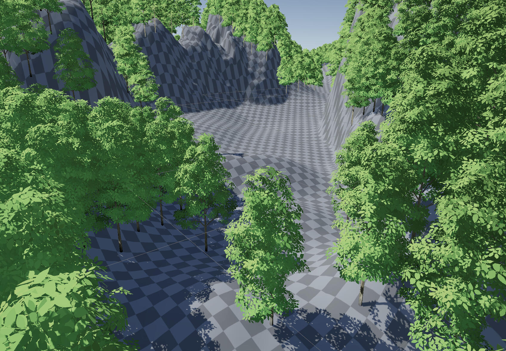
Starting from the greybox, I textured the landscape with Megascans surfaces. I also populated the environment with trees from a Megascans pack available for free on the Unreal asset store. I only textured the parts which would be visible to the camera in the flythrough video.
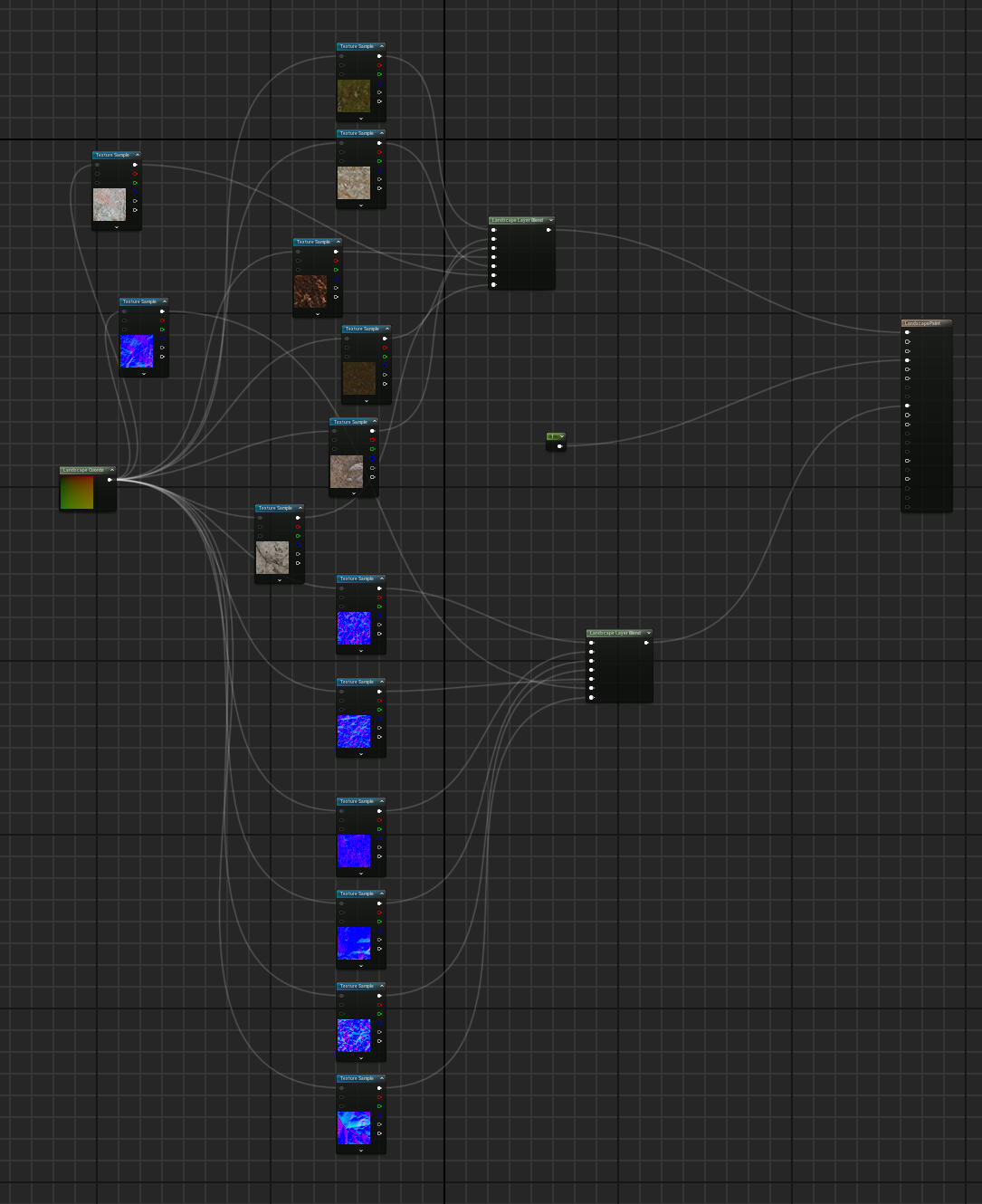
I made a single landscape material containing each layer. The node at the beginning converts the landscape coordinates to UVs for the textures and normal maps. This started out more organised but as I added more textures it eventually became a complete mess.
I began to play with fog and postprocessing effects here. I also changed the colour of the skybox and skylight to get the shadow hue I wanted.
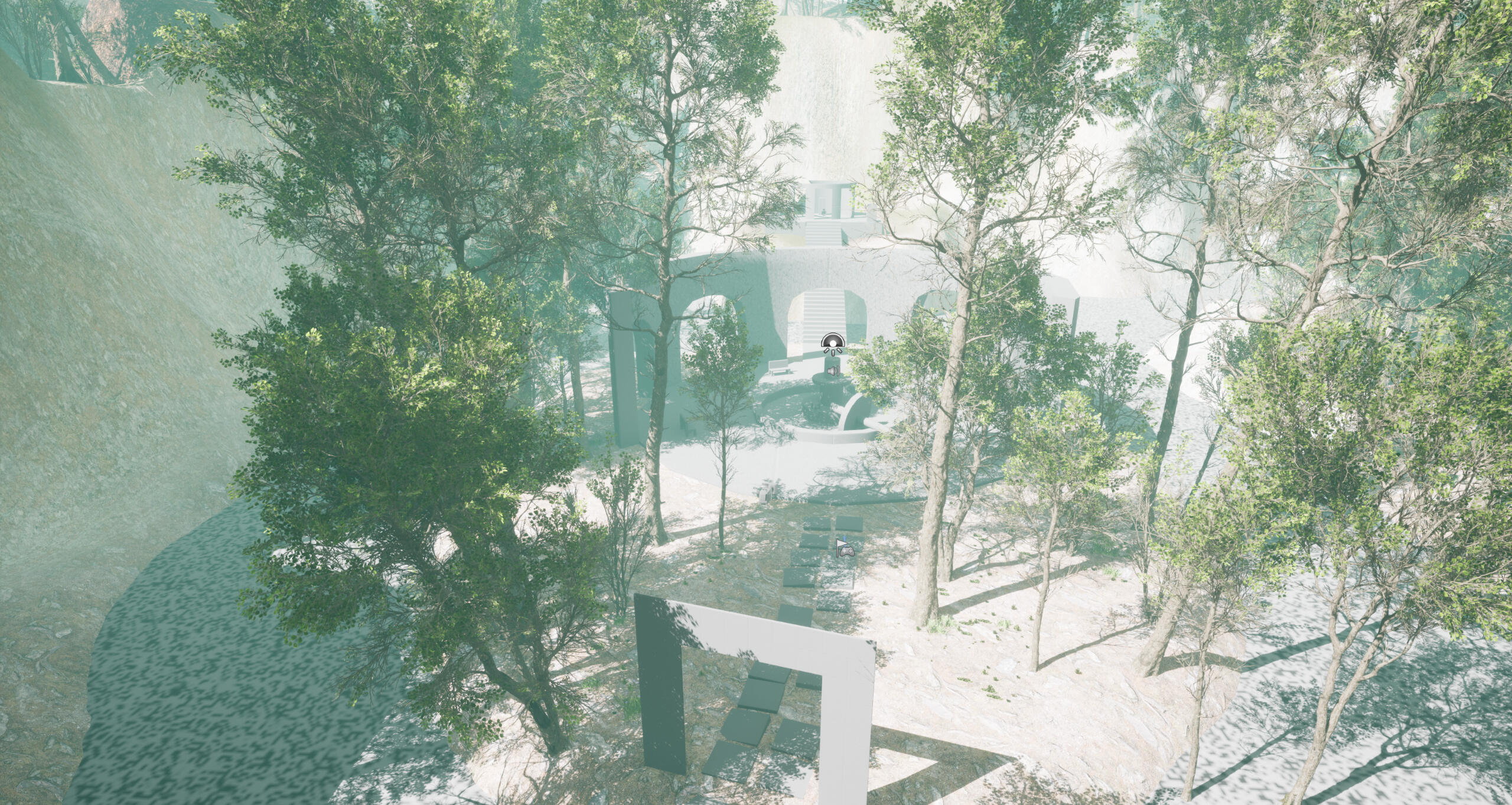
I continued refining the settings up until the end.
Before
After
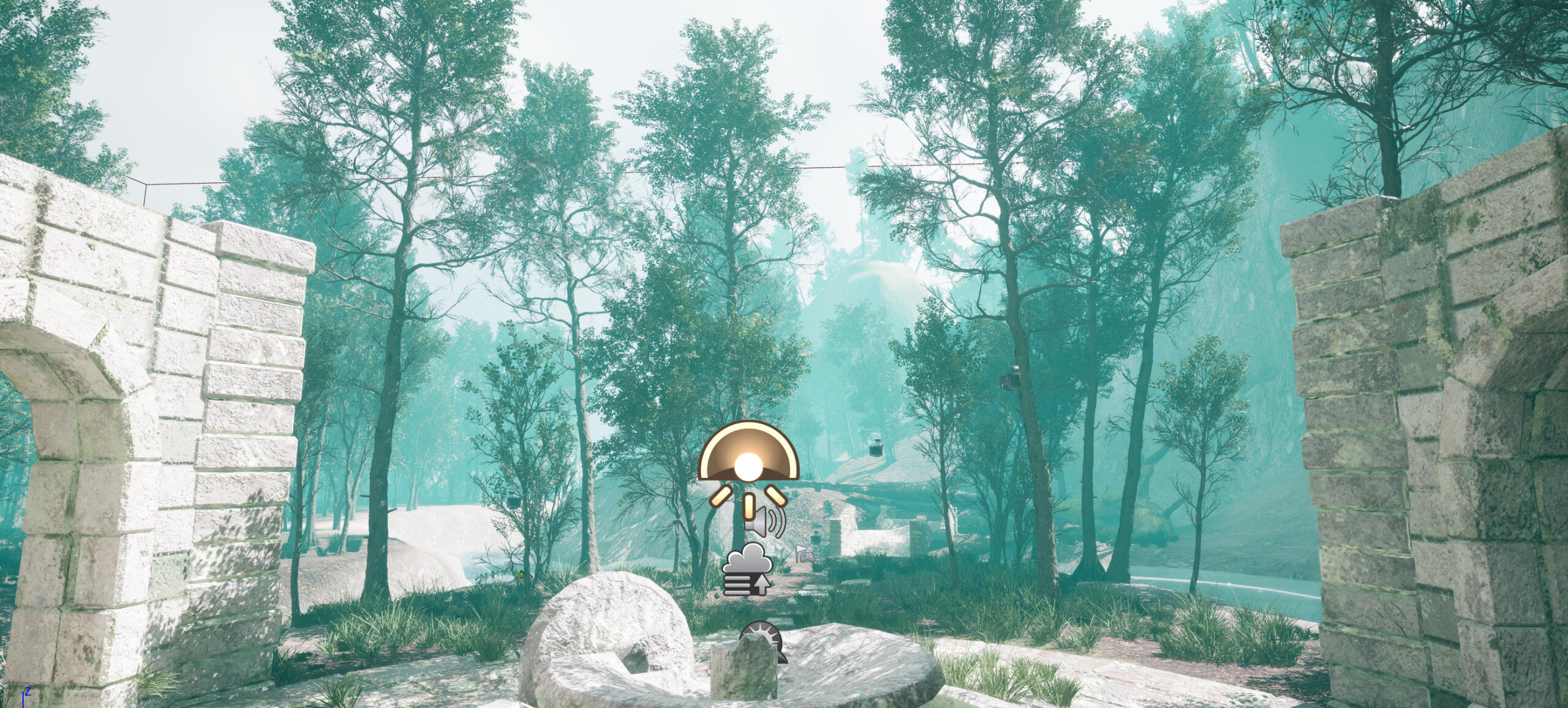
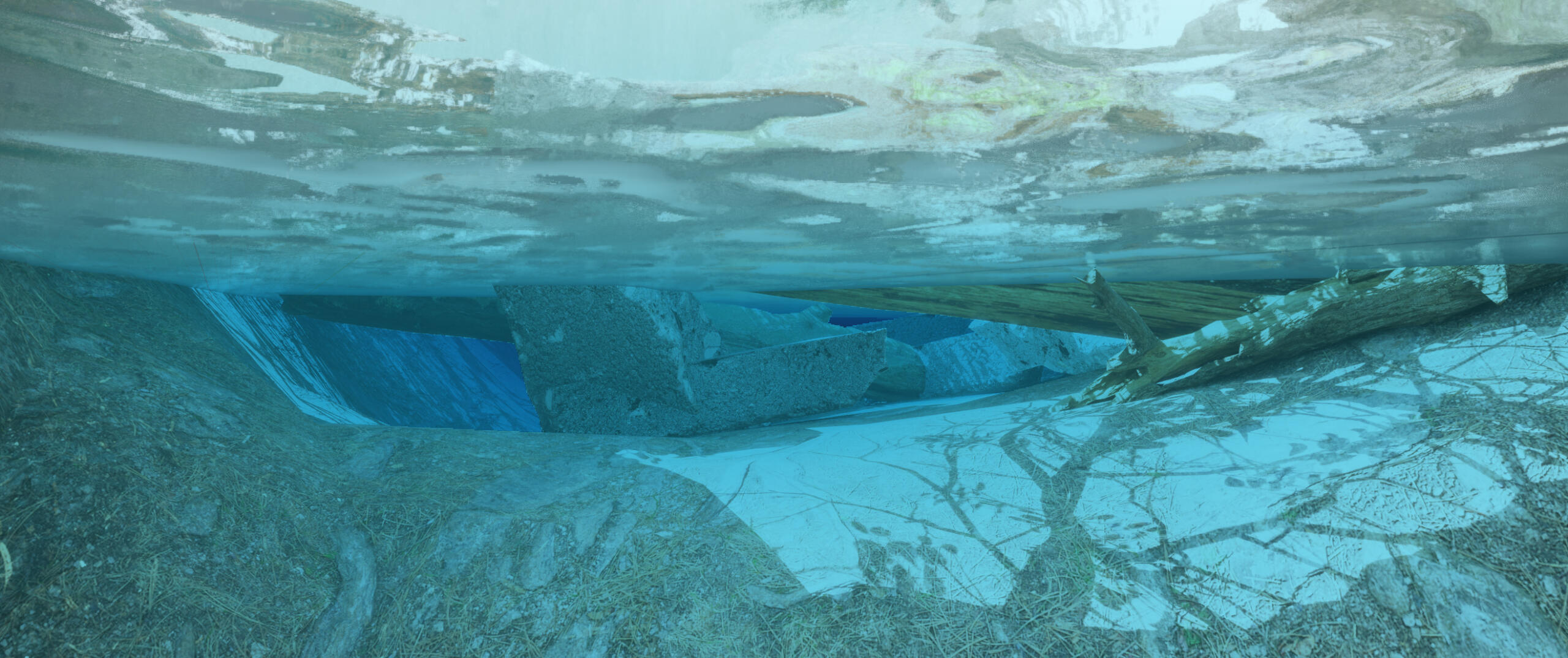
I added water using the Water System plugin. The default settings of the water material looked too blue and vibrant, so I edited it to look lighter and fit the mood of the environment better.
Before
After
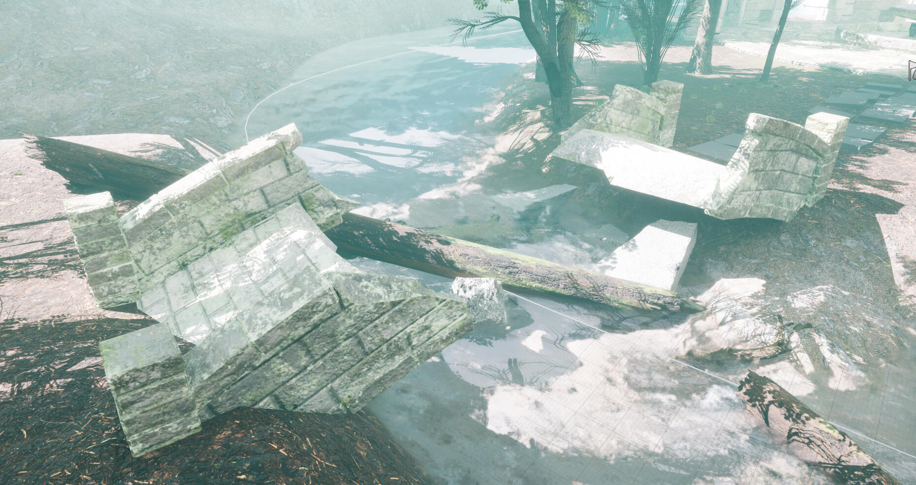
I used more Megascans content to populate the damaged sections with rubble. The bridge debris is properly decorated under the water as well.
I added two waterfalls from a free pack on the Unreal asset store. I wanted to make them myself, but after learning how they were made I realised I wouldn't have enough time to figure it out. The water simulation route also seemed daunting and time consuming to learn, so I opted for free assets.
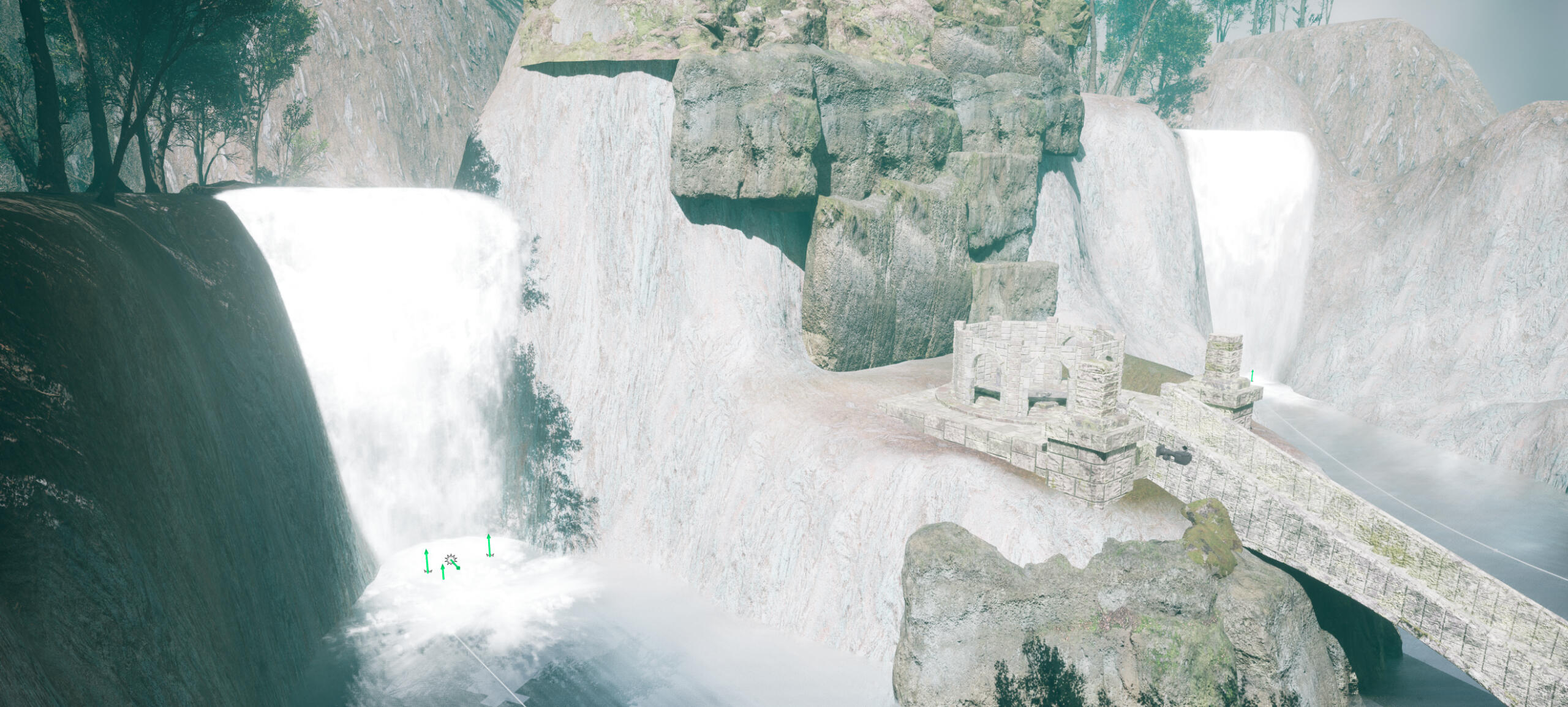
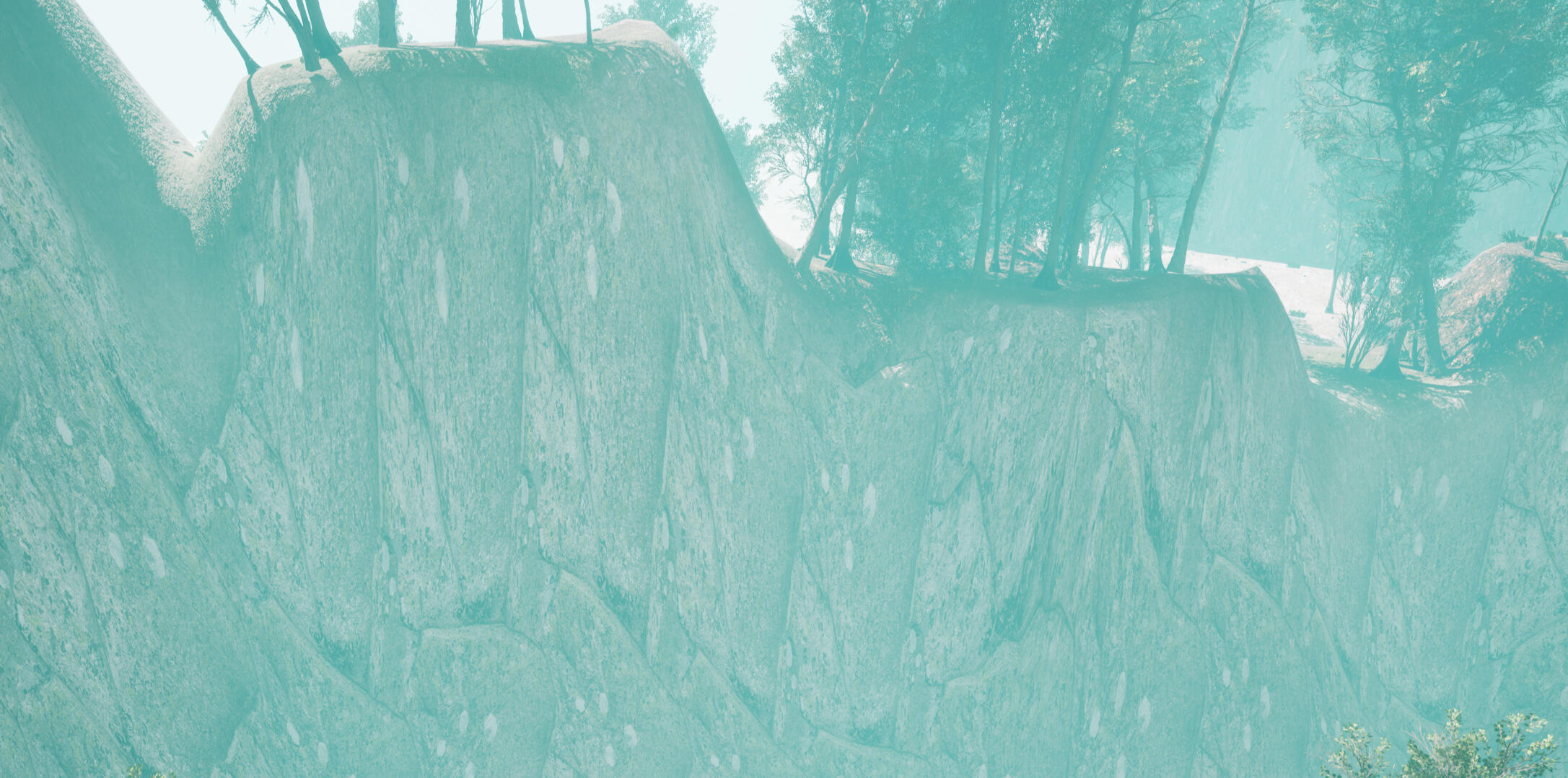
I didn't like the way the cliffs looked, as the low polygon count along the walls caused the textures to stretch. I tried to fix this with the retopology tool but found little success. In the end I decided to use more Megascans assets. I only populated the cliffs that would be visible during the flythrough.
This wasn't a very good solution in terms of optimisation, so I will need to find a better solution to this in the future.
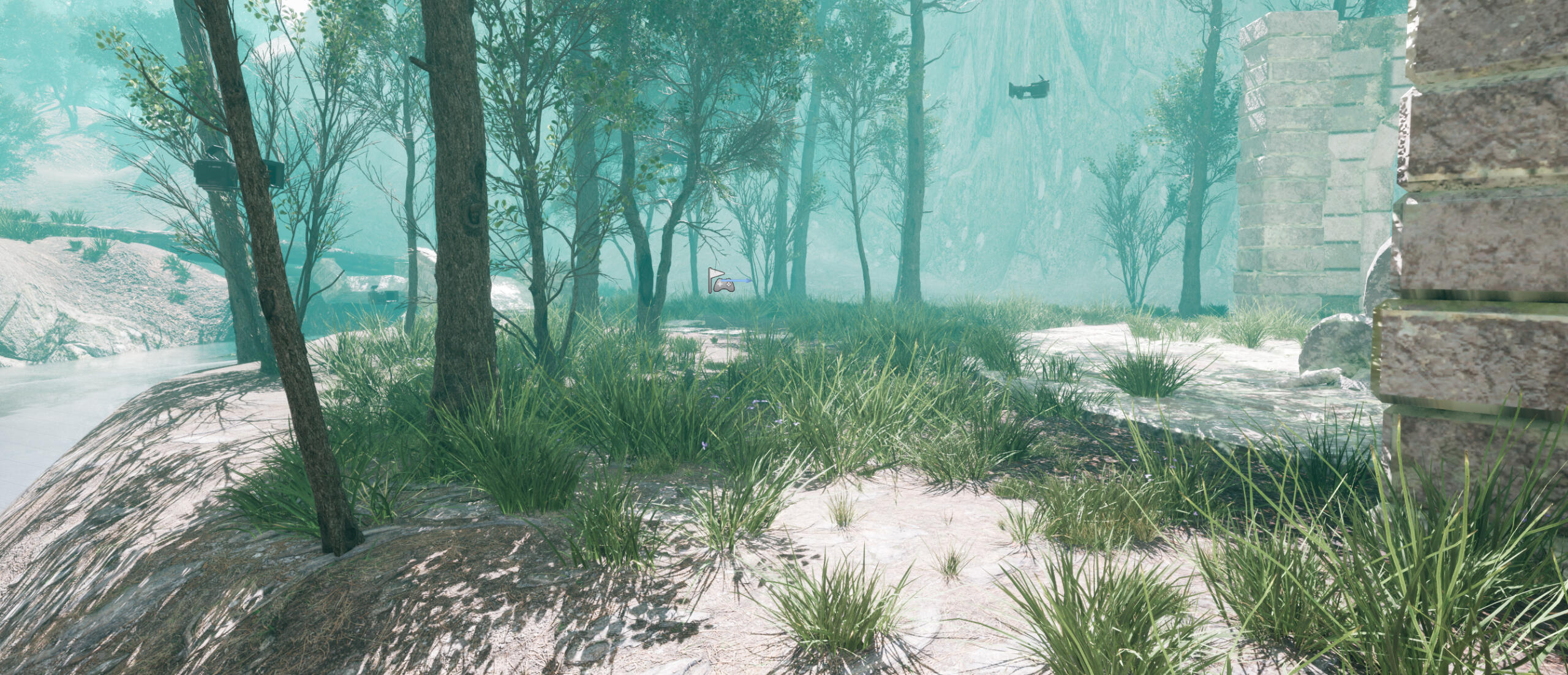
To finish I populated the ground with grass from another Megascans pack.
Reflection
I think overall I did well with this project. I spent this semester forcing myself to learn Maya as a Blender user, and gained a lot more experience in this area. I also learned a bit more about using Substance generators and using layers to add more detail to my textures. I think I developed a fairly good and smooth workflow from Maya -> Substance -> Unreal, and after figuring out my formula for texturing the process became a lot faster. I think my environment storytelling-wise is okay on communication. I did well to communicate the age and secluded location of my environment. I don't do very well to communicate what the people who built it might have been like. I used the sword and the grave to show that this was a burial ground for a hero or knight. I engraved text into the grave and briefly show it in my flythrough, but I think it can easily be missed. The sword itself is also intended to hold some kind of magic or holier power, which is shown in the glow of the gem. This is another part which I don't give enough screen time to and think could also be missed. Lastly, I have a lot of work to do in terms of optimisation in both my assets and within Unreal. The bricks in many places did not need to be geometry. The bridge in particular gets very little screen time, and the bottom of the bridge is not shown. The bricks here could have been left as normal map. I did make progress in using normals for bricks as I progressed, but I still have a lot to work on.
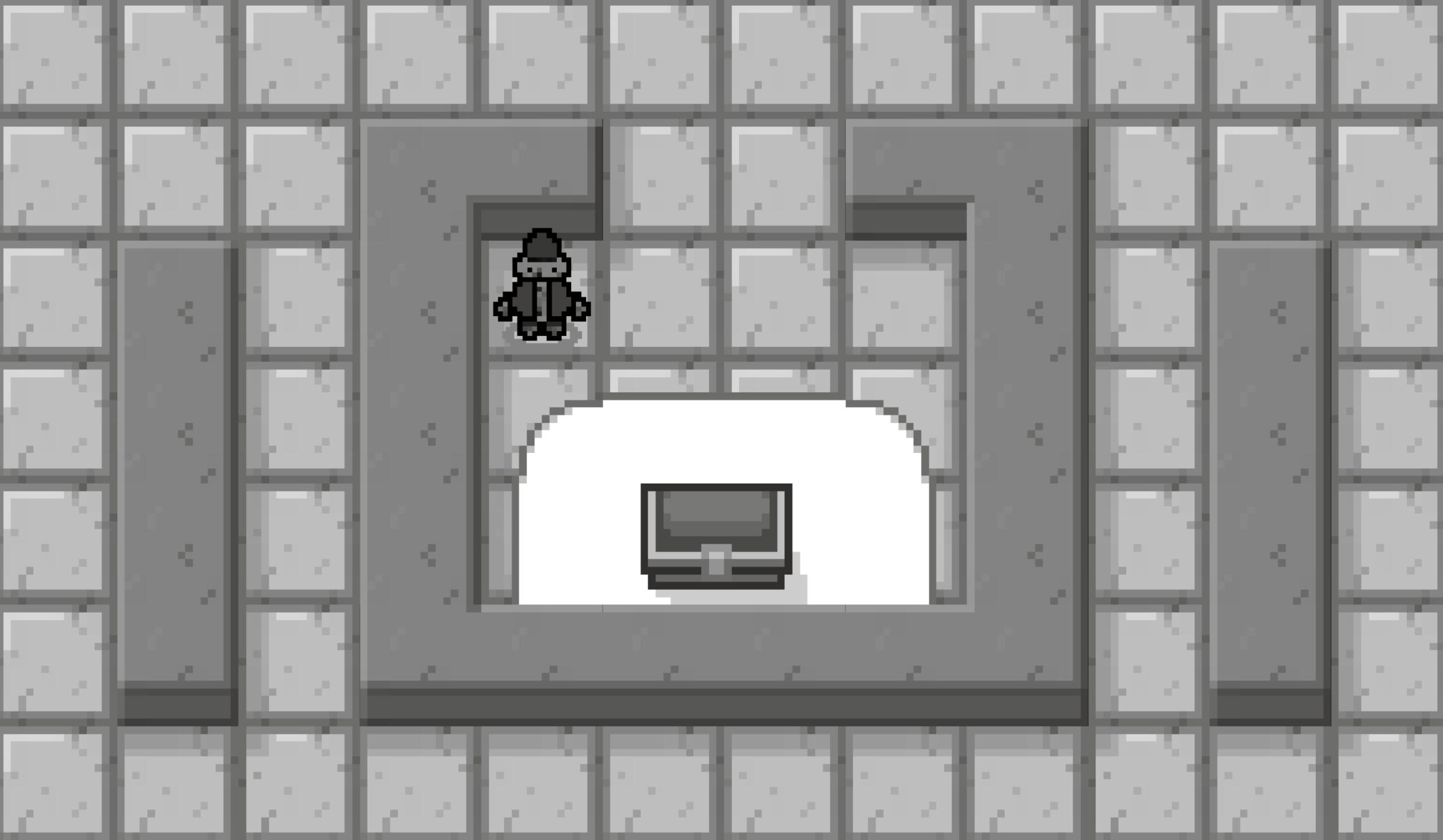
Don't Stop Smithing
Minigame
Planning
The idea for this deathmatch minigame was originally a standalone game inspired by the Lethal League games. I only ever played Lethal League Blaze whenever I had subscribed to Xbox Game Pass, but it's been one of my most enjoyable and memorable gaming experiences despite how brief my time was with the game.
My original pitch is as follows:
1v1/2v2 ball sport fighting game. Game takes place in an enclosed arena. The ball spawns floating in the middle, and the players spawn on opposite sides near the walls. After a 3 second countdown players are allowed to move and the ball is dropped (bouncing in the middle). Players have to hit the ball into their opponents and deflect the ball when it is launched at them. The ball will not damage the player who hits it last. When a player is hit, a point is scored and the next round starts. This time the ball will spawn by the player who lost the last round. The first to 3 points wins the match. If 2 minutes of in game time are elapsed, the currently active round will end. The player with the most points will be awarded a win. If the scores are tied, the game will enter a sudden death mode with an increased ball speed multiplier.As a group we had compiled multiple ideas and had narrowed our options down to two. We weren't able to decide on one so we opted to prototype both games and pursue the prototype which received better feedback. My idea was quite simple so the lead programmer in my group Bruno, made a start on my idea first before handing the project over to me.
PROTOTYPE
The project was handed over to me with basic movement and the ball physics. The ball deflects off the walls and speeds up when it hits the player.
Bruno used a premade 2D character controller to focus on the ball physics. The character controller was based on the old Unity input system, so the first thing I did was set up the new input system. The code is basically identical to my lecturer Masaya's tutorial code which I followed along with in class. This required me to rework the player movement.
The movement is based on analogue stick coordinates and jump height varies based on button hold duration. This was done to roughly mimic the feel of Lethal League Blaze's movement. This approach is still very raw and will be adjusted to include things like initial dash, dash, and turn around when animations are made. I may also consider adding momentum so that when the stick is released, the player will continue drifting when in the air. This might impact the snappiness of movement. A common point of feedback for prototype was that the movement felt very nice, so I may leave it as is.
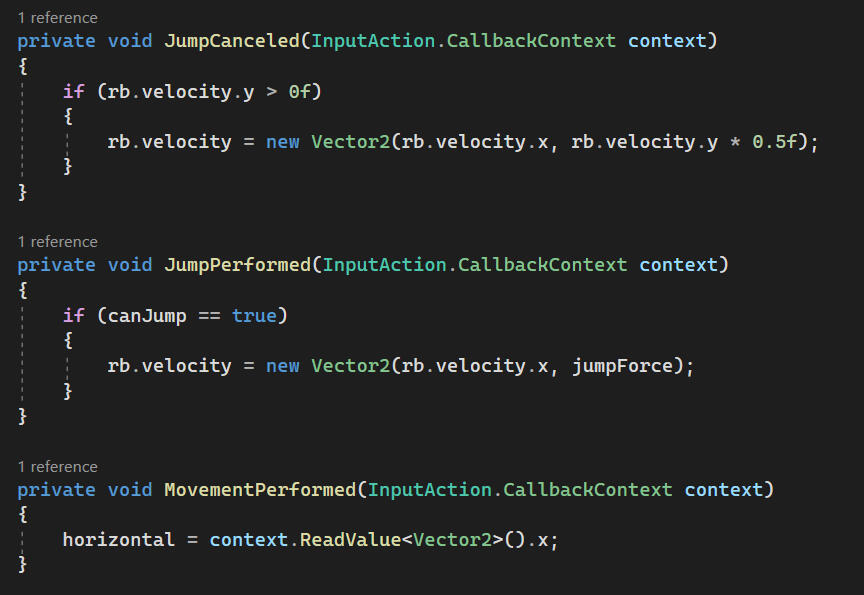
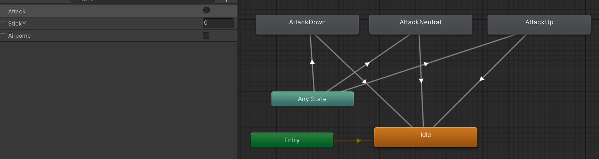
I then added a simple attack animation which enables and disables a hitbox.
I also made a small edit to the ball's code to ignore the player's hurtbox and then bounce when it enters a hitbox. This also activates a function to stop the game temporarily when a player hits the ball. The duration of hitstop scales with the speed of the ball when it is hit.
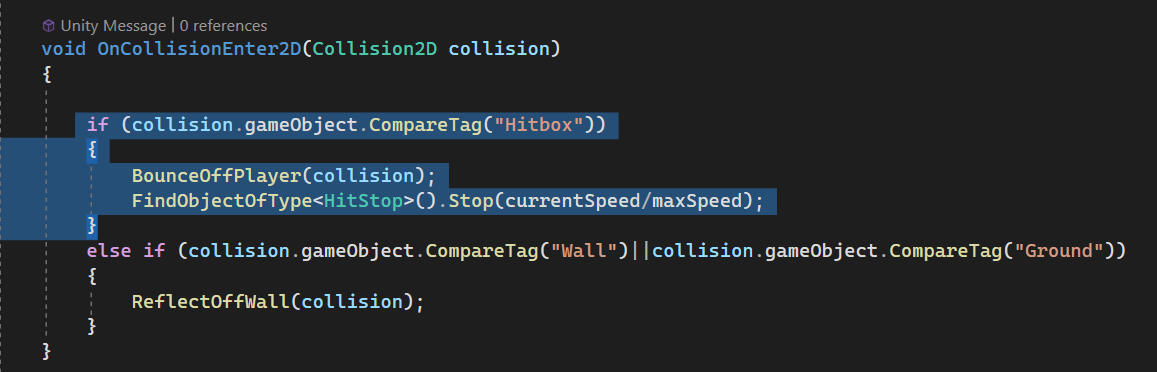
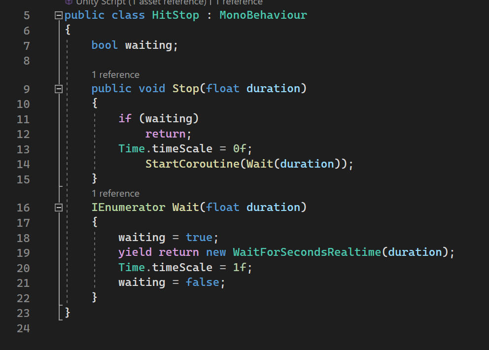
The code behind the hitstop is very simple, setting timeScale = 0f and returning if hitstop is already active.
LOW SPEED - SHORT HITSTOP
HIGH SPEED - LONG HITSTOP
Based on feedback on my group's two prototypes, the two will be merged with the other acting as the main game, whereas this one relegated to a minigame. The minigame idea was suggested to us from a lecturer as this prototype had simple mechanics and lacked potential as a standalone game. I initially disagreed on this point as I had a lot more planned for the mechanics which would make the game more complex and interesting. However, I also considered it from the perspective of someone who doesn't get as invested in the mechanics and feel of playing a game. Fighting games aren't a very popular genre among casual and even some serious gamers in my experience. I think that because these games tend to be 1v1, there's a lot more pressure to perform for some (no teammates to share blame when things go wrong), and skill gaps between players usually demand a large time investment to close up. This line of thinking seems to match my personal experience with playing fighting games with friends (skill gap too big for them to catch up without huge time commitment, solely responsible for losing, losing isn't fun). Because of this I agreed that the other prototype had more potential at being a fun game.
I do have some concerns about how the merge will go in terms of the game's flow and theme. Our two ideas are almost polar opposites and don't share much in common, so I'm curious as to what people will think about the two stages of gameplay. Games like the Mario Party series have a similar concept of balancing slow luck-based gameplay with minigames, but I think that the minigame we have is not as intuitive or easy to pick up as a minigame should be. Even with the mechanics simplified, I don't think many people will immediately recognise that they need to hit the ball into their opponent.
finishing mechanics
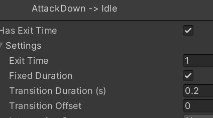
The next addition was directional attacks. These are additional animations which work based on stick coordinates. This allows the player to attack to the side when moving left and right or standing still, as well as up and down. The downward attack can only be performed when the player is in the air. The hitboxes were also made bigger as everyone really struggled to hit the ball.
Attacks were given a 0.2 second transition time to prevent spamming.
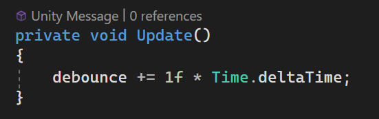
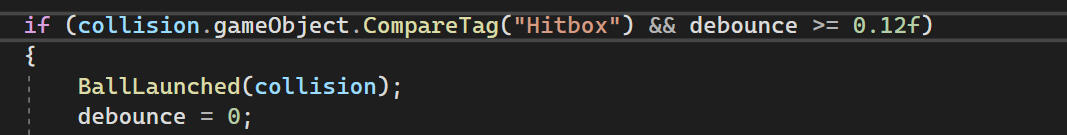
There was also a bit of a bug where the ball would be hit 2 or more times in a row if the ball bounced back into the hitbox while it was still active. I tried to make the hitbox disable itself when on collision, but was unsuccessful. As a workaround, I added a debounce timer to prevent the ball from being hit until the hitbox's active time has passed. This resolved the issue, but I'd like to come back to this and find a better solution, as this could prevent the opponent from hitting the ball back in some situations.
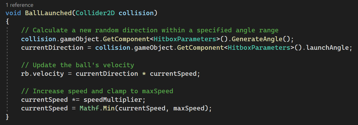
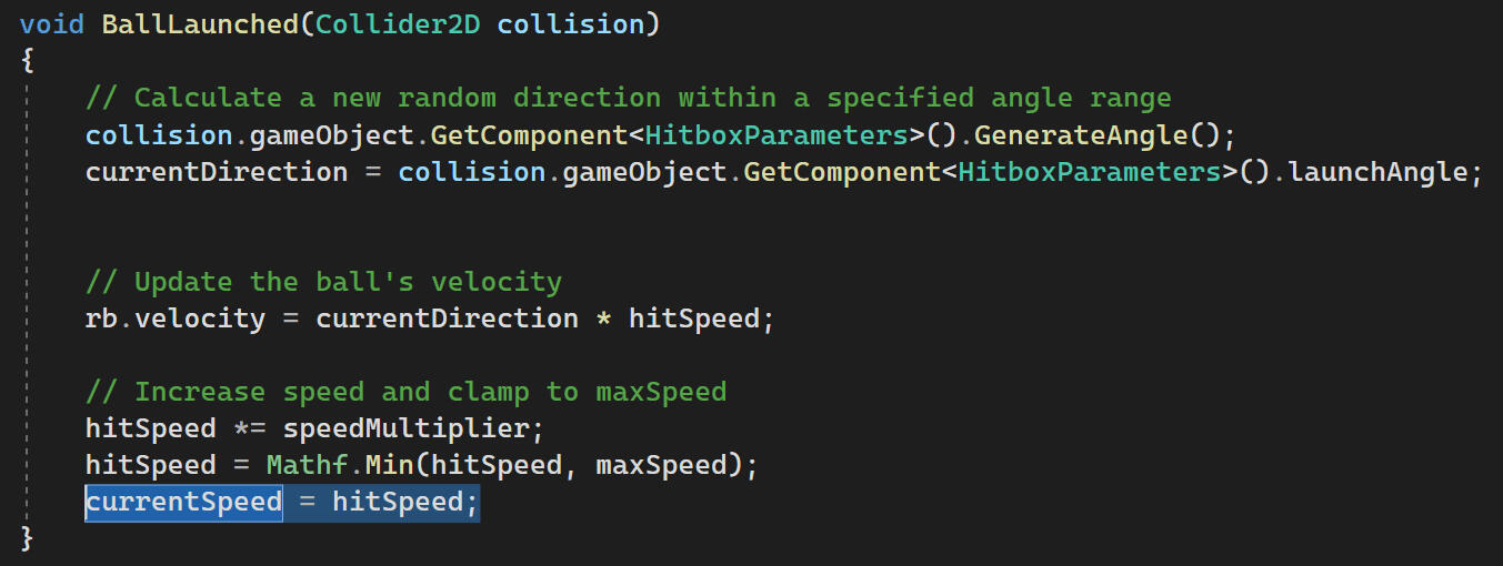
The code in the prototype treated the hitboxes in a similar way to walls which resulted in some buggy launch angles and speeds. I fixed this by giving the directional attacks their own specific launch angle ranges. The angles are the attacks' directions with a random offset between ±10o.
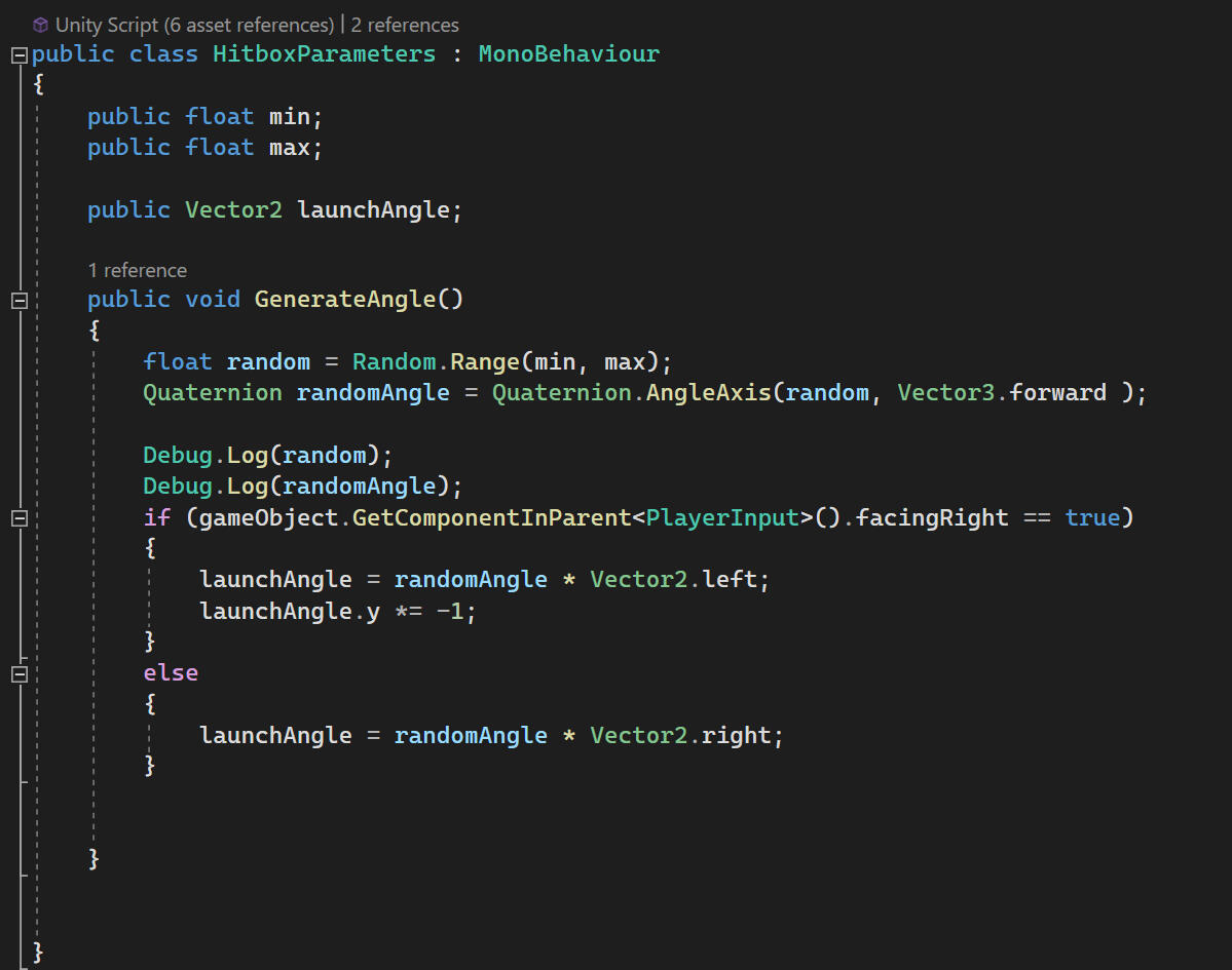
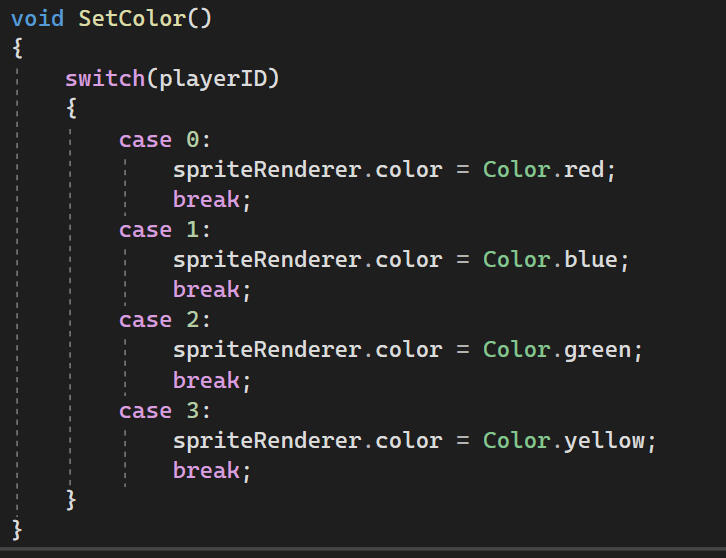
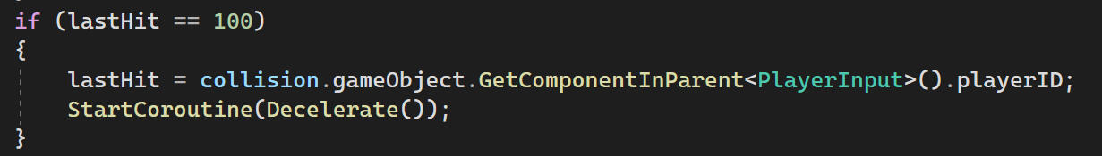
The ball will now ignore collisions with the player who hit the ball last based on the playerID. 100 is just the default value so players can't lose at the start of the game when no one has hit the ball.
The ball will now ignore collisions with the player who hit the ball last based on the playerID. 100 is just the default value so players can't lose at the start of the game when no one has hit the ball.

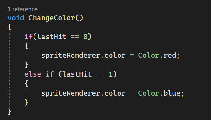
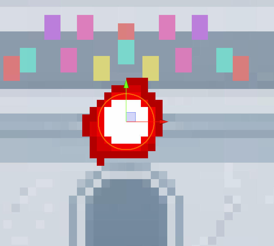
The ball also changes colour to indicate who has control over the ball.
The last thing to add was a way for the game to end. This knocks the player offscreen and reports the playerID of the loser to the game manager. The knockback is unpredictable but it's funny as a temporary death animation.
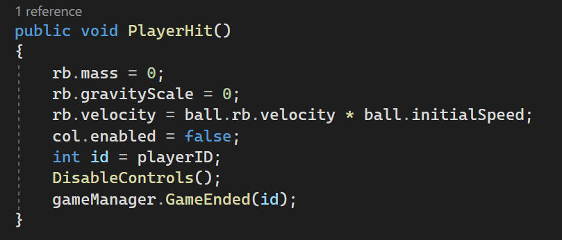
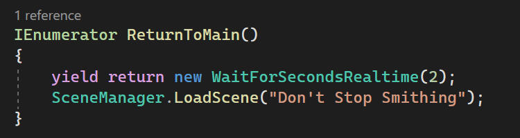
The loser is removed from the main game and the players are returned to the main scene. My code original code was completely reworked by Bruno, so this coroutine is all I have left.
VISUAL POLISH
I made some sketches as posing reference for Philip to make animations. Unfortunately these were not finished in time for the final game.
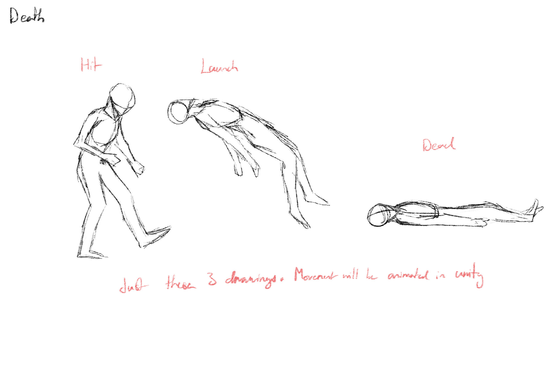
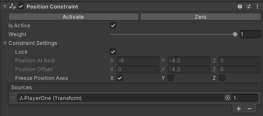
I added a shadow beneath the players to make their position in relation to the ground/background more clear. It stays directly beneath the player, which doesn't match the scene lighting but it's the easiest way to convey position.
The shadow stays with the player using a position constraint instead of making it a child of the player. This so the shadow stays on the ground.
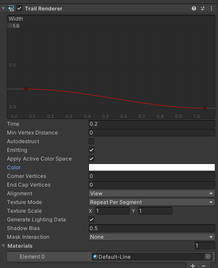
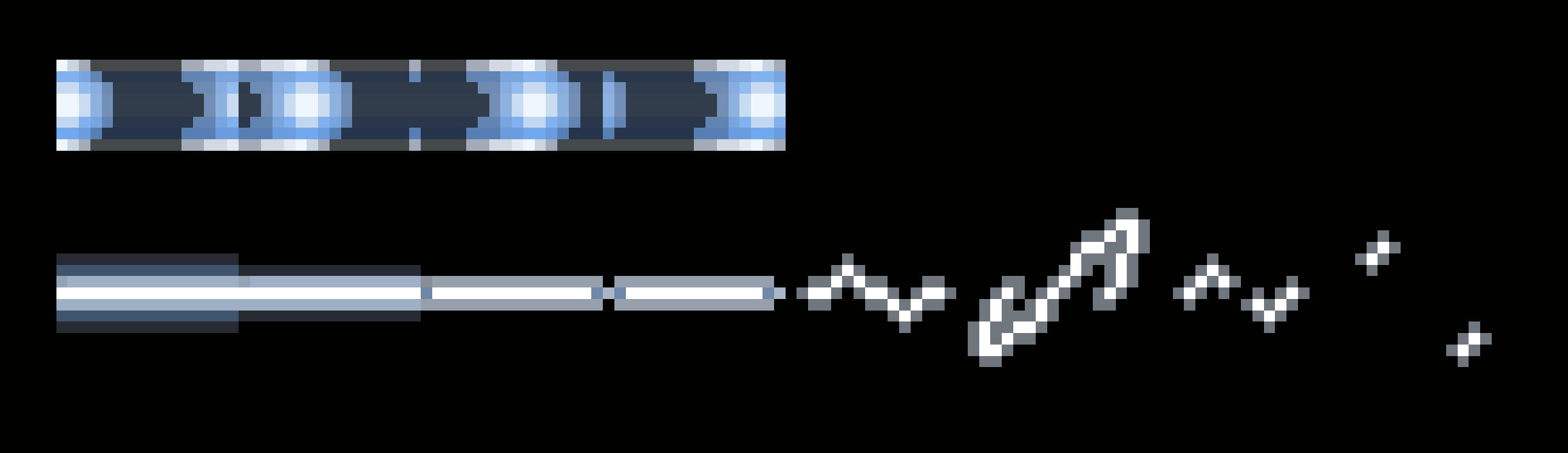
While I didn't see any complaints about this in playtesting feedback, I found that a lot of people were struggling to track the ball even when it was moving slowly, so I added a trail behind the ball.
This was made using Unity's built-in trail renderer.
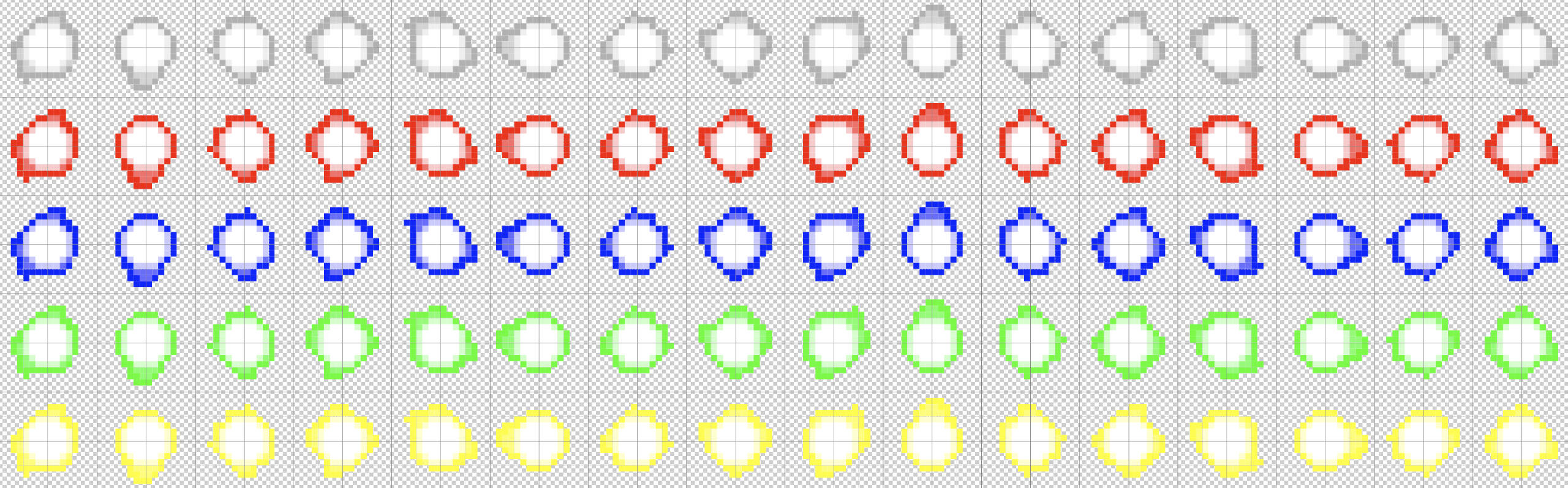
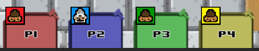
i made a change to my code to set colours for the players and the ball based on their original playerID. A common piece of feedback we received was that there was no way of knowing who had been sent to the minigame without testing controls first. Ideally we'd add a screen between the two scenes to show who's being sent through, but in the absence of time this is the best we're going to get.
Players 3 & 2
Early on in development, my group members suggested making the ball a fireball to match the theme of the game. I animated the ball in white first, before recolouring it using adjustments in Photoshop.
I intended to swap the sprites out in the animator, but this ended up going poorly. Transitions from neutral worked fine, but the transitions to other colours were delayed.
I got around this by using only the white ball and changing the colour tint on the sprite renderer, just like how I'm doing the players' colours.
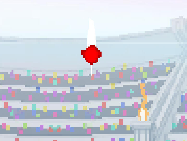
The problem with this though, is that the centre also changes from white. I wanted only the flames to change colour to match the original.
The solution I came up with was to delete the inside of each frame and place a white circle behind the flames. The colours aren't quite correct, but it's close enough.
The last bit of visual touch up was some effects on hit. Visual effects had been requested for polish in our playtesting feedback since the beginning.
There are two basic particle effects: hit sparks when the ball hits a collider, and speed lines which play during hitstop. They can both be seen in this clip.
The effects should now make it very clear that the ball has been hit. The speed lines were added during hitstop to convey the force behind the impact and prepare players for the ball to move very quickly. It should also make it clear that hitstop is in effect, as some people thought that game was lagging during early playtesting.
HITSTOP CORRECTION
My initial solution to hitstop was functional enough for the prototype, but it wasn't really what I wanted. In Lethal League Blaze, only the player who hits the ball gets frozen, allowing the opponent to move around in preparation for the ball's trajectory.
My initial solution to hitstop was functional enough for the prototype, but it wasn't really what I wanted. In Lethal League Blaze, only the player who hits the ball gets frozen, allowing the opponent to move around in preparation for the ball's trajectory.
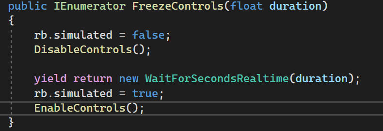
Instead I use rb.simulated = false to freeze the ball completely. This also stops any collision interactions, so a player can't lose by running into the ball while hitstop is in effect.
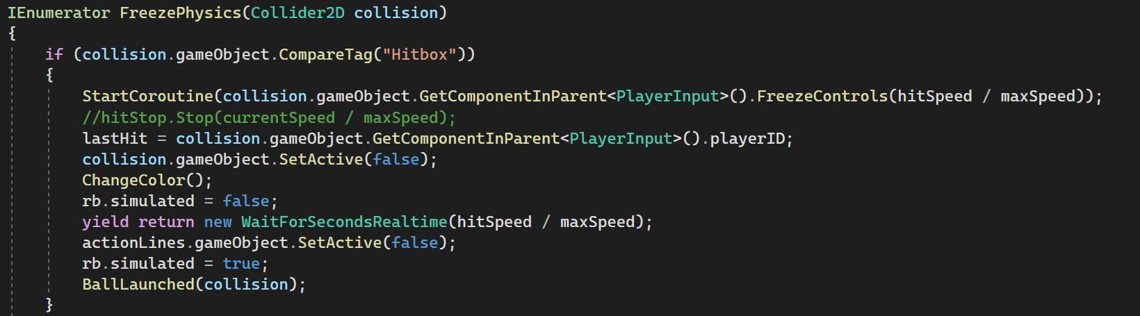
I also call FreezeControls() from the player script which works the same way. I also disable inputs from the player during hitstop so that they can't turn around or start a new attack in the middle of hitstop.
BALL PHYSICS CHANGES/REACTION TO GRAVITY
A piece of feedback complained that the physics were too unnatural/confusing, and that players were losing to the physics and not to each other. They requested that we make the ball arc lose speed to drag.
I started by just adding drag and gravity to the rigidbody which made the ball's path arc, but there were big speed changes when bouncing off walls.
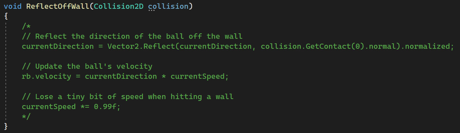
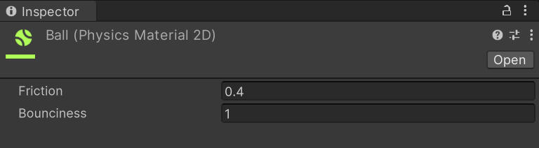
I replaced the original code for reflections with a bouncy physics material.
This solved the jerky movements and fixed an issue where the ball couldn't be hit down when it was on the ground. However, the ball was falling and losing speed too quickly, so most of the time the ball would just go to the bottom of the map. The ball also only bounced perpendicular to the walls regardless of the launch angle, which completely negates the effect of randomised launch angles.
I tackled the gravity problem first since I had a better idea of what to do in order to fix it. I wanted to make the ball ignore gravity once it reaches a certain speed, and then have gravity scale up as it slows down.
First I made a coroutine to calculate speed by change in position.
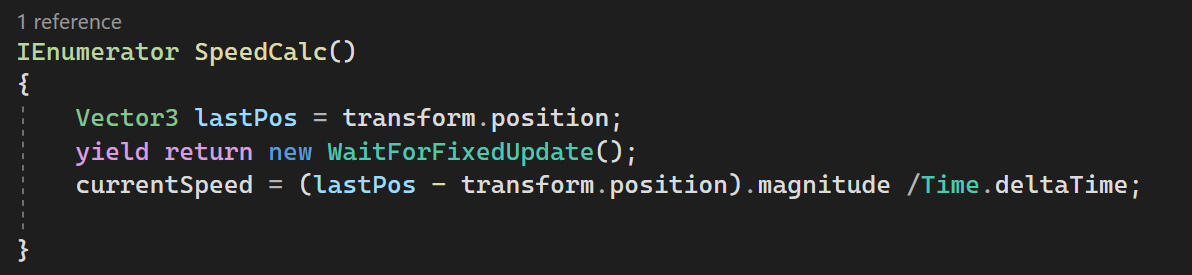
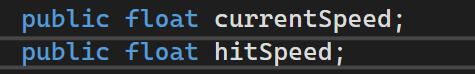
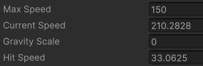
The original variable for currentSpeed was renamed to hitSpeed, as it only determines the speed of the ball after you hit it. The new currentSpeed variable actually controls the current speed of the ball.
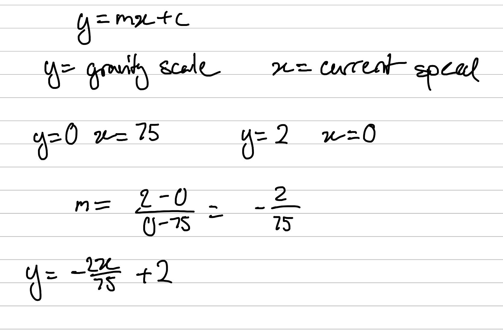
Then I made a linear function with the y-intercept and x-intercept at the max gravity scale and ignore threshold speed.
These are placed in update, and gravity comes into effect as soon as someone hits the ball.
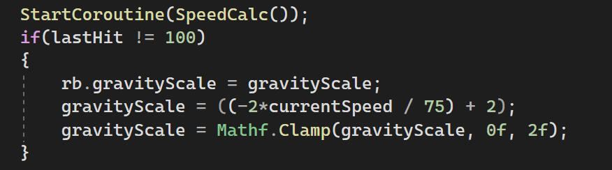
I tweaked the drag on the rigidbody so the ball loses speed a bit slower, and with the new gravity scaling the ball stays in the air when it's moving fast.
To get the ball to reflect properly, I brought back the code for reflections, which should now work with the new currentSpeed variable.
Unfortunately, this completely broke the collisions. For some reason, the currentSpeed fluctuates a lot when it bounces off of a wall.
Something was clearly going wrong with calculating the speed, so I made I reworked this variable entirely.
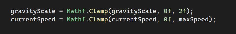
currentSpeed gets set to the hitSpeed each time a player hits the ball.
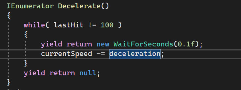
currentSpeed is gradually decreased every tenth of a second, so the ball's speed will decrease each time it hits a wall. I tried to decelerate the ball in Update(), but this caused the ball speed to immediately drop to 0 for some reason. I still don't know why this happened.
The speed and gravity scale are clamped in Update().
The while loop is called when a player hits the ball for the first time.
And after all of that, the ball finally behaves the way I wanted it to.
REWORKING THE RULES
We received a pretty scathing piece of feedback from some 3rd years.
"I'm unsure if the deathmatch adds to the gameplay at all, because even if a player is losing by a significant margin, they can stay in the game just by being good at the minigame."
This makes sense given that the decision to combine two different prototypes was done the moment we were given the option to. My inital concerns around combining the two games have come back again 10 weeks into development. I don't want to scrap that work now, so I'm going to change the game's rules a bit to make the minigame more meaningful.
I had two main considerations in mind:1. Give the players lives so they don't get kicked immediately for losing in the first round.
2. Give the lowest and second lowest scoring players different penalties for losing.
I chose to take the second route. The lowest scoring player will be eliminated if they lose, and the second player will lose their ability to dash in the next round. I felt it was a bit odd to punish the second lowest and lowest scorers equally, but I didn't want the second lowest scorer to have no punishment for losing the minigame. This is why I decided to nerf them in the next round. This also means players can have a second chance at life without drawing out the game for too long with everyone having multiple lives. I feel that this was the best way to go about re-balancing the game.
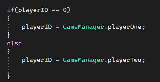
Bruno's script sets the playerID for the two lowest scorers. I swapped them around so player 1 (left spawn) gets the second lowest and player 2 gets the lowest (right spawn).
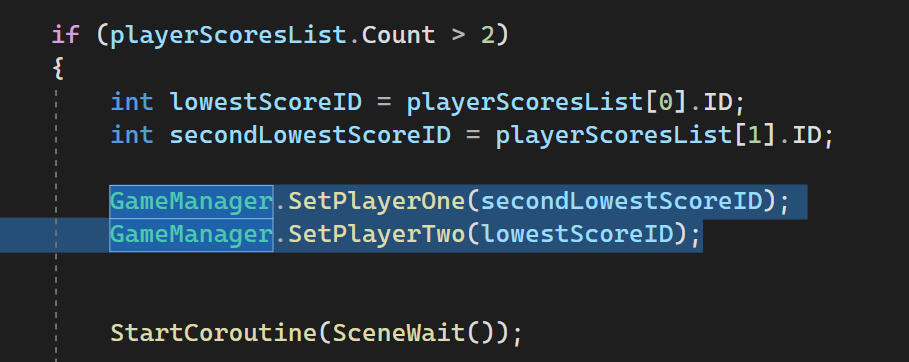
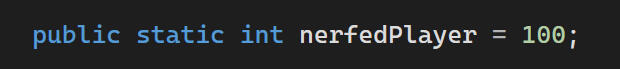
I made an int nerfedPlayer which takes the playerID of the second lowest scorer if they lose the minigame. If the lowest scorer loses, this value gets reset to the default value of 100.
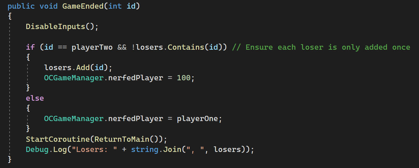
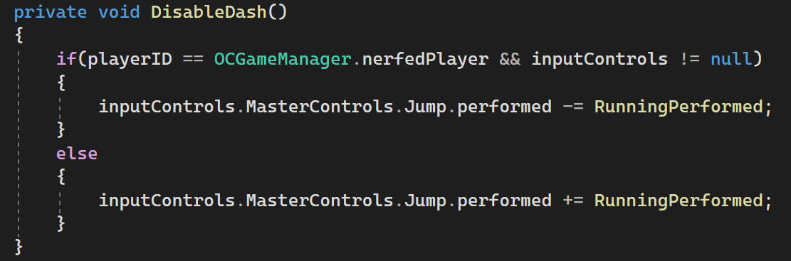
The player controllers will then perform a check on startup to disable their dash input if their ID matches with nerfedPlayer.
Environment Art
Main Game
The lead artist in my group Philip, is focusing on the character sprites and animation. Philip provided some rough mock-ups of what the game could look like.
Sketches from lead artist
Placeholder Assets
I started by figuring out how to translate these to pixel art, and what kind of texture/pattern would look best in the game's style. I generally made colours lighter as the character sprites we have are mostly darker colours, so the value contrast should help them to stand out. A piece of feedback we received on placeholder assets was that it was very difficult to see the characters on a checked floor, so I made the tiled floor a single colour.
I didn't like how the stone and dirt turned out here. The tiles were the simplest and easiest to look at by far. I presented these to my group members and they shared the same opinion. I also prefer the tiles as they make the movement and positions more obvious to the player.
value test
I tested the tiles in greyscale to check the clarity of the player characters. The pale stone tiles have the best contrast with the player and have very clear tiling making it easy to see where you are positioned on the map. This led me to continue with this style of assets.
tileset
I remade the tiles with a thinner gap as I felt the lines were a bit too thick. The highlights were a bit too visually loud for me, so I made them smaller rim highlights. I also made a set of brick wall to match the flooring stylistically, but also stand out enough to be obvious where the play area ends. I think I've hit a good balance of visual cohesiveness and visual clarity.
I made a wooden barrier for the walls within the play area. To help them stand out from the flooring, I made the shaded side face the camera for some extra visual contrast.
Bruno requested some kind of gate opening to keep the players in the starting area before the timer started. We had just discovered that tiles could be animated, but I didn't really understand why we'd need this when we could just freeze the players' controls, but I did it anyway as an experiment. I took the 'gate' idea a bit further to a magic barrier, mostly just as a challenge for myself.
The last placeholder assets to replace were the item and crafting stations. I didn't like having brown on brown for the item stations, so I added a cream coloured mat over each station to help the materials stand out. The area around it was also changed to more clearly look like carpet.
PLACEHOLDER
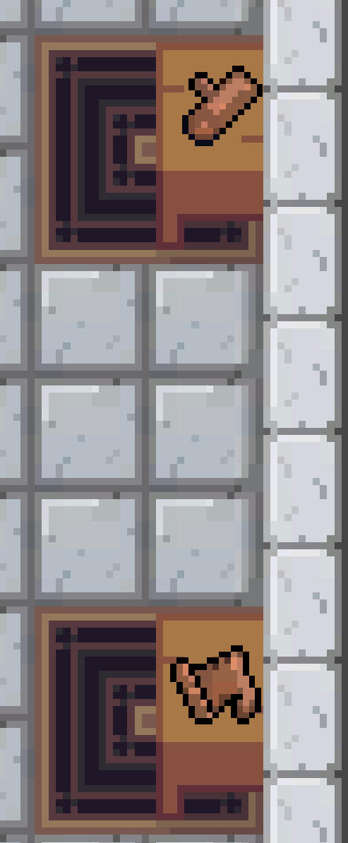
NEW assets
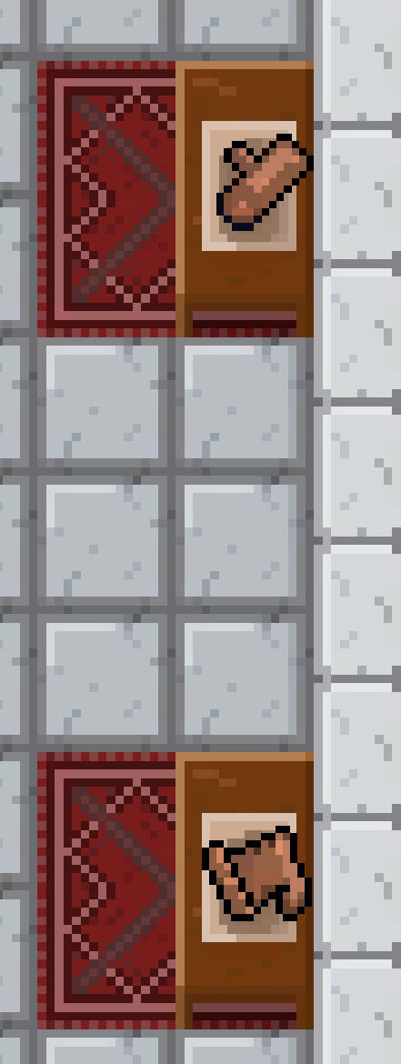
In the final tileset, the colours were changed slightly to be darker and less saturated. I felt they looked a bit out of place at first.
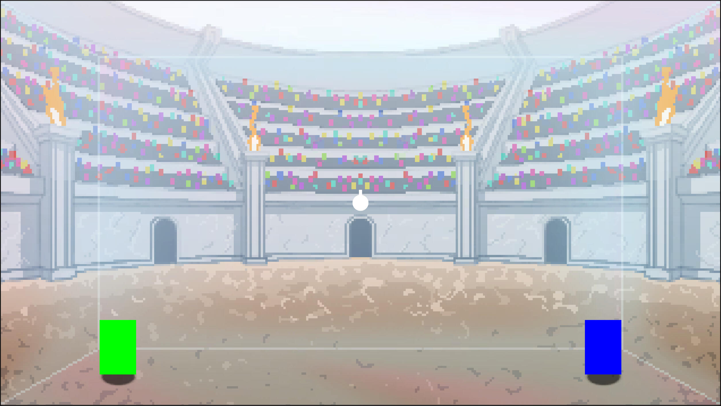
MINIGAME
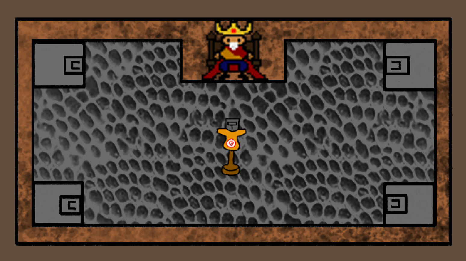
As the minigame is intended to be played for elimination, the idea for the theming around it become a deathmatch. As a group we thought it would be cool for the deathmatch to take place in a big arena.
I had not worked with pixel art for over 5 years before this project, and have honestly just never been very good at drawing backgrounds, so this was a bit daunting for me.
moodboard
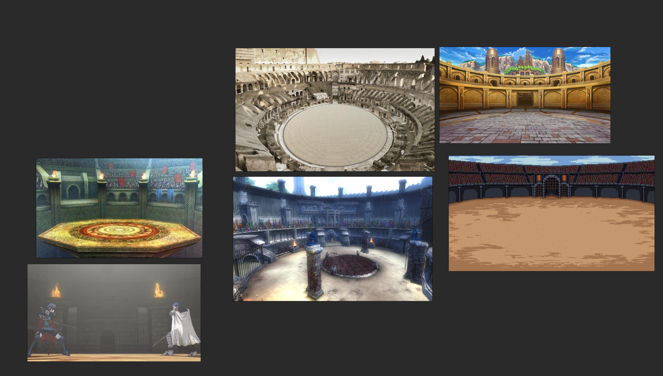
I wasn't really sure about the scale of the arena as some of the size varies a lot between each of these reference images. More of them tend to be on the larger side though, so I went big with mine as well. The design details were mostly inspired by the two images on the left, but I took some inspiration for the lighting and colours from the others.
I started off by drawing out a perspective grid before sketching out the background's layout by hand. I was intending to use this as a guide for going over with pixel where I would add more details.
iNITIAL sKETCH
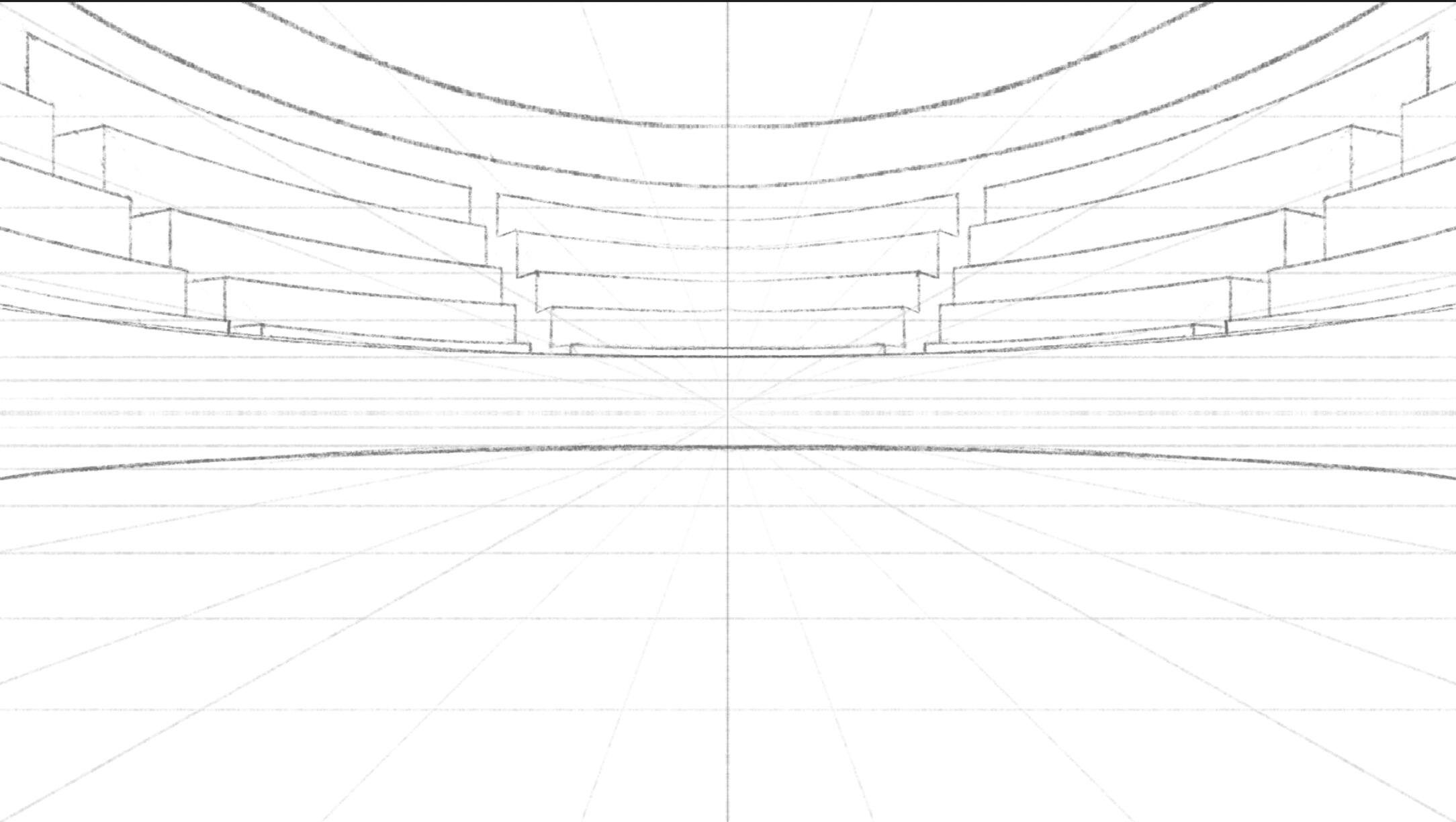
perspective correction
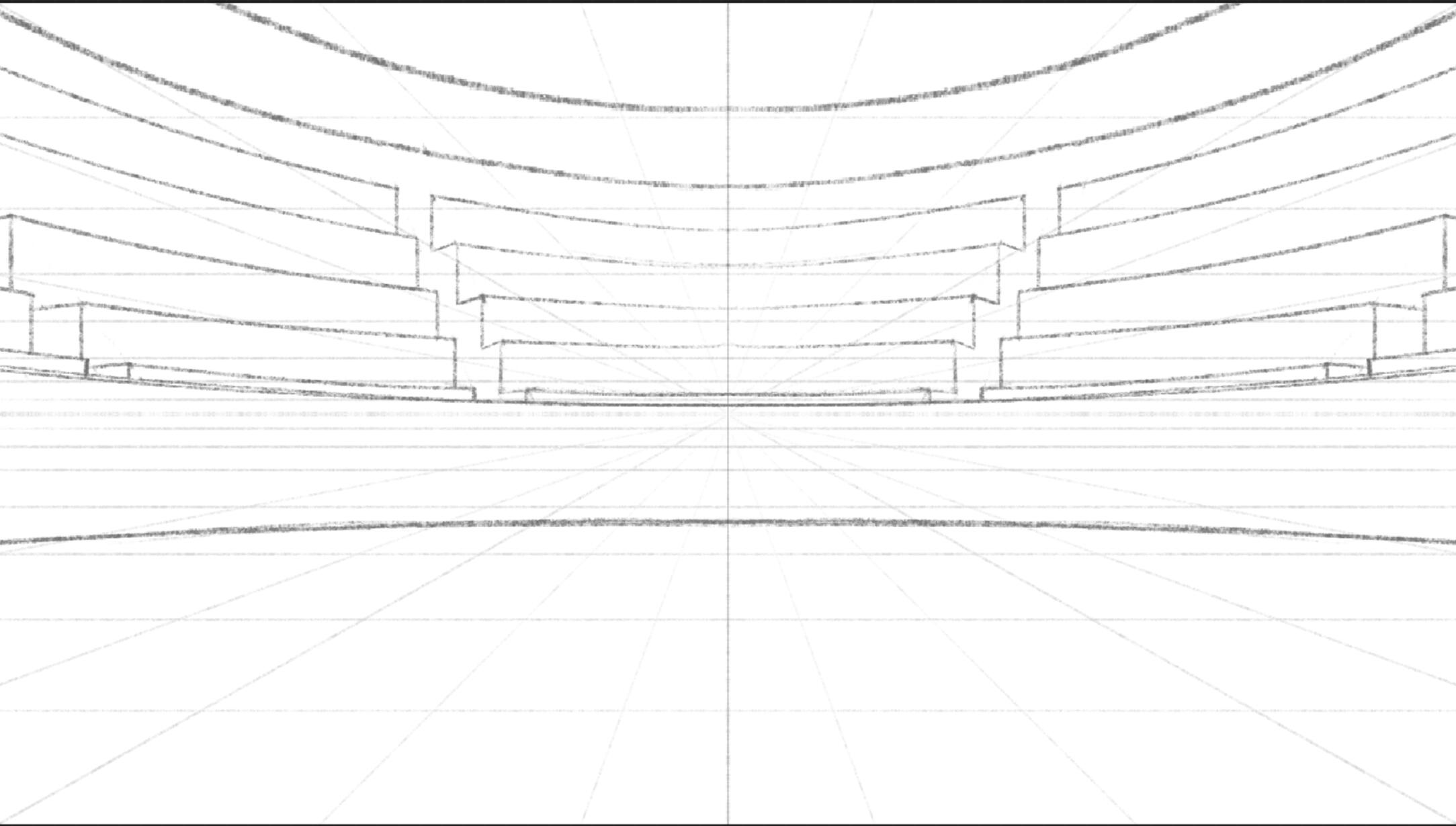
Finished guide
At first I tried to make a very strikingly lit scene, but despite many iterations and adjustments, I didn't end up making something I liked the look of.
Eventually I realised that this dramatically lit scene does not match with the game's silliness at all. I ended up scrapping this work and going for a much brighter and evenly lit scene.
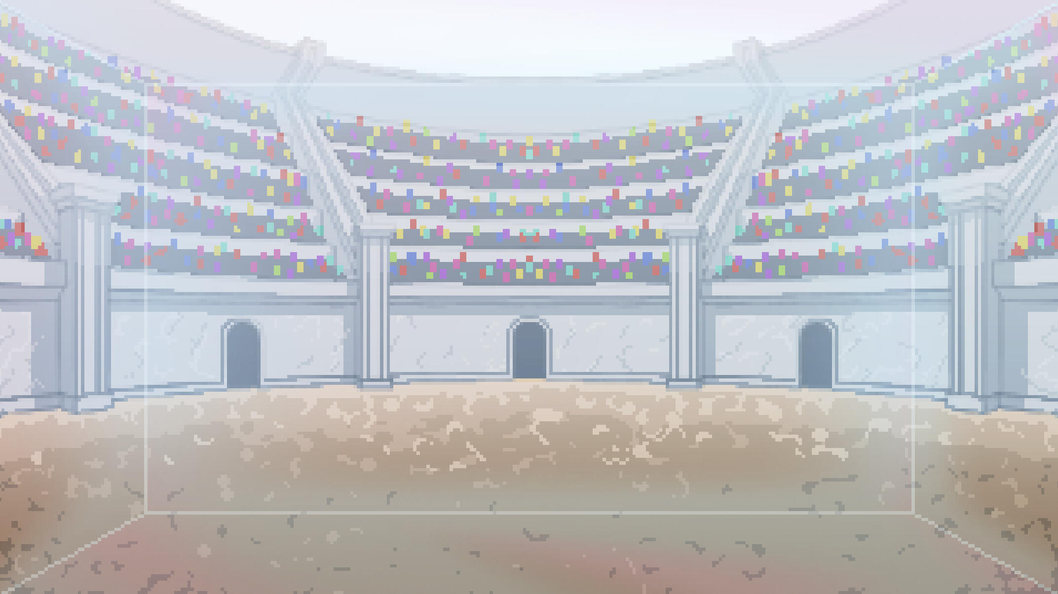
The crowd is animated on a simple 2-frame loop. The colours are separated into even groups so that one half of the crowd moves up while the other moves down.
Lastly, the fire on the pillars are animated on a 4-frame loop. These help to make the background feel less static.
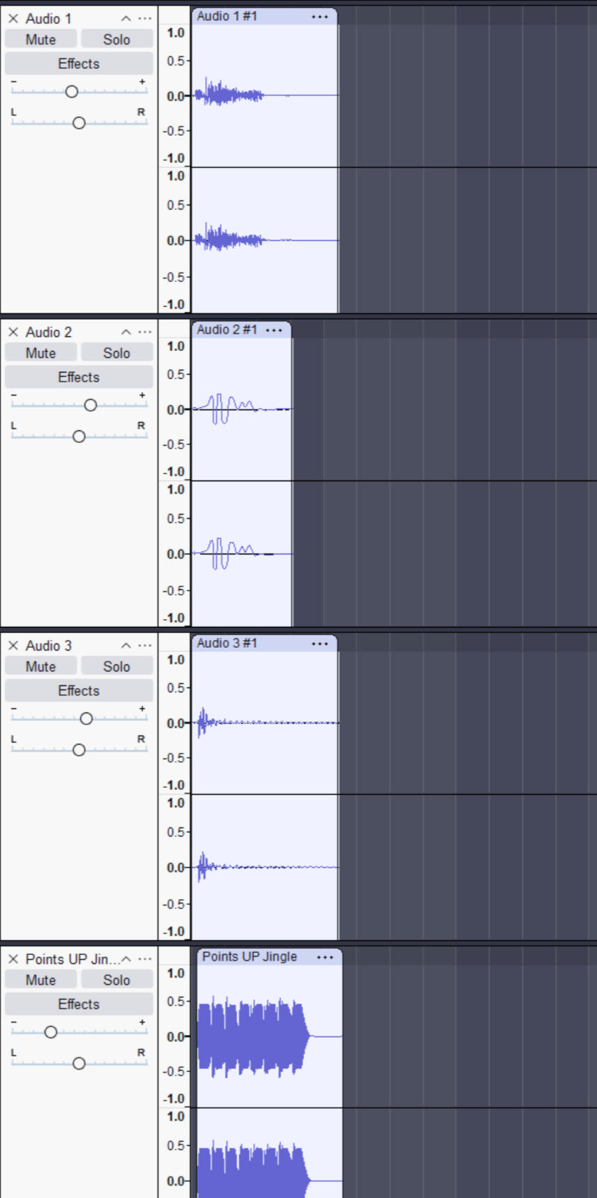
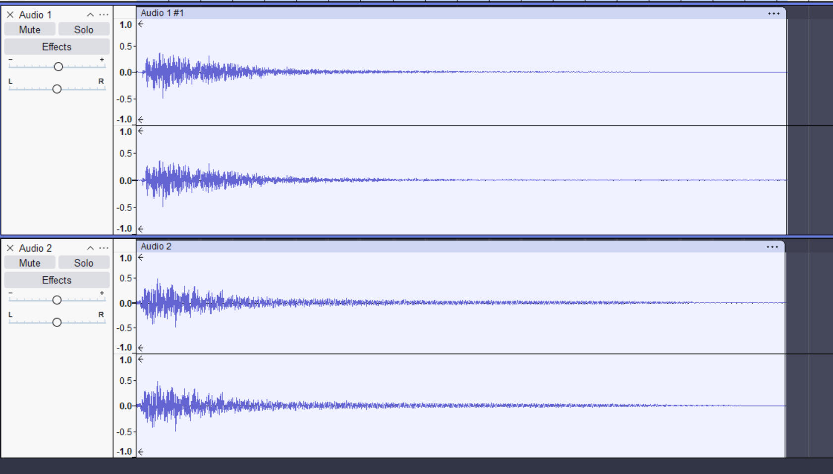
Sound Effects
I wanted to try making some of the sound effects myself, but this somehow ended with me making almost all of them. To make the sound effects I recorded myself using various objects around my house to get some noises. I would then go through my recording and take the snippets I liked and use those for the sound effects. Processing the recordings into sound effects was time consuming but I had a repeatable process which helped speed things up and ensure the sound effects all had a consistent quality and sound.
Recording
I only have a few hours of quiet time each day to record at home, so I went into each recording session with a rough plan of what kind of sound I wanted to make and what I'd need to record to make those sounds.
Some smaller sound effects for the menus were made using LMMS. I used the included Triple Oscillator plugin and made some tweaks to the settings to get the sound I wanted.
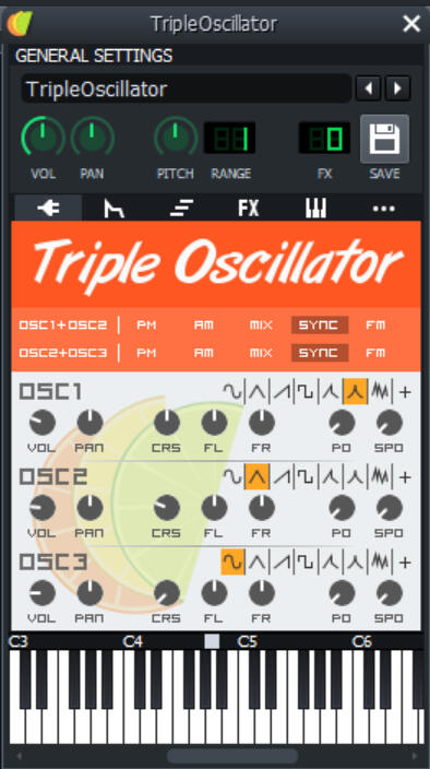
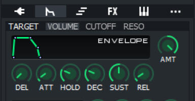
There were some pops and clicking at the beginning and end of each note, so I edited the envelope to cut the harshness out without affecting the responsiveness too much.
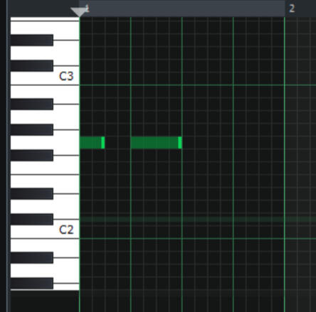
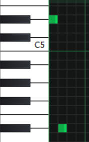
Most of the synth sound effects were only 2 or 3 notes. There are a few exceptions such as a rising scale and falling scale for earning or losing points, but these were replaced with other recorded sound effects.
listen through recording
I recorded multiple attempts at making a sound in one go, where I would then parse through each sound and take the ones I thought sounded closest to what I wanted.
Layering
Most sounds won't sound right on their own, so I layered the sounds with other recordings to build up a more detailed and full sounding effect.
EDITING
This step varied between each sound effect it would be impossible to break down every single sound effect as the individual clips were edited very differently, so I'll go over the most common edits I made.
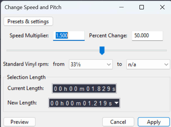
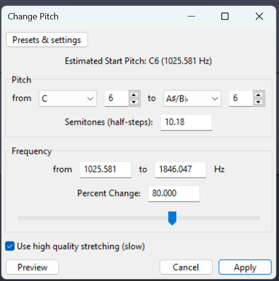
SPEED & PITCH
A lot of sound effects were too short or too long when recorded, so they were stretched using the 'Change Speed & Pitch' effect. This changes the speed duration of the clip with a cleaner pitch change. In cases where the speed of the clip was already correct, the 'Change Pitch' effect was used.
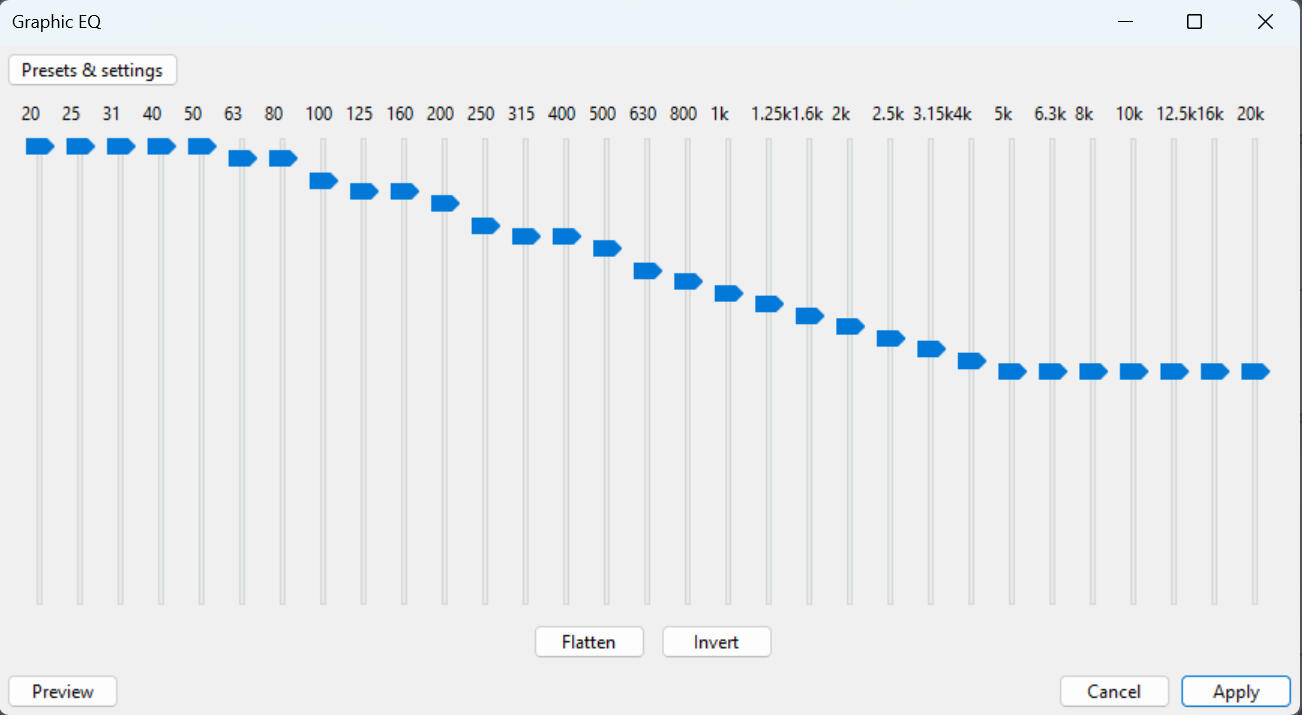
EQUALISER
Because the items I used were all quite small, I often had to make bass frequencies louder to get a nicer sound effect and better sense of size/force on hits and impacts.
REVERB
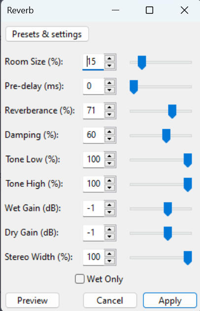
The sounds from my microphone often sounded 'dead' and empty as if there were no walls or space. I added some reverb to a lot of the sound effects to make them sound a bit closer to what I heard in real life and sound more like they're coming from the game's world.
FINAL PROCESSING
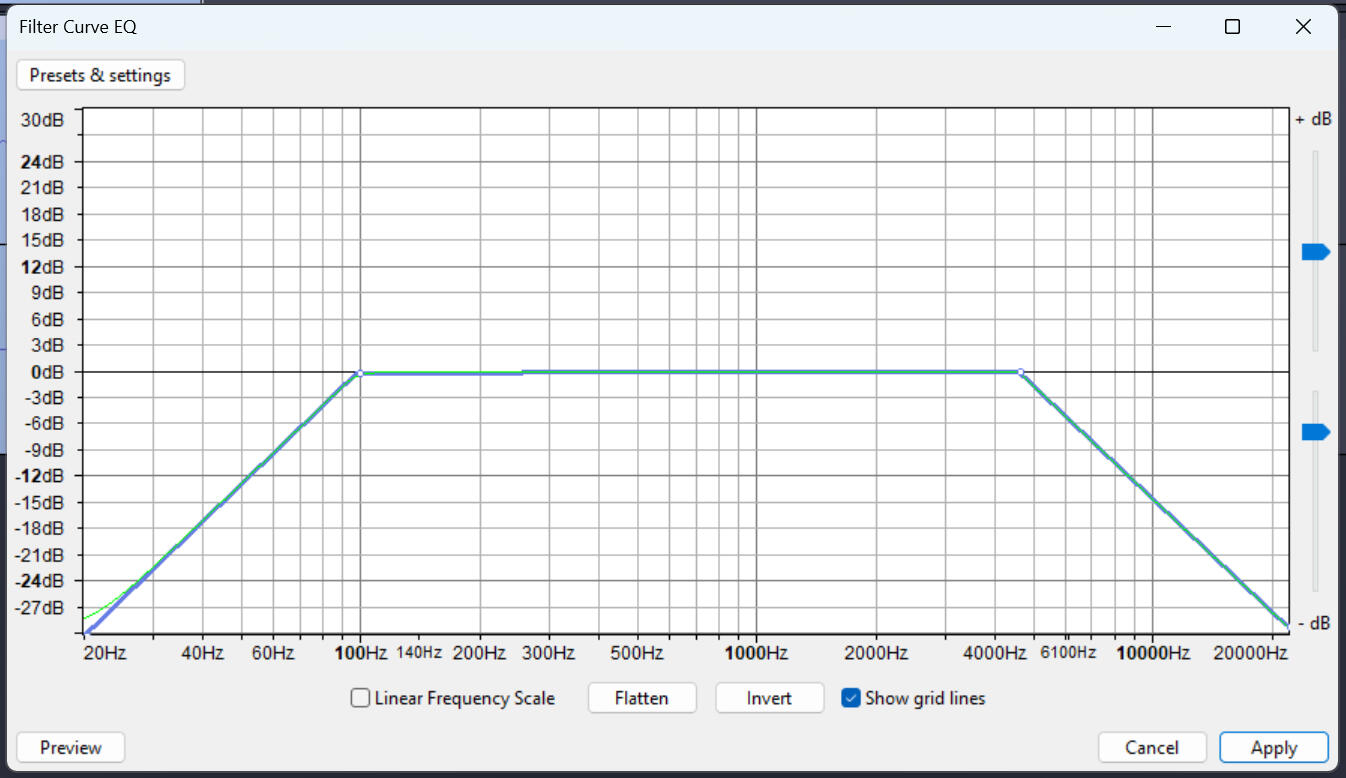
FILTER EQ
Cutting out the low and high end frequencies gives a perceived lower quality, almost like an old radio.
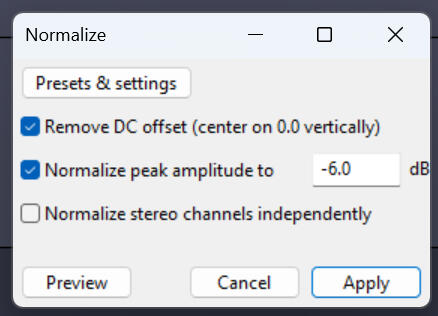
Normalisation
This ensures that the sound effects are a similar volume.
Normalisation
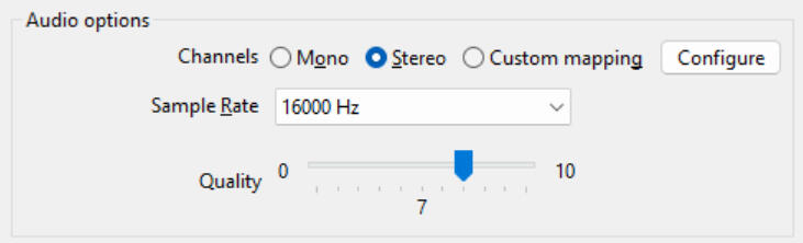
After lots of listening tests, I found a sample rate of 16000hz exported at quality level 7 as a .ogg file sounded closest to the SNES.
I made 20 sound effects in total though a few of them were not used.
UI Graphics
ITEM DISPLAY
Throughout playtesting, many people complained that the UI was too small for them to read the weapon recipes.
I made new assets and rearranged all of the sprites to give everything space. I chose a background colour to specifically contrast every single sprite. To tie the background colour into the game thematically, I made the backdrops pieces of paper. Text colour was changed to stand out on the new assets.
This update was met with positive feedback and the item displays were now clear enough for people to read.
Player Score Display
A lot of people in playtesting didn't know who they were in-game. Bruno attached coloured rings to each player. I updated the score displays to match these colours and make it easier to tell who is who. I made a single neutral panel and recoloured them for each player using the sprite renderer.
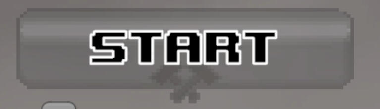
Menu Buttons
The button designs are very simple, just grey boxes with a blacksmith hammer accent. The button to start the game has a slight variation.
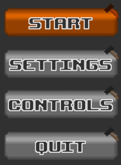
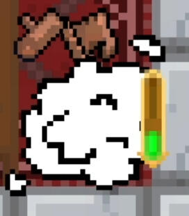
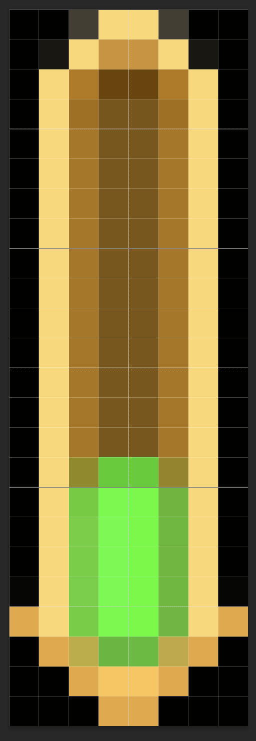
Progress bar
I made the progress bar gold instead of silver so it wouldn't blend in with the background. The green is used for additional colour contrast. The bar works by swapping between the three sprites.
Reflection
I went into this semester not knowing specifically what I wanted to do, which shows in the variety of my work. In past projects, I've always been a jack of all trades, and my work this semester has shown that I fit well in this position. There are some downsides to this position though, as there are some aspects where I won't have enough time to iterate or pay as much care and attention to my work. This is the case for the sound effects and UI. While I did put a lot of effort into the sound effects, I didn't have the time to improve them once I had made them. As I'm still an amateur in sound design, the quality isn't where I wanted it to be and is well behind my other work. I worked on the UI because it was a leftover task that needed to be done, so I didn't put too much care into my work here.
My main skill before my studies was illustration. I had wanted to work on my drawing skills again for this semester, but unfortunately, my group wanted to do pixel art. I've tried my hand at pixel art in the past but I was never good at it. I didn't have much motivation to get better at pixel art, but I gave it my best shot anyway. To my surprise, a lot of people thought it turned out great. There are some inconsistencies in the quality of each tile, and the background almost looks like it was made by a different person. Regardless, I think taking the time to study from references and inspiration paid off. While I don't think I'll revisit pixel art anytime soon, I enjoyed it and learned a lot.
In terms of coding, I've mostly done small features and occasional bug fixing in group projects. While the minigame was started by a groupmate, I still coded and developed the mechanics independently. While the code is somewhat messy, I learned a lot of new coding features and concepts that I will be able to apply again in the future. This is the area I've improved the most over this project.
As a game designer, I've learned a lot throughout this project. I had a lot of concerns about the mechanics of the game which I didn't feel confident enough to speak up about early on in the project. These came back in playtesting feedback, so I should start voicing my thoughts and opinions to my group members more often. This would've helped to speed up iterations and improvements on core game mechanics and would've made a more well-designed game in the end. I also need to get better at writing and playtesting. The playtesting notes and feedback I left for other groups lacked detail because I struggled to convey my experience in written form. As a result, a lot of my feedback is nitpicking and pointing out obvious problems. I had improved a bit on this by the end of the semester, but I need to get better at quickly analysing games and putting my thoughts into words.
This semester, my group members and I have improved considerably at working together and managing time. We still ended up falling behind schedule a bit, and I think we could have better communicated when we needed help or were too busy. I also think we might have been a bit too lenient with deadlines, which led to us working on parts of the game longer than necessary. I could have finished some assets sooner if I paid more attention to how much time I had. I also think as a group we should be a bit more open to critiquing each other's ideas. I'm not entirely sure if this applies to my group members as well, but I think too often I would hear an idea and just say "Okay, we can do that," without thinking too much about how it would affect our game.
Overall, I've developed skills in multiple areas which makes me a very versatile worker, but I think I should step back and focus on art for my next project. At the moment I don't feel as though I excel in any field and would like to be a more valuable asset than someone competent enough at the things no one else wants to do. I also need to think and act more confidently to help encourage more critical thinking about game design within my group so we can make better games.
Souls-like Game
Week 1
Some work on the game had been started prior to returning to university. As a result this week was mostly spent catching up on our game and ideas.
character concept art
While I'm not the character designer on this project, I was the one who wrote the story, so I gave some initial input on what the characters might look like. These were for the character designer to use as a starting point, so I left these as vague ideas for them to ideate on further.
Week 2
I think video games have unique opportunities as a storytelling medium. The interactivity of video game narratives is what got me invested in RPGs when I was younger and could easily imagine myself in the place of the protagonist. Even though the decisions I made didn't impact the story, to me, the gameplay was a part of my version of the story - of my experience with the game. While I have no experience with creative writing, I want to give an this an honest try.
the premise
The world operates on a cycle governed by a finite resource - ether, which is effectively this world's 'life force'. There are two halves to this world: Vita and Mors, and there is a perfectly balanced amount of ether in the two worlds at all times. Ether enters Vita where it inhabits life, and returns to Mors upon its host's death where its contents are erased. Humans found a way to extract ether, and burned it as fuel. This created a void in Vita, so ether had to flow in from Mors to keep the two in perfect balance. This caused the duration of the cycle to shorten. The process of erasure in Mors takes time. Eventually, the cycle became shorter than ether could be cleansed in Mors. The ether flowing into Vita now contained remnants of its past host. This led to the birth of mutant and incomplete life forms. Humans abandoned the ether burners, and by the time the last ether burner failed, the cycle had become so short that life was now stuck in a rapid cycle of death and rebirth.
The world was designed around the idea of a circular economy. I'm hoping I can make this a blatant environmental message as long as I can convey the world's system clearly.
I'm currently planning to implement a similar day system to Majora's Mask to tie the state of the world to the game mechanics. I'll have to be very careful about implementing this though, as time travel is not a possibility in my game.
characters
There is a single god who created the world called Essentia, who ran out of power and split apart. Their consciousness inhabited the 5 elements and became the guardians. The birth of Esssentia was the beginning of existence, and was born alone. In the emptiness of the void, the god's existence had no meaning, thus they created the world to give their own existence meaning.Essentia
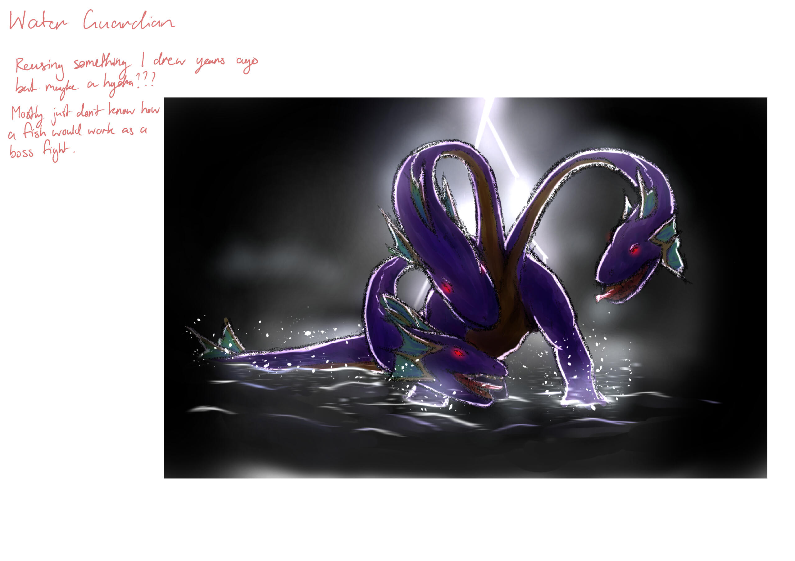
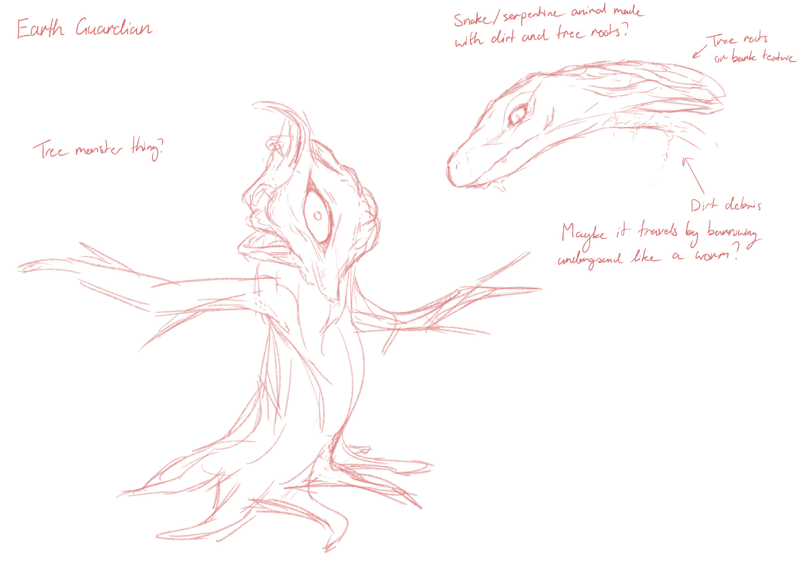
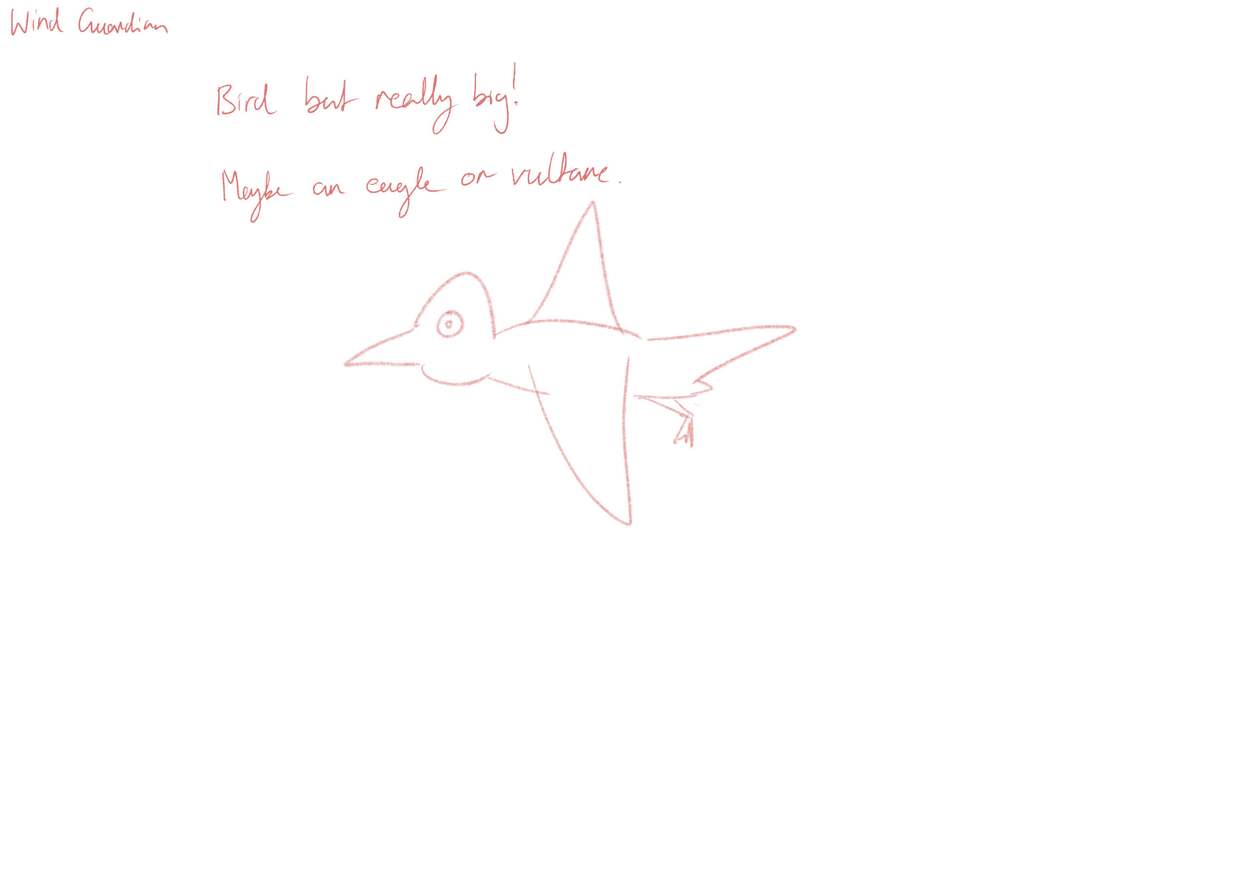
Earth Guardian
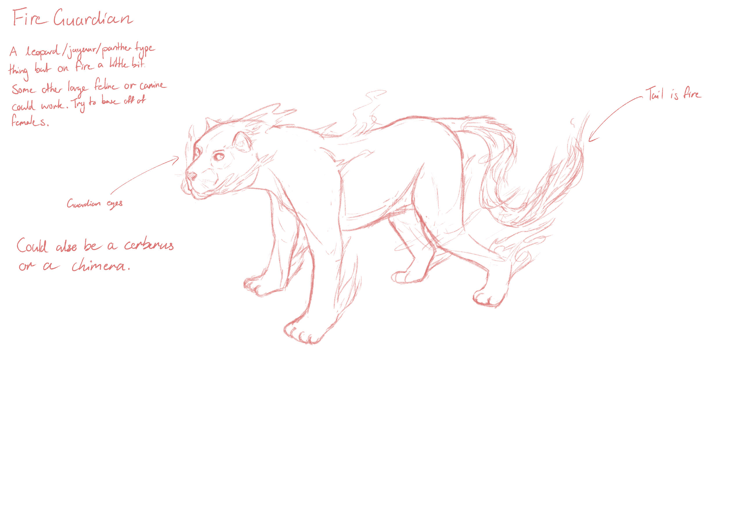
Fire Guardian
Water Guardian
Wind Guardian
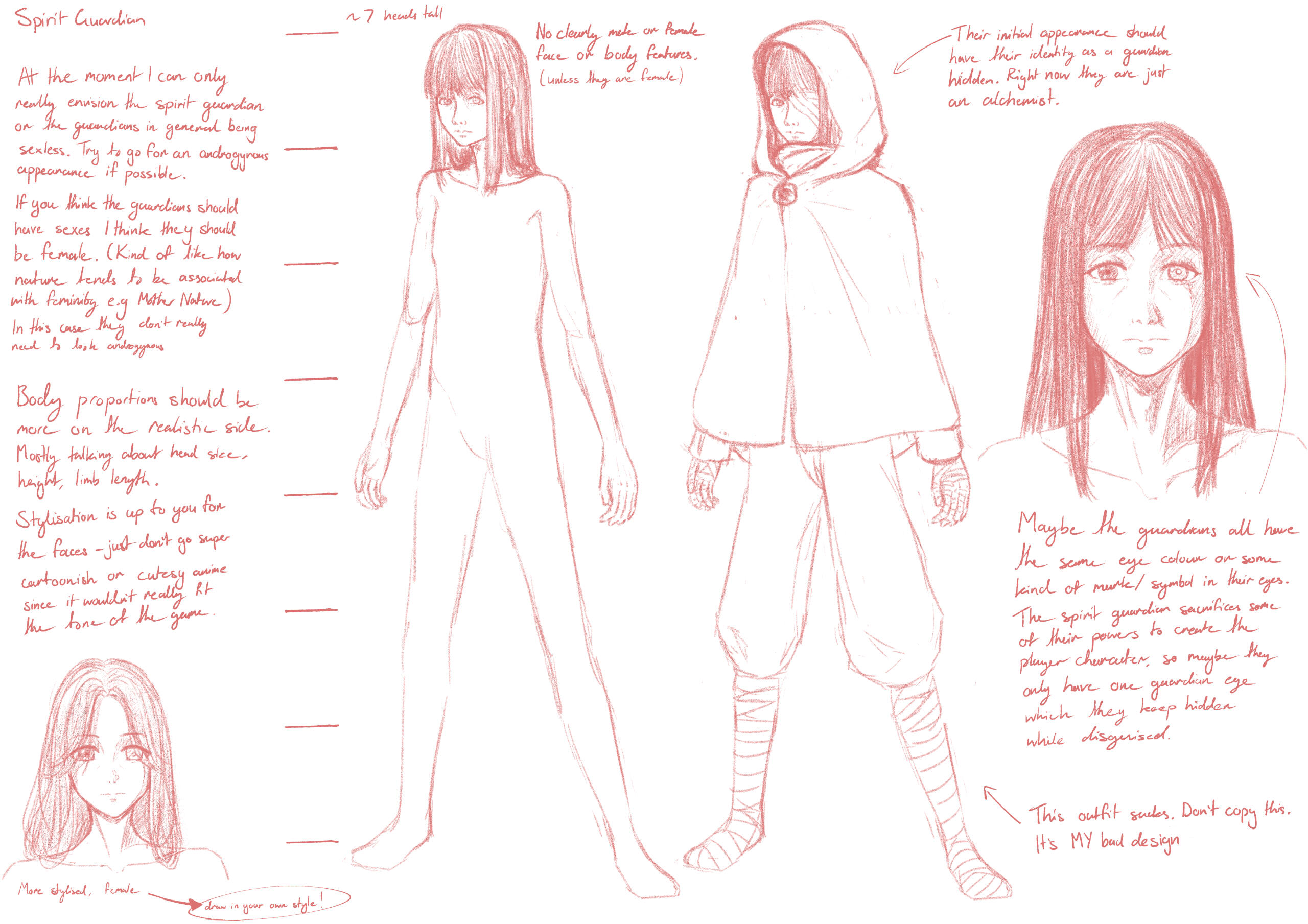
Spirit GuardianI made each of the guardians part of one whole to give each of their personalities different extremities, and because they were originally Essentia, they are directly tied to the creation of the world.
I intend to name each of the guardians and flesh out their backstories as I go on, but this is quite challenging because I want their backstories to directly tie into the world's history.
closing
By this point my approach to writing the story should be clear. The world is the main focus of this story, and I intend to convey as much as I can through the environment and gameplay. The lore has become very lengthy and would it be a waste of time to explain every change in detail. Feedback from my group members has been very positive, and I'm pretty happy about that.
If I were to give worldbuilding another try, I would try to avoid tying off logic and plot holes until I have a complete story to work with. This would've saved a lot of thinking time and kept the original themes I had in mind.
A lot of time was spent on writing, which all culminated in a (very) long flowchart. I will still be working on this in the background, but I will only be documenting changes I see as significant at this stage as it would take too much time to note every change.
Environment concept art
At this stage we're not sure if we want to make a big open environment, or something with tighter interconnected paths. I made these as a quick look at what the environment could look like, and to try figure out how the game's colours and tone could look.
moodboards
Concept Art
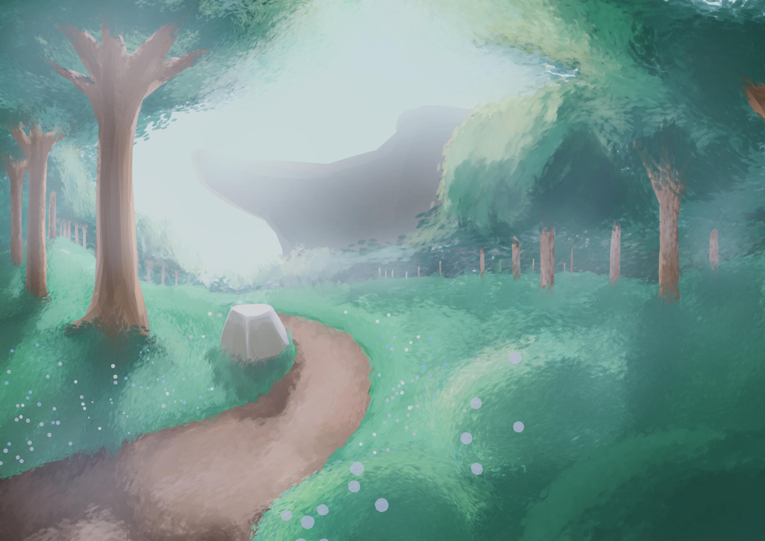

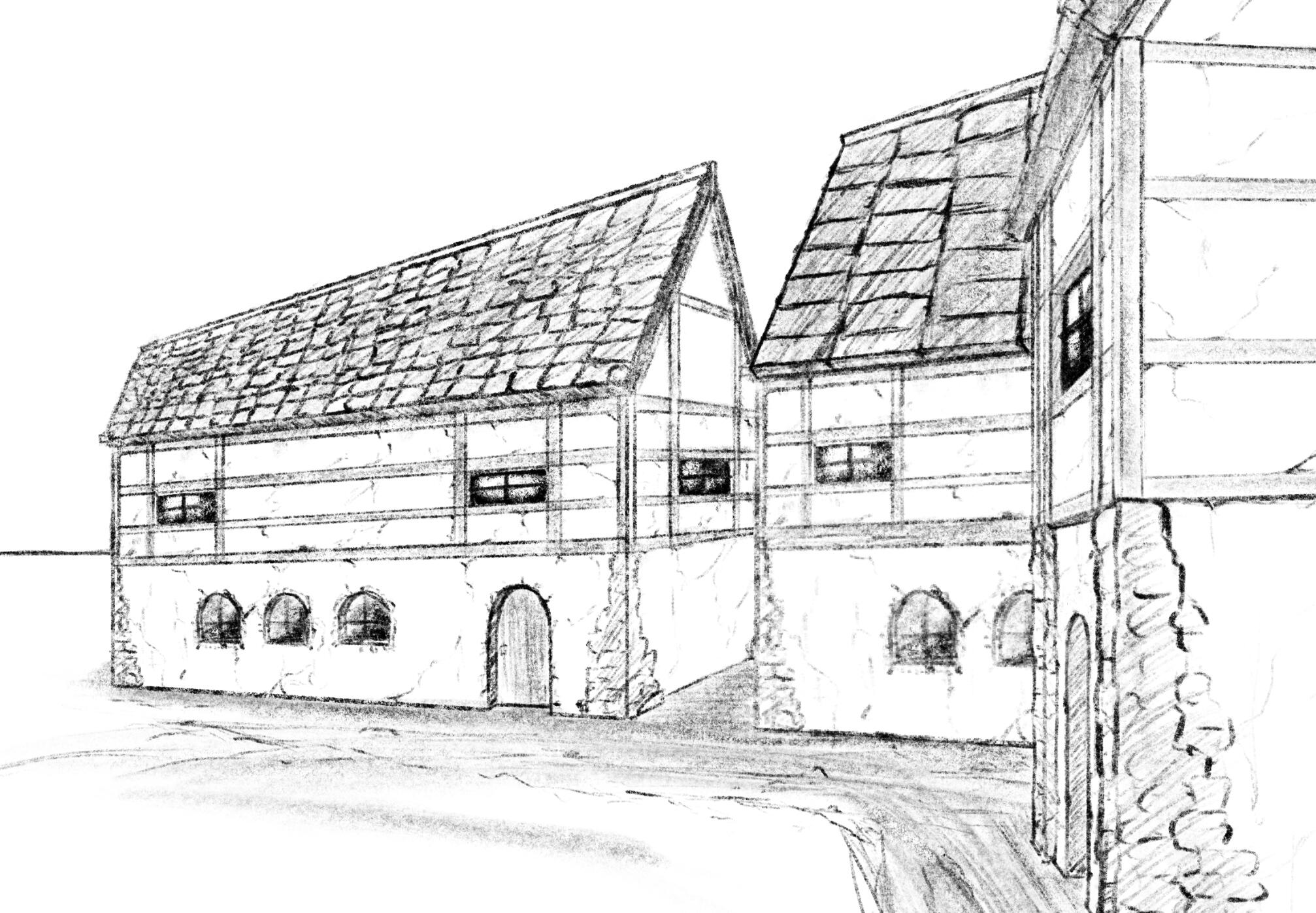
In general I want a bit of a muted/desaturated colour palette, but I still want clear contrast in values. I think the second painting is closer to what I would want in terms of layout and aesthetics.
Week 3
I really like stylised rendering in games, and I especially like cel-shading. I think breaking the image down to shapes and colours makes everything look simpler, and harsh separation between light and shadow makes the lighting look a bit more dramatic. Combining this with more control over colours and value make cel-shading extremely versatile.
Inspiration
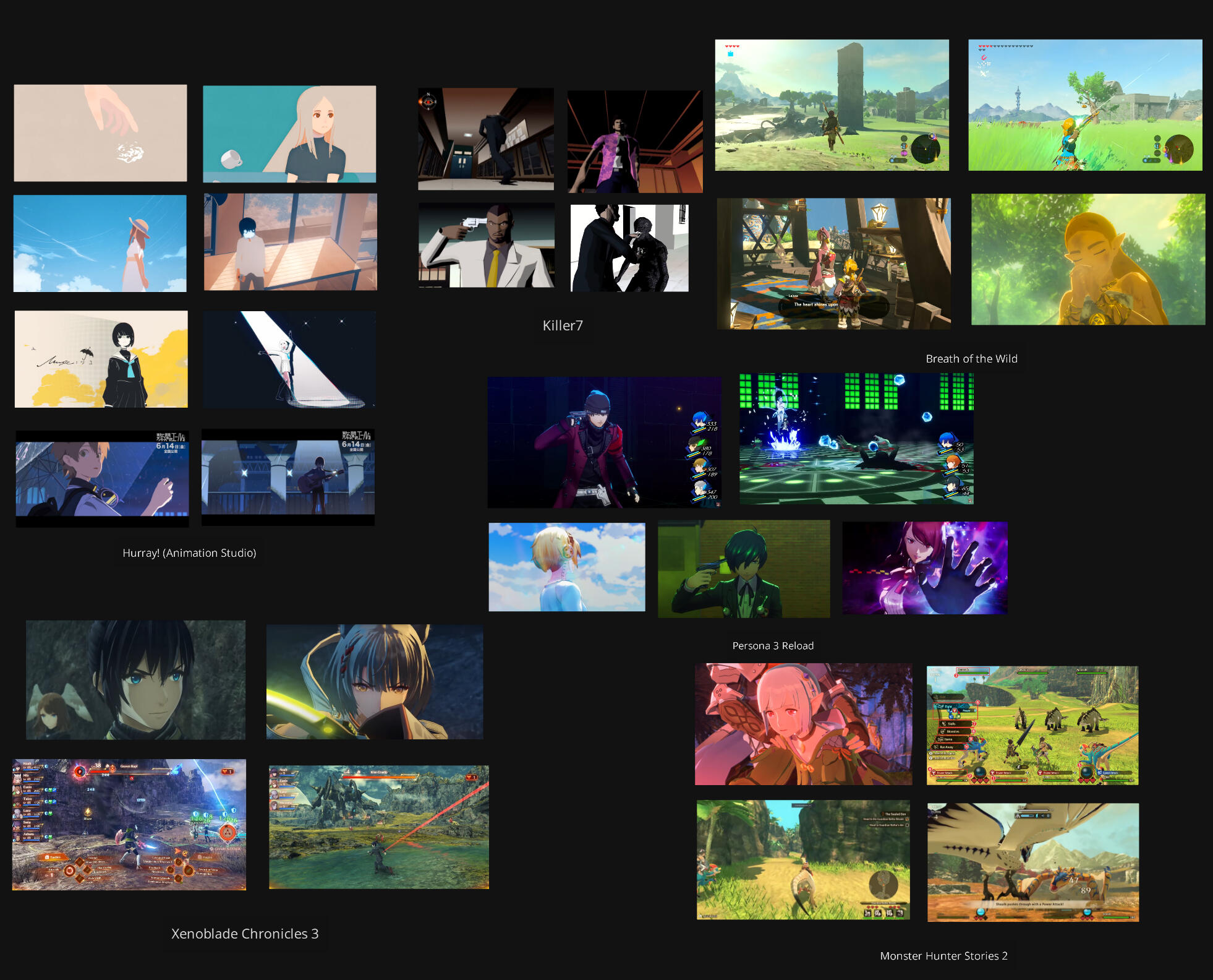
With the exception off Killer7, all of the games here use PBR shaders for the environment and objects. While it could be interesting to explore cel-shading terrain, I think that it would make more sense to stick with PBR as the environments we have planned will be mostly in natural areas.
SHAder
I followed this tutorial from MinionsArt to make a lit cel shader. This was very helpful for getting a grasp of basic HLSL, and using custom functions in shadergraph. To get point lights working, I took another bit of code from one of their public Patreon posts. With very little work I had a decent cel shader.
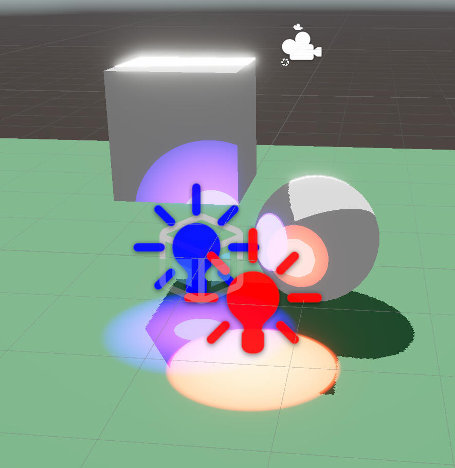
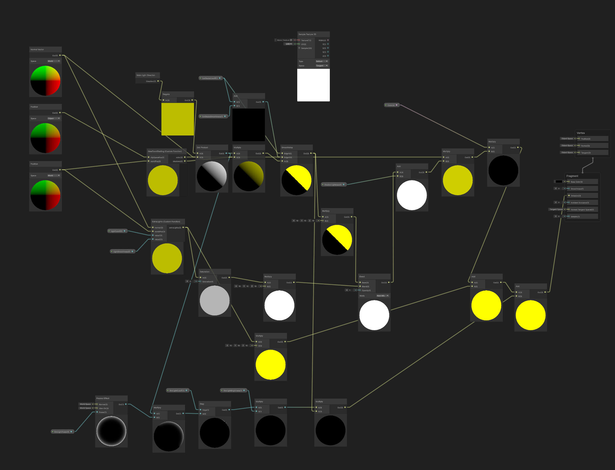
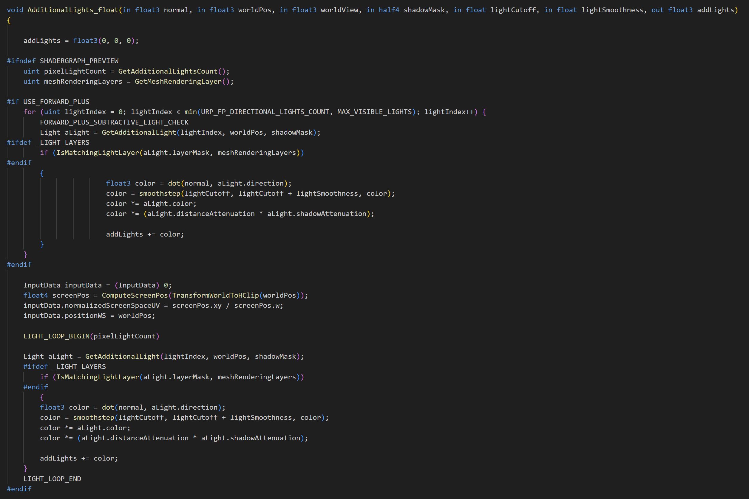
When testing the shader, I noticed that not all of the point lights in the scene were being rendered. This is due to Unity's forward rendering limiting the number of additional lights per object, as well as the number of point lights on screen. I tried switching to deferred, but this created new rendering bugs which I didn't know how to fix, so I switched to forward+.
This required some changes to the code. I attempted to figure it out myself through Unity's documentation, but I ended up borrowing from this Github repo in the end.
I played around with the shadows a bit. I tried overlaying a gradient to give the objects a slightly softer appearance. I also tried using a noise texture and gradient map to give the shadows a 'water-colour' edge bleed.
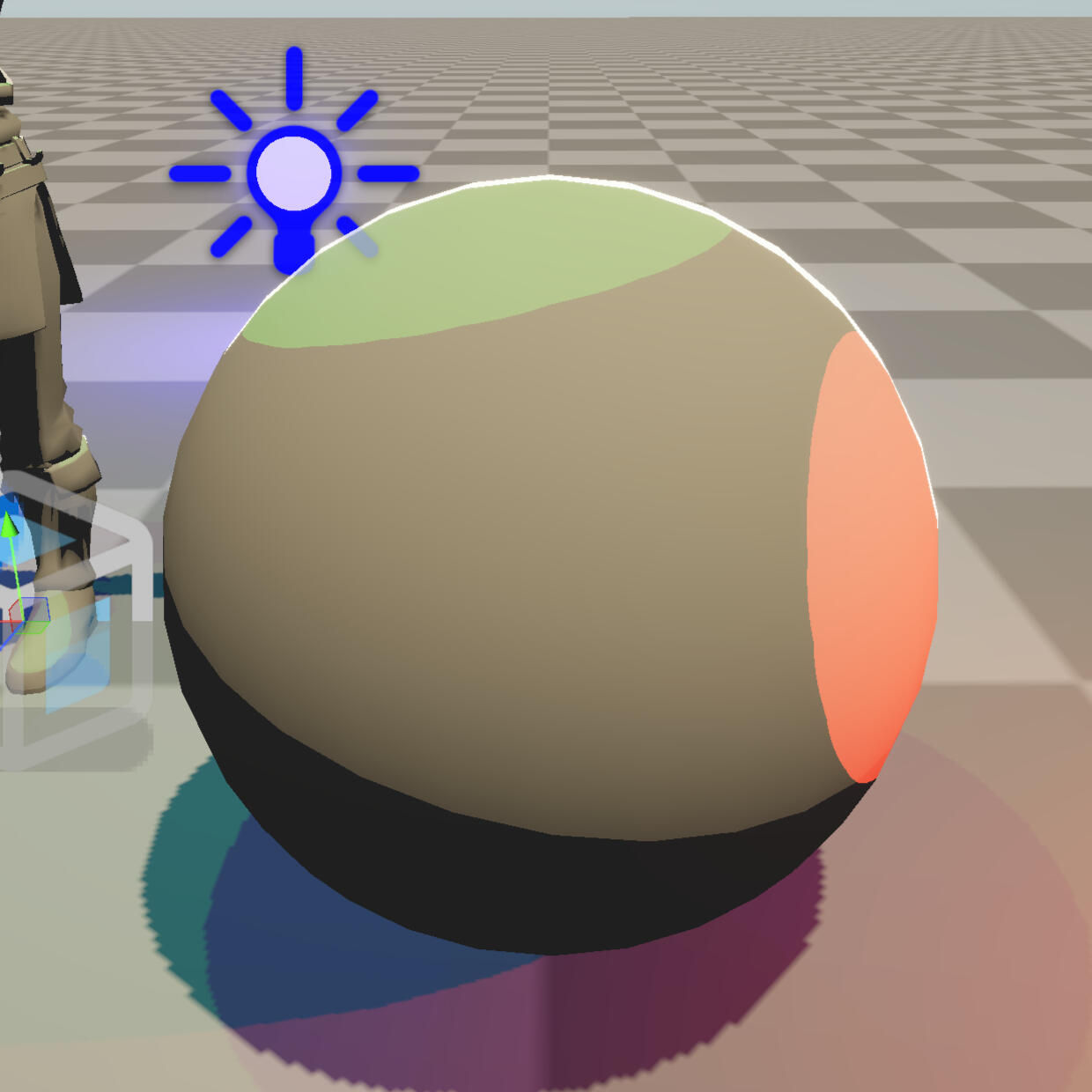
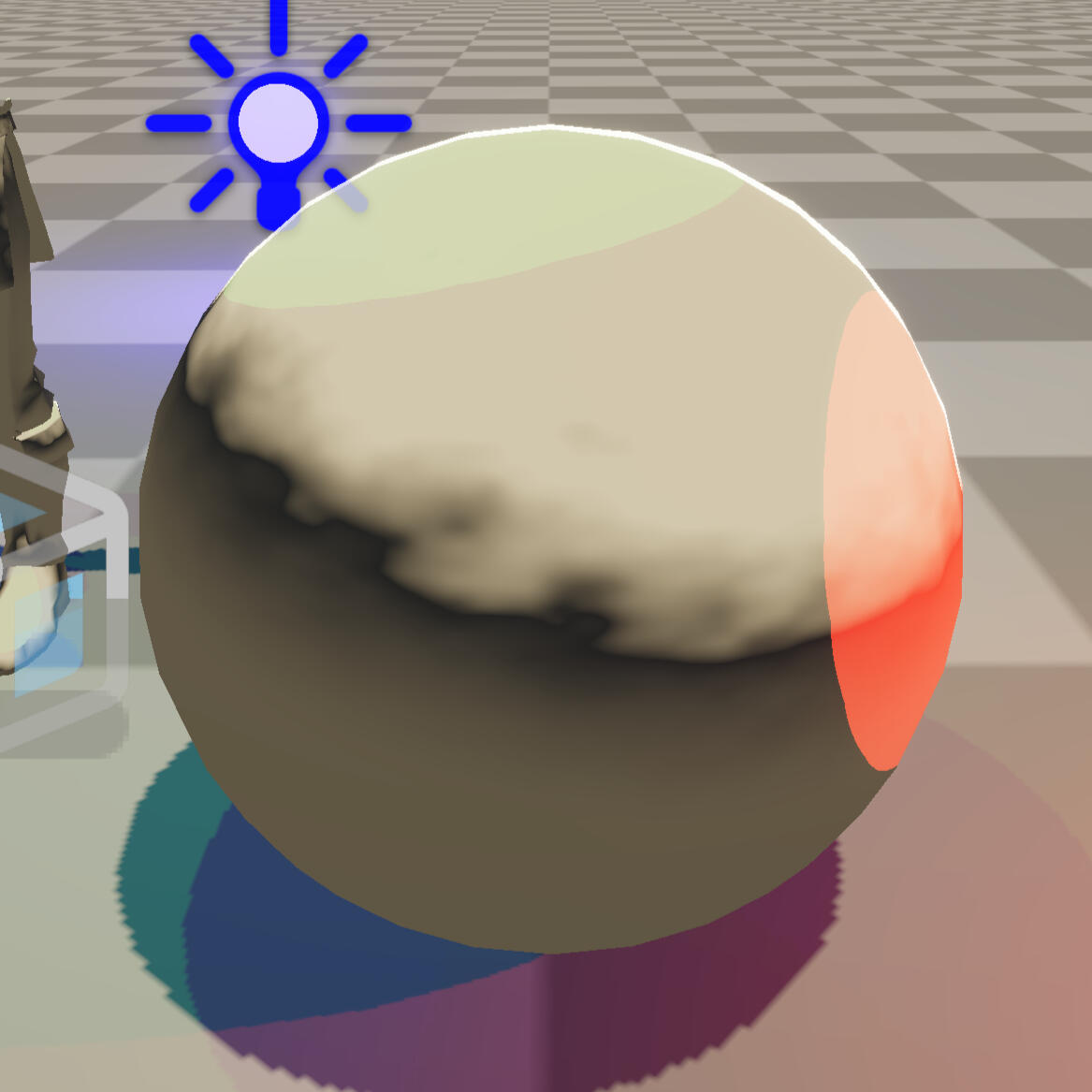
I prefer the look of flat colouring over the softness of the extra gradient shading, so I'm dropping that experiment. I think the watercolour shader looks quite interesting, but it has some problems on any geometry that isn't a sphere, as the shadows aren't soft enough/don't spread enough for the gradient map to look good.
I think the solution would be to add a grabpass of the shadows and then blur it before adding the noise. I think this would give every shadow a consistent edge and a much cleaner appearance. I might come back to this again in this project or another project in the future.
Enemy Concept Art
This concept art was also drawn as an idea/guide for the character designer to work from. Depending on their workload and availability, I may have to develop this further myself.
While I was away from class sick, my team relayed to me that our lecturer suggested that we put a hold on concepting and work on getting things into our game. This is probably the right move.
Week 4
I also did some exploration on how character faces should look. I had already decided on cel-shading by this point, so I was seeing how cartoony I could get with the faces while still keeping the more serious tone of the game.
My group and I unanimously agreed on this style.
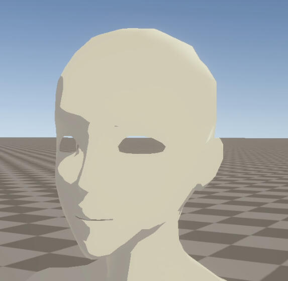
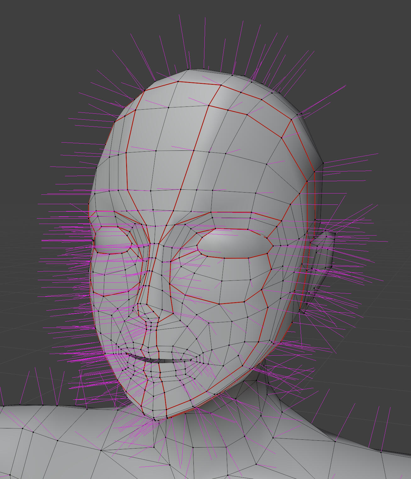
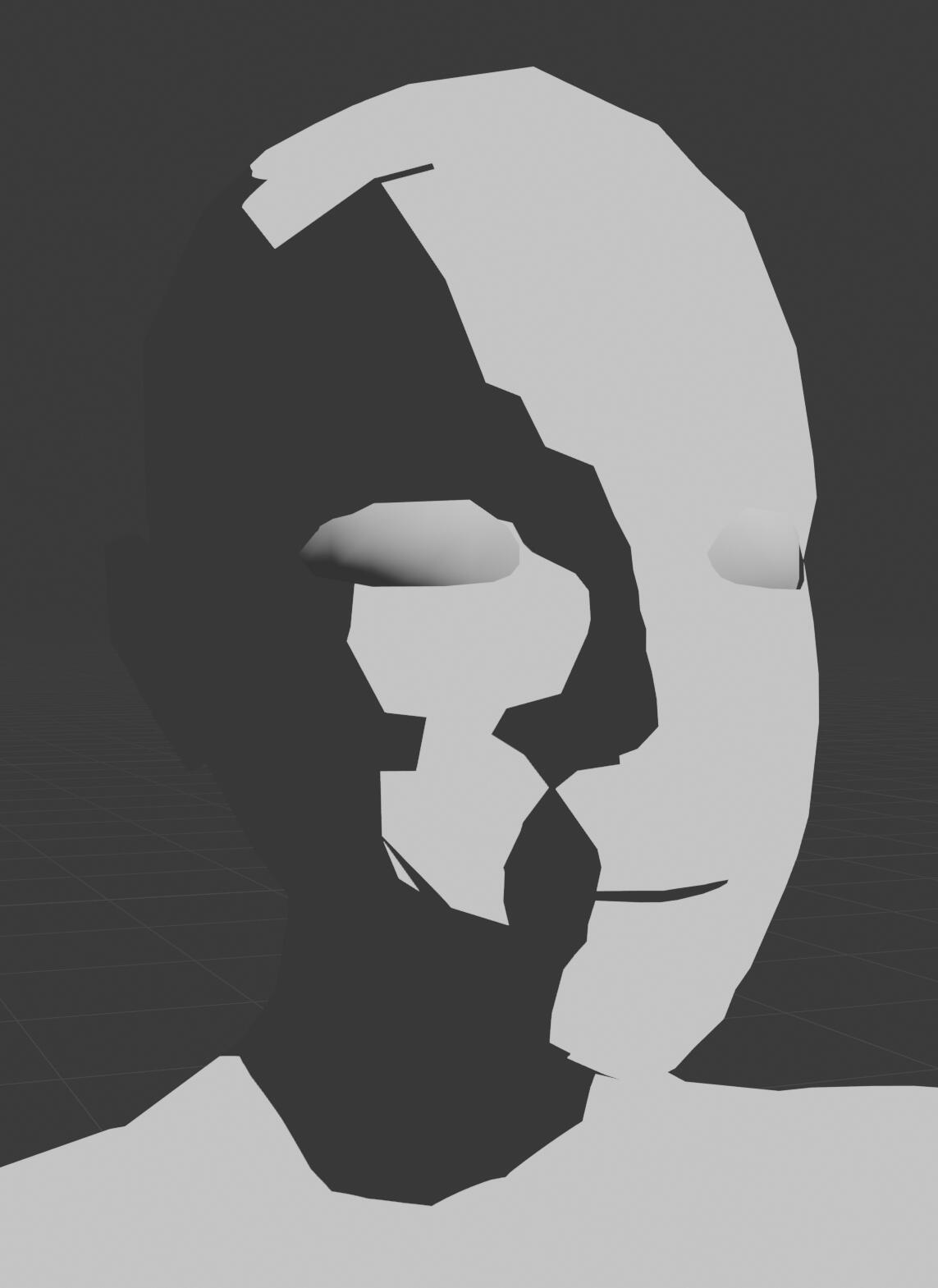
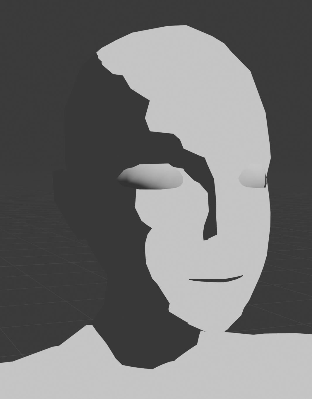
Base Mesh
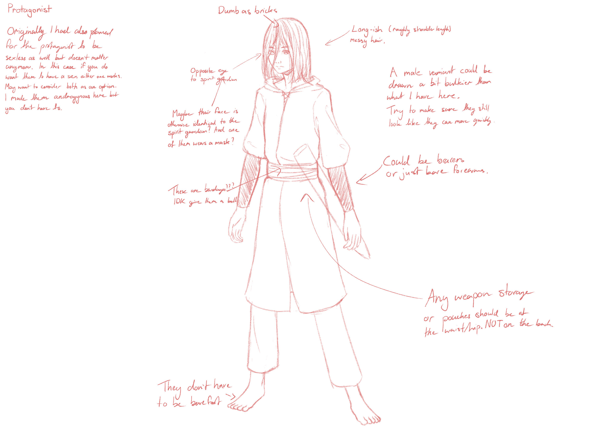
Our character designer gave me a rough sketch of the main character to work with. I drew a front and side view adjusted to the final art style to use as reference.
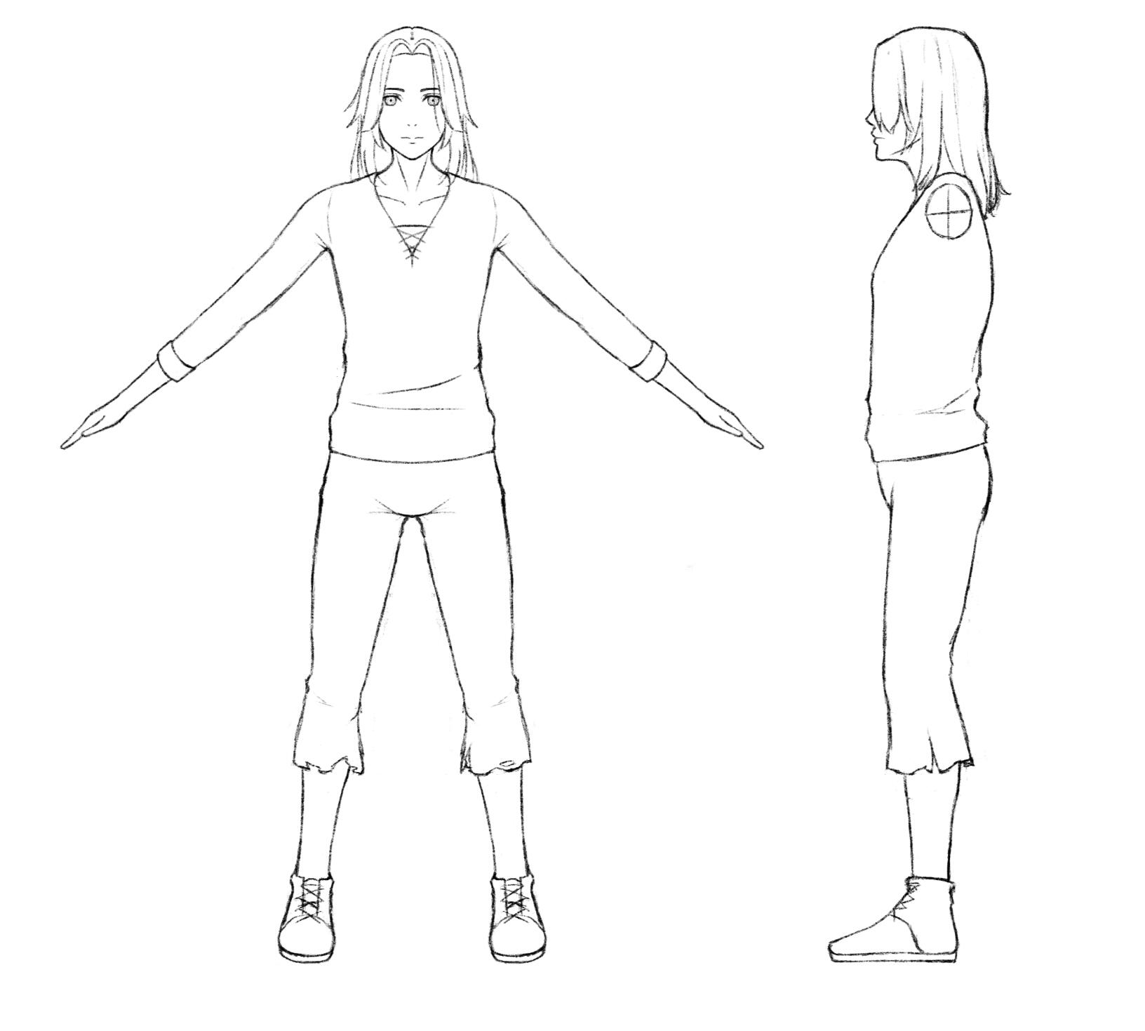
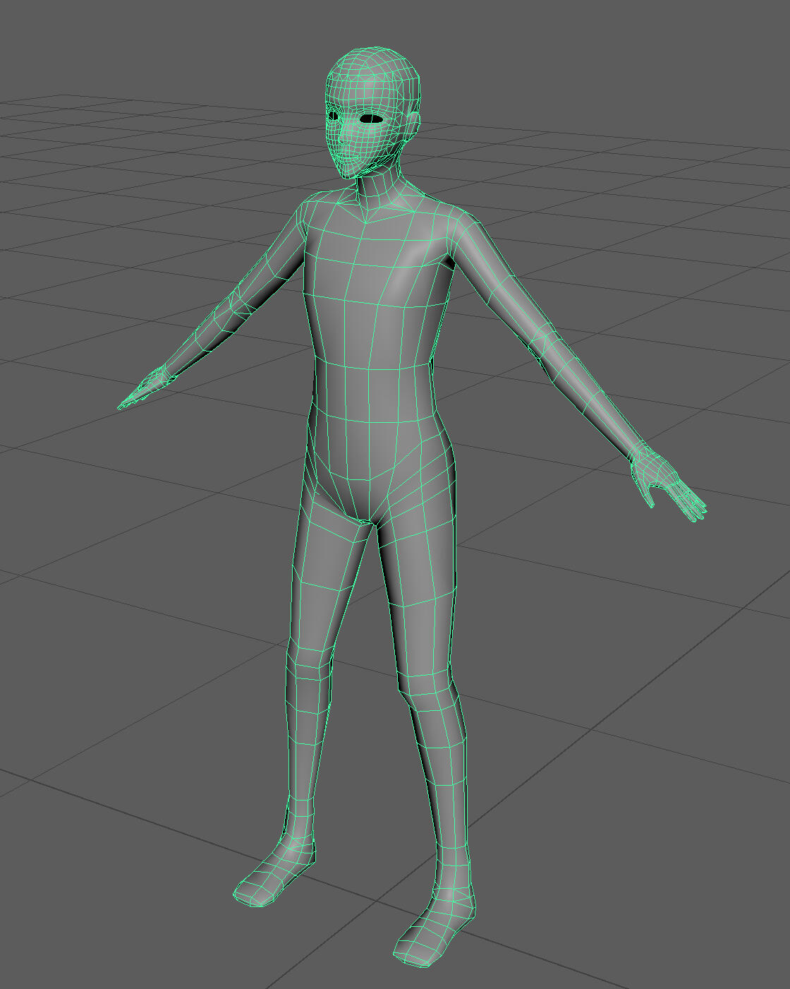
The plan is to make a base mesh with good geometry and normals for the cel shader (especially on the face), then set up shape keys in Blender with different body proportions. This should help to save time when modelling any new human characters for me and my group.
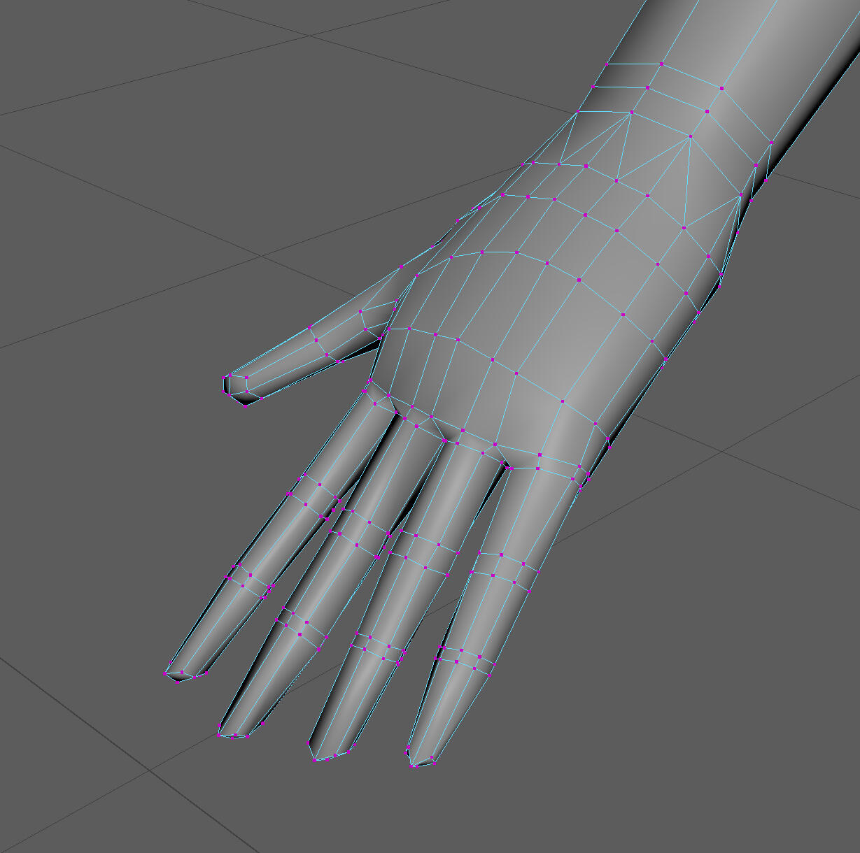
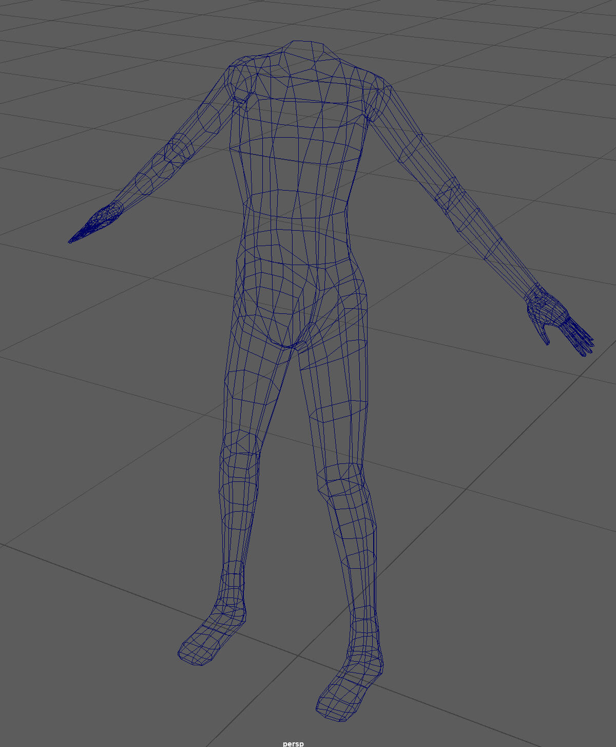
The body was modelled first, followed by the hands. The topology around joints is collapsible.
The head is much higher poly than the rest of the body because I want it to look a bit closer to the drawings. The face will also look a lot better up close.
I made the head by modelling it flat against the reference image, then deforming it with a lattice. After that I modelled the ears and the rest of the head separately. I got the method from this tutorial video.
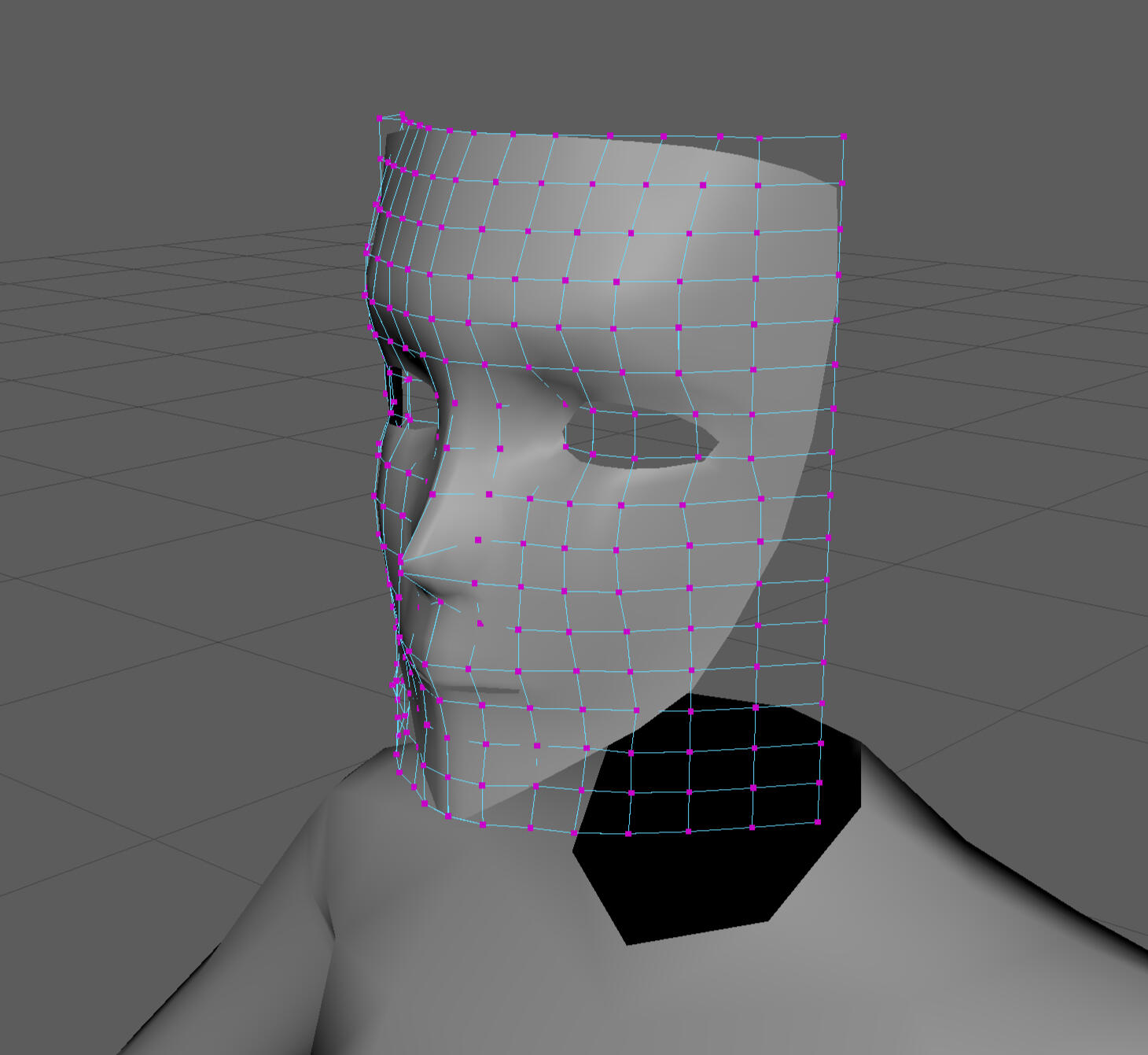
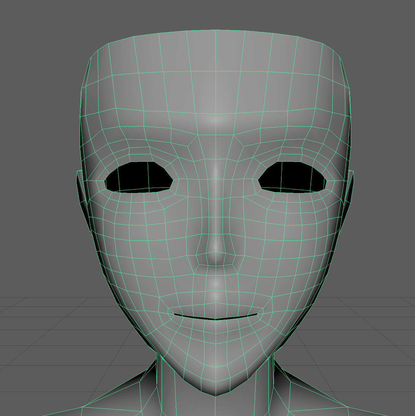
The shading on the face isn't very good yet in Unity. The geometry on the forehead is a bit too pointy. The eyebrow ridge and jaw also need some geometry tweaks. If I can't get it to look good with geometry changes alone, I'll try correcting it through normals.
Annotation
Dark Souls
FromSoftware. (2011). Dark Souls. Namco Bandai Games.Dark Souls is a highly influential action role-playing game released in 2011 developed by FromSoftware. Dark Souls is set in the dying kingdom of Lordran, where humanity has been cursed by a cycle of death and rebirth until they eventually lose their minds and become hollow. You play as the Chosen Undead, who escapes from confinement and is taken to Lordran. The player must embark on a journey through Lordran to slay the four Lords and obtain their souls to rekindle the First Flame; the source of life and death. The story of Dark Souls is presented through the details of the world. Every single detail is tied to the game’s story such that engaging with the game allows the player to experience and discover the history of the world for themself.Dark Souls’s quiet approach to storytelling elevates the sense of curiosity and discovery in the player as they explore Lordran. The decision to make NPC dialogue short, vague and one-sided conversations leaves the player to infer. This creates a sense of mystique surrounding Lordran’s past, yet the answers to any questions about the world always present themselves to you through the characters, bosses, enemies, and environment. This ties the core gameplay mechanic of exploration to the narrative, taking full advantage of the video game medium. Dark Souls is an example of excellent world design and environmental storytelling.Dark Souls has greatly influenced the approach I intend to take to writing and presenting the story of my game. Making the gameplay and environment tell the story of the world, in my opinion, creates a much more immersive and individualised experience that other storytelling mediums cannot achieve. Dark Souls has inspired me to create a game where the full story is about the world rather than the player, and to try to tell that story to the player through gameplay mechanics and visuals instead of words. I really like the idea of tying the characters’ backstories to the world, and exploring how their actions have led to the events of the present. Dark Souls has made me think more about how a story can be told effectively, and I will be borrowing a lot of ideas when writing for my own souls-like game.
Week 5
Research Question
How can I use colour theory and NPR to create a souls-like game with a stylised visual aesthetic without sacrificing the grim tone synonymous with the genre?
At the moment this is direction I want to go in. I'm currently working on a character shader, but I want to go further with NPR, extending it to the environment and objects. This is to gain full control over the colours and lighting of the scene as a whole to create a more cohesive and intentional visual design and aesthetic.
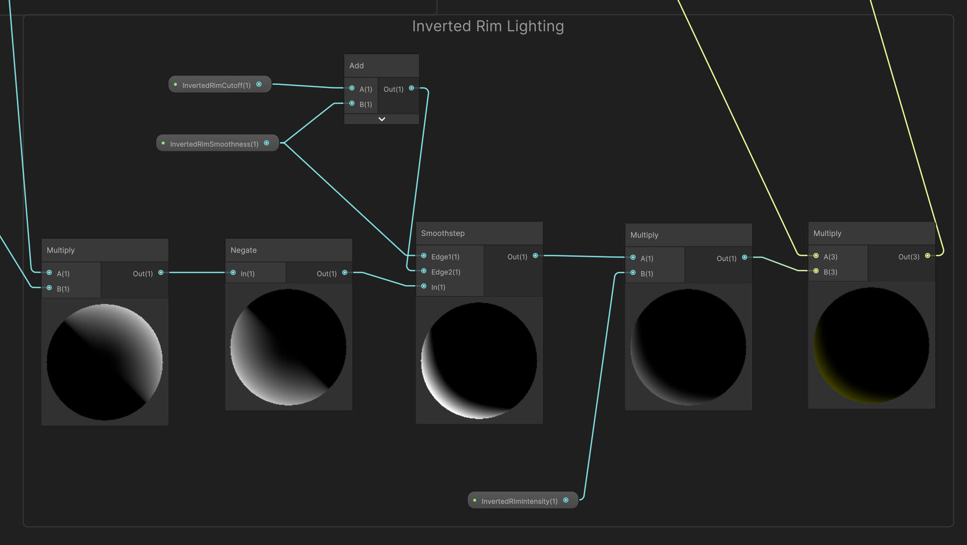
I tried adding a couple more shader features to make it a bit more interesting.
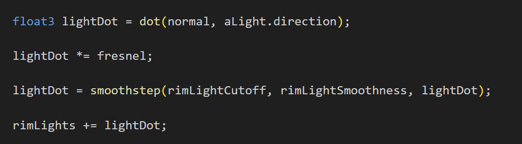
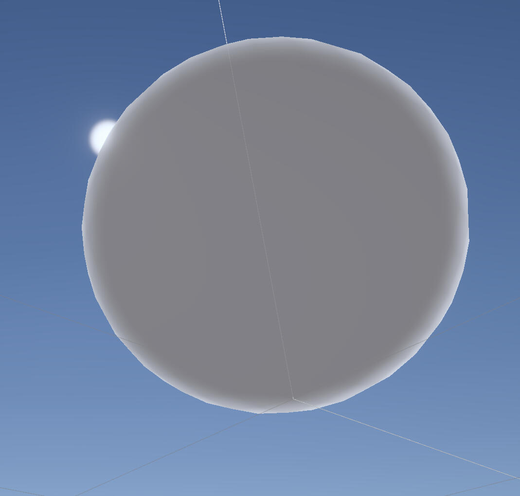
inverted rim light
This seems to show up in a few cel shaded games, but the first one I noticed this in was Xenoblade Chronicles 3. It's a subtle effect that can be used to sort of mimic bounce lighting.
Additional Rim Lights
I think it would look odd if the additional lights didn't behave the same way as the main light, so I added this feature.
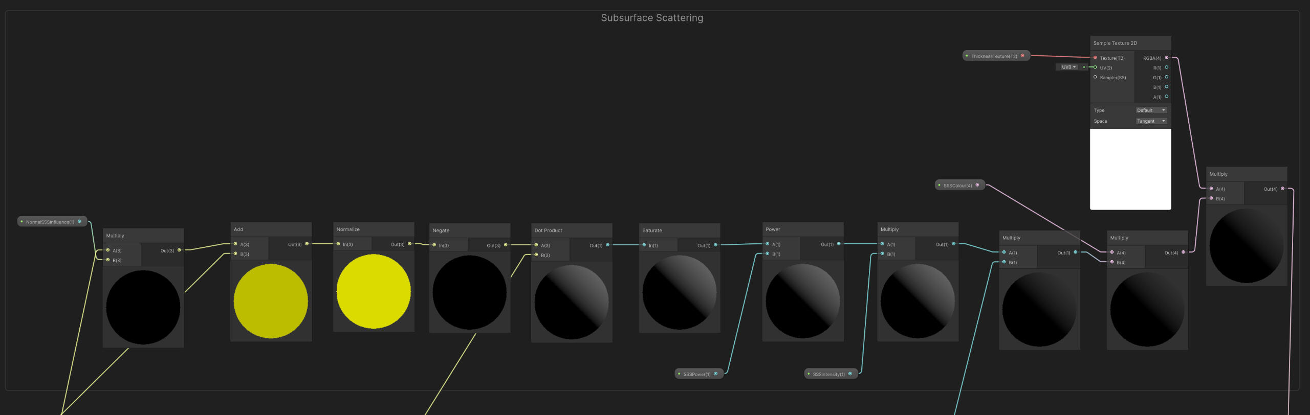
Subsurface Scattering
I don't think this feature will make it into the game as it won't be noticeable at all during actual gameplay, and I don't see it being all too noticeable during cutscenes either.
Week 6
This week I presented our game in class. There wasn't too much of an actual game to show, but we still got a valuable bit of feedback on the scope/timeline of our project.
It's highly unlikely that the game will be finished if we decide to make it open world, so it should be a more linear experience like Dark Souls. It may also be easier to make the distance between each boss very short, so the game ends up playing out almost like a boss rush. This was a good suggestion, but I think I'd still travel time between bosses to be long enough to feel like exploration. This will have to be tested later on.
There was also concern about how much animation we would have to do, and that doing it all ourselves would be enough work to justify its own research question. I'm considering shifting my focus over to animation as I do have a lot of interest in it. Especially when considering that a large amount of the animation is supposed to be done by me, it might be worth switching to ensure my workload is manageable and also contributes more to the game.
Week 7
Normal Editing
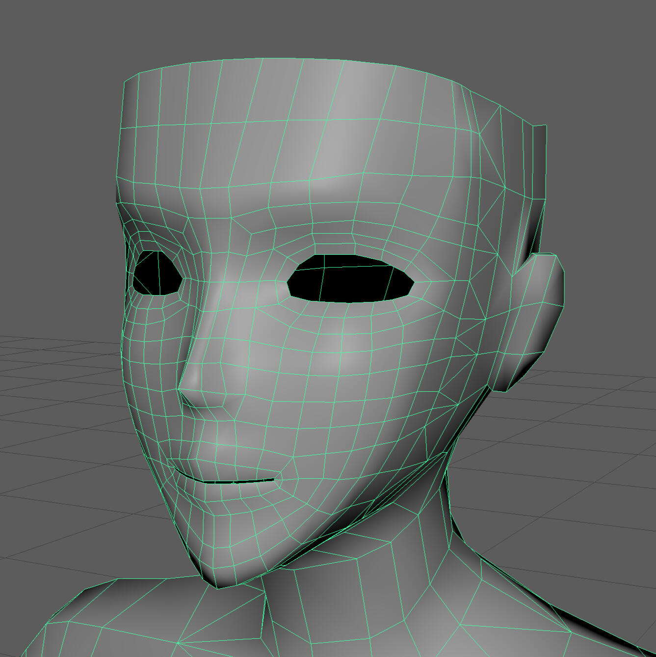
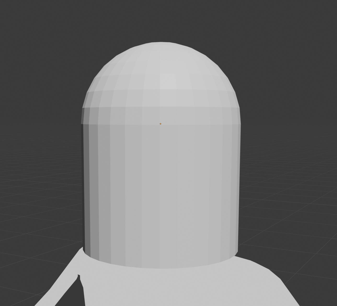
I wanted to fix the face shading now, as it'll be extremely useful knowledge to have when making more character models in the future.
I started by retopologising the entire head. I brought the poly count back down to match up with the rest of the model. I also made adjustments to the shape to bring the eyebrow ridge and forehead down.
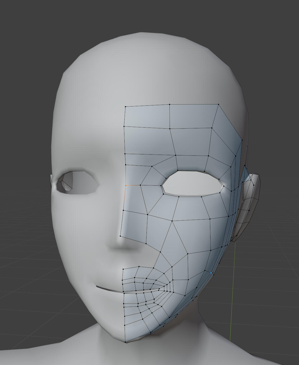
This does sacrifice the quality I wanted when I first made the model, but I realised that it's highly unlikely the face will ever be seen up close, even during cutscenes.
The head shape is now much closer to what I wanted, but decreasing the poly count has made the shading even worse. I'm going to try fix it as much as I can through normal editing, but given the poly count think I will need to use a normal map.
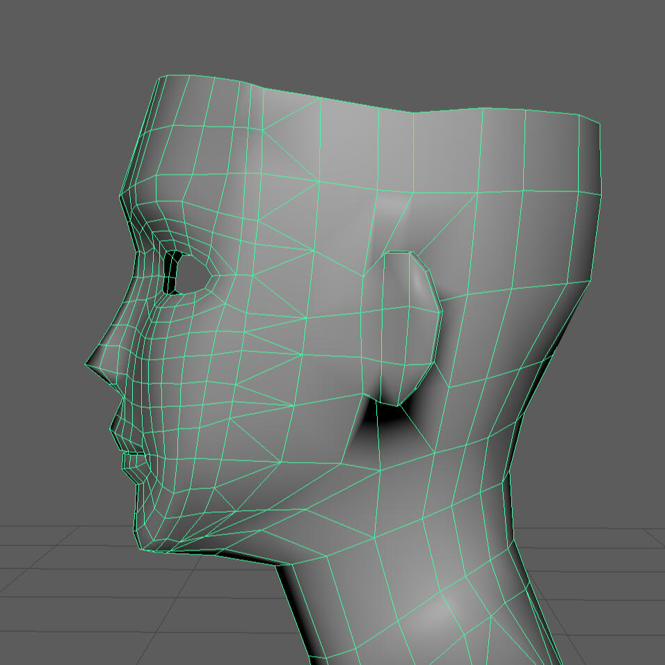
The first results I got weren't very good. There just weren't enough polygons for my normal editing to make the shadows I wanted.
I ended up adding some more loop cuts around the areas where I needed the shadows to look cleaner or make a specific shape, like around the cheeks.
I also marked some seams to more easily visualise the face in zones.
The results were better, but there were still some issues at some light angles, and the shadows didn't match with the rest of the head.
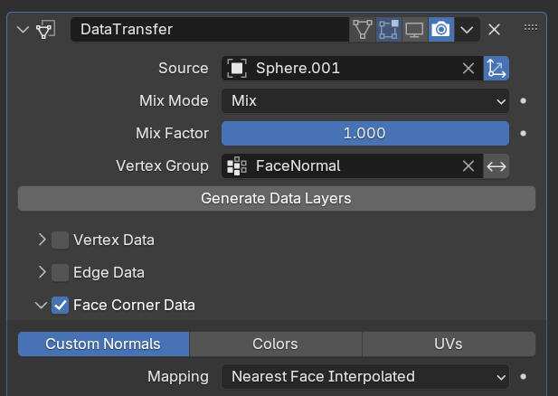
To try fix the remaining problems, I used a proxy mesh to smooth the normals. This cleaned things up a bit, but the low-poly jaggedness remains. Some light angles look almost perfect, but it's just not good enough.
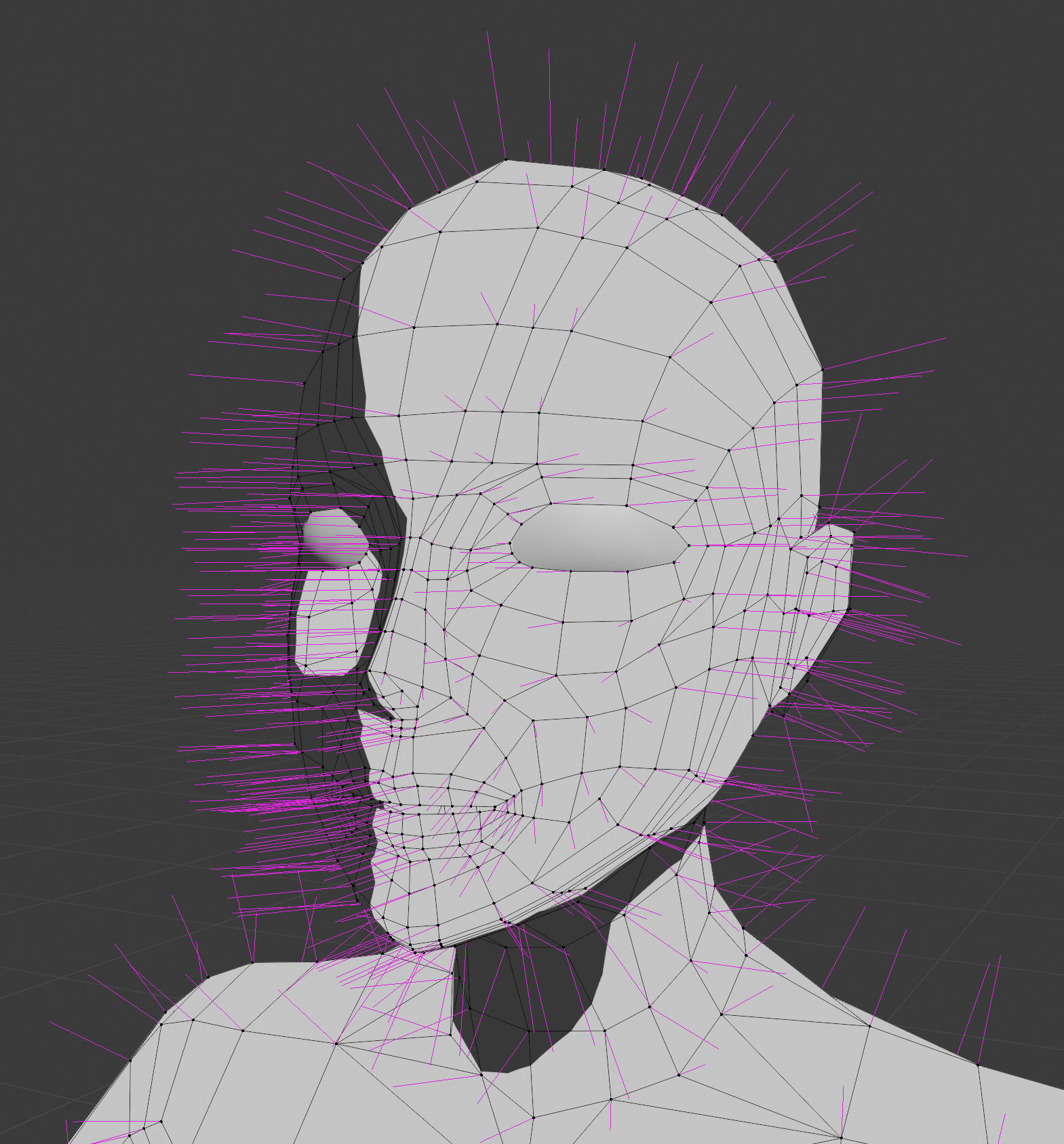
This is about as far as I'm willing to go for now. I've spent too much time on this. More likely than not I'll just use a normal map on the final models.
Annotation
Colors Psychology
Joosten, E., van Lankveld, Giel & Spronck, Pieter. (2010). Colors and Emotions in Video Games. 11th International Conference on Intelligent Games and Simulation, GAME-ON 2010.Colour psychology is the study of how different colours elicit different emotional responses and behaviours. Colours have This study identifies important colours as the colours which generate the highly-aroused emotional responses, based on Plutchik’s (as cited in Joosten et al., 2010) findings which links certain colours to basic emotions. Their experiment recorded participants’ emotional responses through a questionnaire, asking them to assess their feelings of arousal, valence, and domination after completing five rooms with different ambient light colours in a video game. Their results show that “red elicited a highly-aroused, negative emotional response, and yellow elicited a positive emotional response,” and that the effects are “prevalent mainly with inexperienced videogame players” (Joosten et al., 2010, p. 5). Colours should be considered a way for game designers to manipulate the emotions of players, though it is easier to take advantage of these effects in inexperienced players as “they take more note of visual cues, even subconsciously,” (Joosten et al., 2010, p. 5)This study in particular makes use of a more complex role-playing game compared to previous research, so the game was more difficult for inexperienced players. This means that experienced players are guided more by their knowledge than visual information, and very importantly spend less time in each room, which may explain their reduced emotional response (Joosten et al., 2001). This is corroborated by another study which “found that the duration of a videogame is an important factor in eliciting emotional responses,” (Landers & Boutcher, 2003, as cited in Joosten et al., 2010). However, there are weaknesses to the study conditions which are acknowledged in the paper, as “The colors in the light blue and dark green condition were less intense than the colours in the red and yellow condition” (Joosten et al., 2001, p. 4). This is crucial because the hue, saturation and value of a colour also have a significant effect on arousal and valence (Wilms & Oberfield, 2018). Additionally, “only the background light of a condition was manipulated. The objects in the condition and the condition itself were in standard colors,” (Joosten et al., 2001, p. 5). This is another important weakness of the study, as the visual attention of players is likely to be focused more on the exact subject in front of them instead of the surrounding environment during gameplay (El-Nasr & Yan, 2006). This would suggest that changing the colours of the subjects of visual attention could produce a stronger emotional response in experienced video game players.It’s important to know about which colours trigger which emotions as I want to evoke specific feelings through the visuals of my game. Understanding that player attention and focus applies limitations to the impacts of colour on emotions is going to help inform my decisions when choosing which parts should have their colours changed, and how the colours should be adjusted. It’s especially important as I am making a souls-like game, which typically have both intense action sequences where attention is the key factor, and more calm exploration where duration is the key factor. Specific control over the environment’s colours through NPR shading is unlikely to have a significant impact on the player’s emotions as the desired effect will be felt over time. This may explain why many ‘cel-shaded’ games adopt NPR for characters and PBR for the environment. This may shift the direction of my research and practice from rendering techniques to environment texturing and lighting.Other References:
Wilms, L., & Oberfeld, D. (2018). Color and emotion: Effects of hue, saturation, and brightness. Psychological Research, 82(5), 896–914.El-Nasr, M., & Yan, S. (2006) Visual Attention in 3D Video Games Proceedings of the 2006 ACM SIGCHI International Conference on Advances in Computer Entertainment Technology
Week 8
annotation
3D Level Design
Field, P. (2020) Spatial Communication in 3D Level Design. YouTube.
Spatial communication is the concept of using space to communicate ideas and information, and is an important way for game designers to inform and direct players throughout a level. This video presentation by Peter Field showcases a block-out of a level design and works through the design decisions which went into the layout of the environment. Field utilises the concept of sightlines to show the player their objective which is out of reach. Progressing through the level takes the goal out of view, and sightlines for the path forward are obstructed. This motivates the player to move forward in order to see what’s around the obstacles in their path, and reestablish sight lines with the goal. Field looks for opportunities to tear down walls and show the goal to the player as reinforcement, while still preventing them from escaping the level, making the level more visually engaging. Lastly, 3D space allows for information to be revealed to the player by guiding them into looking at the level from different perspectives. The player could run into what looks like a dead-end, only to turn around and find a new path adjacent to the one they came from, which was hidden from their original perspective.Sightlines and perspectives are crucial for nudging the player forwards, and can be used to encourage players to explore and observe their surroundings more carefully. Periodically reminding the player of their goal by showing rather than telling can be a good way to communicate to the player that they are on the right track without pushing them along. 3D levels allow players to look at things from all kinds of perspectives, so it makes sense to take advantage of this to design more interesting and less straightforward levels. This should however be done in moderation as not to create a maze, as the goal is not to make the level confusing but rather to control when information is revealed to the player.This presentation was very informative and will be useful when designing levels for my souls-like game. Level design has been a big gap in my knowledge as a game designer, and it’s about time I put some theory behind my cluelessness. Souls-like games are often praised for their excellent level design, so it’s important that I try to live up to that. Using sightlines and perspectives to selectively conceal and reveal information is a concept I can use throughout the entire game, due to the way souls-like games tend to incorporate a long, seamless and interconnected map. Field’s presentation will be a great help in making a more competently designed world.
Greyboxing
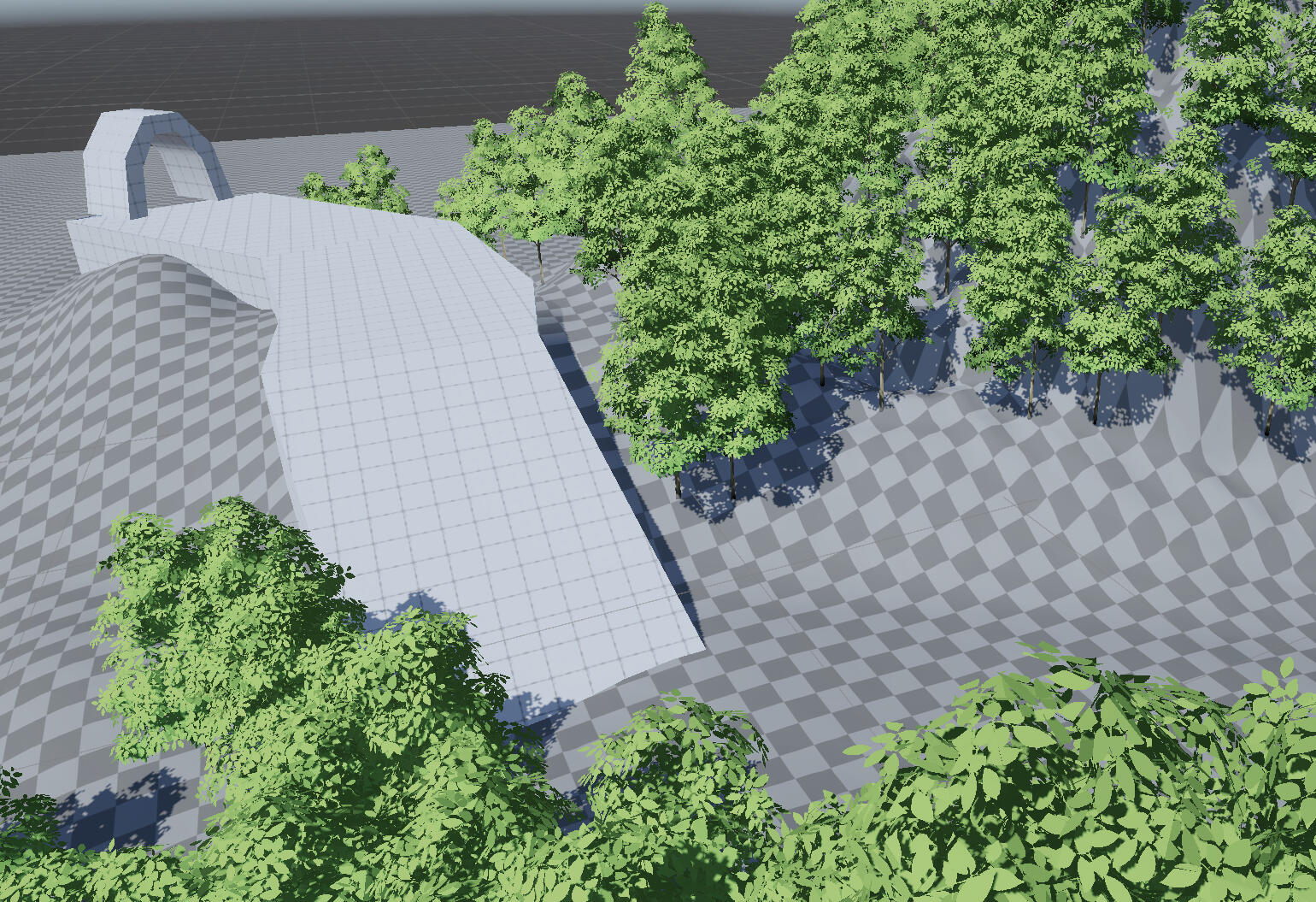
I'm going to have to put shader and model development on hold for now. The game needs an environment to play through.
I made 3 different variants for the starting area.
The first one plays with the idea of balancing sight lines between an overarching objective and a current objective. I tried to use parts of the map to show and conceal the mountain in the background (end goal) at different times while also showing something else to the player when the mountain is hidden (first the bridge, then the forest). Hiding the mountain behind the starting area was intentional. Story-wise, the protagonist has awoken with no memories, and is quite confused. I made sure that the bridge was the only thing in view to make it clear that there is no other option, and to keep the player curious about their surroundings for a bit longer.The blocked path and the cave are a bit of conditioning for the player to understand that they eventually will need to look around for a path forward.
The second one gives a much more straightforward path, and makes the paths a lot less narrow. Instead of providing clear objectives, this one tries to keep any goals out of view for as long as possible. This is to keep the player feeling a bit lost and confused, while never really putting them at any risk of getting lost due to the simple pathing. This way, only the feelings of confusion and anxiousness are imparted onto the player.
The third is mostly identical to the second, but places the mountain in plain view from the beginning. It's possible that doing this won't bring up any obvious signs about the mountain being the end goal of the game if I show it in the background from the very start. I still use some of the cliffs to conceal it further down though, just in case players want to look at it too much.
Of these greyboxes, I definitely prefer the first one. The narrower paths feel a bit more claustrophobic and tense, and in general I think the execution of objectives and sight lines is better. The cave will likely need to be removed, since it will be difficult to pull off with stock Unity terrain.
Week 9
Annotation
Game Mechanics, Narrative, and Emotions
Kayali, F., and Pichlmair, M. (2008) Intentions, Expectations and the Player. In [player] conference, 2008. CopenhagenVideo games are a powerful medium at driving emotions through interactivity. This paper explores the emotional responses that “arise as a consequence of the divergence between an action’s expected, intended and actual outcomes. Further, emotions are relative to each other and to the outcomes of other player’s actions.” (Kayali and Pichlmair, 2008) Game designers set expectations to create believable worlds which behave as the game’s structure should allow. Just like the real world, our expectations are set by our past experience and knowledge. Once a player develops expected outcomes from their actions, they become susceptible to emotional responses from every key interaction with the game’s world/mechanics, based on intended, expected, and actual outcomes. For example, the intention to succeed but expecting failure leads to stress and fear, and the actual outcome may lead to relief, joy, or disappointment.“Emotions happen at the intersection between intended, expected and actual outcomes of a situation. That means that emotions in games are necessarily different to emotions elicited by the consumption of other media. Watching a movie might make one want to step into the action and live out one's own intentions. Yet in a game this is exactly what the player can do. This ability is only realised in interactive media.“ (Kayali and Pichlmair, 2008, Exploration) The interactive component makes video games an incredibly immersive and powerful storytelling medium at conveying emotions. Game designers should integrate the emotional aspects of interacting with the game’s mechanics into their more traditional storytelling techniques and narrative design to make a more immersive experience. Game mechanics should be designed with the expectation that the player will have an emotional response, and an understanding of how a player will feel depending on the outcome.This is useful for my game as the story and the world are important parts of the experience in a souls-like game, and I plan to have game mechanics which tie into the narrative to create a more immersive and complete piece of work. I think it’s also important to consider how the core gameplay will generate emotions in the player. The decision to make a souls-like game for me at least was because I wanted the player to feel the same struggle that the main character would. I think it would be interesting to combine emotions and narrative into other areas and game mechanics.
Greyboxing
After consulting with my group, we agreed that the first level I made was the best. I removed the cave after discussing about the difficulty.
I also added a path through the forest. It should be fairly straightforward, leading to a wide open boss arena, before leading out of the forest where I plan to show a new objective (either the mountain again, or something else like a town).
It's possible that players could wander away from the path through gaps between the trees, but I'll find out later in playtesting.
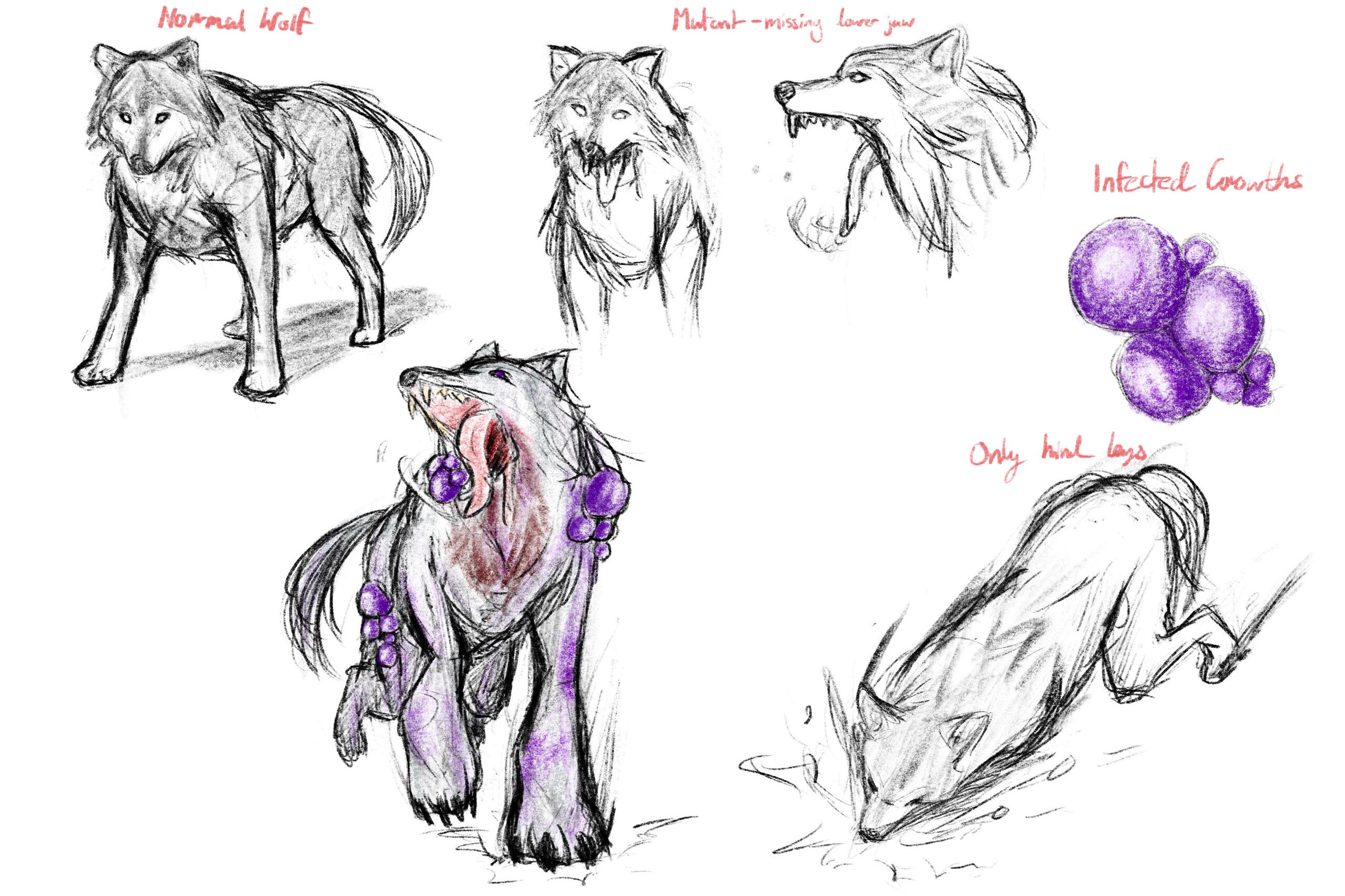
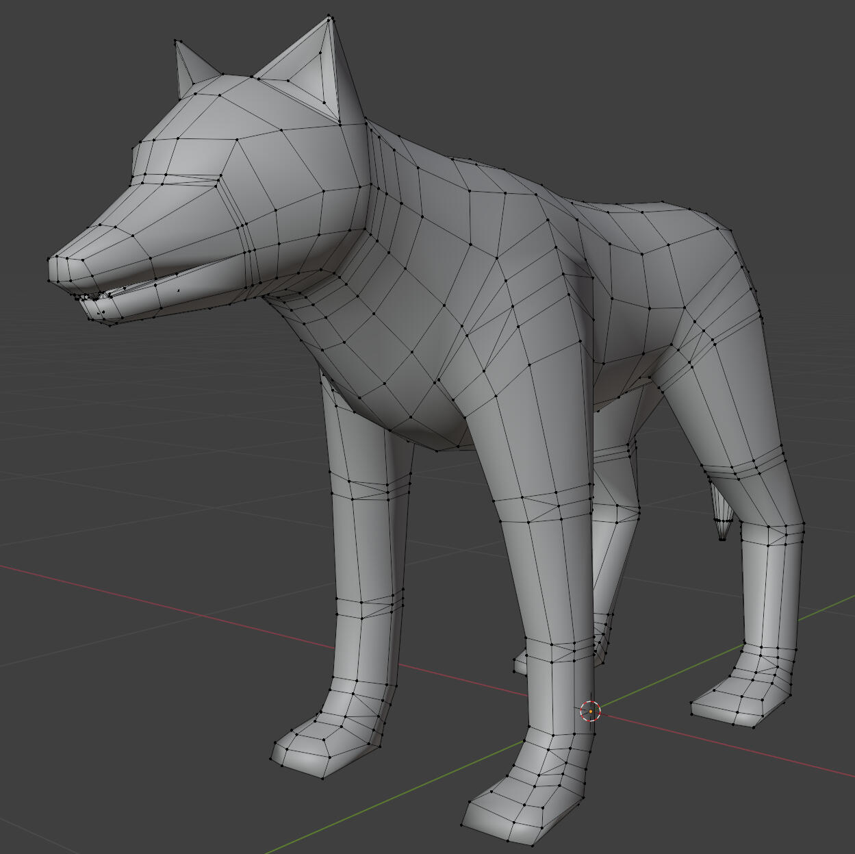
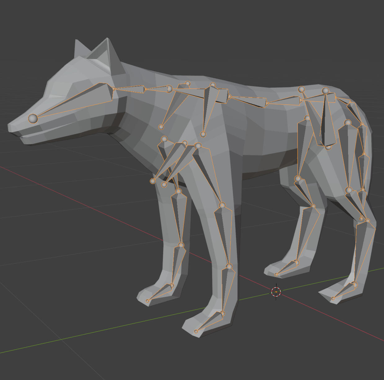
Enemy Model
I also modelled a basic wolf enemy. I rigged it using a quadruped metarig, though this required modifications to add bones for the jaws and tongue.
Week 10
Annotation
Colour Analysis
Geslin, E., Laurent, Jégou & Beaudoin, Danny. (2016) How Color Properties Can Be Used to Elicit Emotions in Video Games. International Journal of Computer Games Technology, Volume 2016More advanced colour analysis methods and tools can be used to develop more effective colour palettes for evoking the desired emotions in a video game. In this article, screenshots from 24 different games were analysed based on their RGB and HSV components. These were then shown to participants in an online questionnaire to measure emotional valence, arousal, and domination. The results were used to develop a tentative circumplex model to assist in colour scripting scenes in a video game. The method for usage of the circumplex model is “first defining in advance what kind of emotion the environment should induce and then setting this emotional valence and arousal in the circumplex model” (Geslin, et al., 2016).
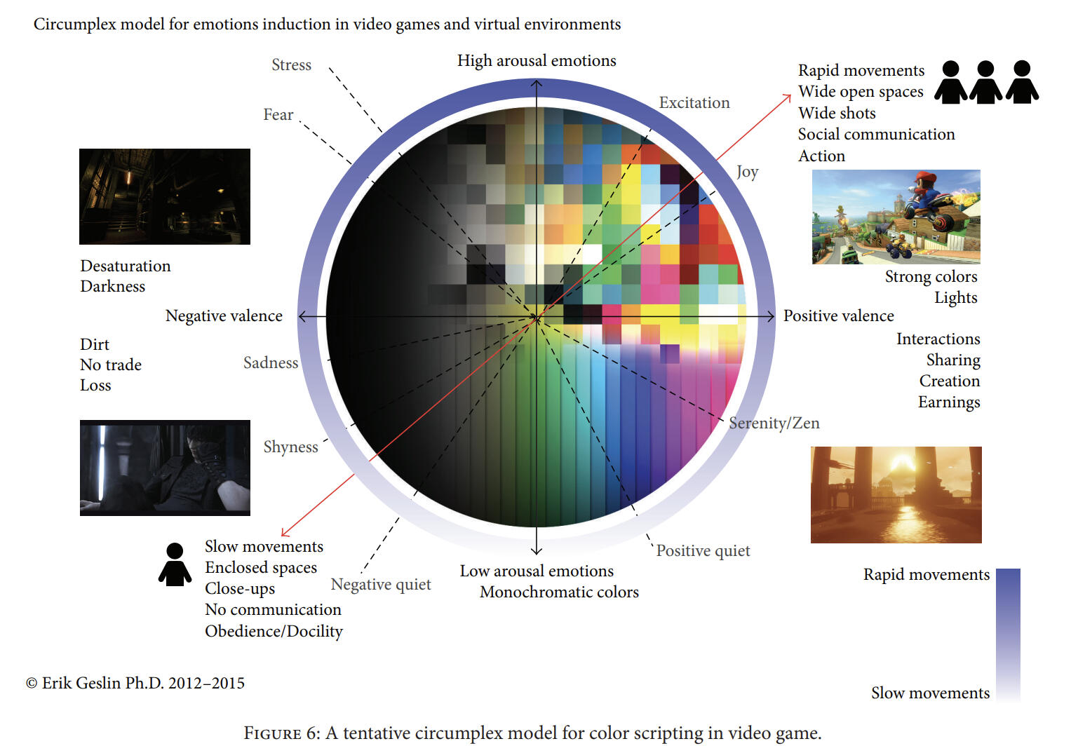
Analysing the entire frame can be useful to make a more cohesive colour palette and scene than making adjustments to individual objects or only the environment. It’s also important to consider that things are always in motion in a video game, so you can’t rely on a single element of the game environment to remain on screen. A full frame colour analysis can provide a lot more quantitative information, and it should be more effective to utilise everything on screen when colouring a game. It is important to consider though, that this circumplex model can only be treated as a generalisation of the relation between colours and emotions, as the responses have only been recorded as qualitative data through a questionnaire.It may be helpful to me and my research to conduct similar testing and frame analysis on prototype builds of my game. There’s a certain atmosphere to souls-like games which I want to capture in my game through a more stylised visual aesthetic. The colour palette and colour design will likely lend a huge role in achieving the feel and emotional impact that I want in my game. A quantitative analysis of game environments I have been inspired by will help inform my own design decisions when colouring and making shaders for my game.
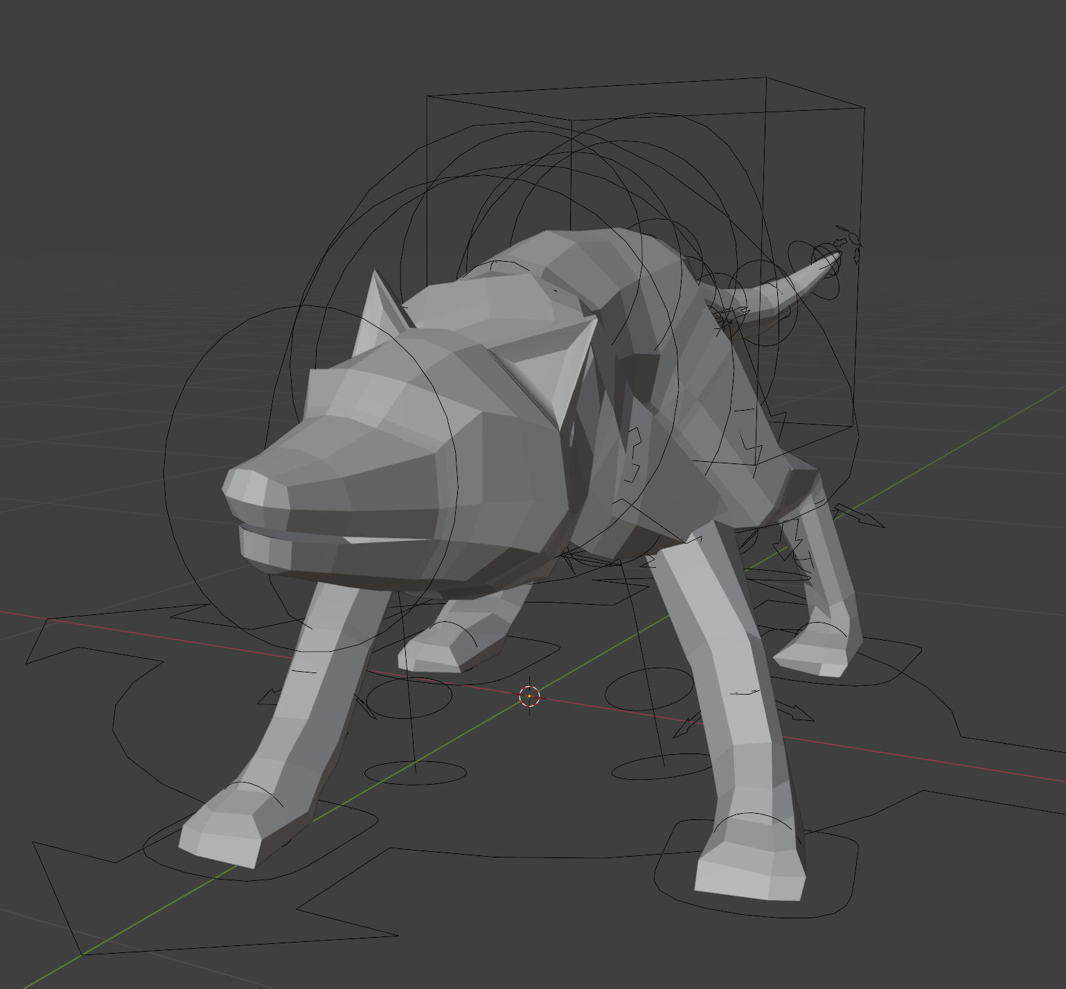
Animation
I made some basic animations for the wolf. I intend to replace these with higher quality animations later. Whether I make all those animations or use online assets will depend on how much time I have.
I've thought about developing a procedural IK system for more accurate foot placement and more natural quadruped walking. Problem is that it will take a lot of time, especially since I don't know exactly how to do it. It's a problem for future me to deal with if I really want to.
Playtesting Notes
Every bit of playtesting feedback called the enemy a dog. I'm not exactly sure what to do about that right now, but I'll hope that resolves itself once it's all textured. Maybe the colour of the fur will make it more obvious.
No one gone lost in my level design unless they were trying to. Feedback unanimously agrees that the layout is very clear and easy to follow. My own observations mostly back this up. I can only say mostly, because many tried to take shortcuts by jumping off the path early in two specific spots.
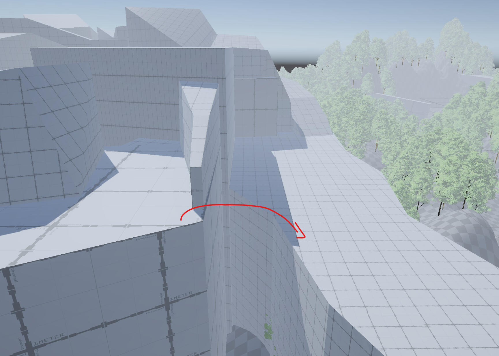
This one always ended in failure, with the playtesters getting stuck after missing the jump.
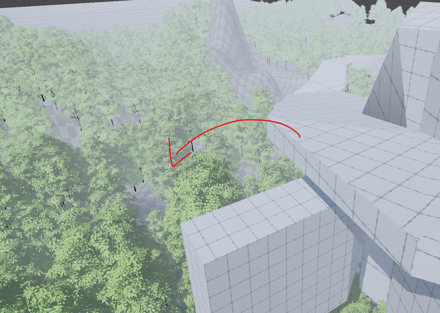
Playtesters kept jumping into the trees and then getting lost in the trees unless they found the path (most of them didn't).
I'll need to add some protections against players trying to skip the level.
Methodologies
Experimentation
• The process of testing different variables and evaluating outcomes.
• Made multiple different versions of the shader with unique/unusual features along with adjustable parameters to test different shading boundaries and colours.
• Unity Shadergraph + Visual Studio Code - PC
• Experimenting with the shader beforehand would inform me of any limitations due to my own skill/implementation of custom shading, and could help me tailor my art style ideation to the results I was able to achieve in engine. It also allows me to see or feel firsthand, the emotions I can evoke by adjusting my shader. "The overarching goal for this type of design experimentation is to explore the design space of game design, by understanding more about the behaviour and experiences that a design choice will evoke in players," (Back & Waern, 2015)Sketches
• Making quick/rough drawings to visualise ideas prior to execution
• Drew sketches to visualise how stylised faces and face shading should look
• Clip Studio Paint – PC / Procreate - iPad
• Sketches are a quick and easy way to get my mental images/ideas out for both individual and team evaluation. Sketches allow me to show instead of tell, "The power of articulating an idea and letting go if it to see how people understand them. Sometime we can be surprised by an interpretation, which then triggered another idea,” (Alfayard, 2023).
My testing and experimentation with the shader falls under the methodology of iterative design, whereas my sketches and concept art fall under previsualisation. In regards to answering my research question, I will need to employ some different methods to expand upon my experimentation. I will need to gather feedback through playtesting and questionnaires in order to gauge how the visuals impact the feelings of players. Emotional responses are subjective, so I can't rely on a single case by asking these questions to myself.Waern, A., & Back, J.(2015). Game Research Methods; In: Lankoski, P. and Holopainen, J. (2017). Game design research. An introduction to theory & practice. ETC Press.Alfayard. (2023) Sketching for Collaborative Ideation. Design Thinking for Social Innovation.
Week 11
Annotation
Design by Subtraction
Team Ico. (2001) Ico. Sony Computer EntertainmentIco has left a lasting impact on the games industry, inspiring many of the games which came after it, including Demon’s Souls and Dark Souls. However, aesthetics and interactive storytelling aside, one of the lasting philosophies from Ico is director Fumito Ueda’s ‘design by subtraction.’ Design by subtraction is a minimalist approach to game design, where mechanics and game elements which do not contribute to the desired experience are stripped away until you have what is effectively the ‘essence’ of your game (Emasiri, 2017). Ico is a game about Ico, a young boy, helping Yorda, a young girl, escape from her mother’s castle despite having no ability to communicate verbally due to a language barrier. Due to the language barrier, the two have very little dialogue, and their relationship is conveyed solely through gameplay mechanics.Ico’s story is told almost exclusively through gameplay by making the player engage in guiding Yorda through the castle while holding hands. The sections where Ico is separated from Yorda and must make a path for her conveys the connection between the two through gameplay integrated directly into the puzzle design and mechanics, thus removing the need for long cutscenes and dialogue. This allows a later section of the game to make the player feel vulnerable simply by removing Yorda from the game (Game Maker’s Toolkit, 2015), which then motivates the player to progress and reunite Ico with Yorda, providing a more immersive emotional experience. The game has no HUD or UI, and the combat mechanics are simple and repetitive, mirroring the desperation and sole objective of Ico, which is to protect Yorda. In my opinion however, the combat mechanics result in some of the longer combat sequences feeling boring and drawn out, which may explain the addition of more mechanics in Ueda’s next game Shadow of the Colossus.Ico is one of my favourite games ever, and I found the design philosophy to be refreshing in the current game landscape where seemingly every AAA game has rushed to push out games with trending mechanics (e.g: Breath of the Wild lead to an influx of open-world games across every genre both within Nintendo and other developers). While I don’t intend to strive for absolute minimalism, I think it’s important to consider which mechanics really matter when designing games. Souls-likes are lauded for their immersive gameplay and world design, so I’d like to employ design by subtraction to cut mechanics which take away from the essence of my game.Other References:
Emasiri, D., (2017) Ueda’s Legacy – Design By Subtraction. Sporadic Musings.Game Maker’s Toolkit. (2015) Ico and Design By Subtraction. YouTube.
WOlf Model
I added some orbs to the wolf's body similar to how I had originally drawn in my concept art. These have been attached to the same rig.
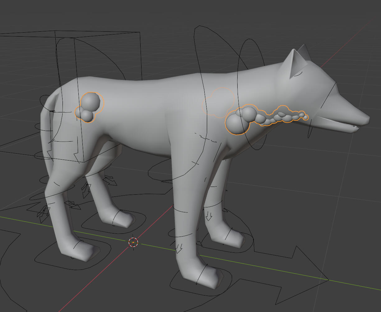
Boss RIg
I got the model for the first boss from our character designer Philip. They're a bit inexperienced with 3D modelling, so I had to make some geometry fixes. This took longer than I thought it would, but I did clean it up eventually.
Inside the mouth)
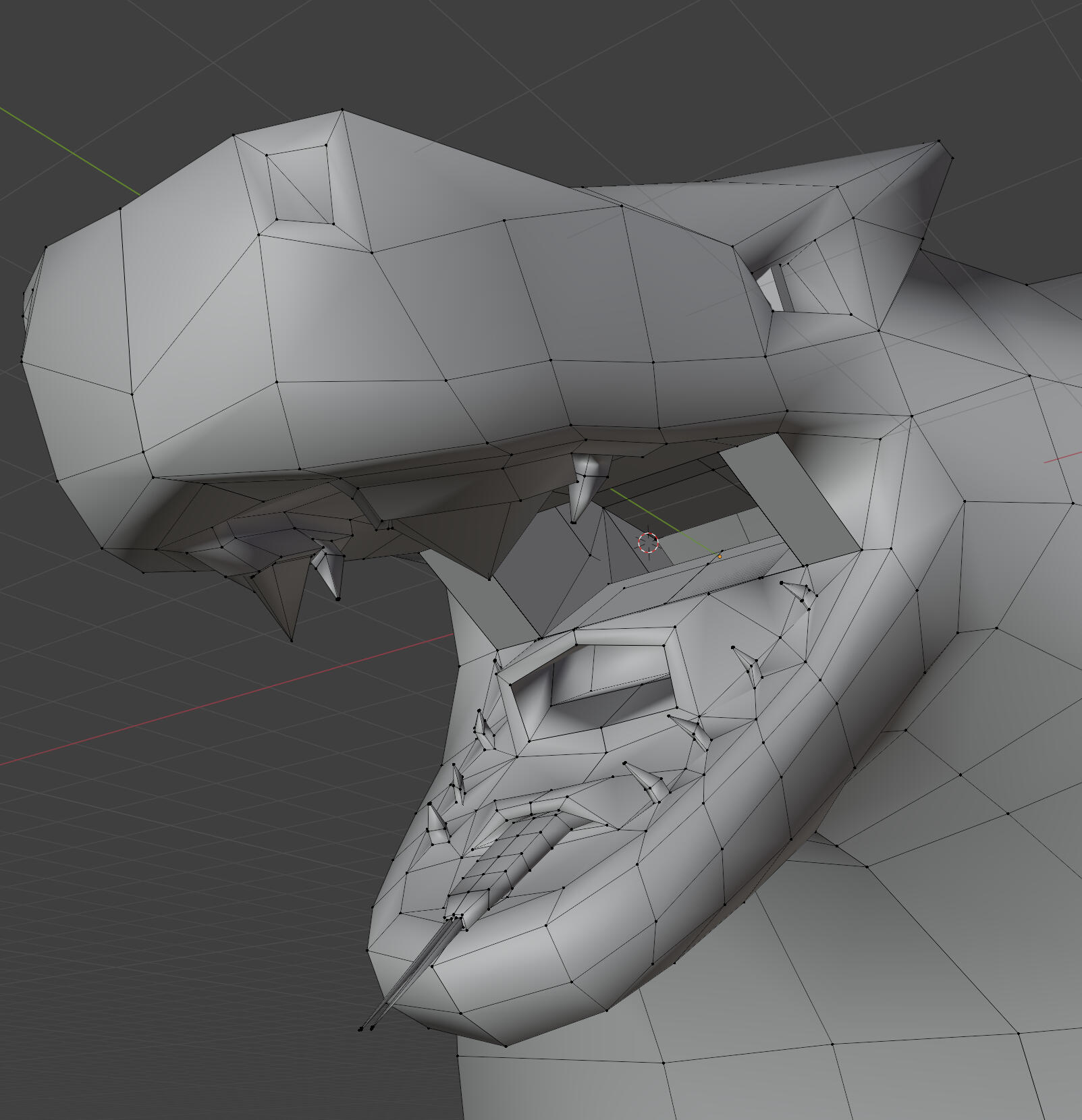
(Base of the tail spike)
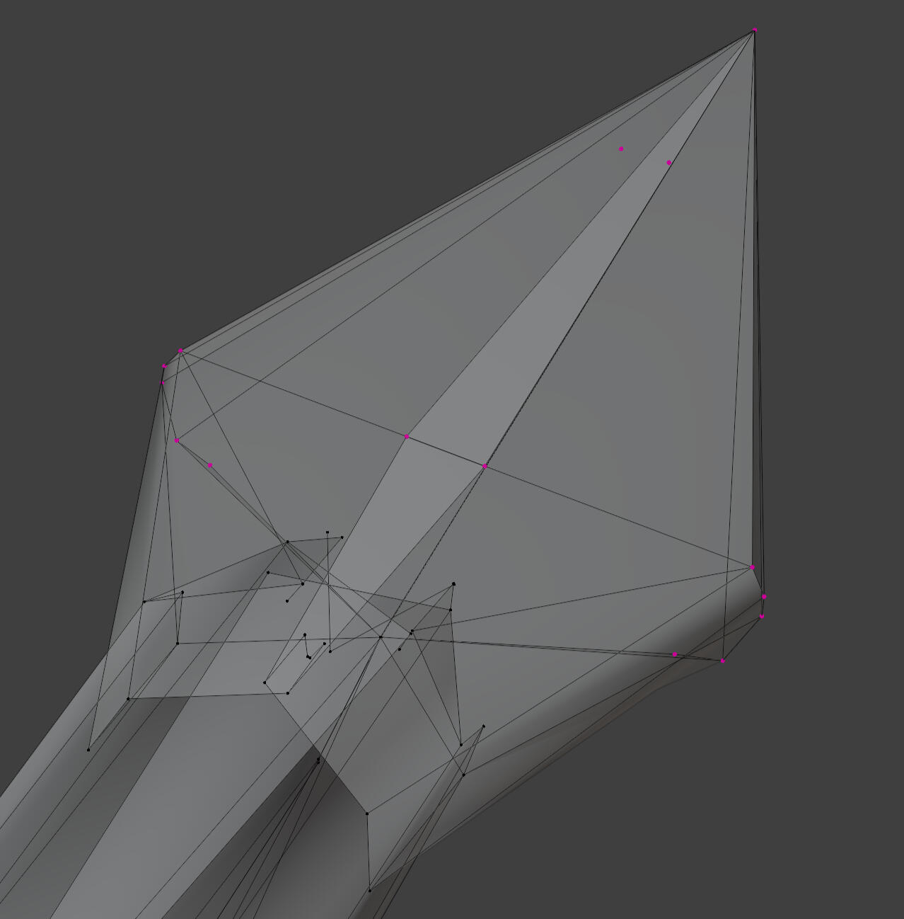
I rigged this model starting with a basic quadruped metarig, then removing the limbs and extending the neck and tail bone chains. In hindsight I probably should've just made my own rig from scratch, but I can do that another time.
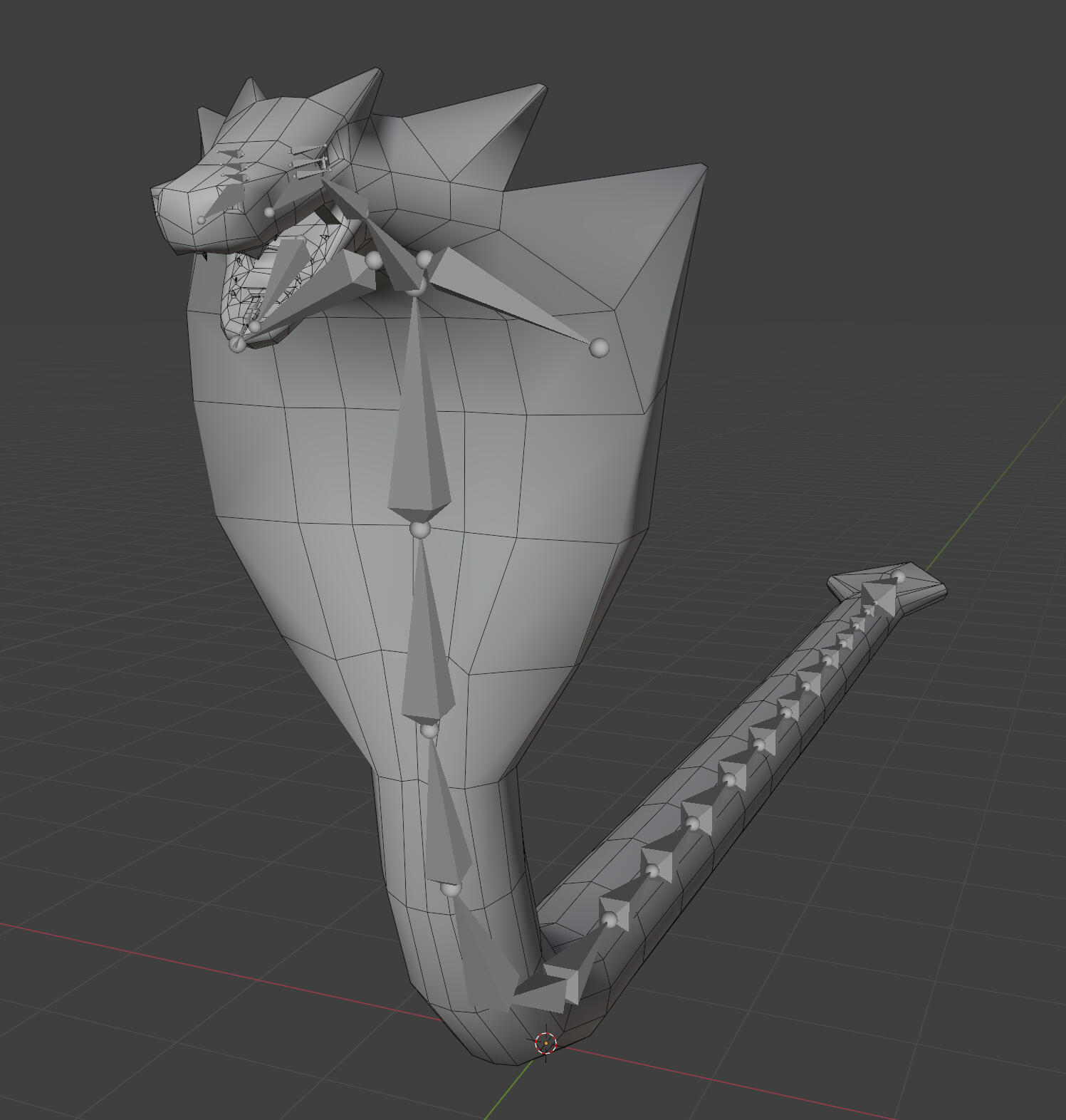
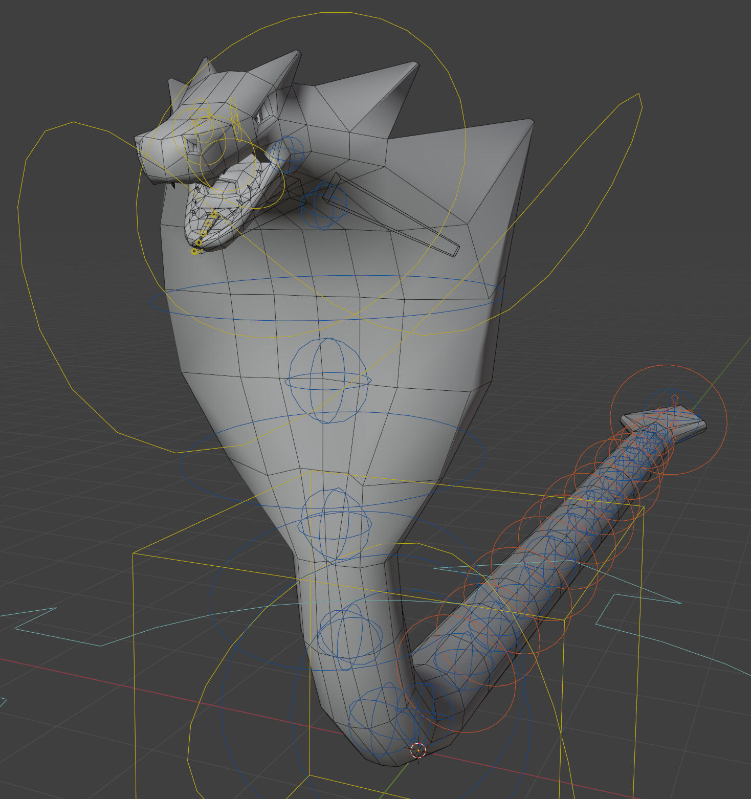
Week 12
Last week I caught a flu and have fallen very ill. I've felt very weak and have very little energy or motivation to do work, so my work from these last 2 weeks is a bit disappointing, but I've done what I can.
Boss Animation
There are three attack animations for the boss. The quality isn't really the best that I can do, but I'll have to leave it for later. After some discussion with my group, we decided we should have the boss primarily move while underground, hence the burrow and emerge attacks.
I think I should use a separate tail model for attacks so that I can place an IK target on the player for dynamic aiming of the attack.
Unfortunately I'm out of time for now. It's a bit of a disappointing end to the semester and quite frustrating to have motivation and good momentum cut short, but it is what it is. I'll just have to catch up over break.
Capstone Project
Catchup
Something I intended to do last semester was animate some attacks for the first boss fight. I ended up getting very sick and forcing myself into doing an absolutely terrible job. I took my time and prepared some sketches this time to plan out the boss's moveset with my team.
moveset sketches
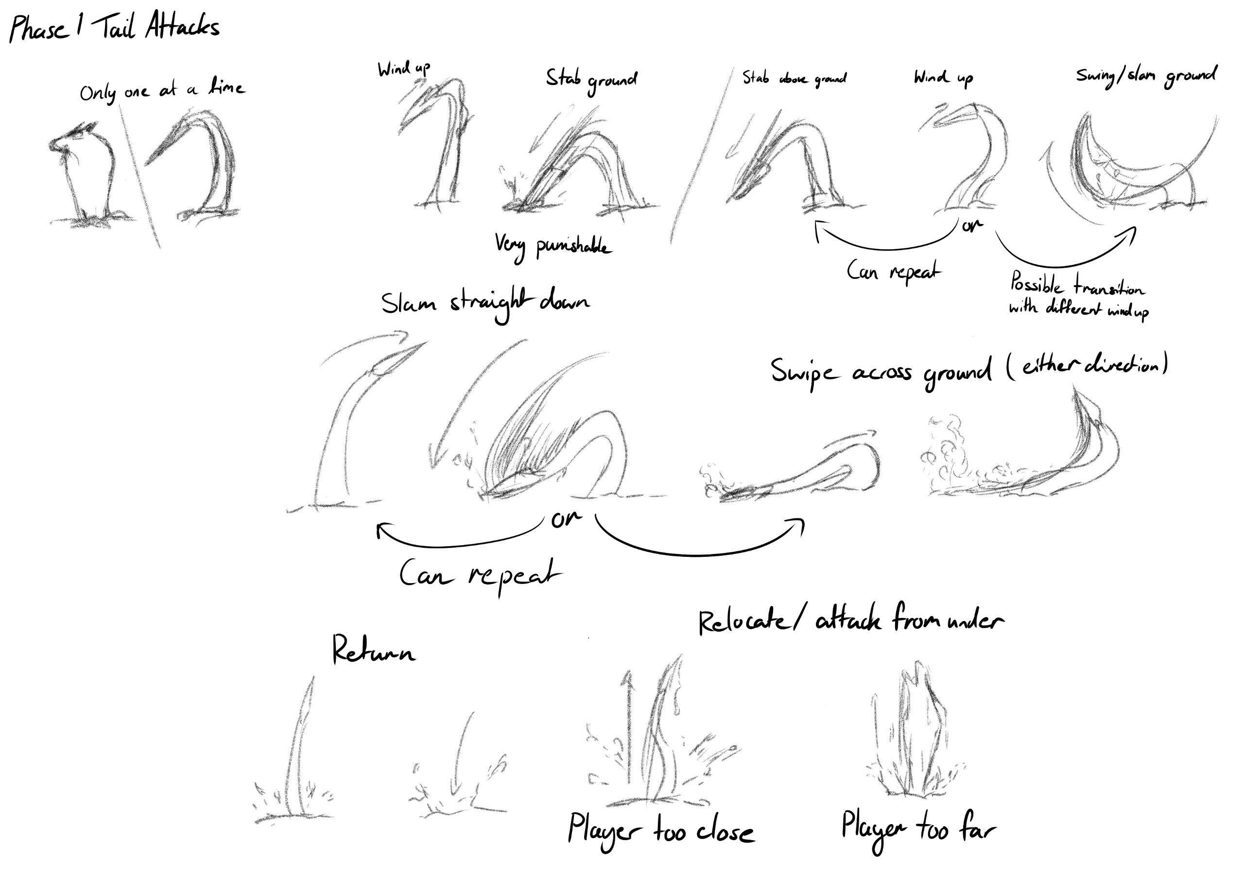
Character-wise, the Earth Guardian is a recluse as they never leave the bounds of their forest. This gave me the idea to have the boss remain partially hidden/protected by staying underground for the first phase. They would only expose one end of their body at a time, and would relocate by burrowing underground. Admittedly, it was very difficult to come up with an interesting moveset, so I tried to make each attack part of a potential combo.
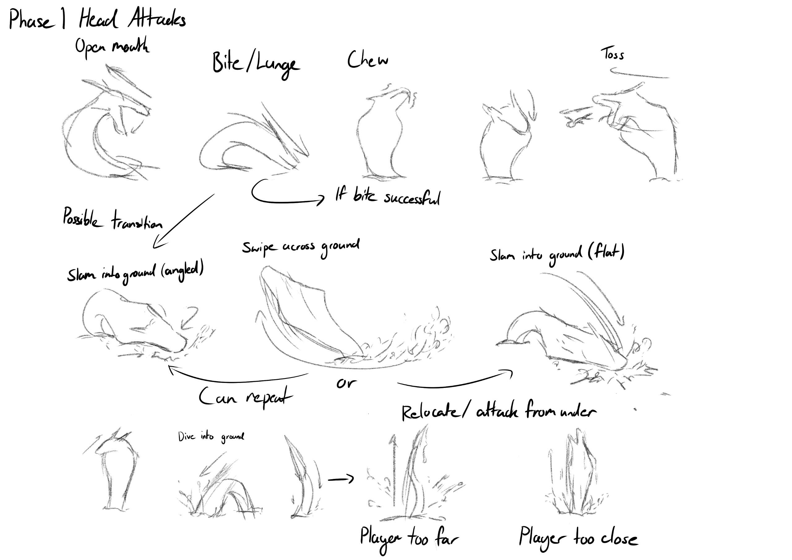
Designing a moveset around the head was even more difficult, but I tried to follow the same idea that every attack could be part of a combo. The continuation of the bite attack was removed due to technical concerns from my programmer.
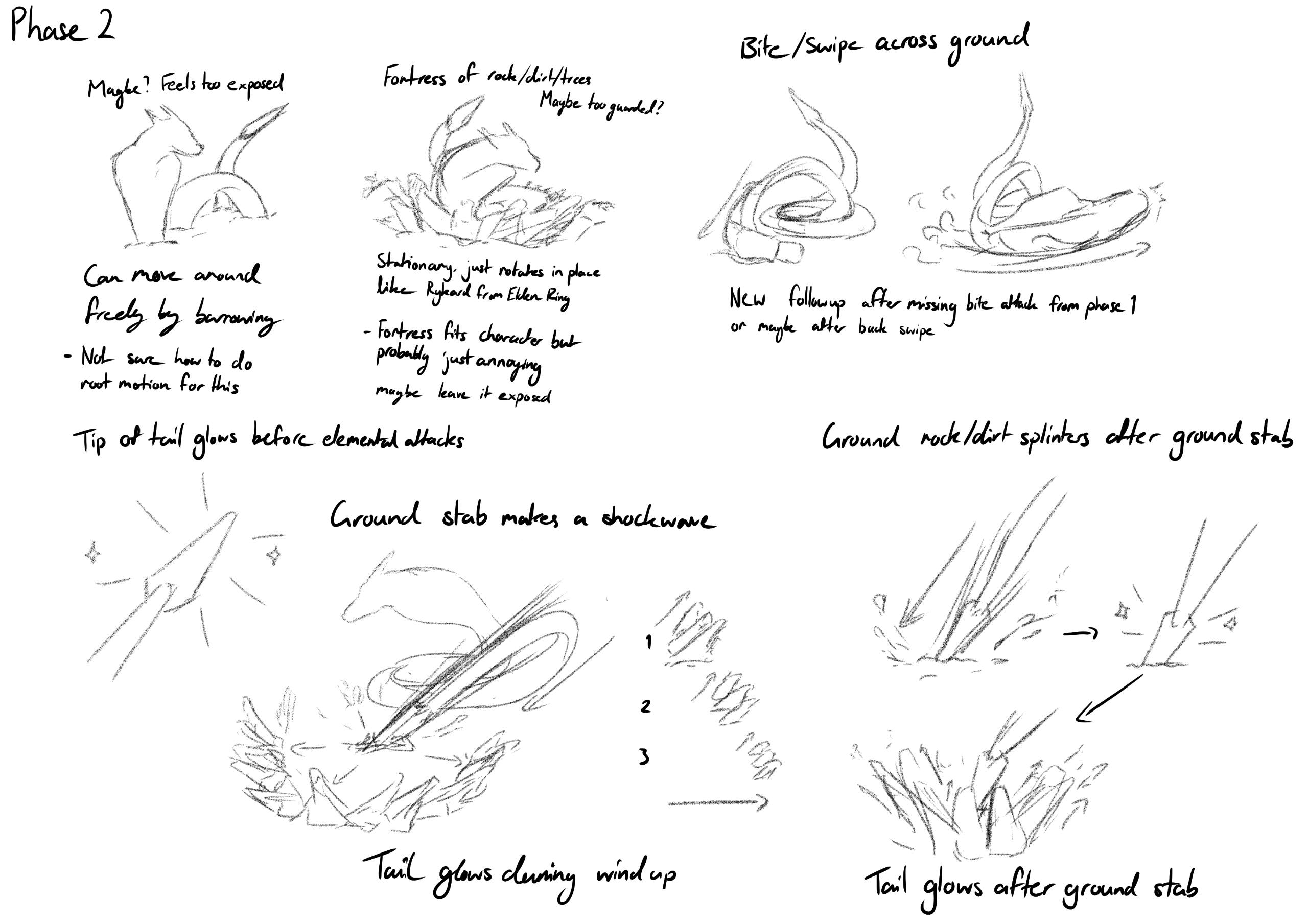
I had the idea to bring the entire body out for phase 2 as a show of desperation from the Earth Guardian, but realistically it was okay to just have both the head and tail active at once as the benefits and trade-offs are the same (they can attack more, but are more exposed to taking damage).
model and rig setup
I made a couple adjustments to the shape of the Earth Guardian's head and body just to make it look a little bit more natural. The body was also repositioned flat in preparation for a new custom rig. I took care to make sure I didn't deviate too much from the original design.
before
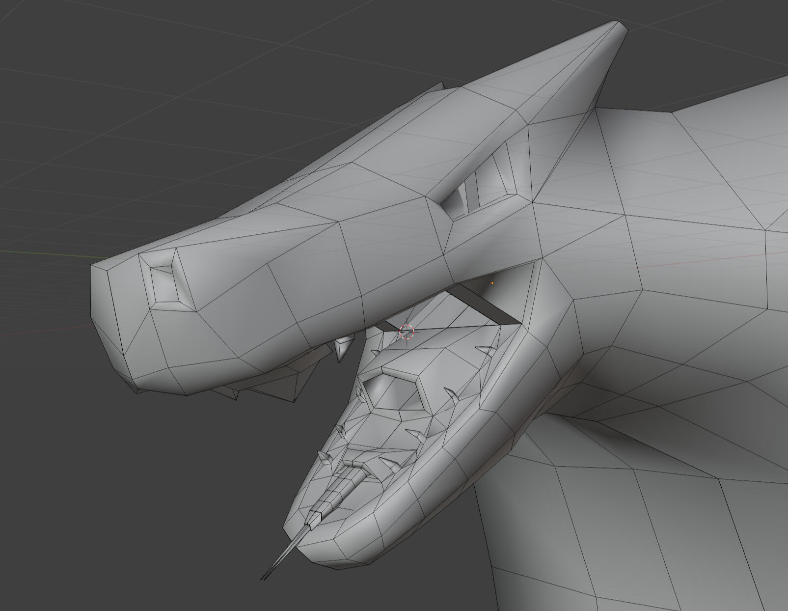
after
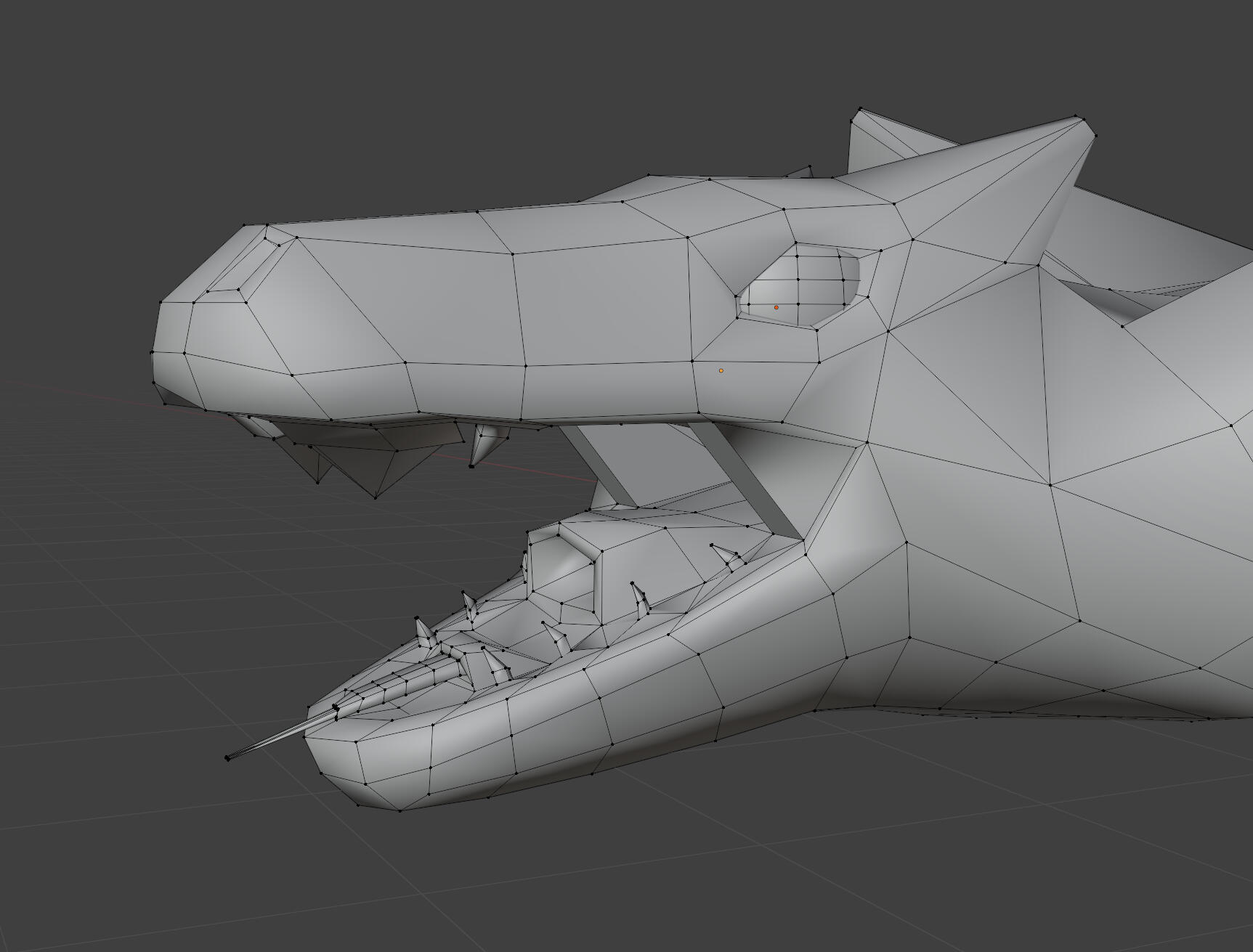
The custom rig has manual IK constraints that I've set up myself, so it should be a lot easier for me to animate. This will also let me reuse the IK bones when setting up IK in Unity.
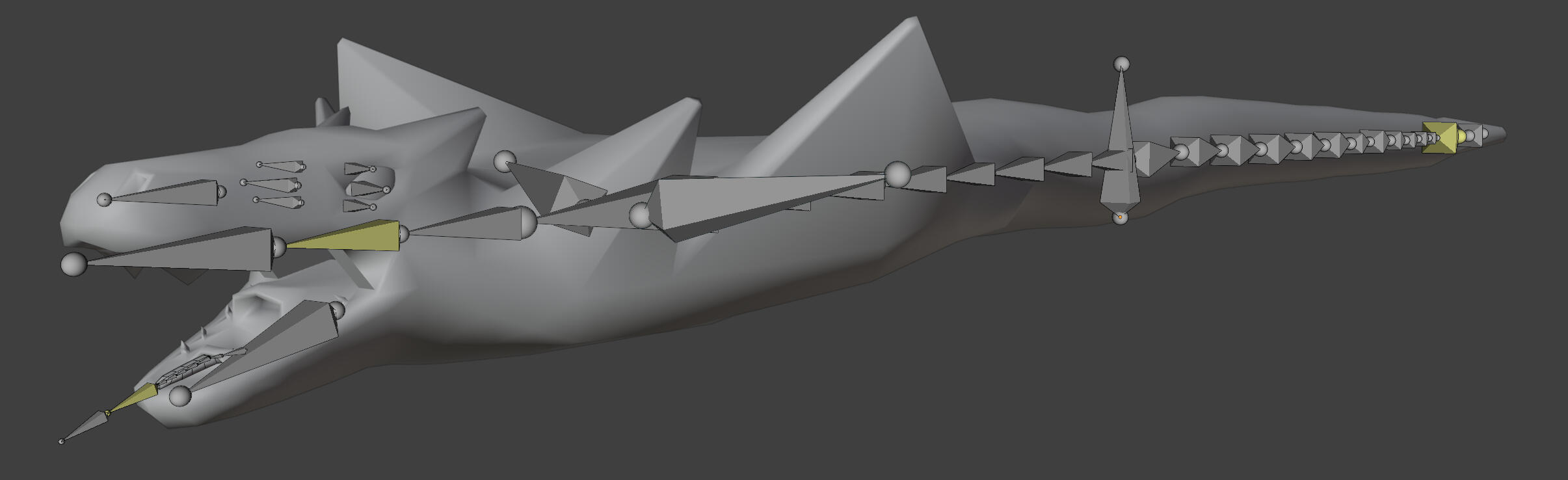
The tail used in combat will be a separate model to make it easier for our programmer to implement. This should also make IK setup and animation a lot less complicated.
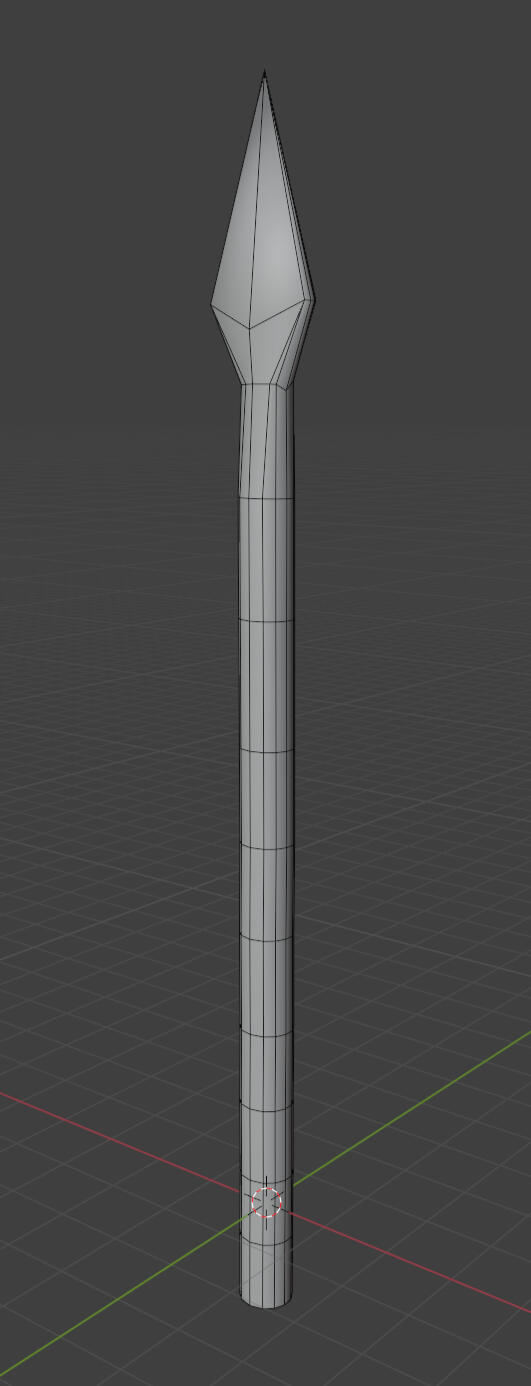
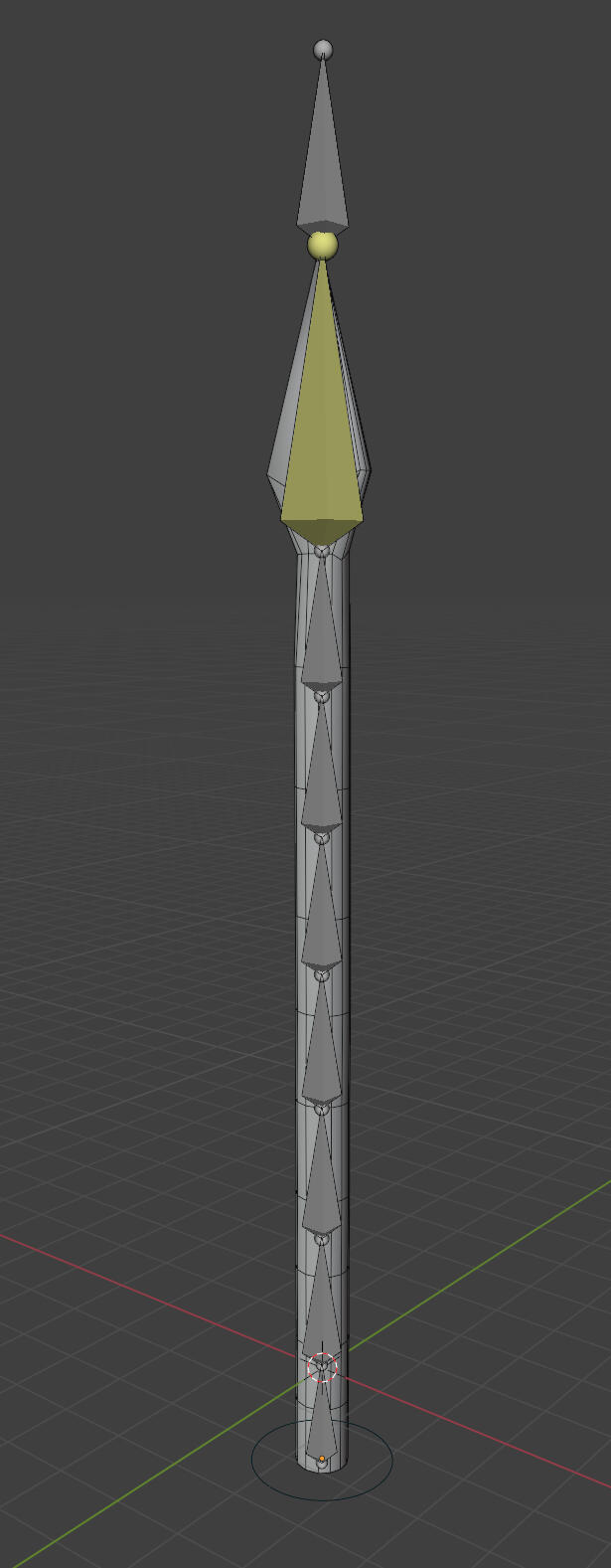
animations
These animations were pretty tough to make, especially for the body, as the rig just didn't want to behave with some rotations. Overall I'm happy with how these turned out. Something I seemed to change my mind on with each animation was how quickly the boss can move. I couldn't seem to decide if I wanted this giant creature to move slowly with a lot of air resistance, or if I wanted it to move unreasonably fast for its size. The animation speeds can be adjusted in Unity for balancing the boss fight, but I'll be ready to retime any animations if necessary.
unity rigging
I made a test scene to try out Unity's animation rigging features. This can be used to aim the attacks directly at the player, which should make the boss fight more difficult, and more immersive. The tail was tested first, so I set up more of the animations. The body was mainly used to test if root motion and animation rigging would play nice. Thankfully they seem to work fine.
Week 1
Wolf Model Adjustments
During playtesting last semester, many people referred to the wolf as a dog in their feedback. I made some adjustments to the model proportions to give the neck and torso a bit more volume to look like it has a bit more muscle mass.
before
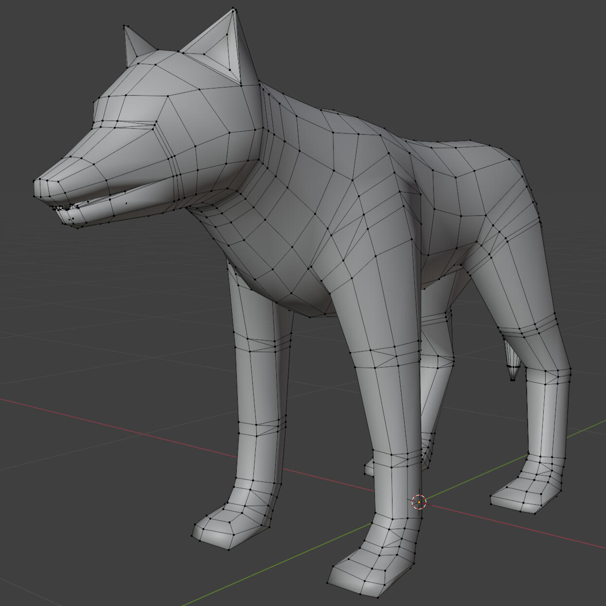
after
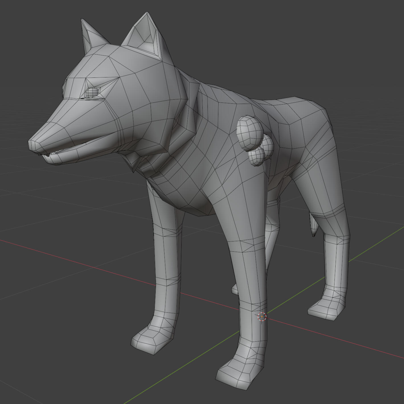
I didn't notice it while working on it but the snout is a bit too long, and the eye sockets aren't quite deep enough. It still kind of looks like a dog but I need to move on, so I'll note this down as something to polish later.
Texturing
I'm texturing with flat colours as the characters will be cel-shaded. I've used fill layers and have painted masks by hand. I'm using masks so it's easy to change the colours of each section later.
I did some experimentation with the colours to see what I liked. I found that the contrast with only two tones was a bit too cartoony for my liking, so I added a mid-tone. For now I've landed on something with a slight brown hue for a more natural colour.
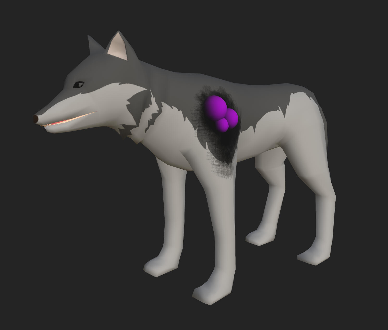
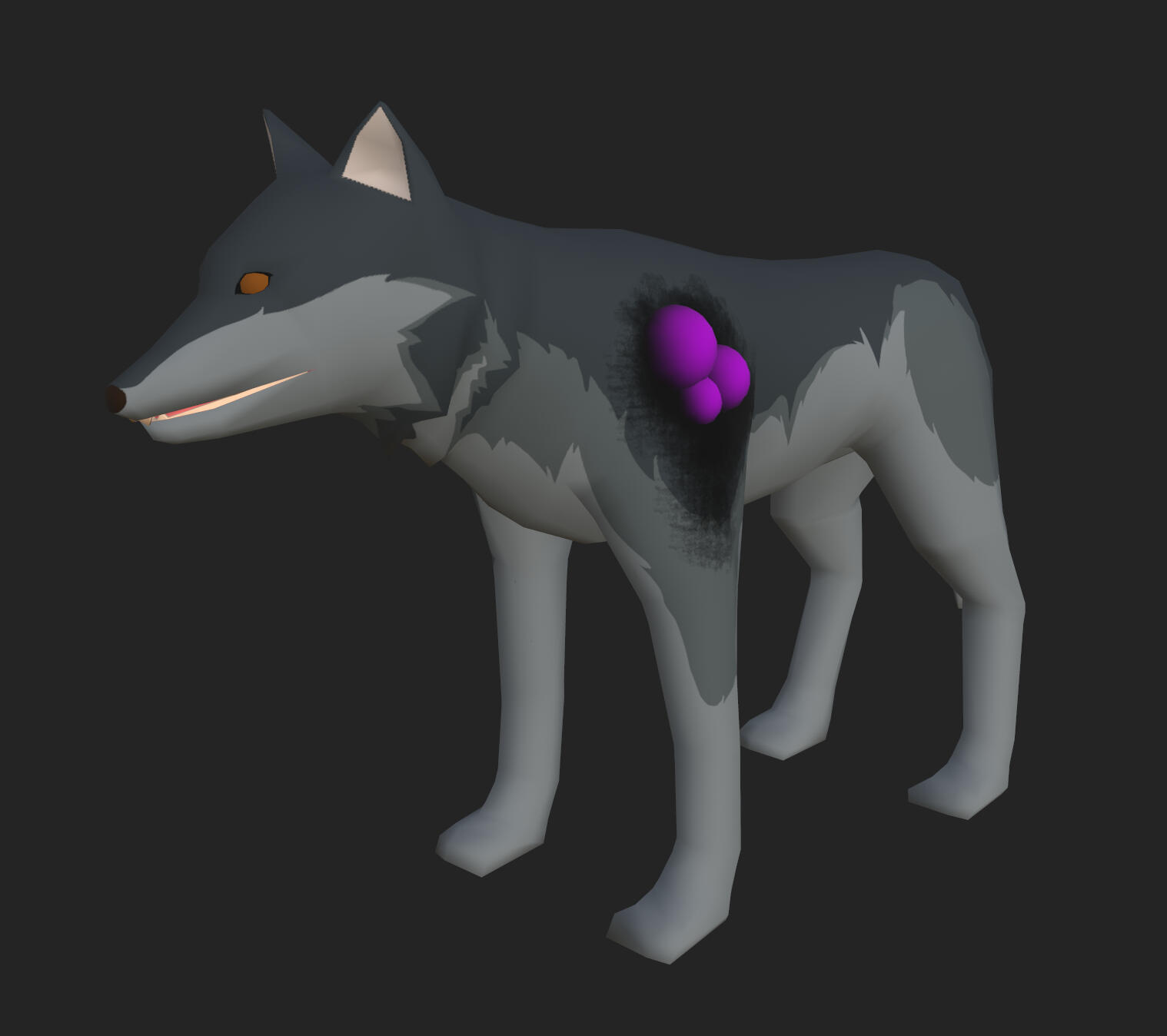
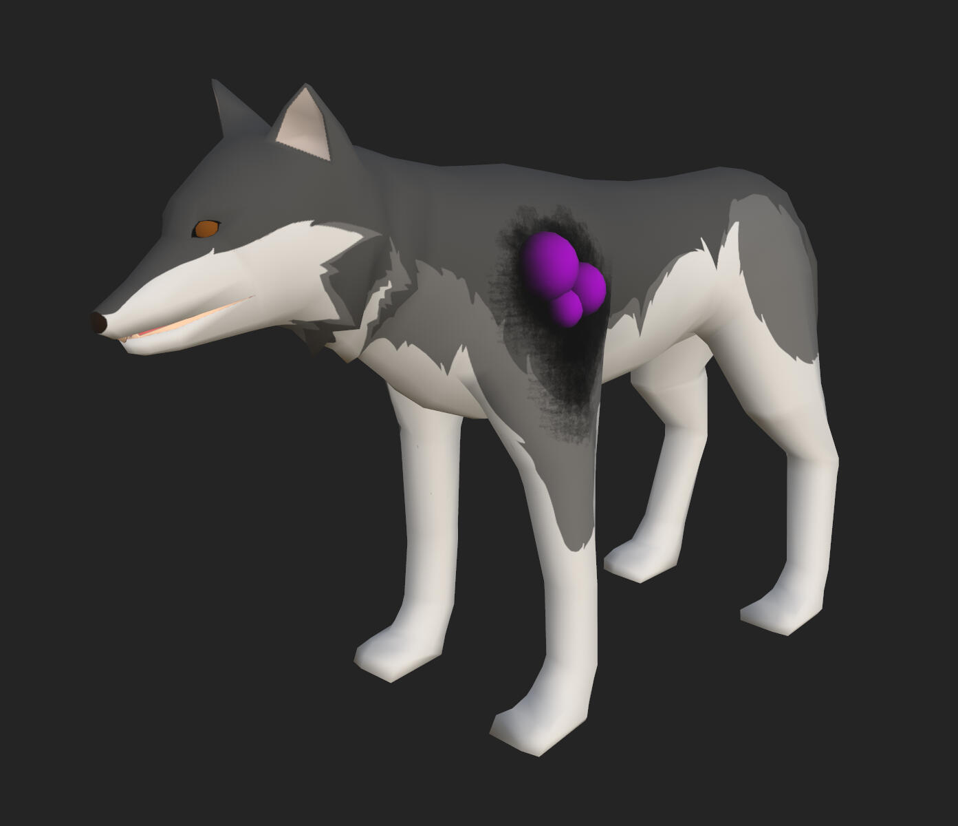
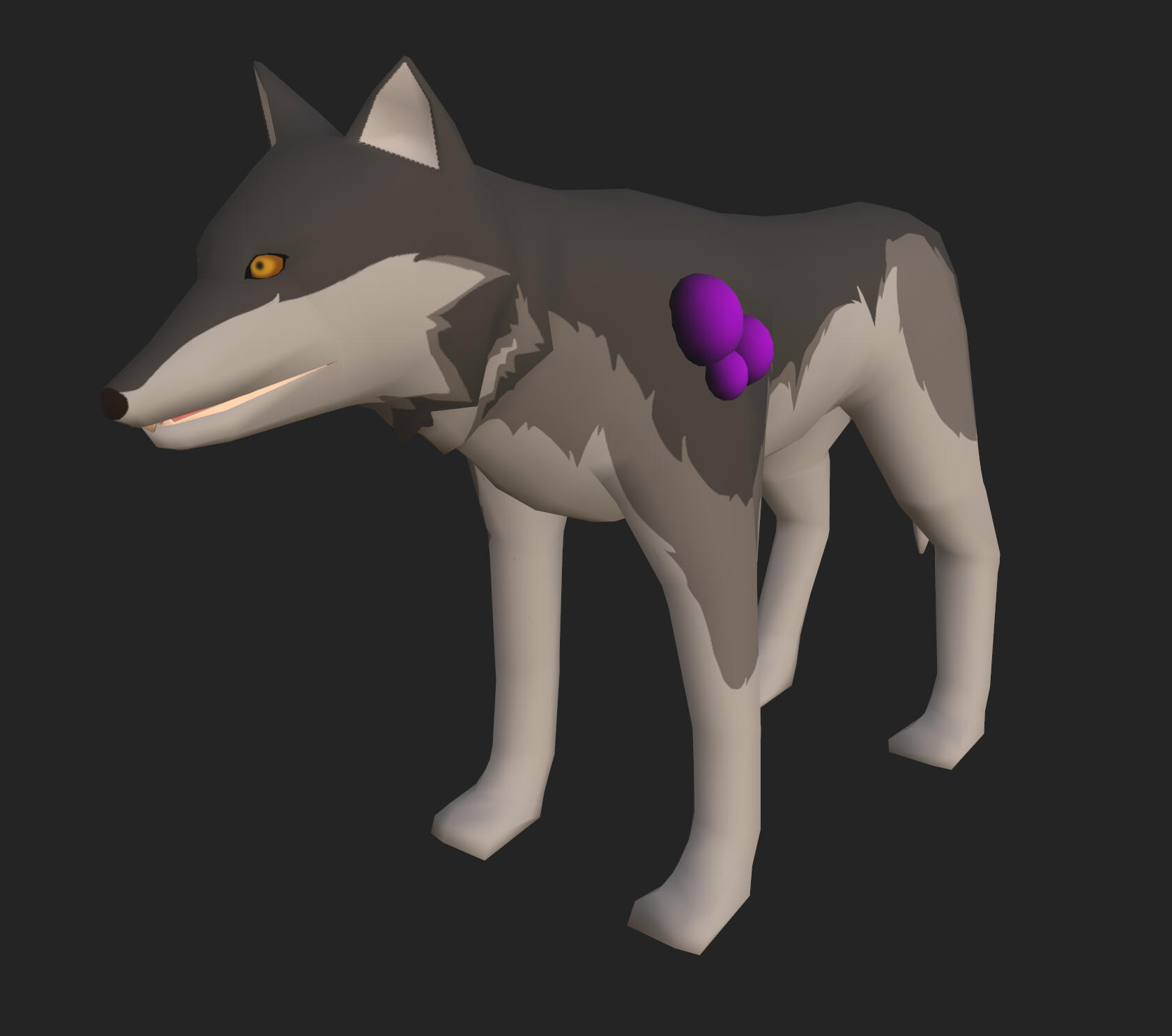
In Unity with the proper shaders, the model does look a bit better, though the differences between the shader and Substance makes it a bit more difficult to get the exact look I want. For now this is good enough though.
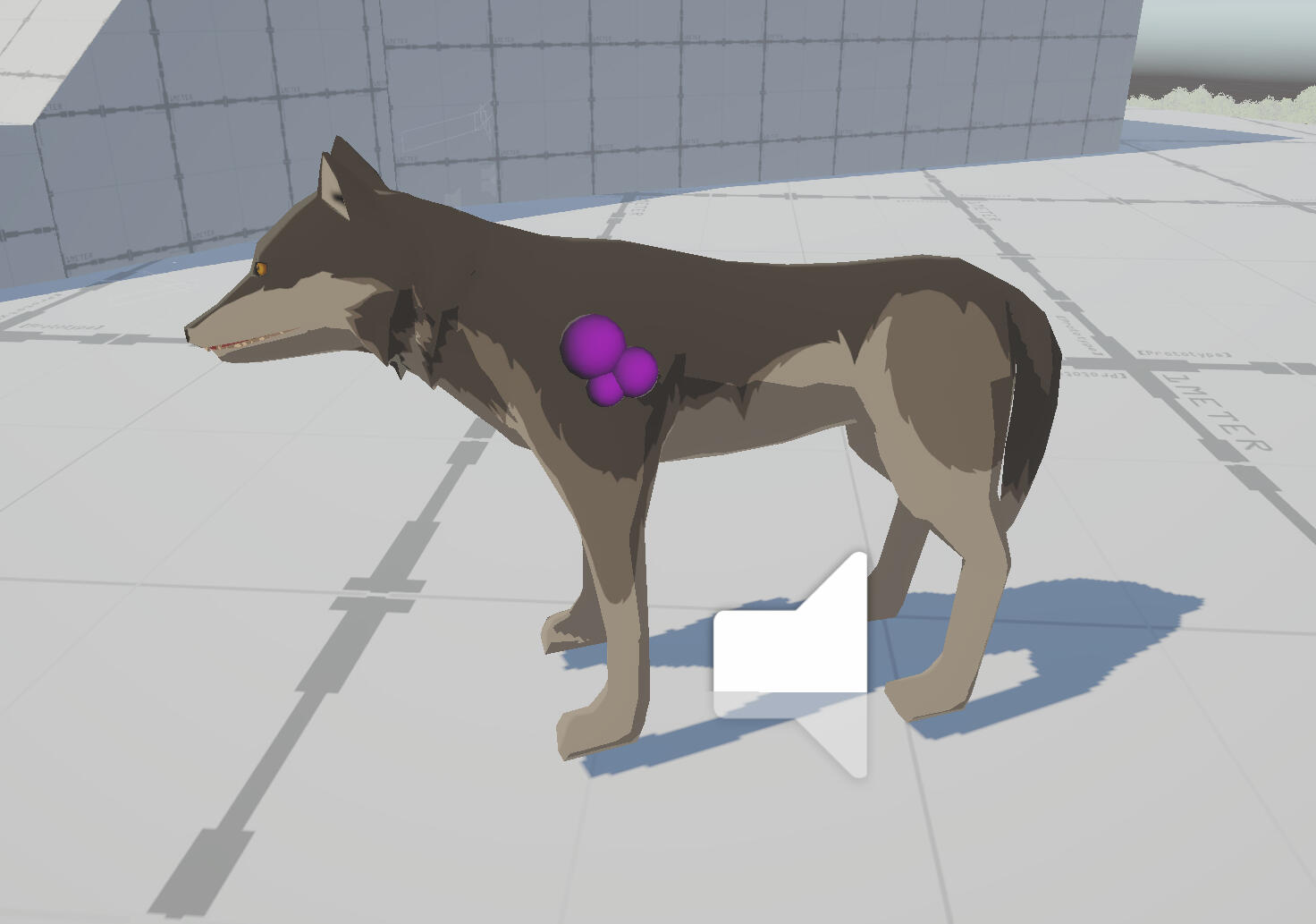
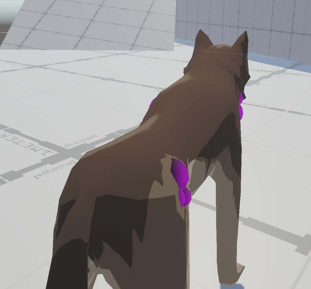
I've made the rim lighting a bit dimmer and smoother to behave a little bit more like fur. The subsurface scattering colour has been set to a deep burgundy to add a subtle gradient to the fur. I'm quite pleased with how the SSS feature is working, because it means the texturing doesn't need any gradients which might look weird over UV seams.
Animation
I spent some time polishing the old animations. I did this mostly by giving the head, torso, and hips some more movement with slight delays in timing to give a sense of weight transfer in the movements. Adjustments were also made to the posture to bring the head and neck down after looking a bit more carefully at reference footage of wolves in motion.
Old
NEW
I also added some new animations for a second attack, turning, and poise break. I gave the larger turnarounds motion to make the movement look a bit more natural.
Some of the older animations still look a bit rigid, especially with the head and tail movements.
I ran into an issue with stretching. The animations with root motion in this set don't loop, so Unity wouldn't correct them automatically. I found out that
non-deforming bones were exported even though I ticked the option to leave them out, so I had to convert the rig to contain only deforming bones. The rig conversion isn't difficult, but it would be best to avoid using rigify from now on, as the FBX wouldn't export with animations until the actions assigned to the original control rig are deleted. This means it's impossible to edit the animations, so I'll be setting up IK and constraints manually next time.
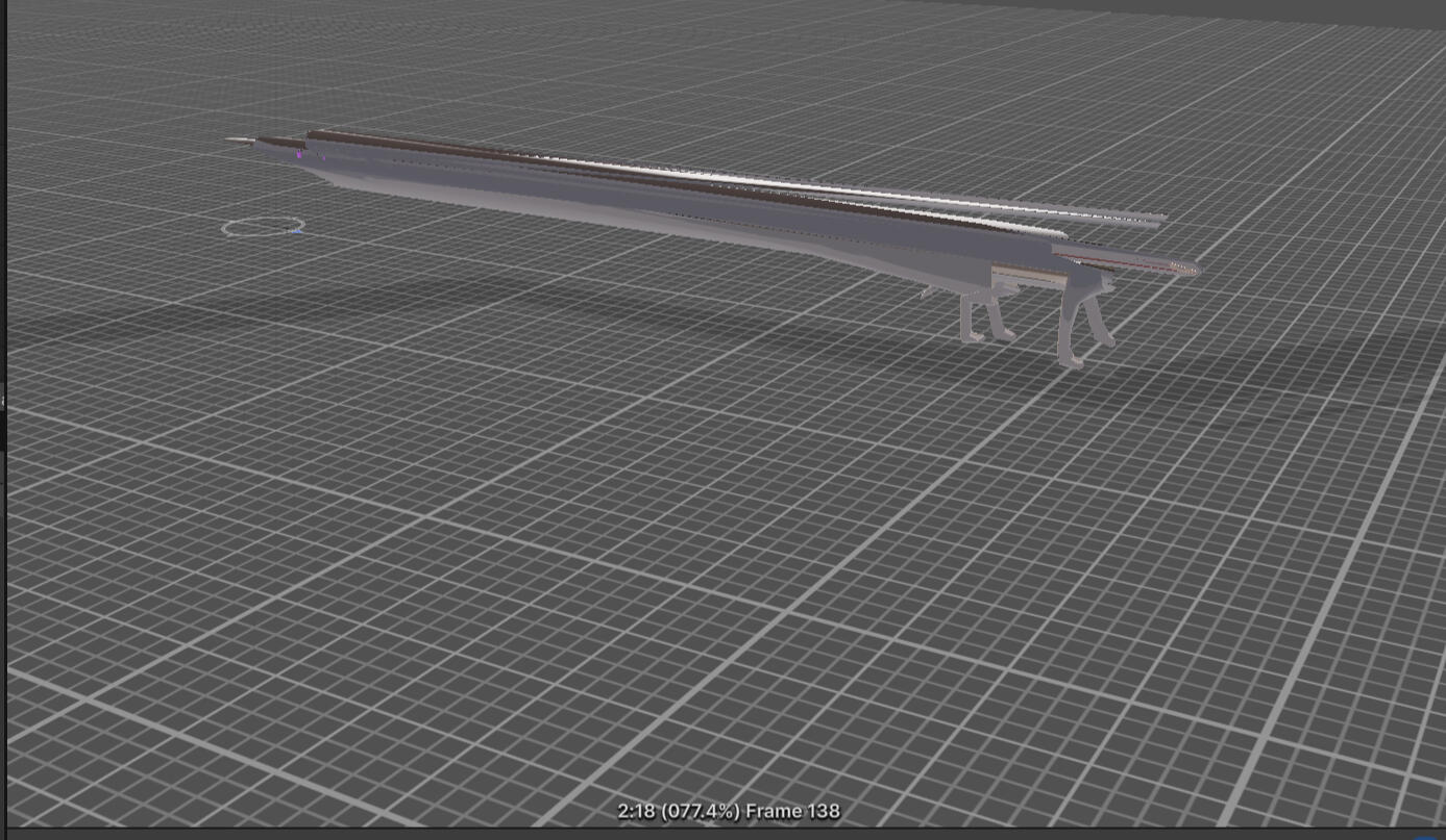
Another annoyance I ran into was with animating the turn animations. The feet had to be keyframed manually almost every frame to keep them in the same place on the ground. While I was working on the last few, I came up with a solution to use for next time. I can add some extra bones which aren't parented to the root bone as 'absolute' IK controls. The existing IK control bones can then be constrained to the absolute bones to keep them in the same place when the root bone is moved.
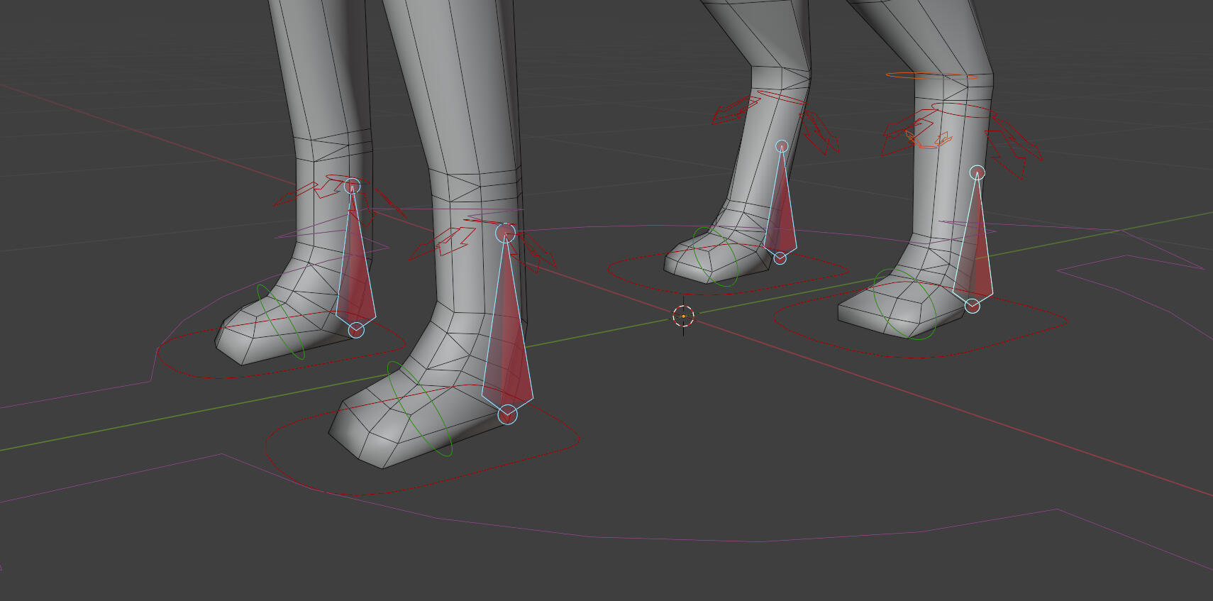
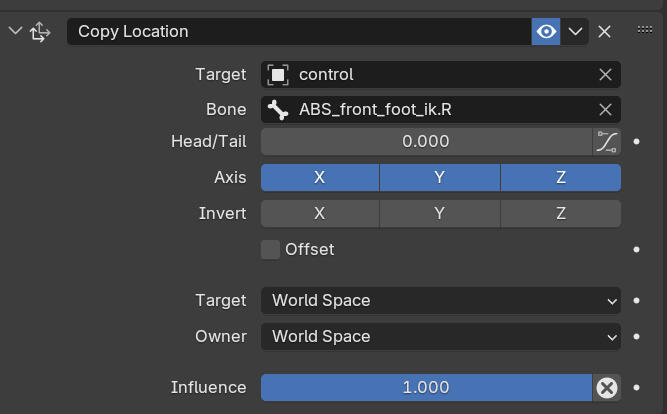
In hindsight I should have made the rig manually from the beginning because I had only used rigify to save time, but at the time I didn't know that rigify was not good for games (I found a lot of tutorials so I was led to believe the opposite). The best thing to do now would be to rig our models with the metarig and set up constraints manually.
Week 2
Human basemesh adjustments
Originally the plan was to model our main character this week, but we didn't have a draft design we were happy with yet so that's been pushed back.
I ended up just making two changes to the basemesh geometry for slightly better anatomy and deformation. The differences are minimal. More corrections will come later when it's time to model the main character.
for better leg deformation
for better anatomy
Player Animations
Instead I spent this week working animations to fill in any gaps which we didn't get through free assets and mixamo.
The blocking animation we were using didn't place the sword in the correct angle. This was a small issue that was easy enough to fix in Unity.
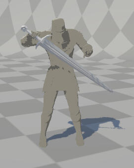
There were more animations which that were too tedious and difficult to change in Unity. There were FBX format animations that I wanted to edit, but these would import into Blender with all the bones as separate objects, which made editing almost impossible. It also caused the files to export without any animation data or armature as the bones weren't technically a rig anymore. I wasn't able to figure out a solution but luckily I only lost about an hour to this. As a result, these animations were all made from scratch.
This rig is set up with manual IK constraints instead of rigify to avoid the issues I ran into with the wolf. This time the armature exported correctly.
The 'activate bonfire' animation originally had the character stepping forward, but this would push the player back when hitting the collider, and could cause the foot to snap due to IK, so it was changed to have the player take a step back. I also think that it makes more sense/looks more natural to not try and step into the thing that's right in front of you.
I also originally wanted the poise break animation to have the player stabbing their sword into the ground for balance, to show the idea of the character persevering/refusing to go down in combat even though they are vulnerable.
This didn't exactly end up looking very good. While it is fairly easy to look the rotation of the hand in Blender, I decided to drop the idea as it would require new variants of the animation for every different weapon type.
Lastly, I edited an animation from Mixamo to make animations for resting at a bonfire. I changed the positions of the legs and made them lean forward a bit more when seated to make the pose less 'relaxed' and more 'exhausted'.
I'm not sure if animation is supposed to take this much time or if I'm just really slow. I feel like I spent a lot of time working this week but it doesn't feel like there's too much to show. I'm definitely inexperienced with 3D animation so hopefully I'll get quicker as time goes on, but as of now it's taking more time away from my actual focus (visuals).
Week 3
Animations
A few more animations were made, though it's not my focus for this week. Not much to say about these, but I think the quality is lower than my usual work since I haven't put much time into them. I'm planning to polish these towards the end of the semester.
The intention with the death animation is for it to dissolve at some point during its movement or after it's frozen.
Terrain Materials
While it would have been easier to look for premade materials, I still wanted to give making my own a try. My main role in this project is art direction so I'd like to have as much control over the visual side of things as possible. I used my old concept art as a rough guide/reminder of what I'm going for.
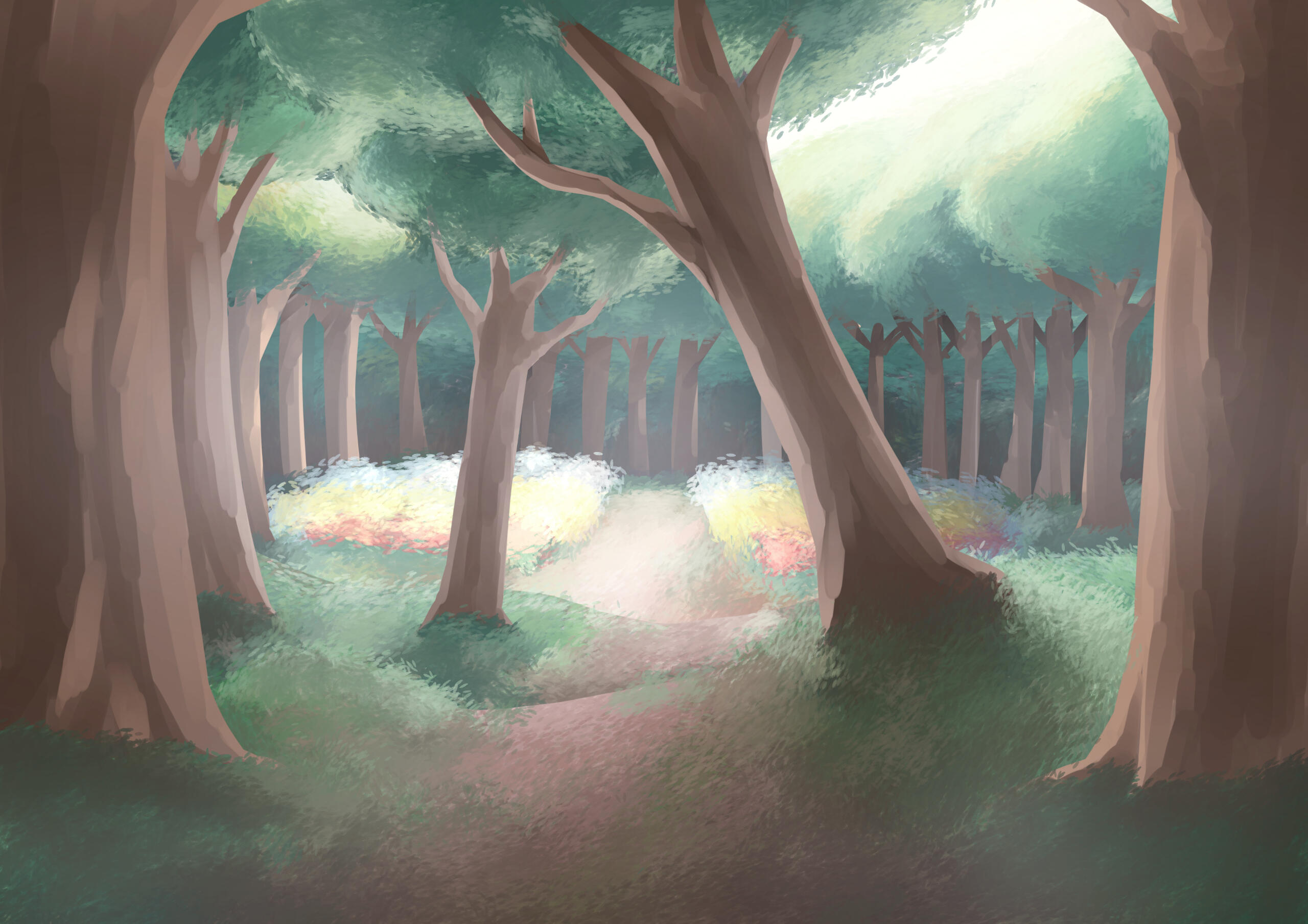
For now I've made materials for grass, dirt, and rock using the blur slope filter on existing Substance materials so that I can still edit the original parameters. I'm doing this to reduce the amount of detail and give everything a more stylised 'painterly' look. The filter affected the normals as well at first, but it ended up removing too much detail, so I'm lowering the normal scale on the terrain layer in Unity instead.
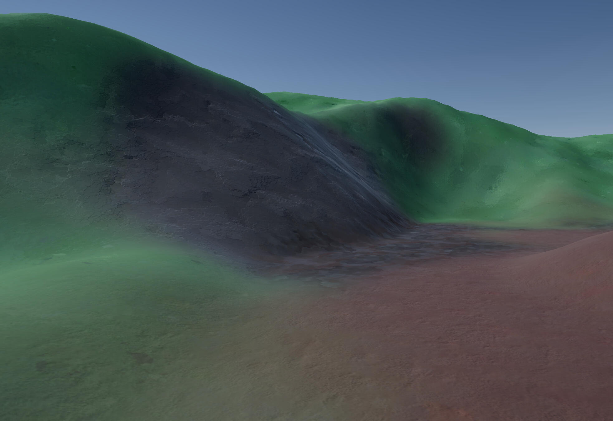
With some postprocessing, the colours get a lot closer to what I want, and the graininess of the dirt from my old concept art comes across quite well.
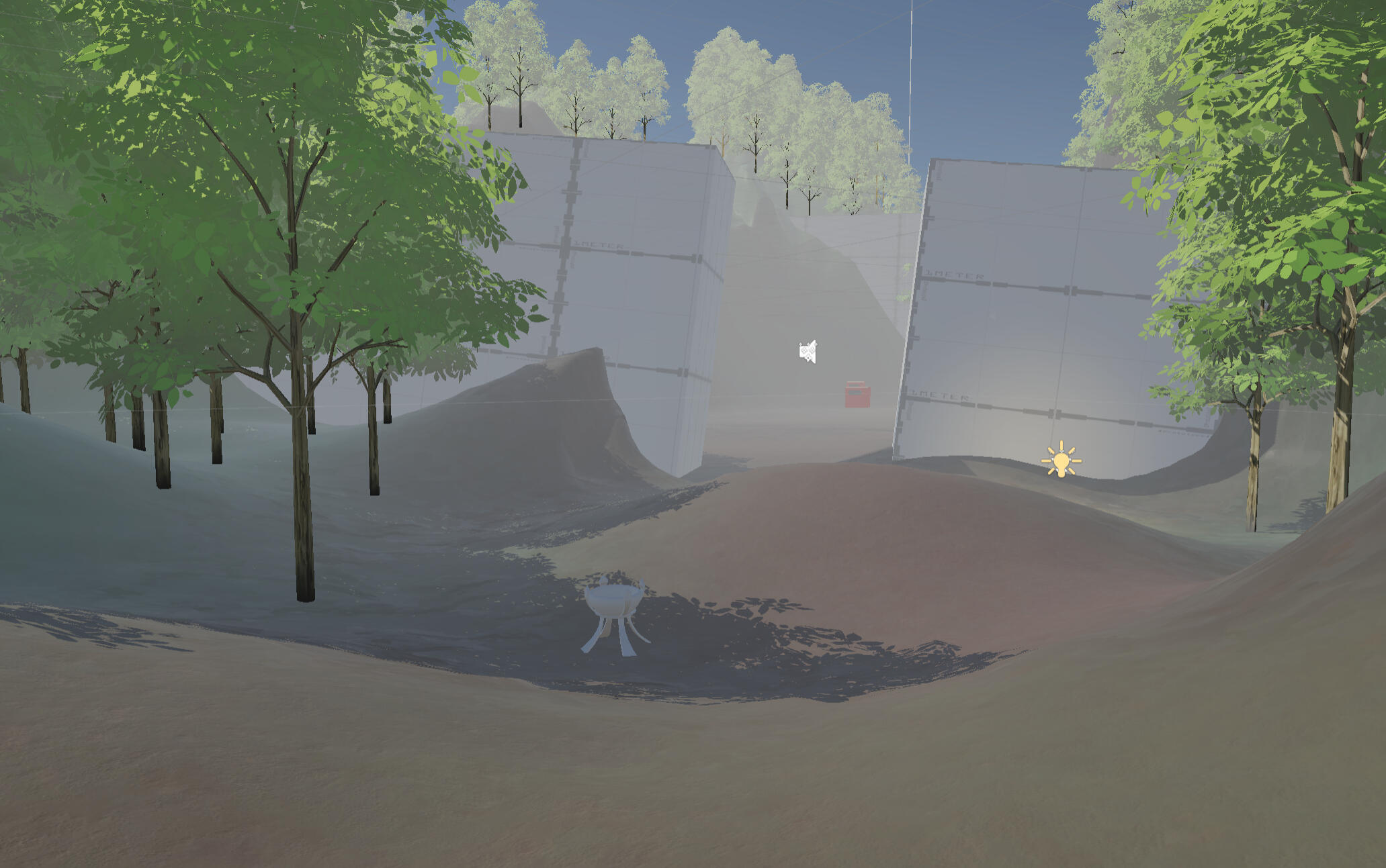
Grass
I made grass using a mesh and an alpha map. The shader was mostly based on this tutorial by Binary Lunar.
The texture was drawn by hand to add to the stylised look as any minor imperfections will be visible.
Each plane is on an angle to improve the appearance of density when looking from higher angles.
The grass samples the colour of the terrain beneath it through a second camera and a render texture. This also captures any lights on the surface, but if the point light isn't in range of the terrain, the grass won't see any change. I reused the custom function from my character shader to add support for additional lights in the scene. This also means that the second camera can be disabled after rendering the terrain once on startup.
Before
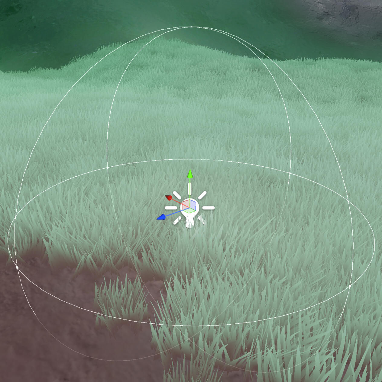
after
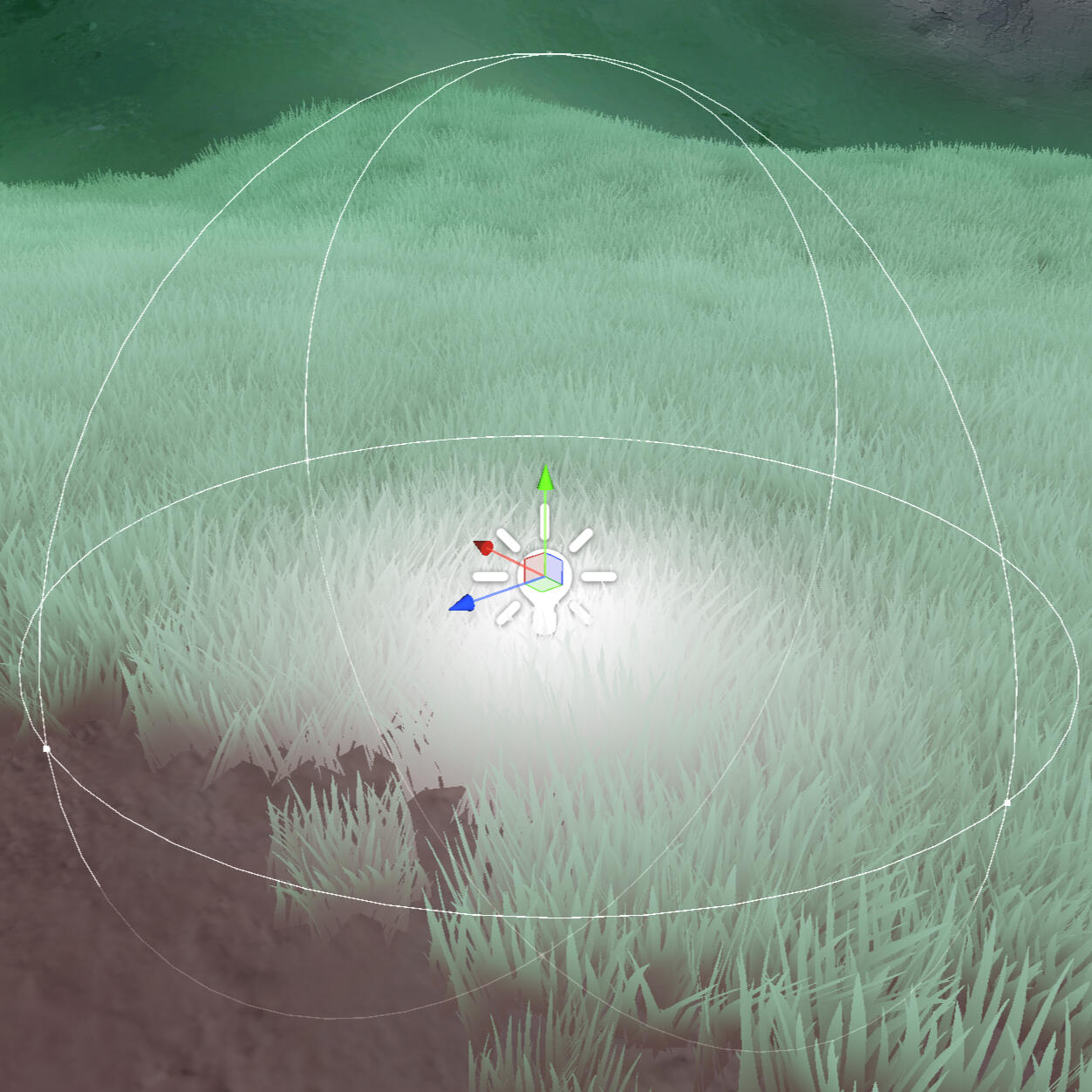
This also corrected an issue with how lights interacted with shadows.
Before - Intensity Increased
After - intensity unchanged
Lastly, I added a sine function to the movement of the noise texture used for swaying, and also divide by the scale of each mesh so that taller grass will sway slower than shorter grass.
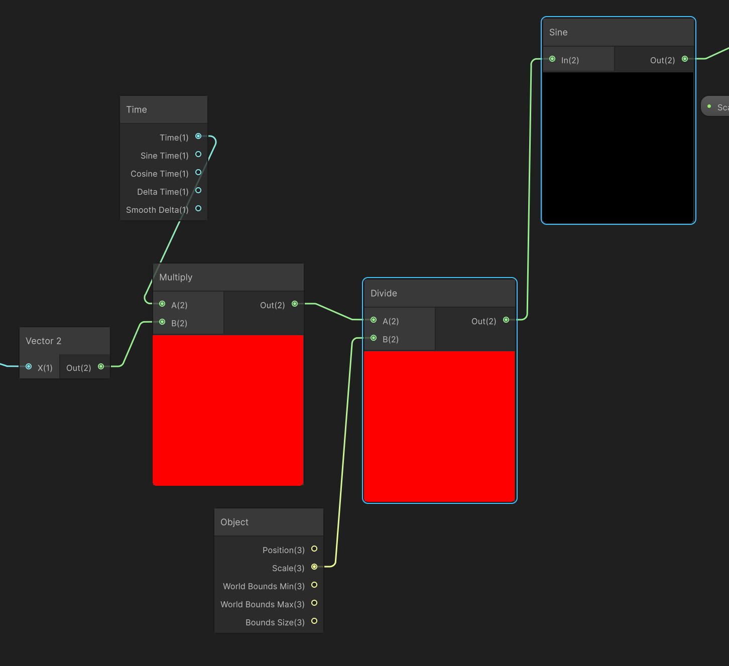
For my first time making something like this I think I'm quite happy with how it turned out. I still need to set up LODs as well as interactivity with the player.
boss health bar syncing
While I am stepping beyond my role here, something that was really bugging me about our boss fight is that the body and the tail have independent health bars. This means that the tail or the body could 'die' before the other, which wouldn't make any sense. I remembered from an earlier conversation with our programmer Bruno, that he couldn't figure out a way to get the two parts to share a health bar with how the system is setup. This spurred me to have a look and see if I could come up with any hacky solutions, which would hopefully give Bruno ideas for a better solution later on.
This was the solution I came up with. It works well enough, but right now it's called every frame. I tried to find a way to get it to only check when one of the bodies takes damage, but unfortunately I still don't fully understand how each script interacts, so I'll leave the rest to Bruno.
Both health bars are still shown, but again, this is something I should leave for Bruno. At the very least this was a good exercise to show that I can still read and understand code, even if I'm not good at writing code.
Update on research question
I'm making a bit of a change to my research question. I feel like I'm not really getting anywhere with it and don't feel that motivated to dedicate all of my time to it anymore. My previous research question was:"How can I use colour theory and NPR to create a souls-like game with a stylised visual aesthetic without sacrificing the grim tone synonymous with the genre?"The thing that caught up to me eventually was that I didn't really want to do something that just emulates the feel of Dark Souls. I really wanted to do a more unique art style that I would actually enjoy making, and would hopefully stand out. This line of thinking leads to my new research question:"How can I use colour theory and NPR to create a 3D action game with stylised visuals to convey the themes of life and death?"I think this makes a bit more sense for me. I've moved away from explicitly mentioning a souls-like game as quite frankly, that has had little to no bearing on my work so far. I've felt stuck on direction and have just been reluctant to make more concept art because I didn't really feel any motivation to do so. I took the time to think more deeply about the themes of the story that I wrote.
Week 4
Production volume was a lot lower this week, for a pretty stupid reason which I will address in the first section.
Terrain-Mesh Blending
This is something that I should have been able to sort out quite quickly, as I already had a setup to render the diffuse of the terrain. In theory, all I would have to do is render the normal and depth from the same camera, and use this data in a shader for any meshes I want to blend in a terrain.
I had been following this guide by Louis Waloschek, which mentions the use of a replacement shader on the camera. It links to a video on the topic and which I used as a reference for scripting the shader switching.
I made some shaders in shadergraph to show normals and height (because the scene depth node doesn't seem to work in URP). I applied these to a terrain and they worked.
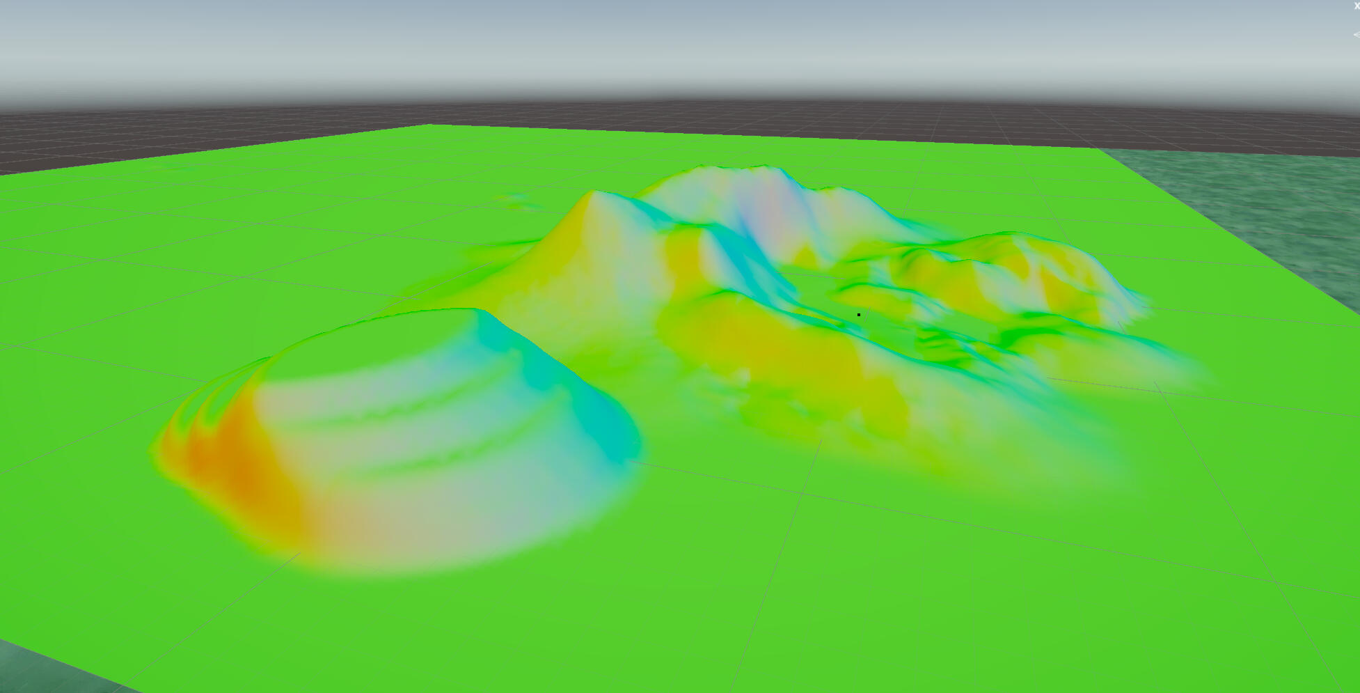
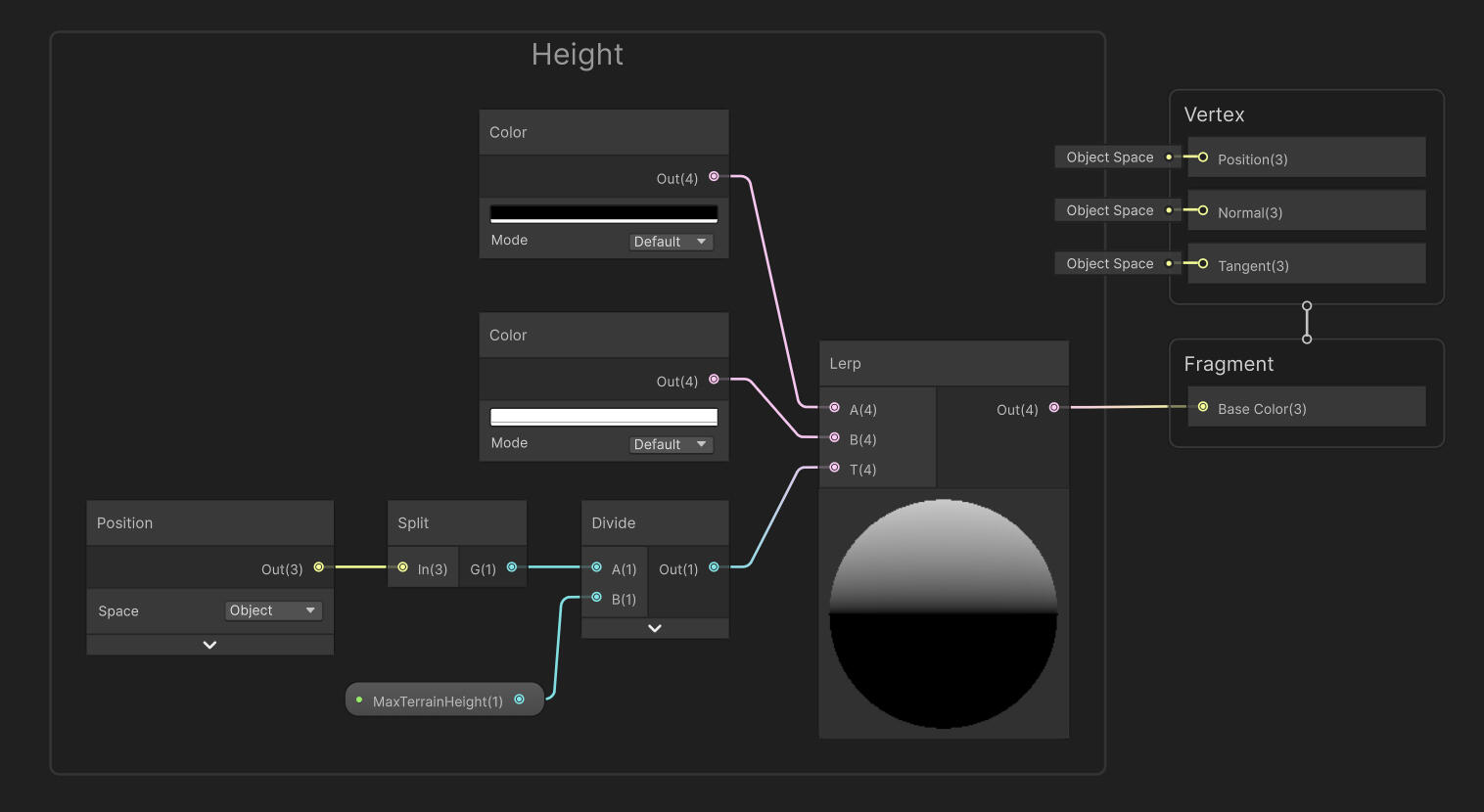
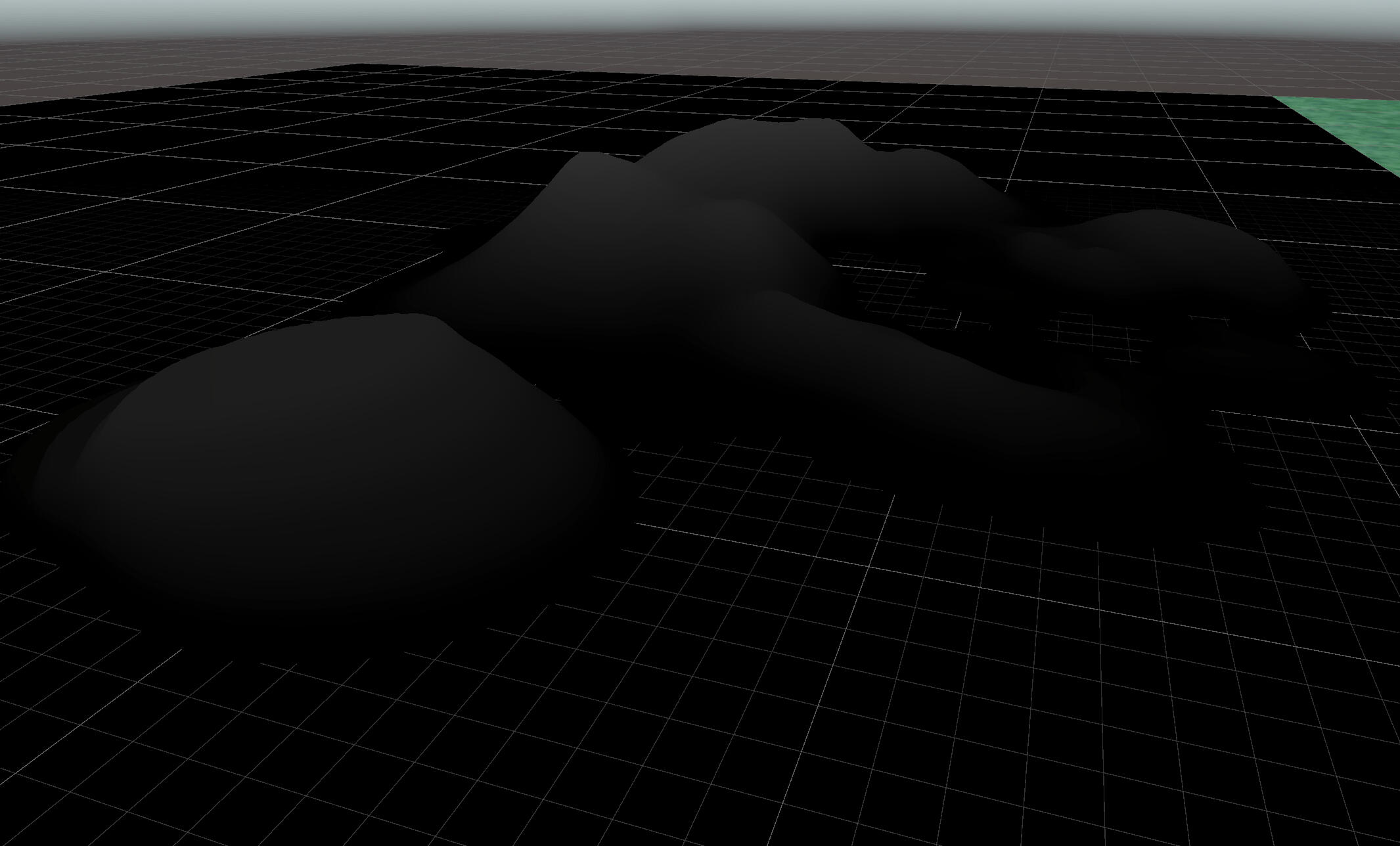
But when I tried to use these as replacement shaders, the output textures would all be the diffuse map. I spent a long time trouble shooting with a new project, different camera, delaying each capture with a coroutine, and rewriting one of the shaders in HLSL. Nothing I did worked, and I couldn't find a working alternative until I stumbled upon this bit of Unity documentation for... ARM developers.

It works now.
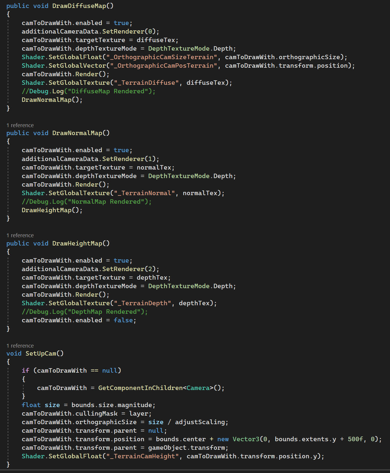
Diffuse
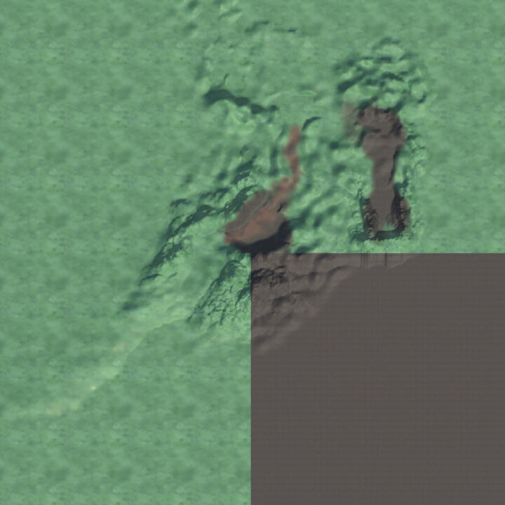
normal
Depth
I ended up wasting a full day of work on this, but at the very least it's setup. I'll push testing on actual objects back until mid-semester break, or as soon as we start bringing in environment assets.
More Animations
I made a few more extra animations for the Earth Guardian. The attacks for the body are lacking at the moment, so we came up with an additional combo attack for phase 2. The idea is that there's a probability that it can bite again, which decreases with each consecutive bite. I've animated it so that it could hypothetically combo indefinitely. There's a bit of hitch in the transition, but it can be adjusted in Unity so I'm not too worried about it.
As of now the attack point for riposte is at the base. The current animations will be replaced if that changes (e.g: the boss's head or the end of the tail).
Tree Model
I made a tree model in Blender using my old concept art as a reference. There are 3 LODs ranging from 1646 tris to 457 tris.
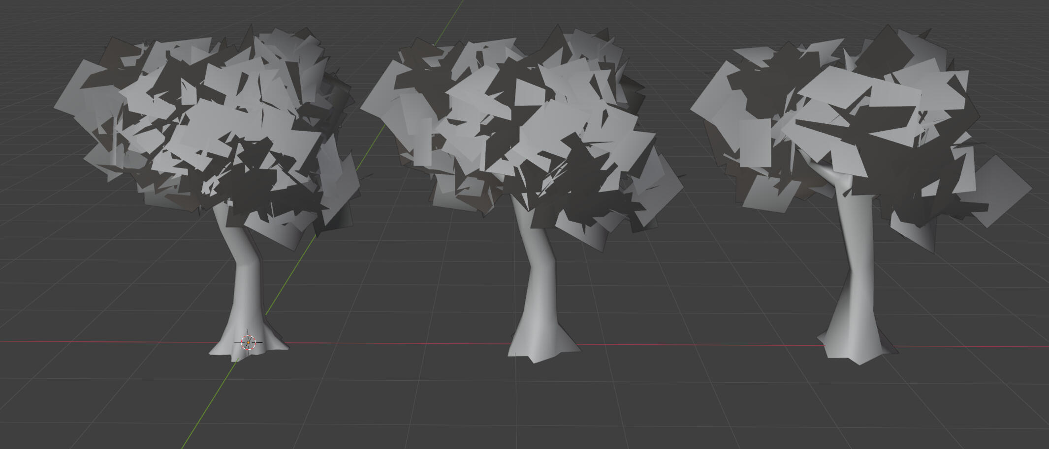
I haven't made a shader yet, but I'm considering remaking the foliage as the shadows don't look very good.
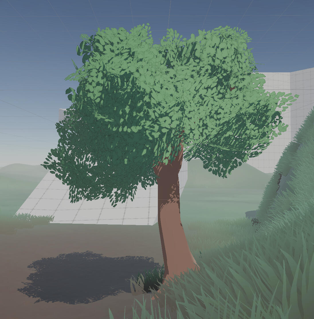
Grass Distance FAde
To go along with the tree LODs, I also made an LOD set for the grass. However, the Unity terrain detail system doesn't allow for prefabs to contain an LOD group. They can technically work if I add them as a tree, but this leads to significantly lower density and less control over the size distribution.
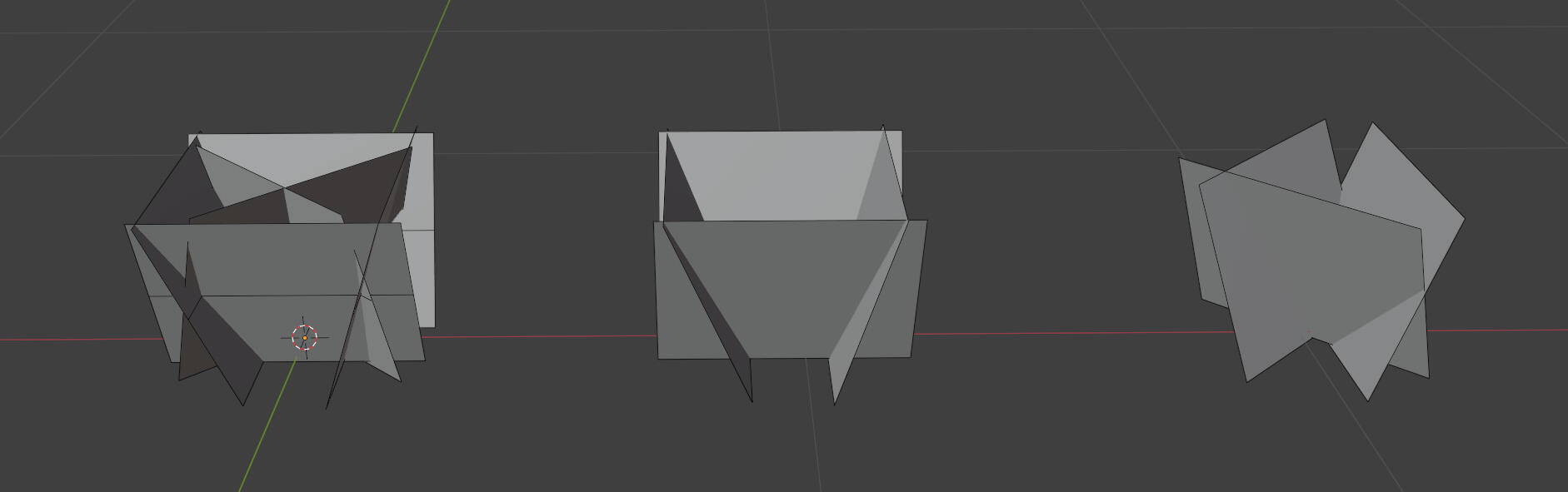
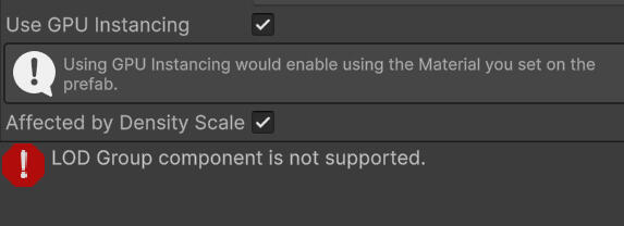
The only other solutions are to use a third-party plugin, or to make my own GPU batching system to swap the models at different distances. Unfortunately, the latter is far beyond my abilities.
I decided that something I could do for now is to bring the culling distance down a bit and fade it out to hide any popping in or out. I added a bit of noise to try obscure the line a little bit.
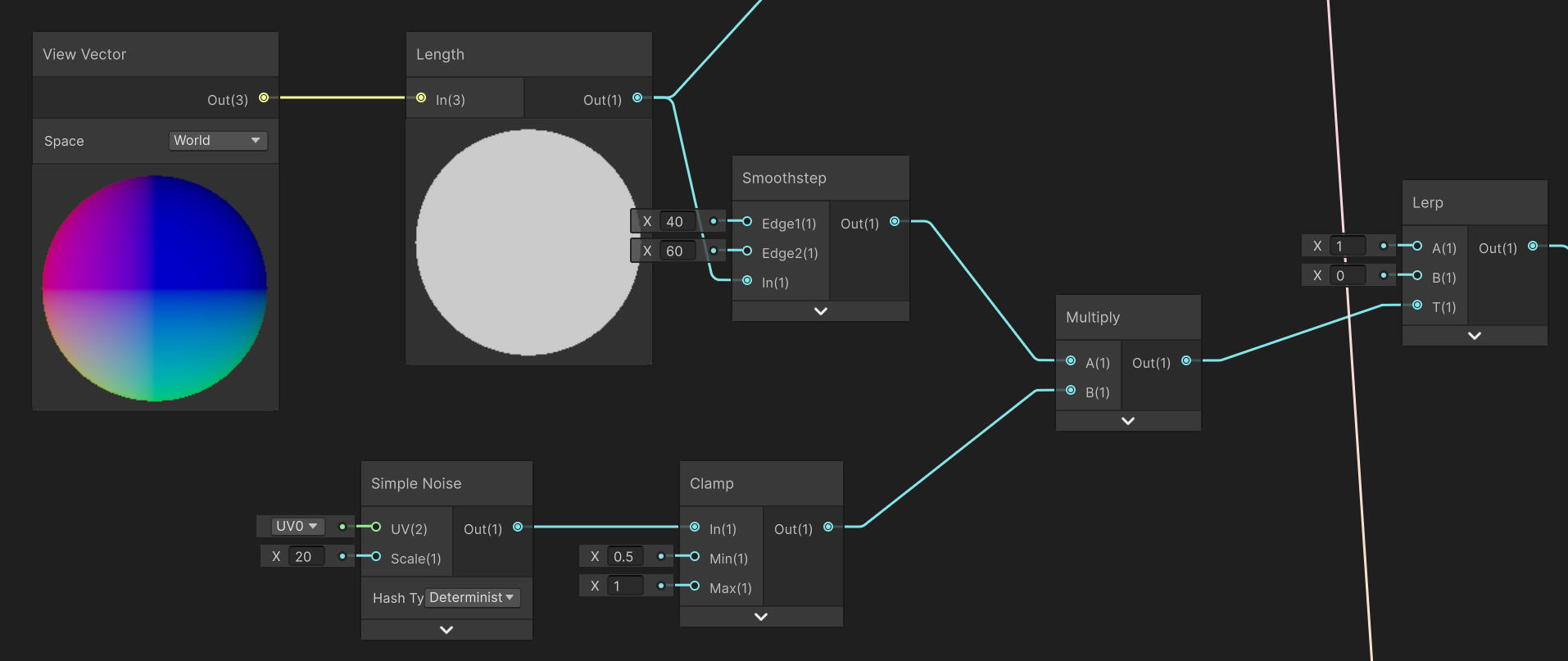
I'm not amazed by the result as the fading starts at a very noticeable distance, but it's better than nothing. The culling distance I have set now is probably a very conservative value, but I'm working on a fairly powerful computer. Either way, it's good to have this setup in case performance becomes an issue in the future. Realistically though, lowering the density of grass will have a much bigger impact on performance.
annotation
Narrative Themes and Colour
Monolith Soft. (2022) Xenoblade Chronicles 3. NintendoAionios, the world of Xenoblade Chronicles 3, is locked in an endless war between two nations: Keves, and Agnus. The soldiers have a lifespan of only 10 years, though almost all die in combat. The war is controlled by another organisation, Moebius, who keeps the war in a state of equilibrium by recollecting the lives of fallen soldiers to recycle them, endlessly. Moebius is opposed by the Lost Numbers, a faction of people who are free from the 10 year cycle. The Lost Numbers are in possession of a power known as Ouroboros, which grants the power to defeat Moebius to 6 people at once. The unique power of Ouroboros is the ability to interlink; to create a powerful new form by fusing two people. One of the main themes at play in the story of Xenoblade Chronicles 3 is contrast. Keves and Agnus, Moebius and Ouroboros, life and death.Xenoblade Chronicles 3 utilises colours to represent the theme of contrast, and expertly ties these visual elements to narrative elements. The colours of Keves and Agnus are black (Figure 1), and white (Figure 2) respectively.
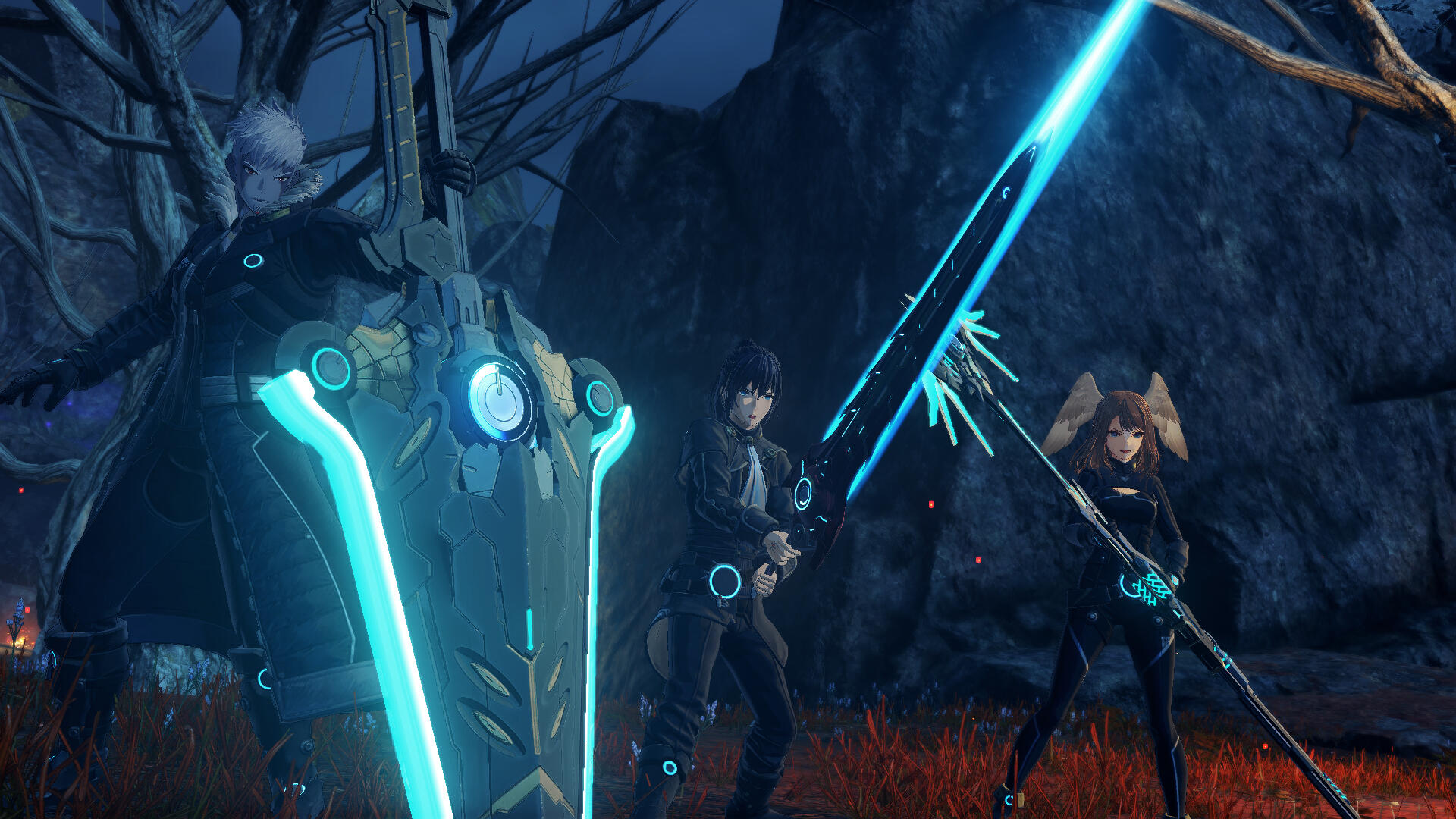
Figure 1. Keves
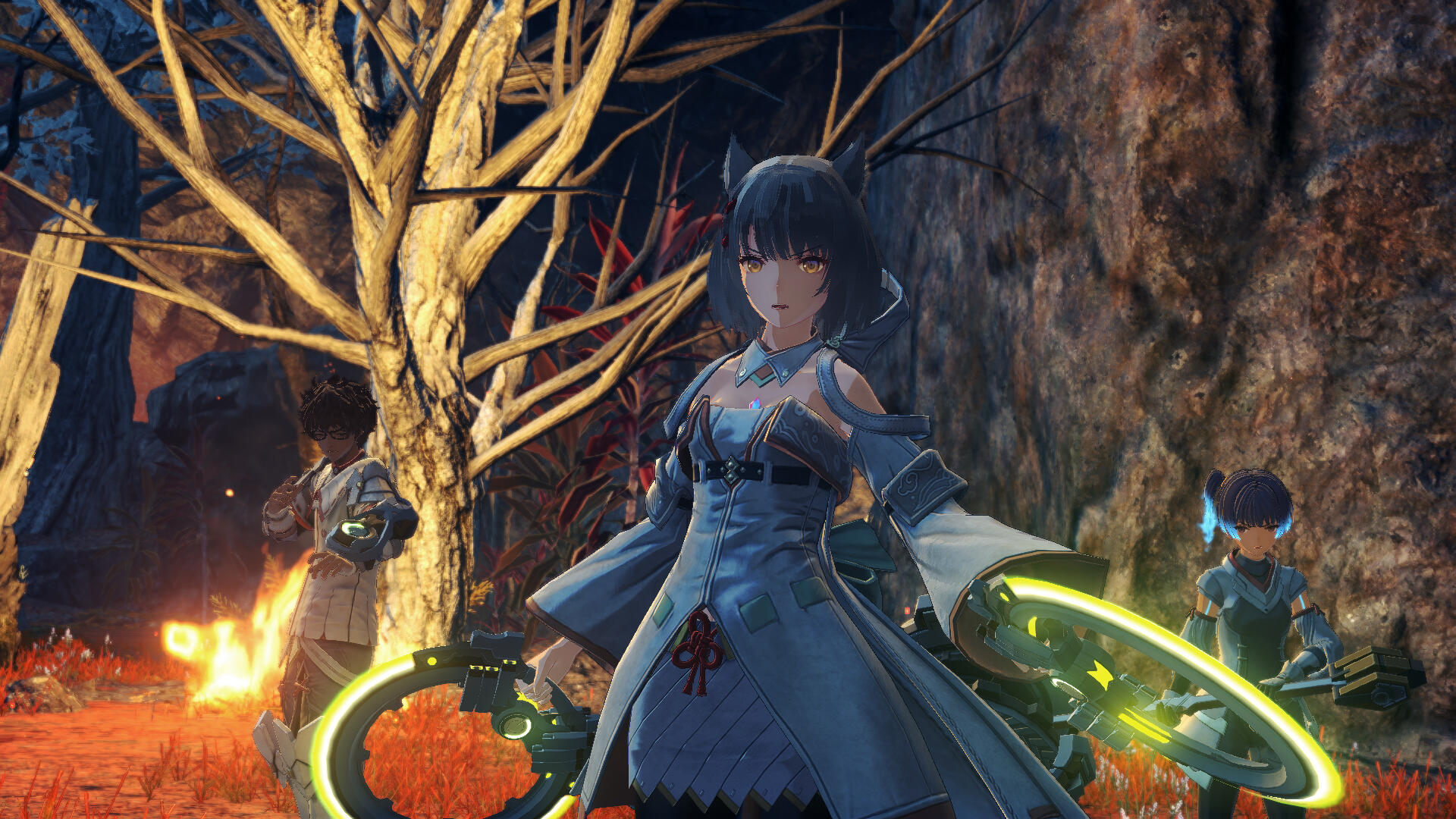
Figure 2. Agnus
The colours of Moebius and Ouroboros/The Lost Numbers are red (Figure 3), and green respectively (Figures 4-6).
Figure 3. Moebius
Figure 5. Lost Numbers City
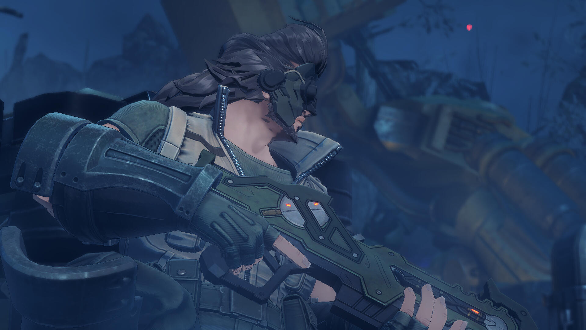
Figure 4. Lost Numbers Soldier
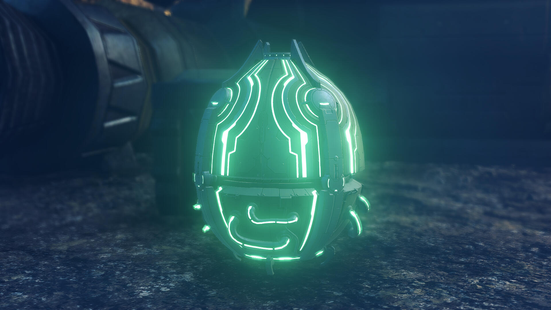
Figure 6. Ouroboros Stone
Keves and Agnus also have different colours to represent the energy which powers their technology: blue (Figure 1) for Keves, and yellow (Figure 2) for Agnus. The power of Ouroboros allows for the fusion between Keves and Agnus. Blue and yellow combine to make green. This design style using complementary colours extends into the UI/menus as well, utilising blue and orange (Figures 7 & 8).
Figure 7. Character menu
Figure 8. System Menu
The representation of life and death is expressed through the character shading, limiting it to two distinct tones by combining the directional light and additional light sources into a single composite main light (Tateno, 2022, as cited in Jiku, 2023). This may be a way of representing life and death not as the colours of white and black, but rather as their raw value component. Xenoblade Chronicles 3’s narrative theme of life and death bleeds into many visual elements of the game, enhancing the presentation of the game’s narrative.Xenoblade Chronicles 3 is an excellent example of how careful use of colours in art direction and world design can be used to very effectively convey narrative themes in game design. Just like in my game, a key theme of Xenoblade Chronicle 3 is life and death, so it’s important that I take note of their implementation of shading and colours. I like the idea that life and death could be represented as a difference in value, and how that contrast carries over into the other visual elements. I’d like to explore how this could be expanded to also include the environment shading, which could make a more stylistically cohesive all-NPR game (instead of NPR characters, and PBR environment).Other References:
Jiku, (2023) 「生と死」を物語る陰影表現とは――『Xenoblade3(ゼノブレイド3)』のキャラクターを魅せる2灯トゥーンシェーディング、世界を描くアップサンプリング 【CEDEC+KYUSHU 2022】[Shadow Expression for Storytelling of “Life and Death” - Characters’ 2-Tone Toon Shading, and Upsampling which Draws The World of Xenoblade 3 【CEDEC+KYUSHU 2022】] Game Makers
Week 5
tree model Updates
I remade the clump object to have less randomness in face orientation. This should help with the messiness of the shadows a little bit.
I've also made a second tree model for a bit of variety. I've also realised the section I wrote last week didn't explain much about how the tree model was made, so I'll use this opportunity to explain with this new model I've made.
The shape of tree is blocked out from extruded vertices with a skin modifier in Blender. This does generate some bad topology, but it's easy enough to clean up. It's mostly concave/convex faces, n-gons, and unnecessary detail.
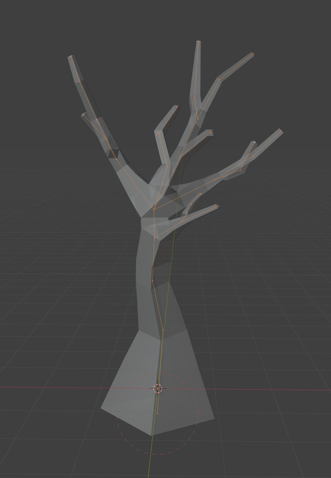
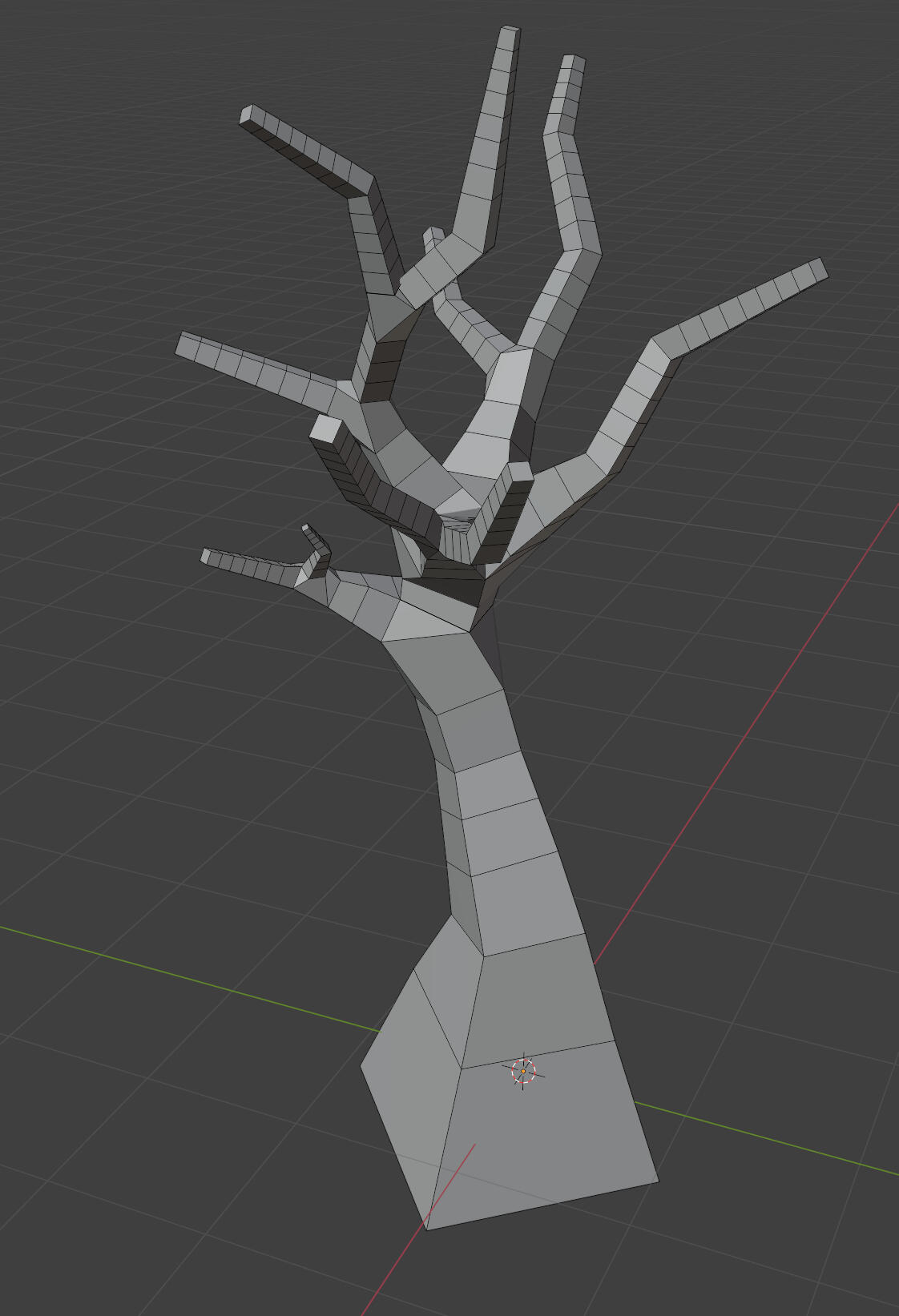
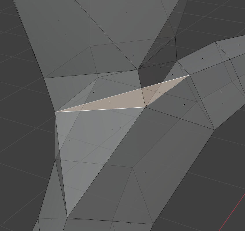
after clean up
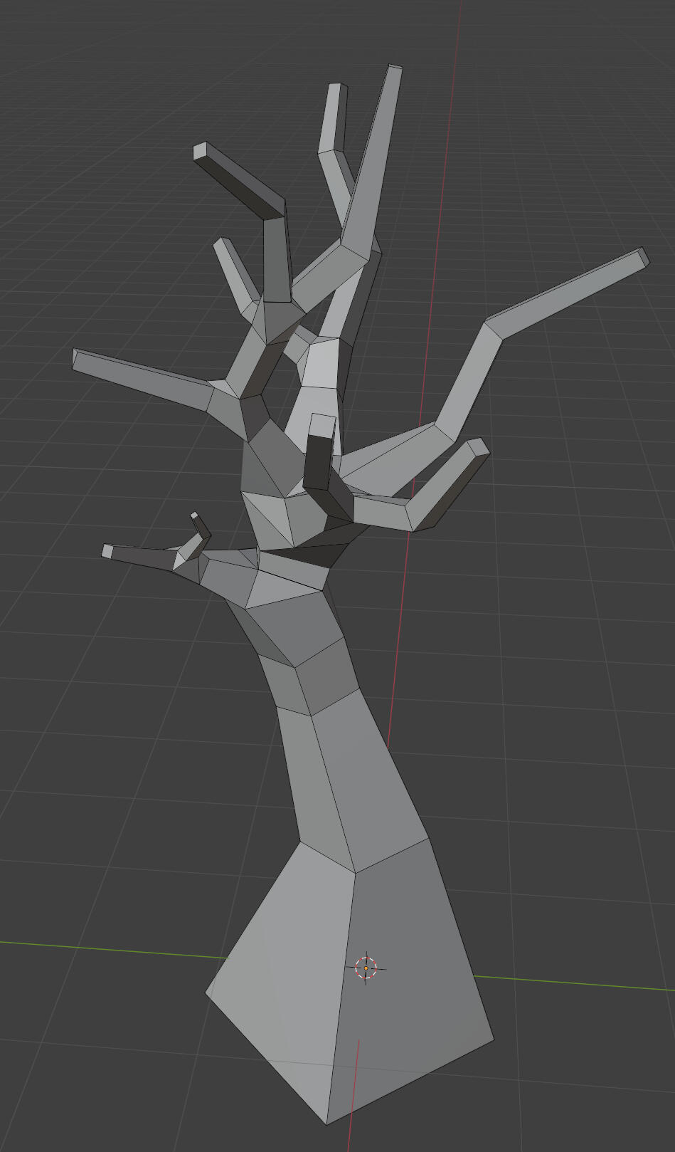
I can then add some extra loops on the trunk to give it some more roundness, and roughly model some roots. I then weight paint a vertex group on the branches to generate the clumps as particles. I'll adjust the random seed and until I have a good result, then convert the particles into an object.
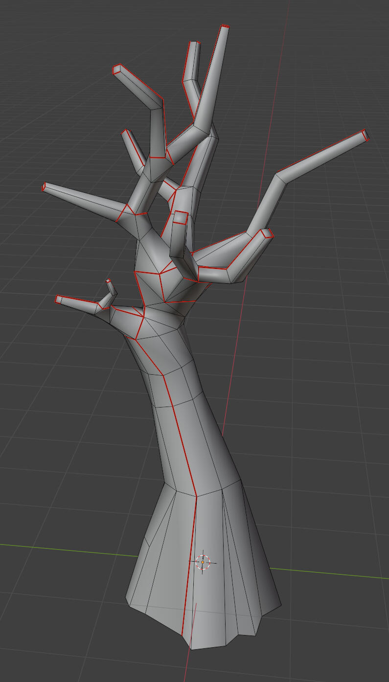
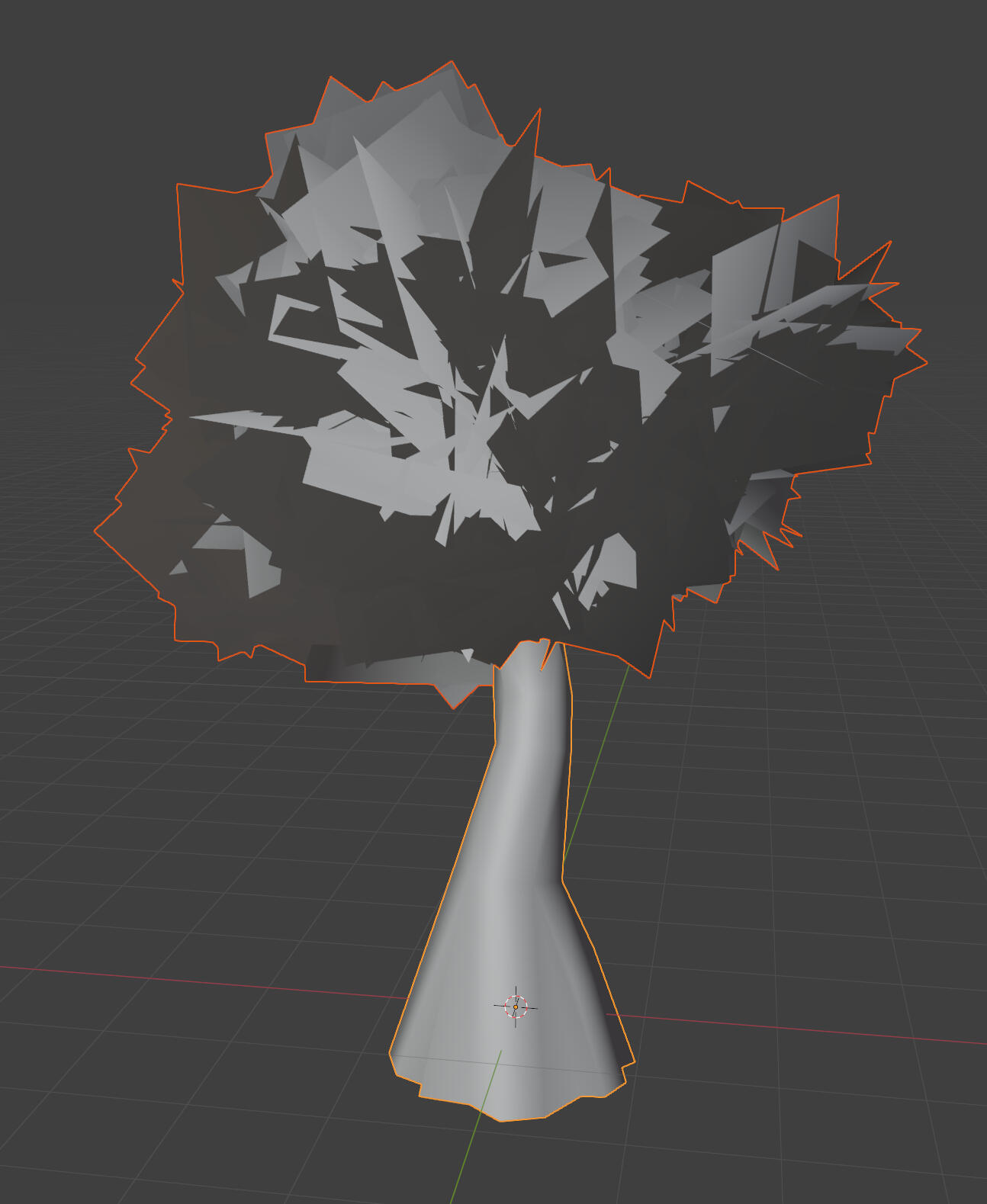
This is probably the quickest way I could think of for making trees, which helps with modelling new trees and increasing variety.
tree foliage shader
I made the shader from scratch, but it ended up being basically identical to the character shader, so it was a bit of a waste of time. The thing that mattered more was the normals, which I should have realised. The tree on the left has spherical normals on each individual clump, whereas the tree on the right has hemispherical normals all around. The intention is for the custom normals to make the leaves' shading look more smooth and fluffy.
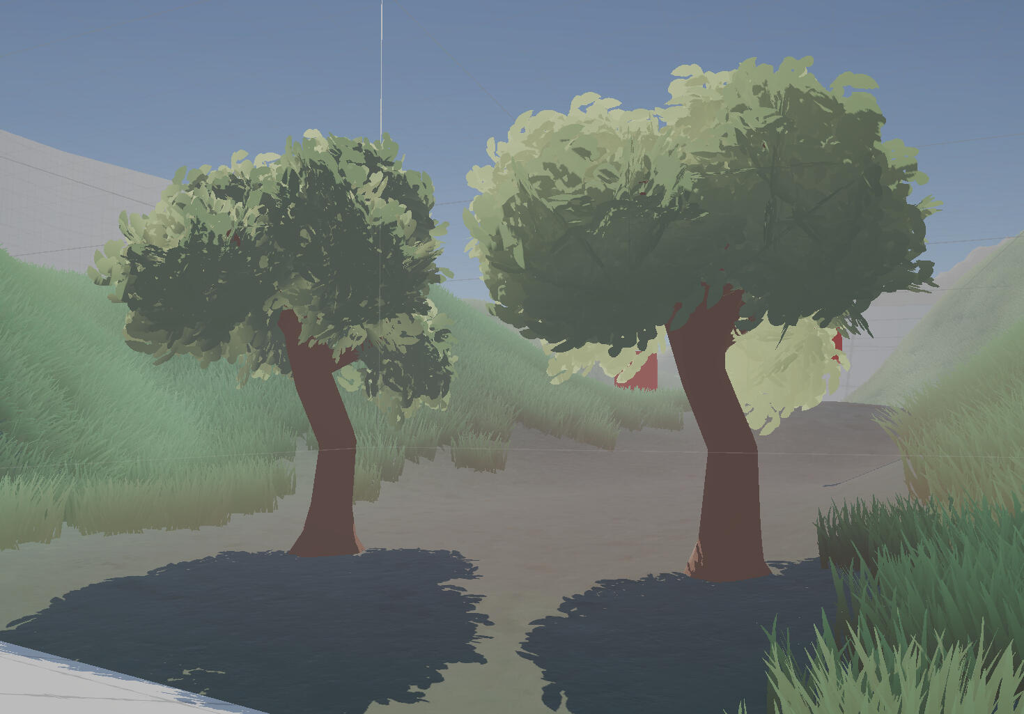
I intended to make something like the tree on the right, but I still liked the other option, so I asked my group and a couple friends for feedback. Some preferred the tree on the left as it looked more realistic, while others preferred the tree on the right as the shading because it looked more evenly shaded, and matched the grass better.
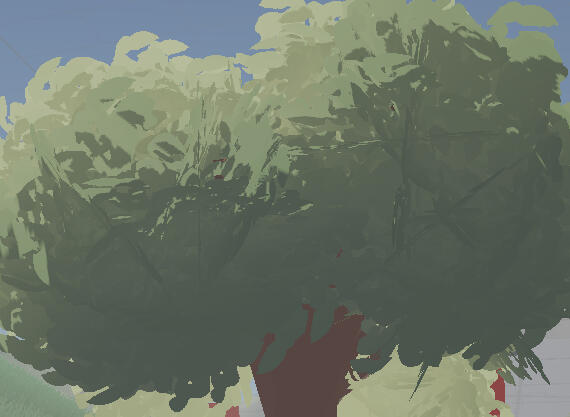
A complaint I received with this was the visible lines in the tree. This is an issue with the foliage cards which are close to parallel with the camera view. I resolved this by adding a bit to fade the faces based on the angle to the camera view direction. This took a bit of time to figure out because the foliage has custom normals, and each face has the exact same UVs, so I couldn't just bake a normal map. I ended up making a custom subgraph which to recalculate the face normals using the DDX and DDY nodes which I stumbled upon when looking through the different math nodes.
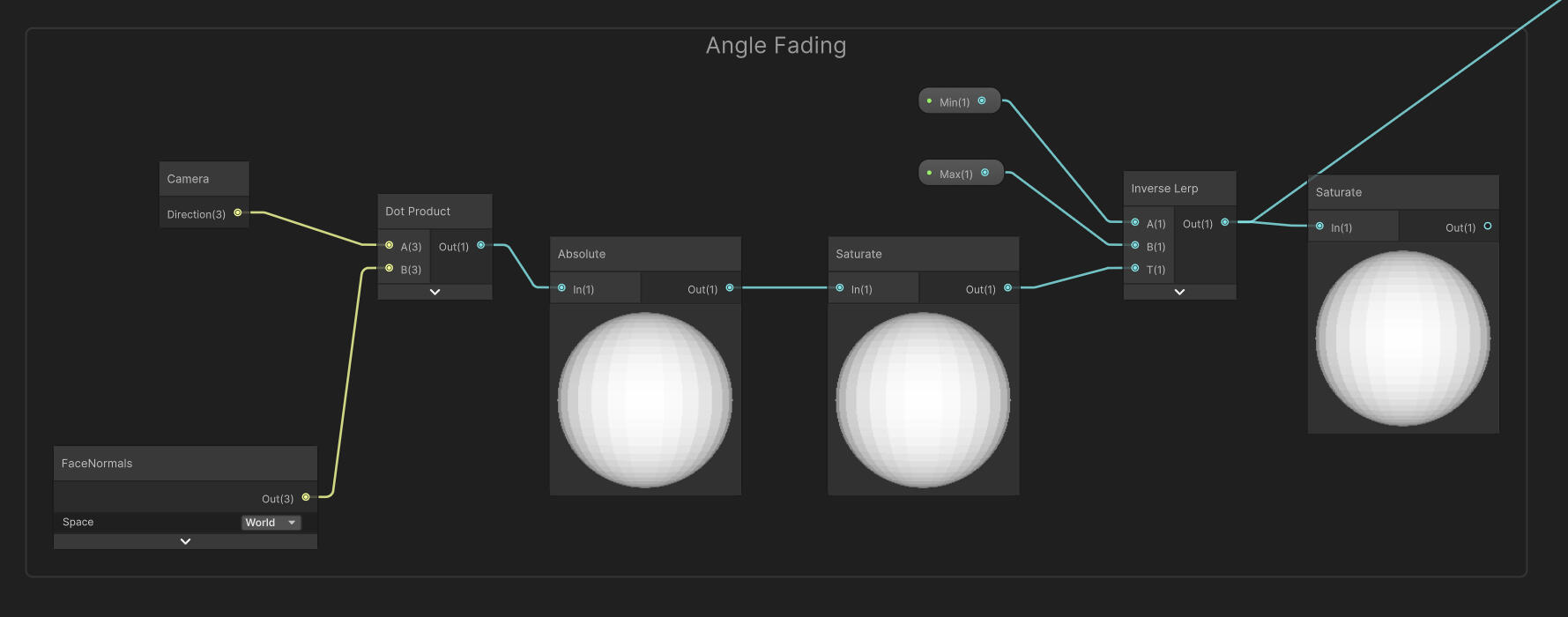
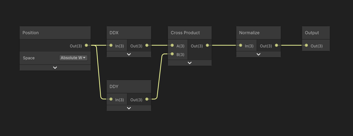
I went back for more feedback, this time with another tree which had spherical normals. This was liked alot, but the tree in the middle with the hemispherical normals was also popular.
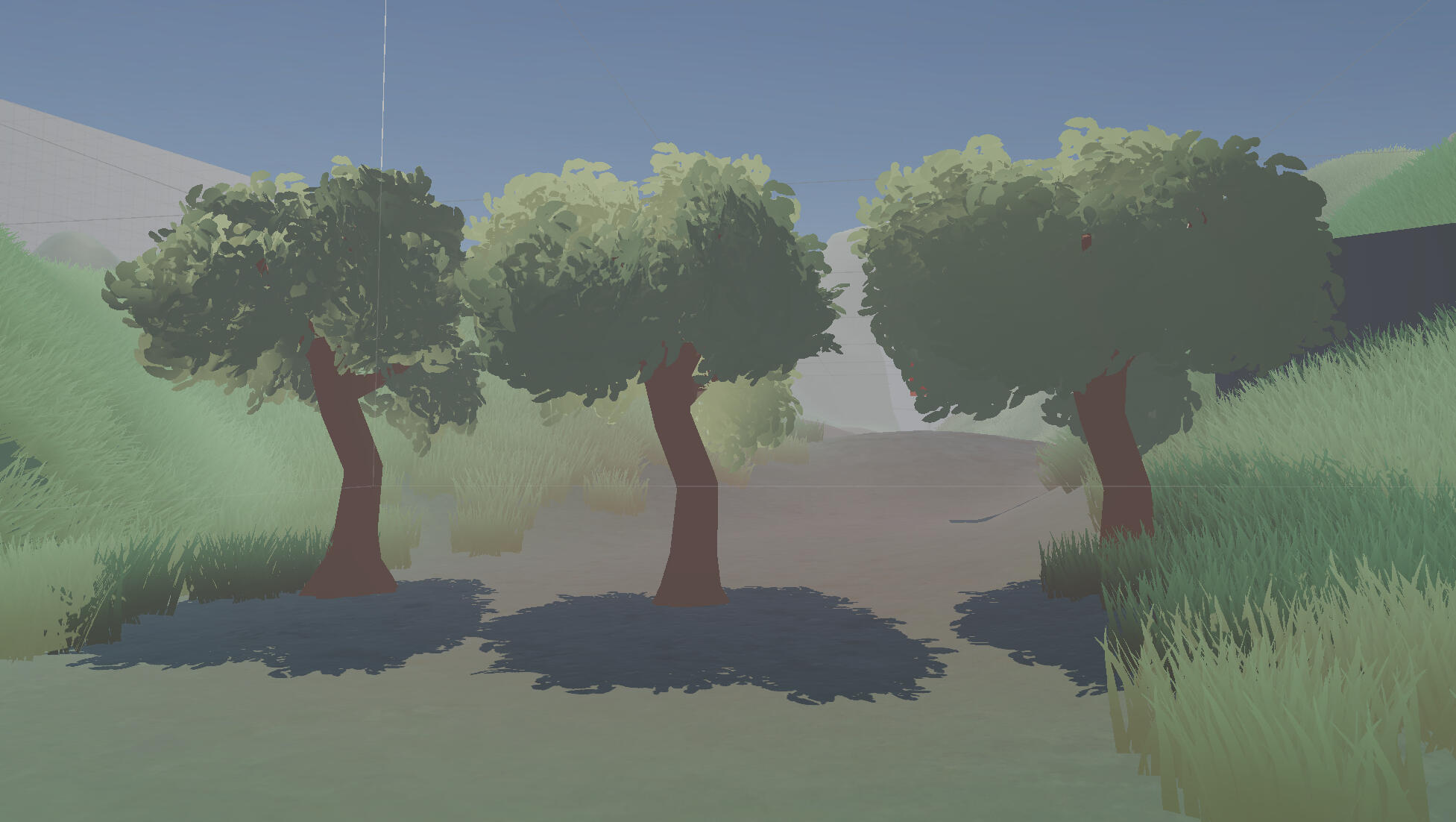
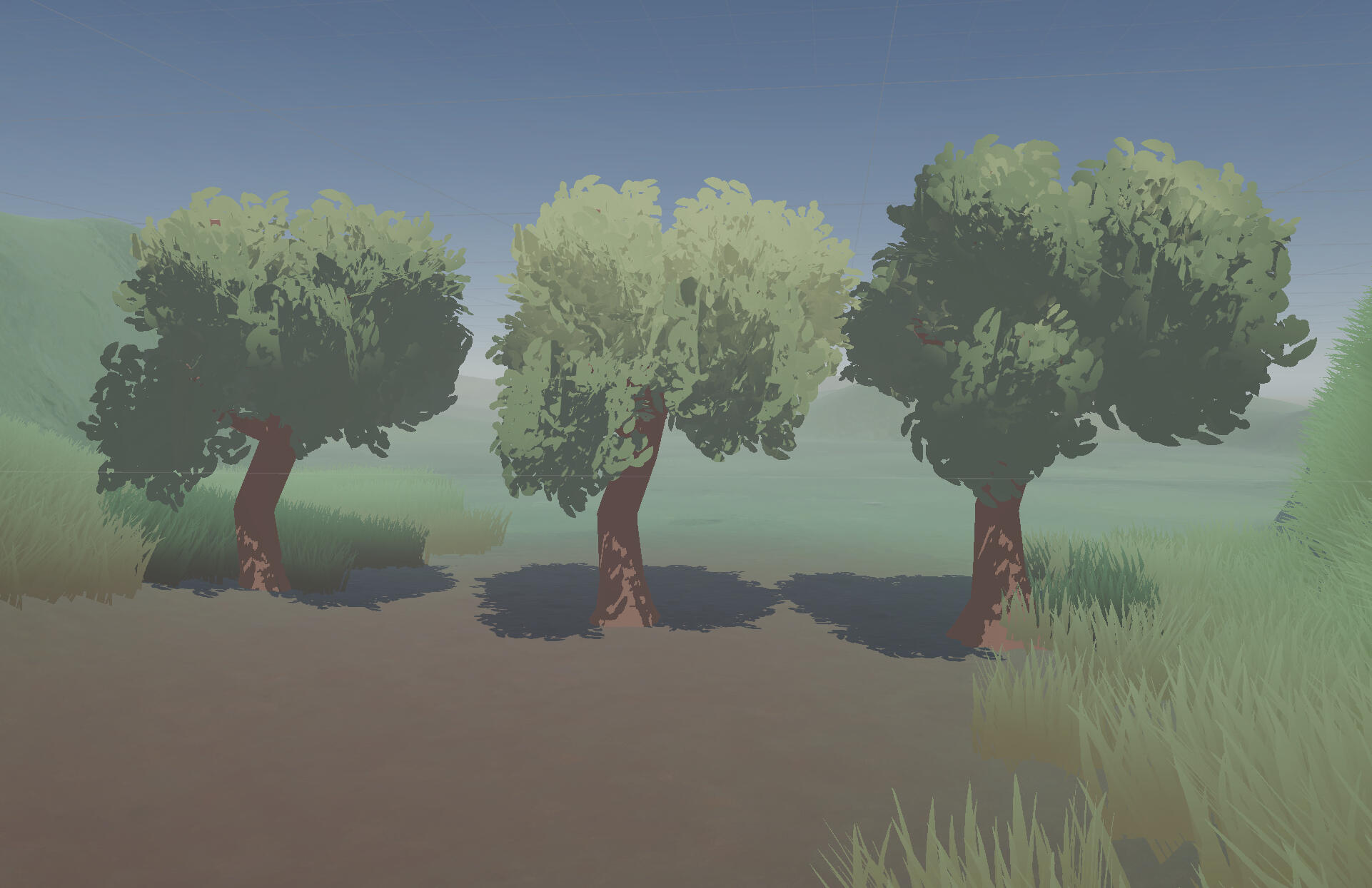
I decided to stick with hemispherical normals, as I don't like how the others still look shaded from the front. The subsurface scattering only works when looking towards the main light, so it makes the front look unnaturally dark. The hemispherical normals don't cast much of a shadow from the front, so the rim light has more space to spread out to make the foliage look softer. Although the underlying shader is basically identical to the character shader, the actual appearance of the object is completely different thanks to the adjustable parameters and custom normals.
Just like the grass, I've added a scrolling noise map to simulate wind. At the moment the grass and trees have independent values for wind speed and intensity, but I intend to define global values at some point.
decision on colours
I've spent a lot of time just thinking about which colours I would assign to life and death, taking into consideration their meanings across all cultures. I never landed on any single colour combination. I was ready to just go with white and black, until I took a closer look at Xenoblade Chronicles 3, and it finally just made sense. If I instead interpret white and black and as light and dark values, I can use contrast as a more universal symbol for life and death.
Purple was originally a placeholder colour I had chosen based on the colour of bruised skin, or dying skin, such as with necrosis.
(I will not show a real example)
In reality the skin with necrosis is really trending towards black, but due to the surrounding skin generally being more reddish or brown, while it may be correctly perceived as a very dark red, the brain can also be tricked into seeing blue, purple, or violet. My perception is somewhere in the middle, as a very dark wine red, leaning slightly more towards purple. This effect is more obvious with lighter and warmer skin tones.
(Do note that this example I've painted may not correctly show this effect, as I haven't calibrated my displays in a long time. I've viewed this on 5 different displays and every single one of them looks different.)
Now that I've changed to using values and contrast, violet is the colour I'd choose to represent death in most situations. When changing the saturation/chroma component of a colour, the value also changes with it. This can be represented through the Munsell colour model. Using this we can see that violet skews more towards lower values, and its complementary hue of yellow, skews more towards higher values. From a purely colour theory perspective, the two are a great pairing.
white flowers concept art
The white flowers/ether conduits hold significance in Etherwilt's story as the conduits that allow ether to flow between the realms of life (Vita) and death (Mors). I would like to be clear though, that the white flowers aren't actually flowers, and exist only as a conduit between Vita and Mors. With this idea of flow in both directions, I began to draw up some sketches of the flower's top profile. I started from a symbol used for the classical element of ether/aether, and white lilies. This progressed into using having one set of petals which would expand to create the points, and another set of petals which would spiral inwards to create the hexagon. It would probably be more correct to refer to the first set as sepals or tepals, but the white flowers aren't really flowers, hence they lack any other flower parts.
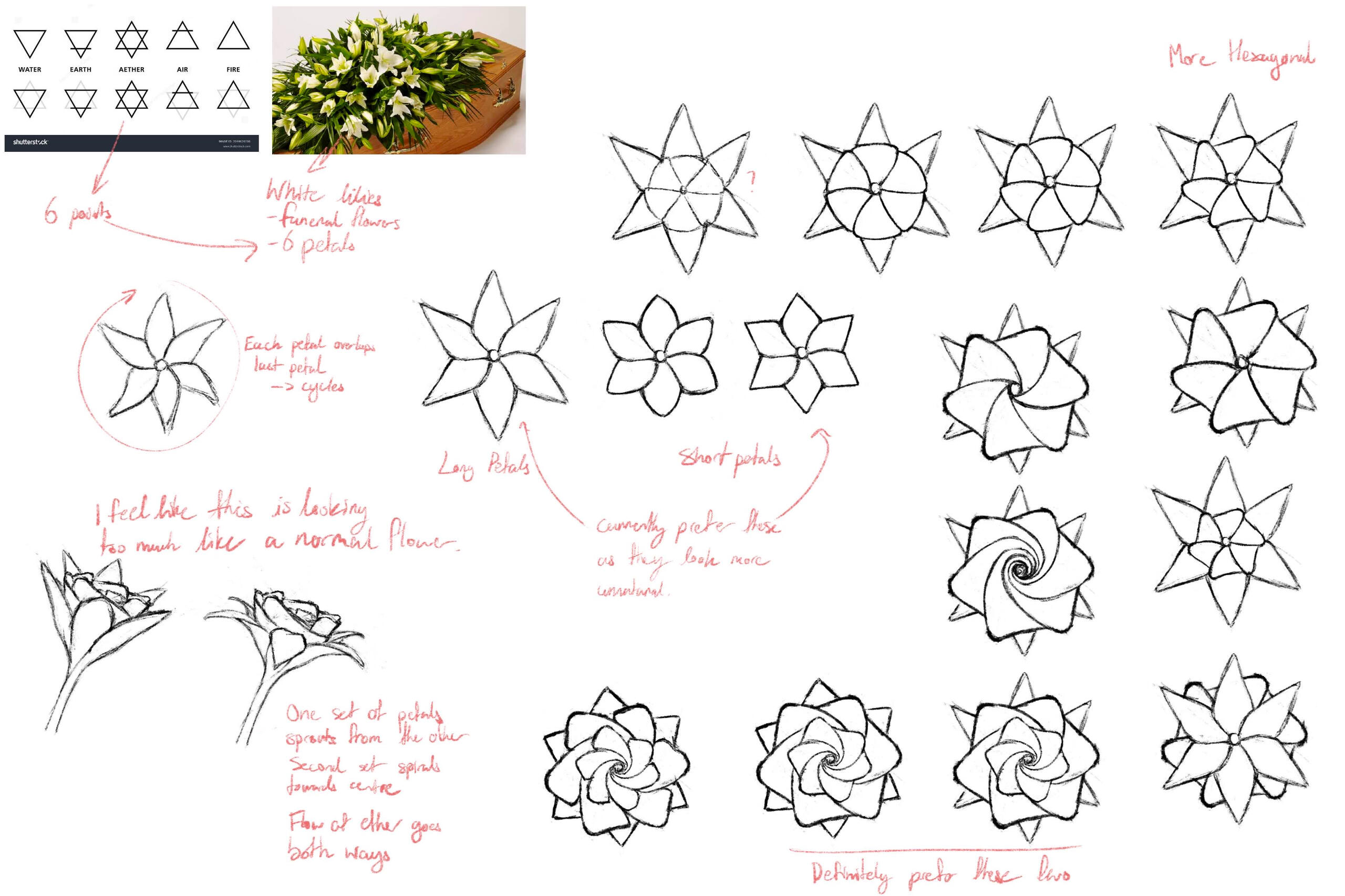
I ended up moving on from these as they just looked too normal. I wanted the white flowers to be recognisable as flowers, but still appear otherworldly. This spurred me to think about how I could make the shape more complex when thinking in 3D. All the ideas for representing cycles, the symbol for ether, and bidirectional flow were still carried over.
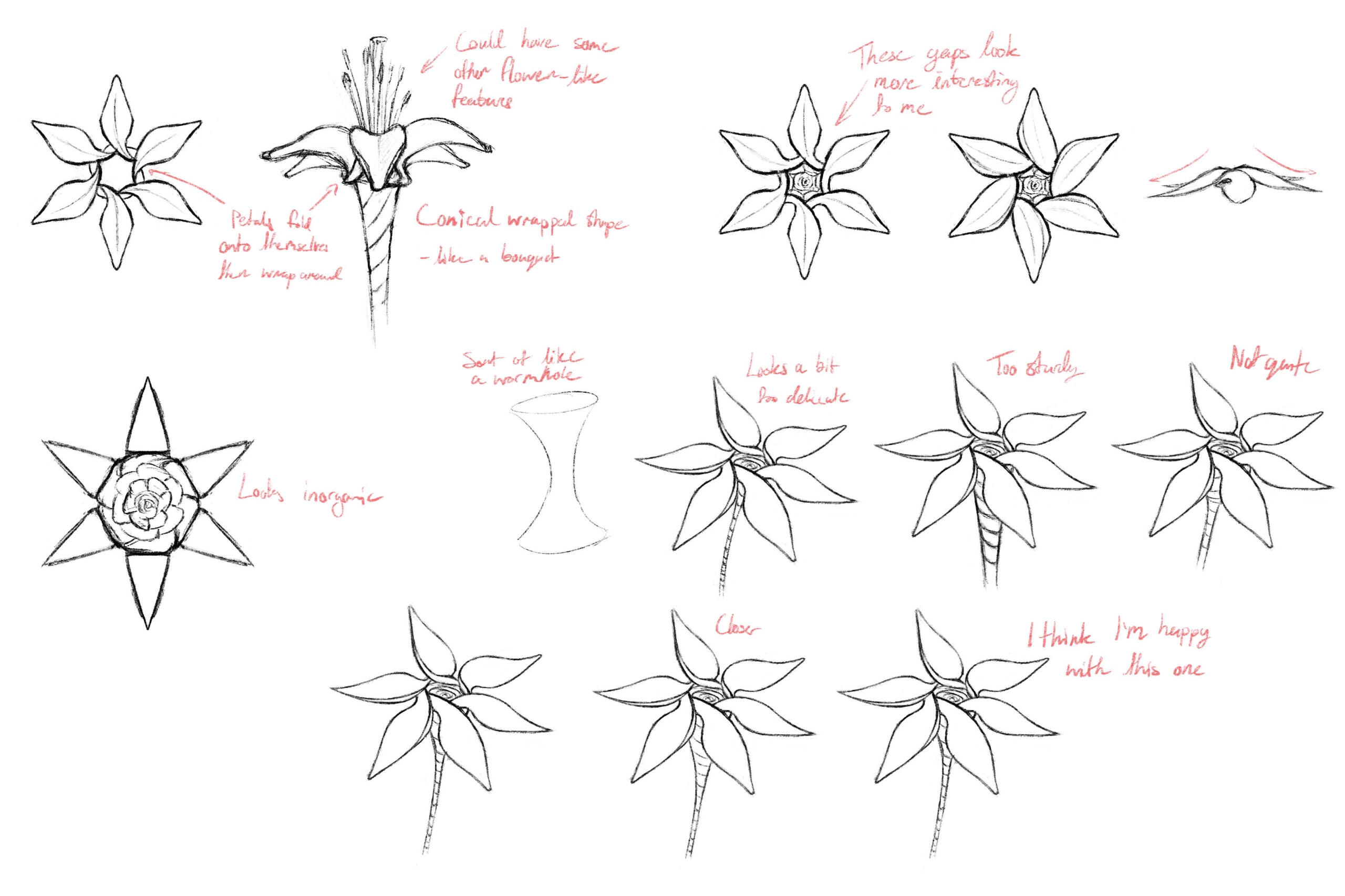
The design I settled on is this. A single set of 'tepals', which spiral outwards and fold over each other, while also creating an internal cavity which spirals inwards. I think I struck a good balance of visual appeal and symbolism with this. It has a simple silhouette which resembles a flower, but could also be interpreted as dangerous due to the pointiness. At a glance it could be believably recognised as a flower, but upon closer inspection of the detail it just doesn't quite look natural.

The tips of each tepal change colour depending on what kind of ether currently is being transferred through it. As I discussed earlier, although death will primarily represented through contrast between light and dark, I do still intend to associate a purple hue with death as well. I used a complementary duo of a pale yellow and dark violet. The yellow is very pale, making the flower look almost entirely white, hence the people of this world would have called the ether conduits 'white flowers'.
Week 6
visual adjustments
A part of the grass shader that's been bothering me is how the bottom is significantly darker when in shadows. This looks especially weird when adjusting saturation. The tips of the grass blades just don't get dark enough.
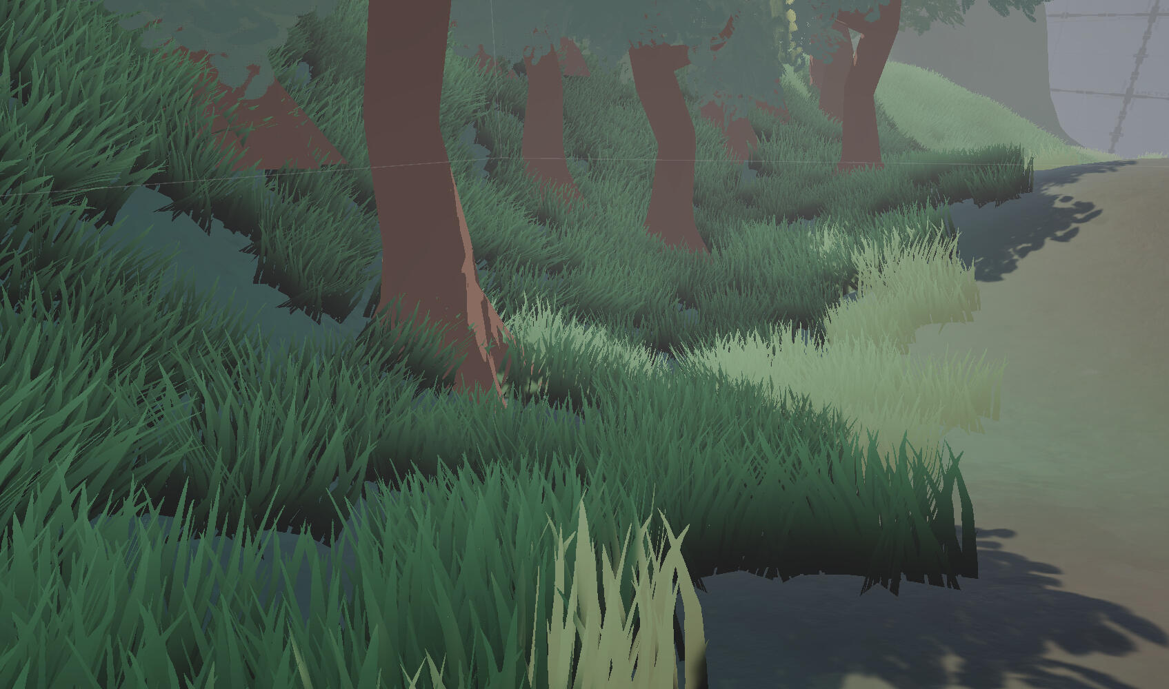
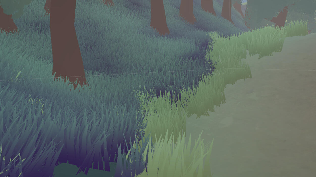
I've edited the shader to make the grass display a solid colour in shaded areas. The shading looks much more uniform and it's a lot easier to control the colour of shadows.
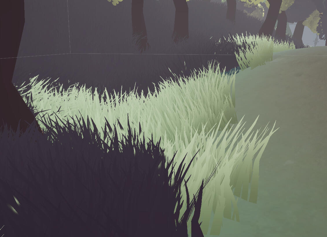
I've adjusted every shadow colour to adopt a faint violet/purple hue. The trees have also now have a much yellower hue overall.
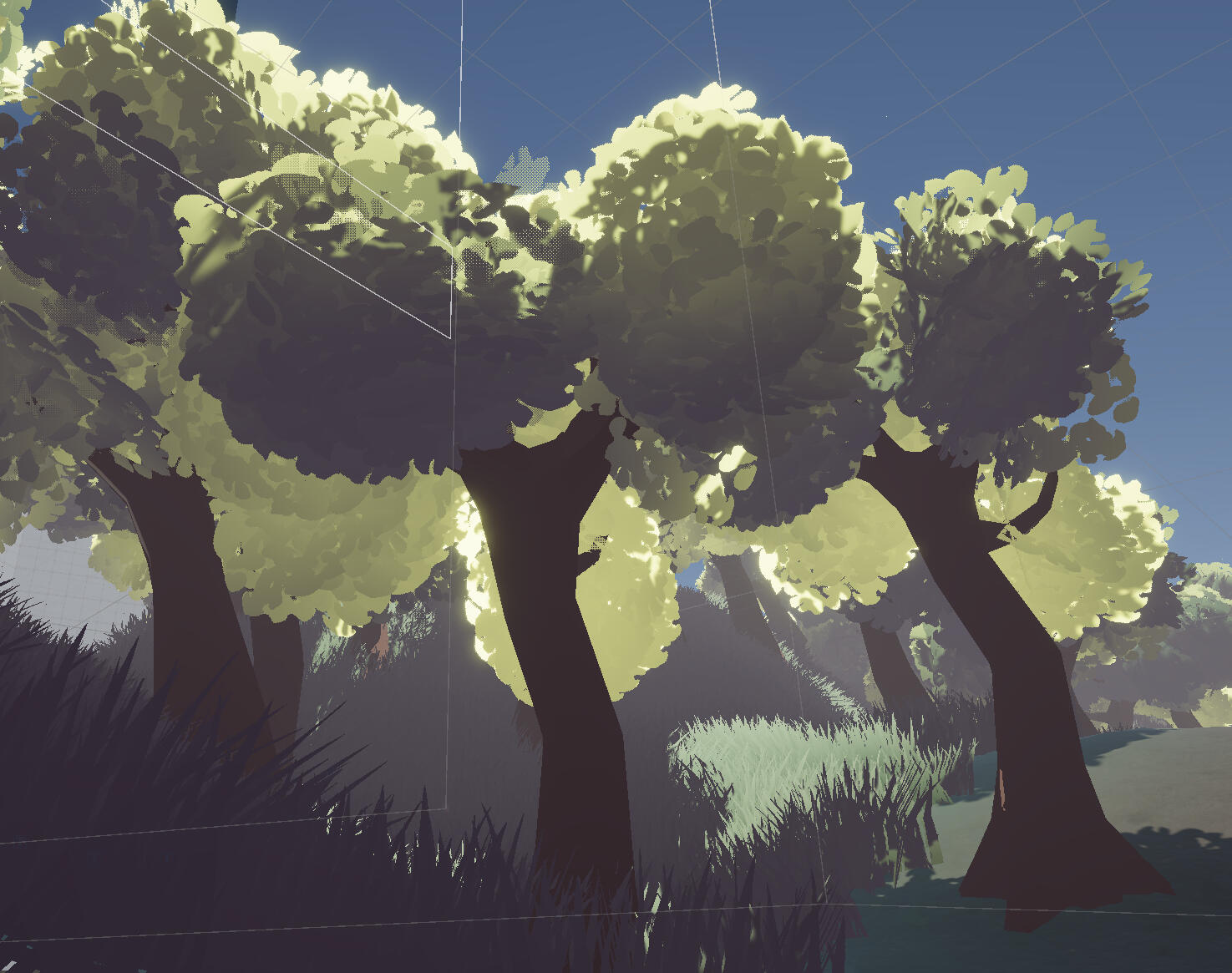
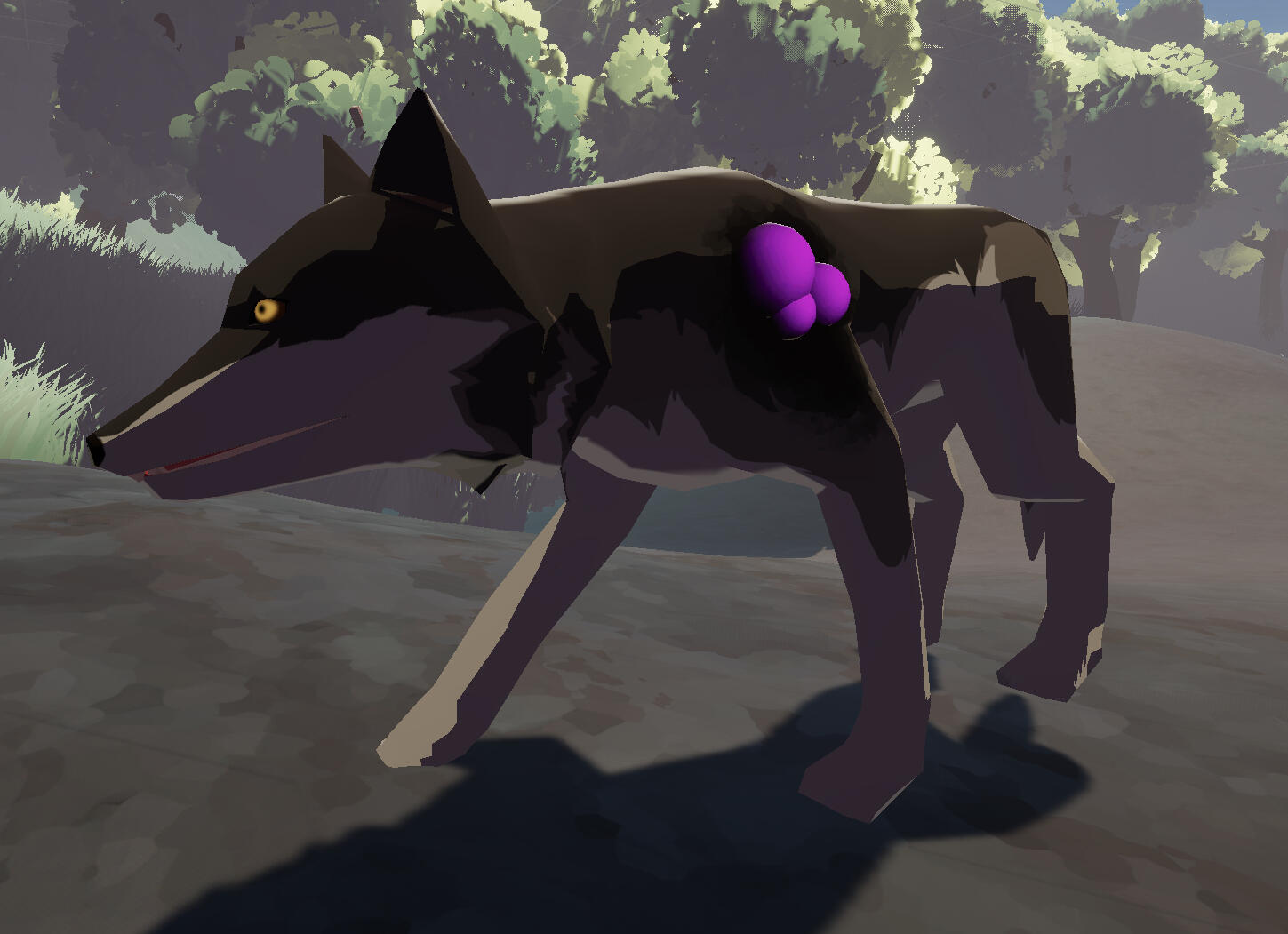
I did try exaggerating the value and saturation, but I think the contrast was a bit too stark.
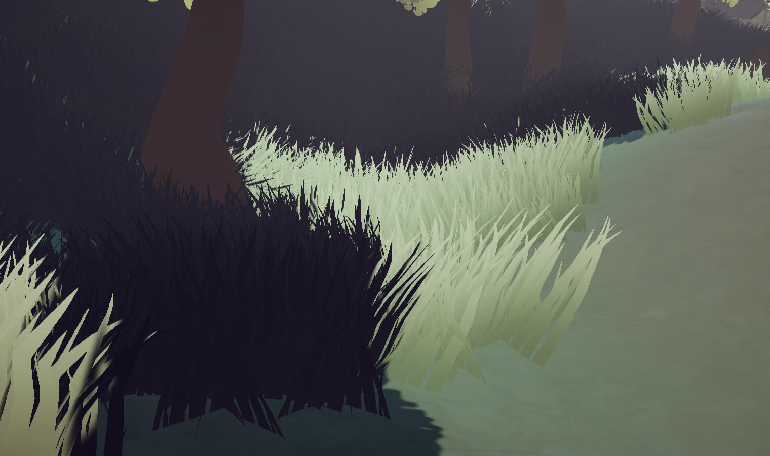
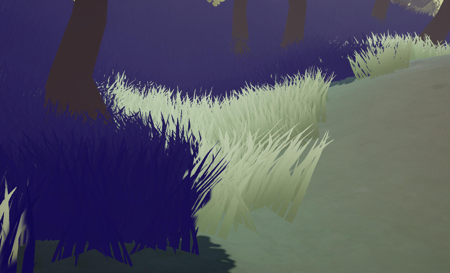
Lastly, I made some changes to post processing, slightly increasing the saturation and contrast. I'm still not completely sure about how much I want to push these values, as I think the tone starts to shift too much towards bright and happy.
Before
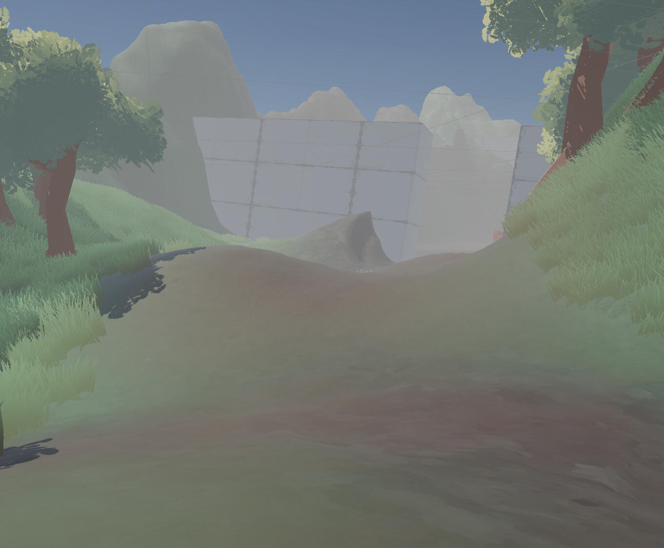
After
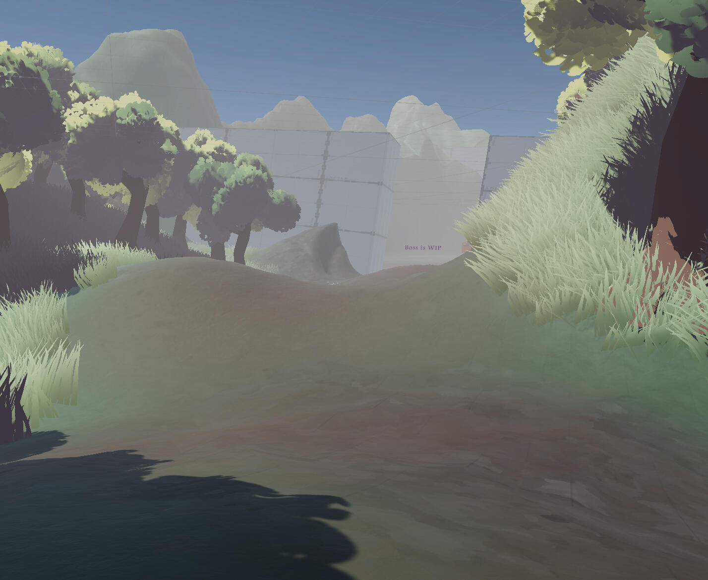
Something I still need to do is figure out how to change the colour on terrain shadows. Terrains currently do not have official support for shader graph, and I don't feel confident enough with HLSL to edit the existing shader (I've already had a quick look and I don't understand it at all).
playtesting feedback
I made a bit of a mistake this week. I set up the feedback document on a separate computer next to the game which timed out as it was left unattended. We didn't get much feedback on the document but some of it was still relayed verbally. I did ask for feedback on the visuals, but didn't receive anything beyond "looks good". The boss fight was generally liked and was praised for its animation. Everyone felt that the fight was quite hard. This is good to know that the game is still difficult as at least for us working on the game the fight has felt too easy.
A problem that was relayed to me directly was that the trees would block their view when the camera went into the leaves. I've now made the leaves fade when the camera gets too close, which should mitigate this issue.
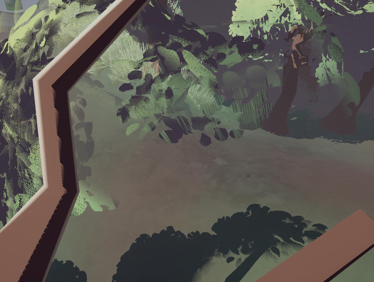
Earth Guardian Texture
I finally found some time to get around to this. At the moment this is just a temporary texture as our character designer still wants to work on it, but I had a quick sketch to use as reference. I believe their intention is to incorporate some texture/detailing on the body. Just like with the wolf, everything is coloured using masks so adjustments will be easy.
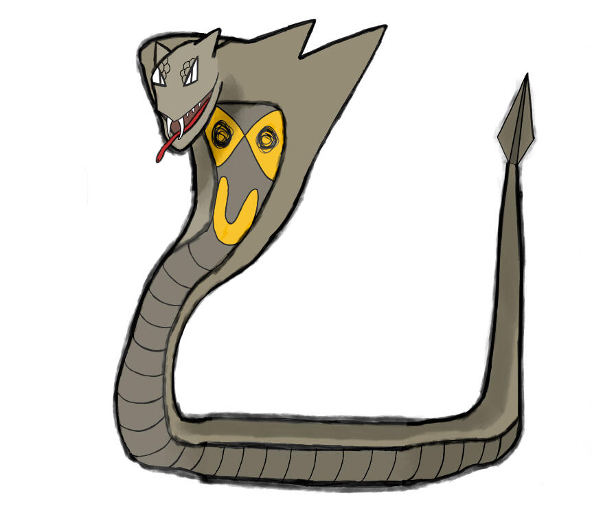
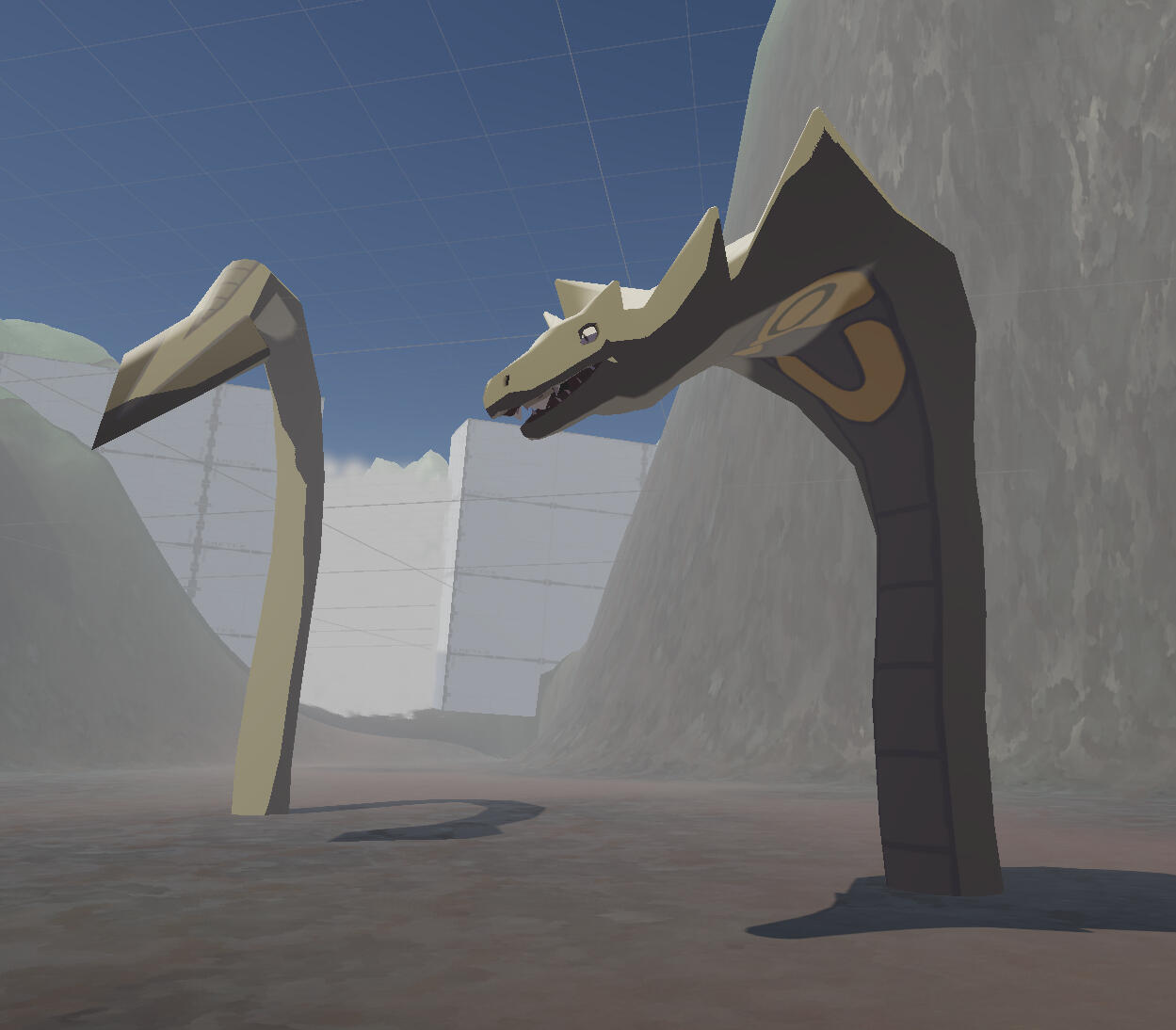
Week 7
Main Character model
I've got a draft design now. While it could end up being a lot of work if the design sees significant changes, I'd rather have something to work with than having nothing at all.
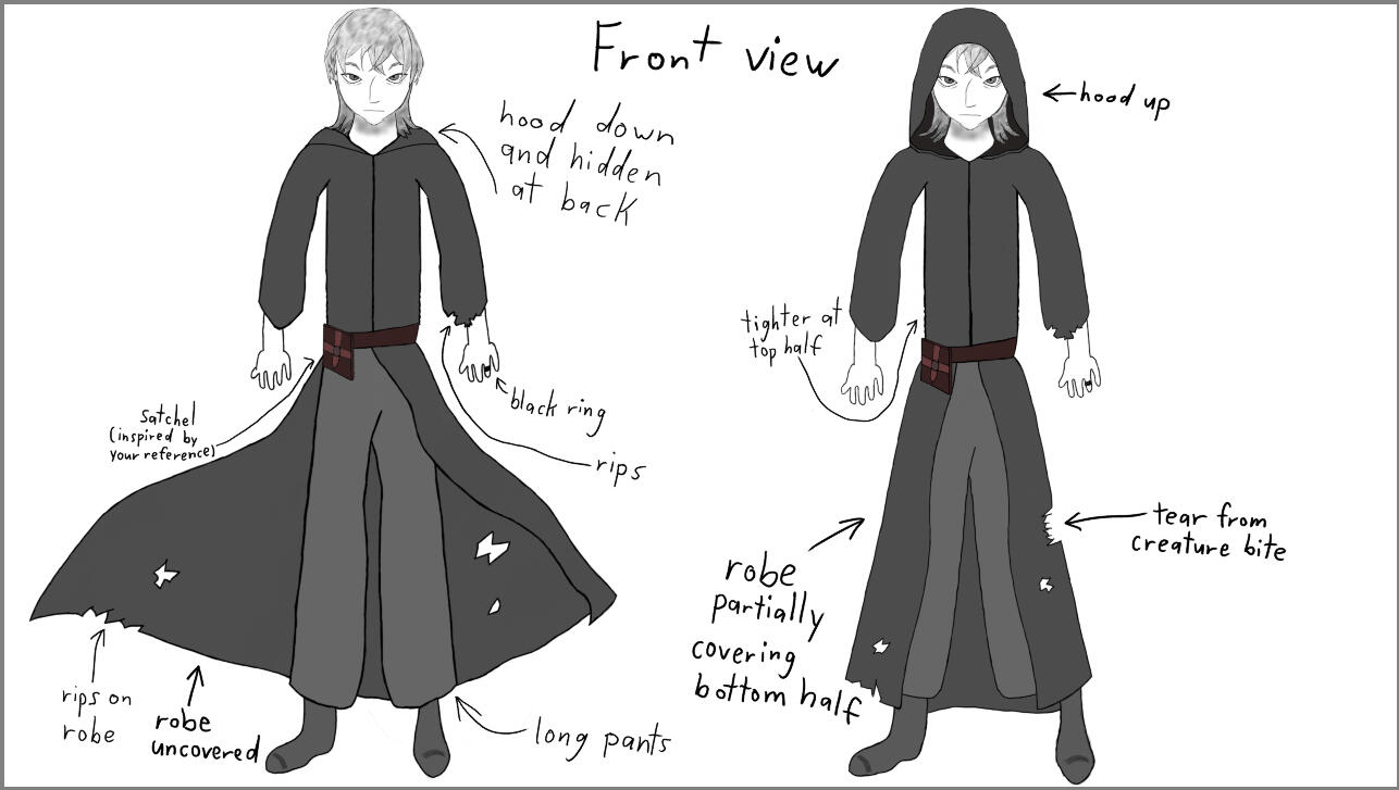
One part of Philip's design that I'm not able to implement at the moment is the damage all around their clothing. This is because of how backfaces are rendered the same way as frontfaces in Unity. I had issues with duplicated/flipped geometry when working with the grass shader, so for now I've given the cloak some thickness. This means I can't use an alpha map unless I can perfectly align both the inside and outside UVs.
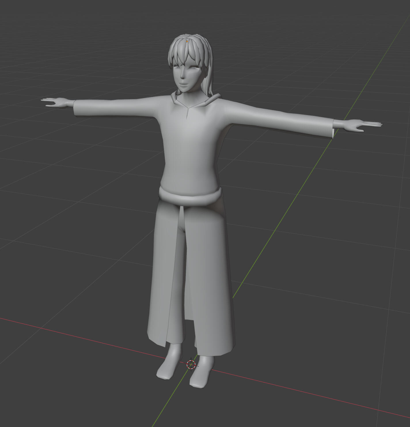
I didn't like how each chunk of hair was shaded as if it were a separate object. This makes the top of the head look too jagged. I used a capsule as a proxy mesh to transfer normals. This ended up fixing the issue, but it removed the detail entirely, so I limited it to the top of the head.
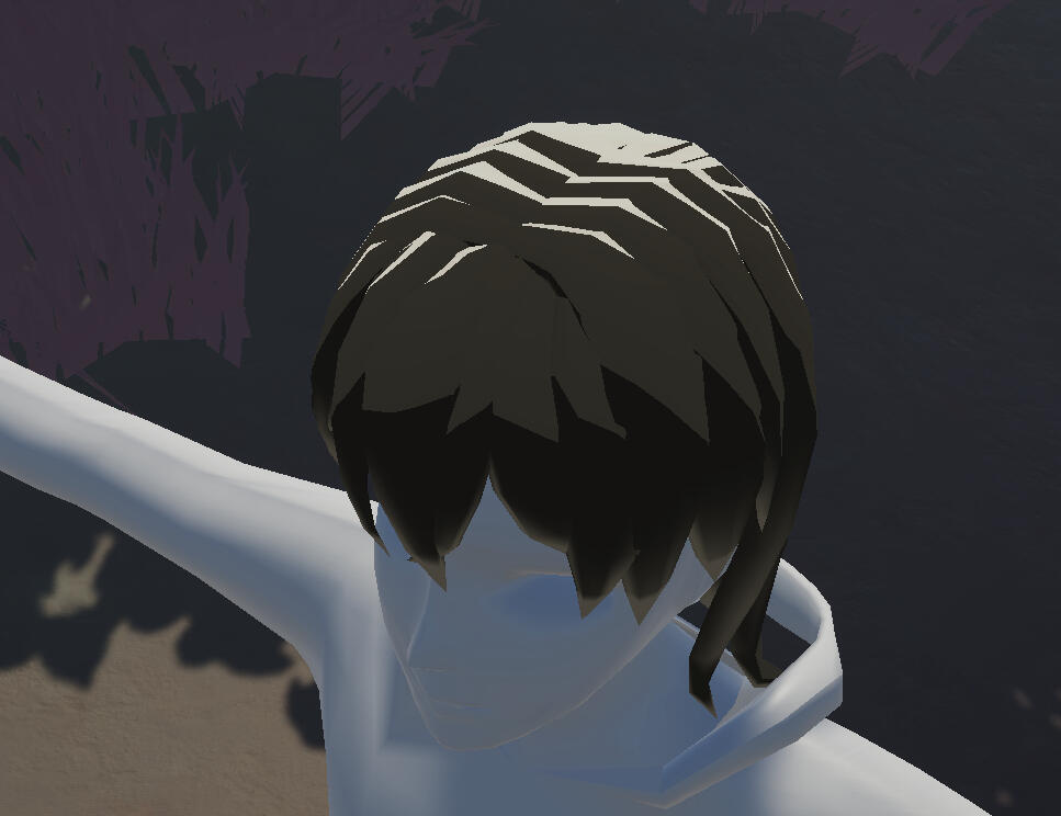
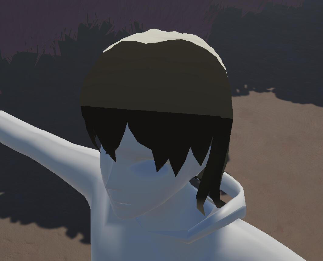
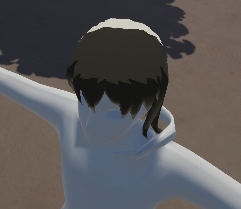
This is the finished model. It's a bit more mid-poly than low-poly, but I'm okay with that. I think the fact that I mostly grew up on the 3DS has influenced the level of detail I've been modelling with.
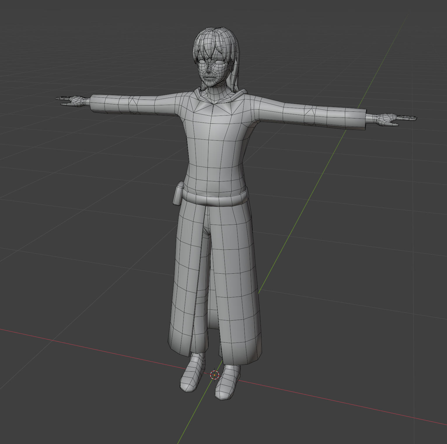
The eyelashes are made with geometry, and the inside of the mouth does have a bit of geometry for teeth. It's possible I might also use geometry for the eyebrows as well, but I'll see how it looks as a texture first. There isn't any facial animation at the moment, but it's still good to have things ready.
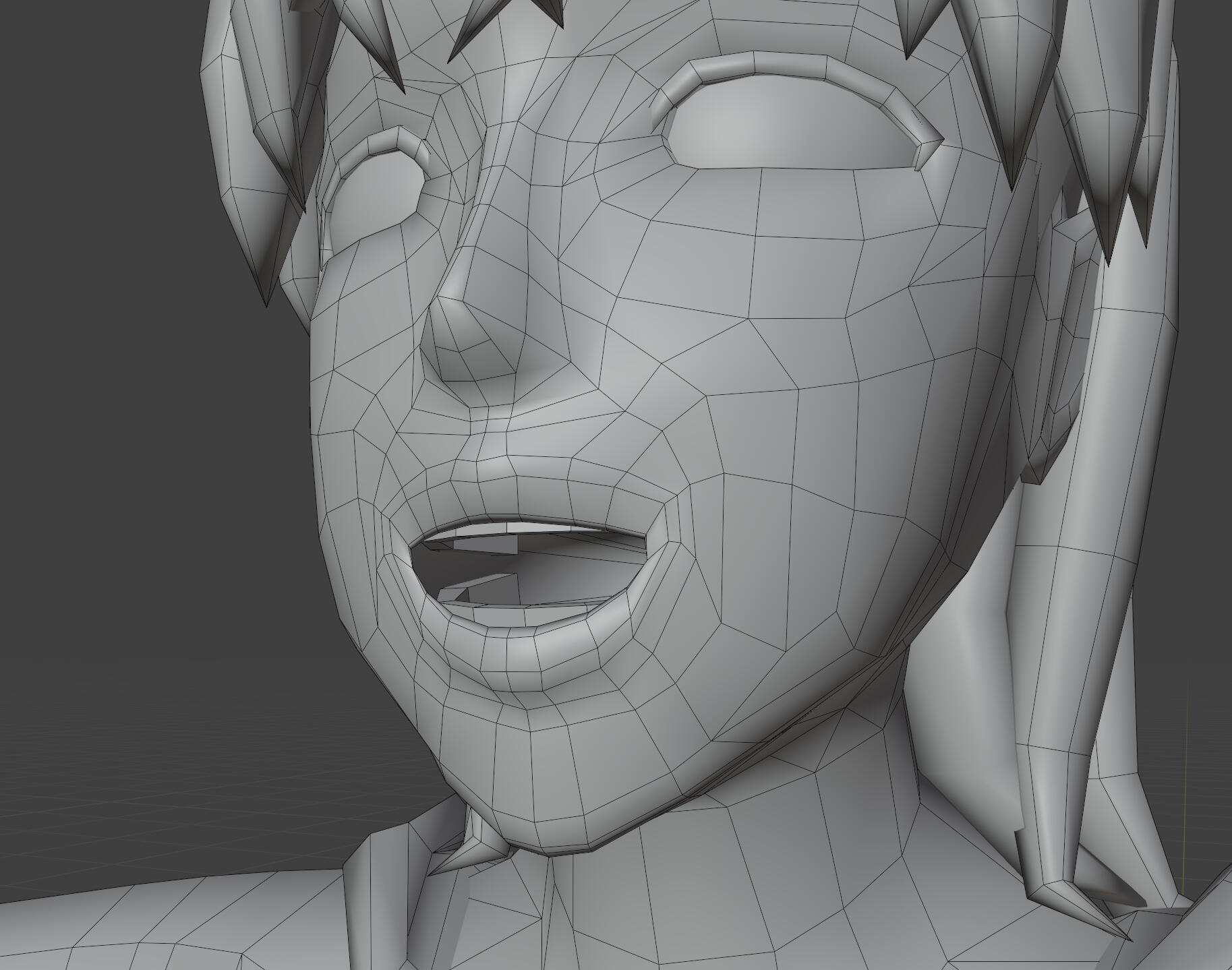
The model has also been rigged. There are additional bones set up for physics on the hair and cloak. Rigging these parts took quite a long time. I won't know how well I've done until I've set up physics in Unity, so I took my time. Hopefully I've done it all properly.
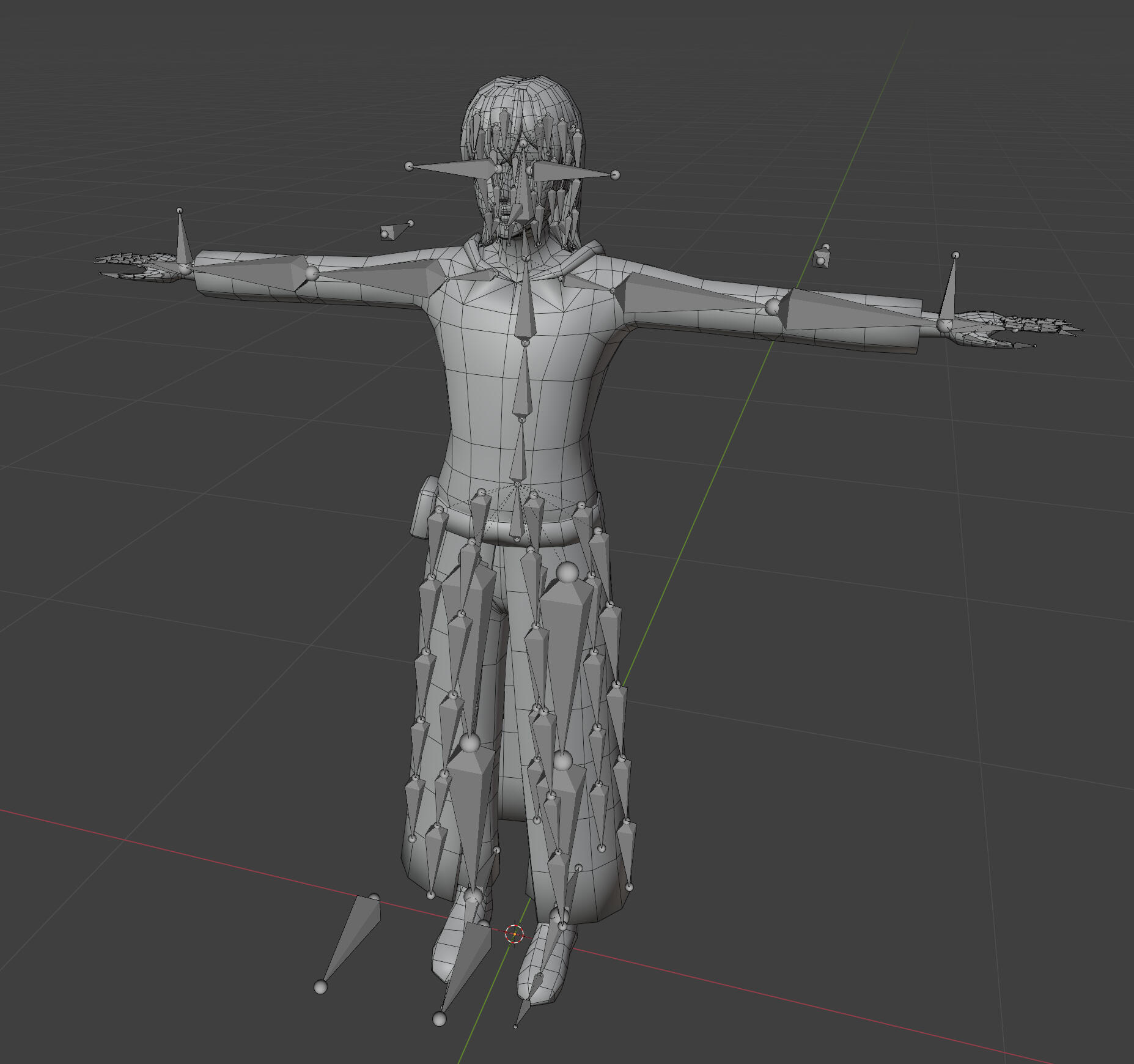
I've also quickly textured the model. I'm assuming the colours aren't final.
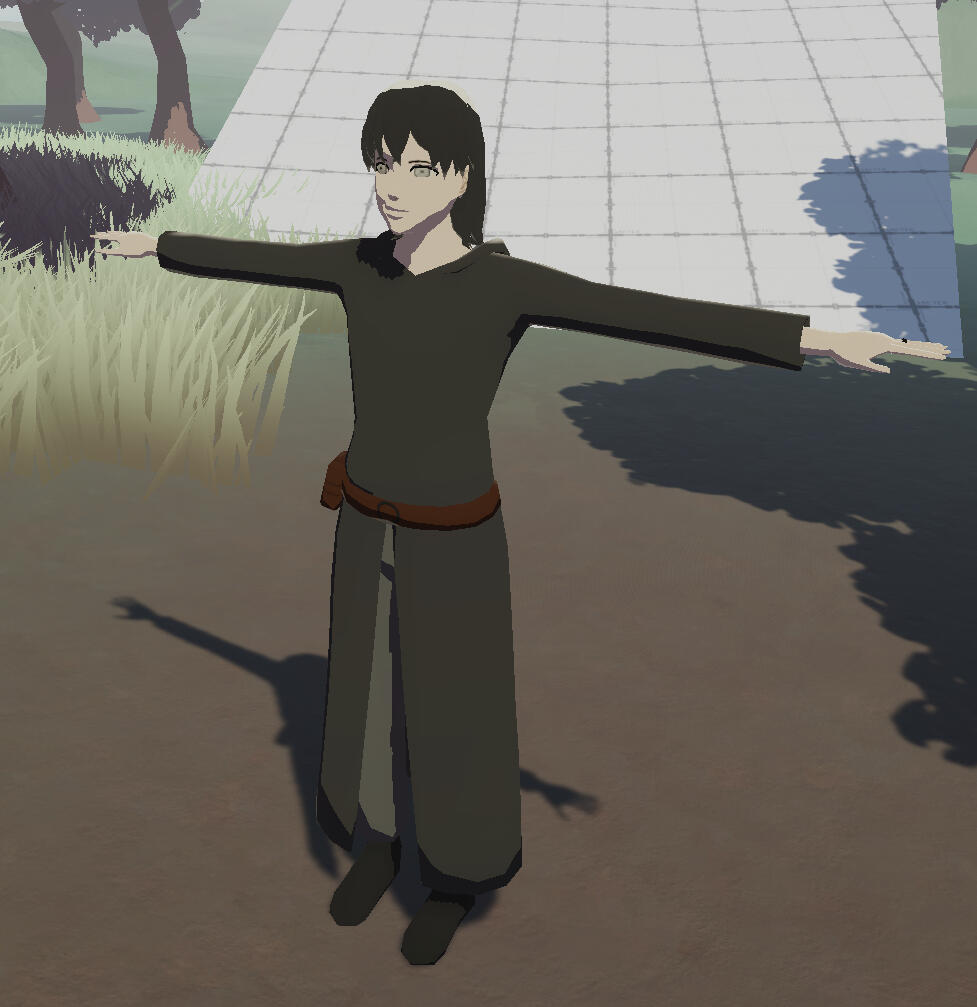
Break
Face shading update
Back in semester 1 when I first made the character shader, I was unable to get shadows to look the way I wanted them to. I've made a bit of an improvement to shading by using a similar proxy mesh solution to the hair, and tweaking the normal and depth bias for shadows in Unity. This doesn't give me perfect shadows, but given that the model won't be seen up close very often, I think this is acceptable. If I have time towards the end of the project, I'll try making a high poly model to bake better normals.
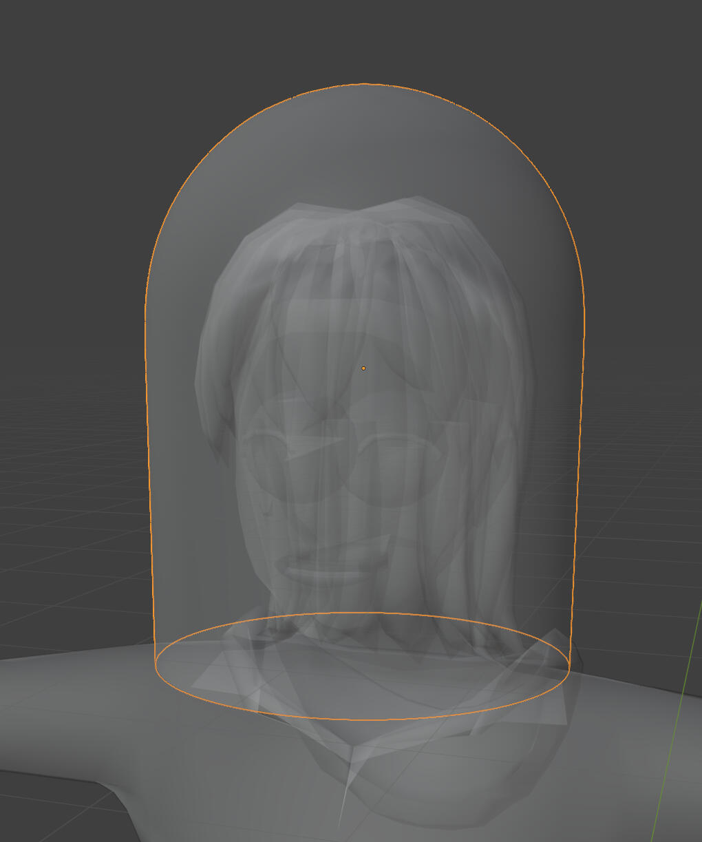
hair and cloth physics
I've added some basic physics to moving parts on the player character's hair and clothing. I'm using the EZSoftBone add-on, mainly because it's free. I tried the jiggle bones add-on included with the Unity-chan package, but it didn't seem to work in any configuration or separate project.
The cloth was still rigged with automatic weights so I wasn't worried about that, but I did notice that the hair all moves in a big chunk, exposing the neck and back of the head. I filled in the gap behind their neck with more hair. I also set up each section of the hair (front, sides, back) separately so that I can apply different physics materials to each part.
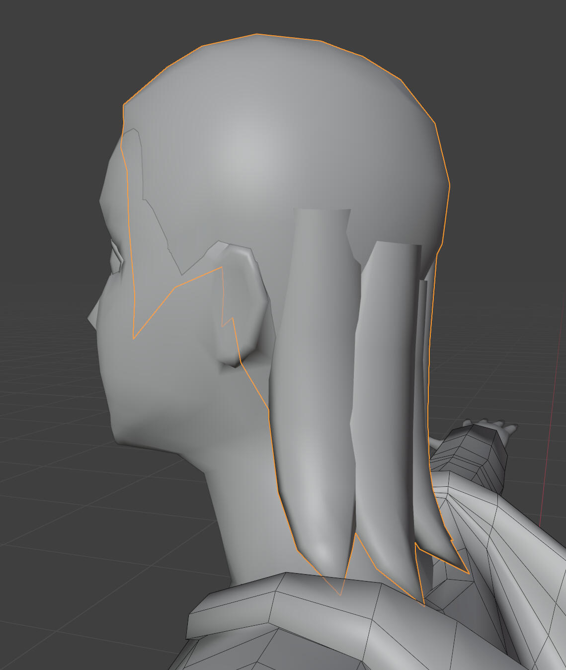
The last glaring issue is that the 'skirt' part of the cloak clips through the legs. I thought that the colliders weren't making enough contact because the gaps between each bone was too big, so I added more bones to fill in the gaps (adding the bones and re-rigging took 2 hours).
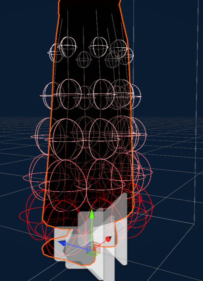
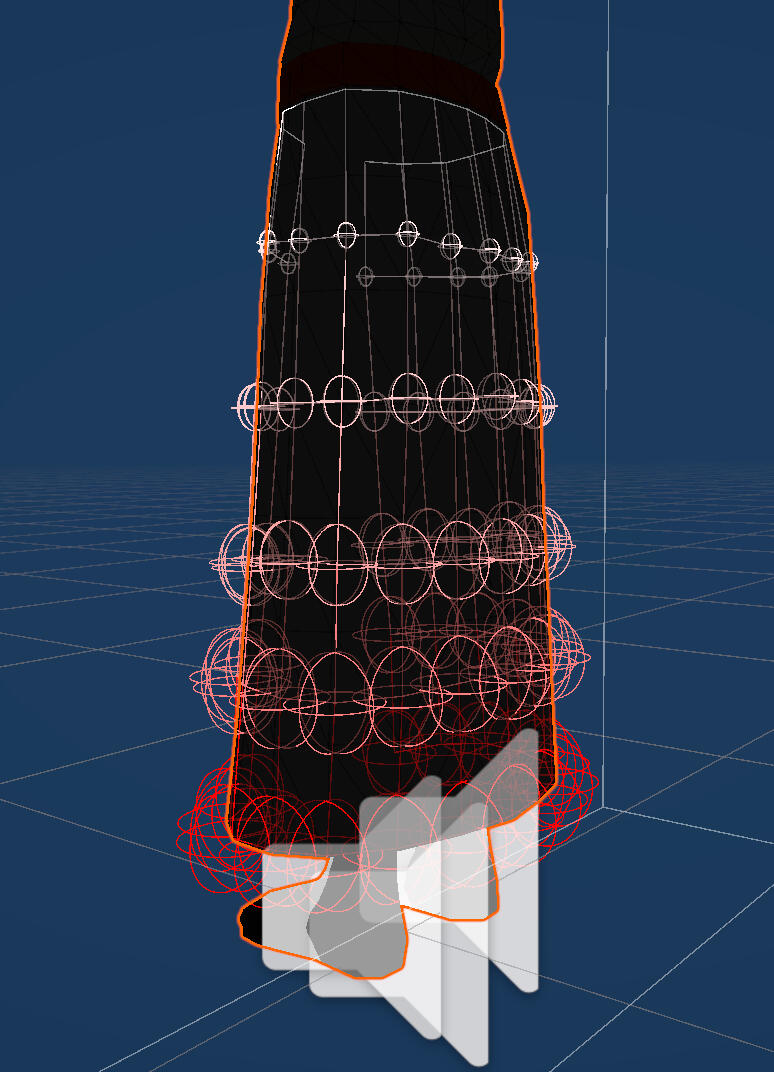
Unfortunately the collision issues are still there. I've spent at least a few hours tweaking collider size and settings, but haven't seen any significant improvements. I'll leave this as is for now, it's better than nothing.
Week 8
terrain shader
This was the last bit of technical work I need to tie down what I can achieve in terms of art style. I'd been dreading this since the beginning and I was absolutely right to do so. This was my least efficient week of work so far.
Initially I had seen an official video which introduced terrain support in shadergraph for Unity 6.3. I rushed to move the project to the beta, before checking it out and realising that it only allows for changes to the terrain layers. Custom lighting still had to be achieved by editing the default Unity terrain shader. I only vaguely remembered how to code in HLSL from last semester, but I was able to figure out how to change the output on the terrain right at the end of all the shading calculations.
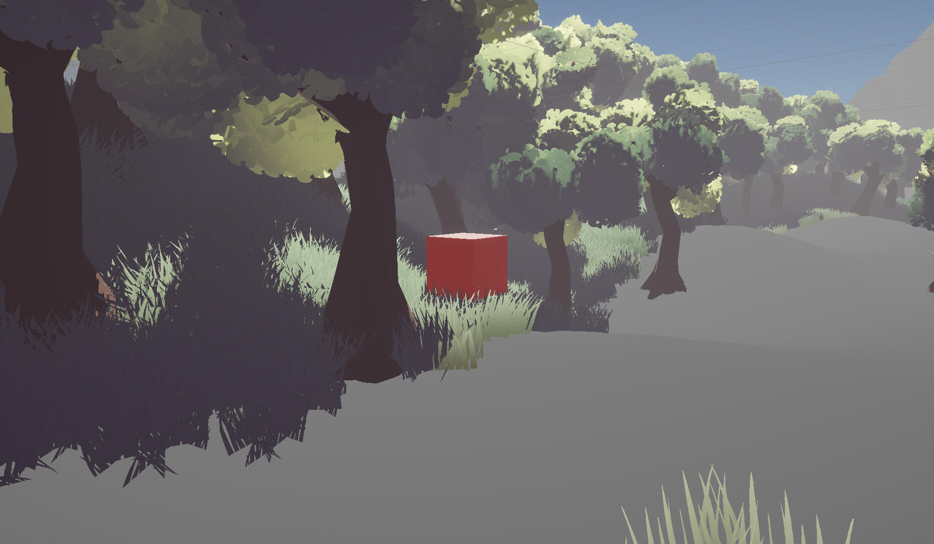
Through this I was able to remove the shadows, and redraw them manually as a solid colour (overriding any PBR details in shaded areas).
However, this still had a number of issues:
1. I didn't have any way to remove the terrain's self-shadowing, so some of the shadows were doubled-up and significantly darker.
2. Any PBR detail is completely removed in shaded areas.
3. The shadow colour is uniform regardless of what the underlying texture is.
4. This solution doesn't factor in point lights.
I was willing to accept the uniform colour as a 'stylistic choice', but the other issues were a bit too much for me to ignore. I attempted a (very) expensive method of reintroducing shadow attenuation from point lights by doing the lighting calculations again, but I was stopped by an error I couldn't figure out.
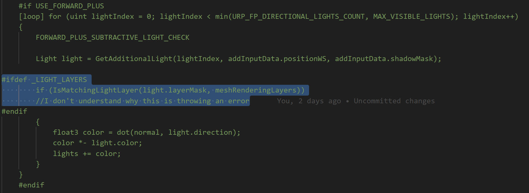
This led me to try editing URP's lighting calculations globally instead of just on the terrain. I got to the point where I could change the tint on the shadows, with this extra code (commented parts).
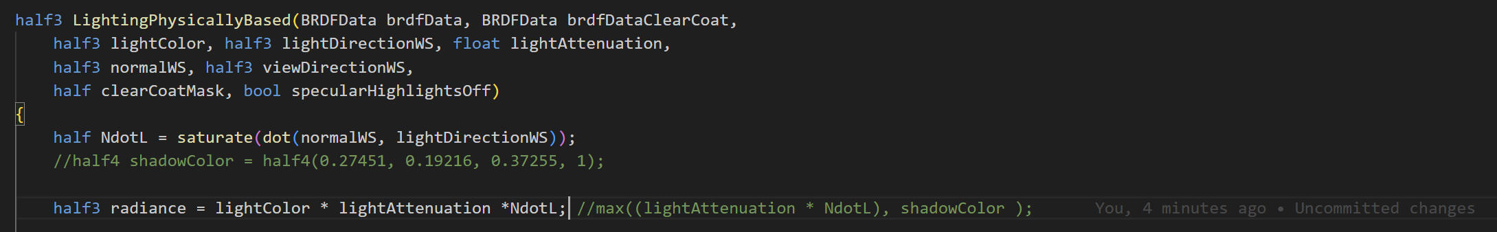
Shadow tint
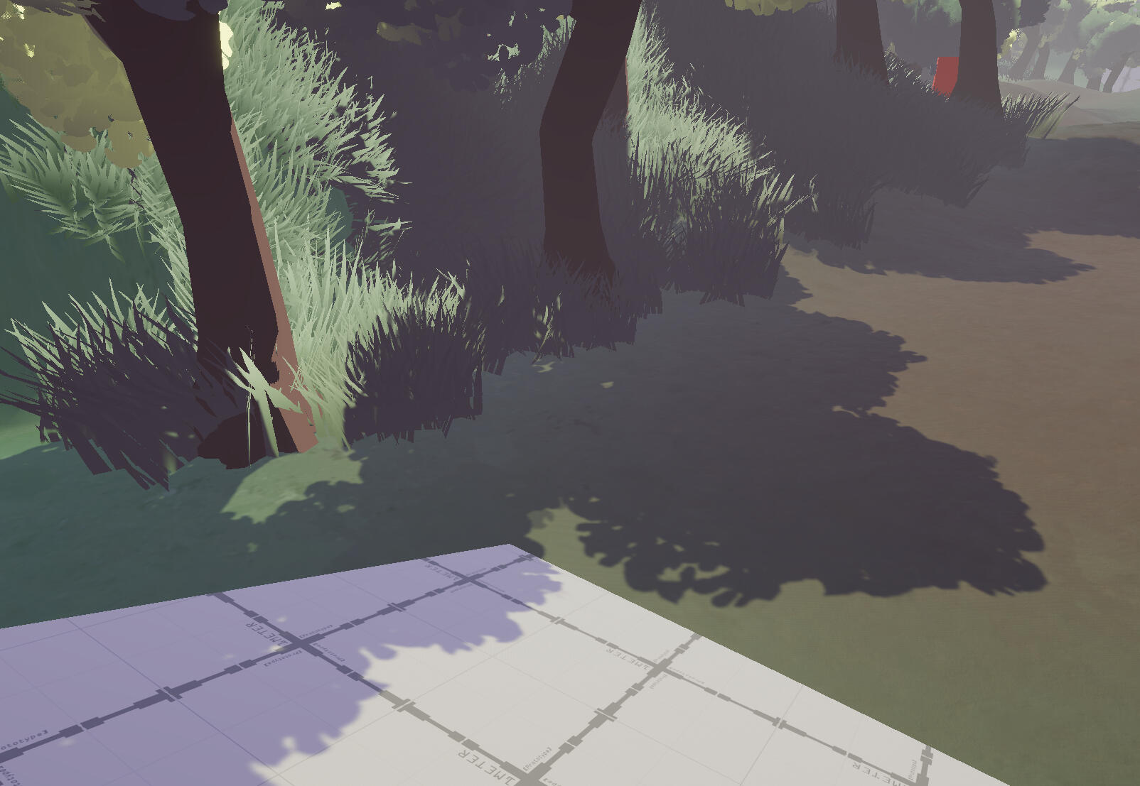
Shadow Tint + Albedo
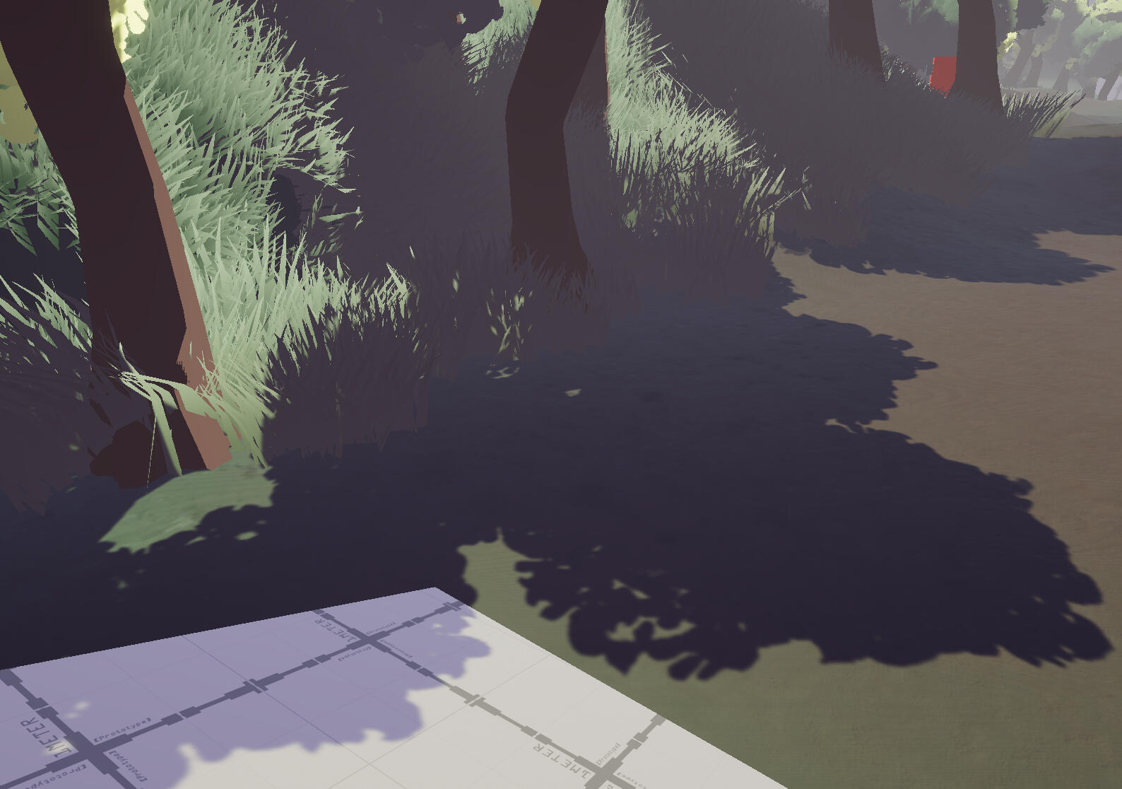
For some reason, this solution gives a weird blocky halo around point lights. So I had to find another point to edit the shadows.
I found the function which is used to calculate the final output colour. I spent some time (2 days) tinkering with different solutions (adding functions, adding inputs to existing functions), but I eventually landed on this. I added another value to the LightingData struct to get the distance and shadow attenuation of the main light and additional lights, and use this information to mask just about anything I want over the shadows. mainLightColor is actually the output of the PBR calculation, so I also added a value to grab the raw color of the main light so the shadow colour can still respond to the scene. (Lines marked with comment at the end are mine.)
This now allows me to put pretty much whatever I want in the shadows, so I can replace the colour completely, apply a texture, or just apply a tint.
Light and shadow attenuation mask
minimal impact on cel-shading
point lights and pbr detail
With some more tweaking and post-processing adjustments, this is the result of my efforts.
All shadows are given a violet/purple hue. I'm using shadows to express the theme of death. Within the context of the game, the main symbol for death will be incomplete ether (also coloured violet). I'm hoping that people will pick up on the link between the colours. I think the current result might be a bit too intense. The saturation of the shadows could be subtler, but I'm still liking how this is coming along.
Main Character Model Update
I've added the rips and tears in the main character's clothing from the original design. My solution to overlapping faces causing issues was to just add a tiny gap between the inside and outside. The UVs were aligned exactly so they can share the same texturing.
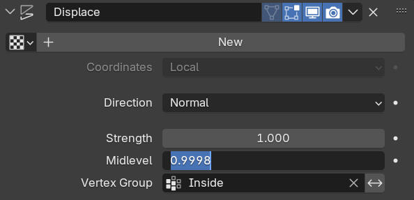
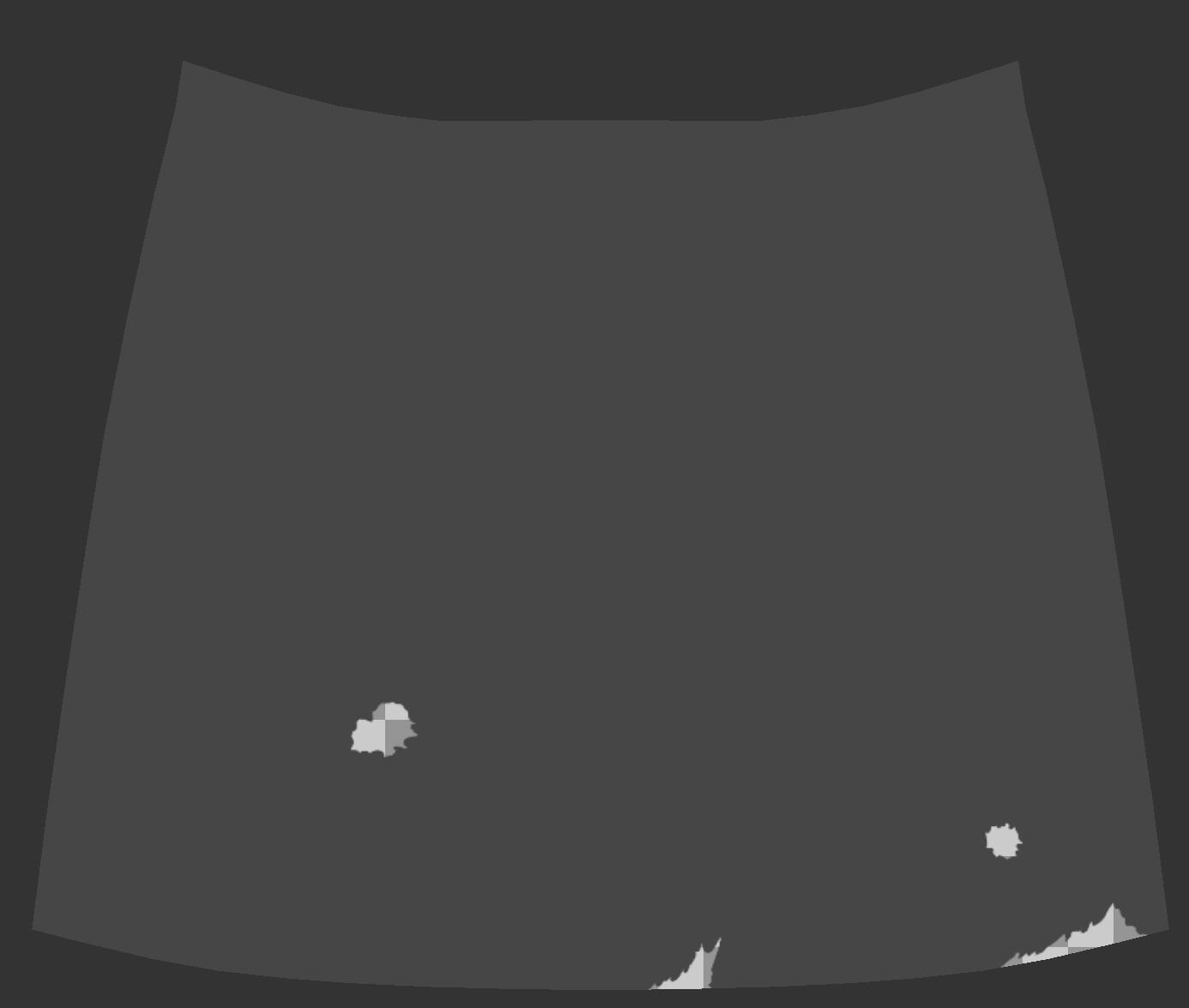
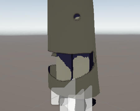
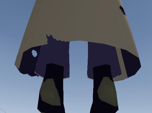
Week 9
main character model updates
I've made some more improvements to the face of the main character.
1. I've changed the shape of the eyes to match the original design more closely.
2. I've switched the eyes onto a different texture set, so the irises look much sharper.
2. The eyebrows have been changed from a texture to geometry.
3. The top of the hair has been rounded out.
Before
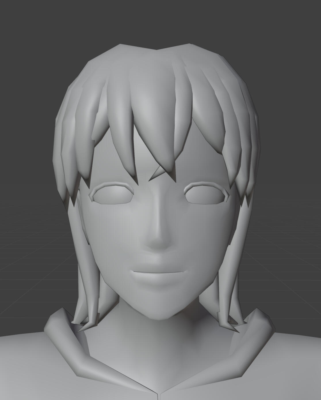
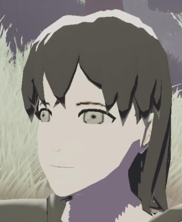
after
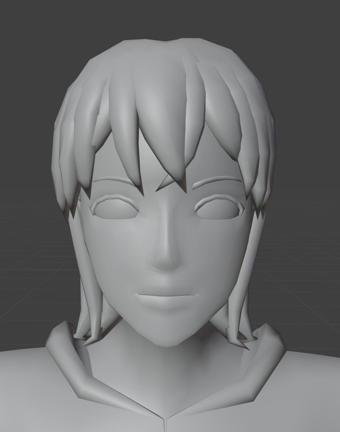
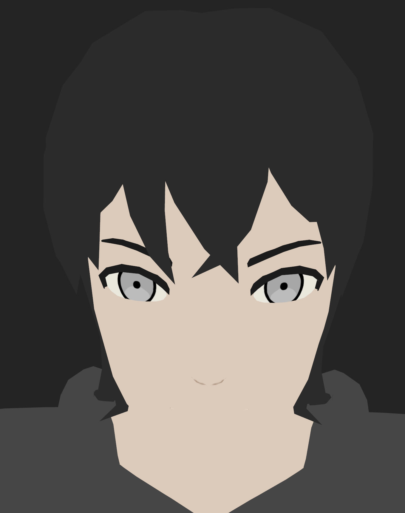
I think the eyes and eyebrows are the bigger upgrades. Everything just looks sharper and cleaner.
Main Menu UI
Most of the systems were already set up so I only had to make the graphics, though I still took the time to look at UI from other games in case I wanted to make any changes to functionality or layout.
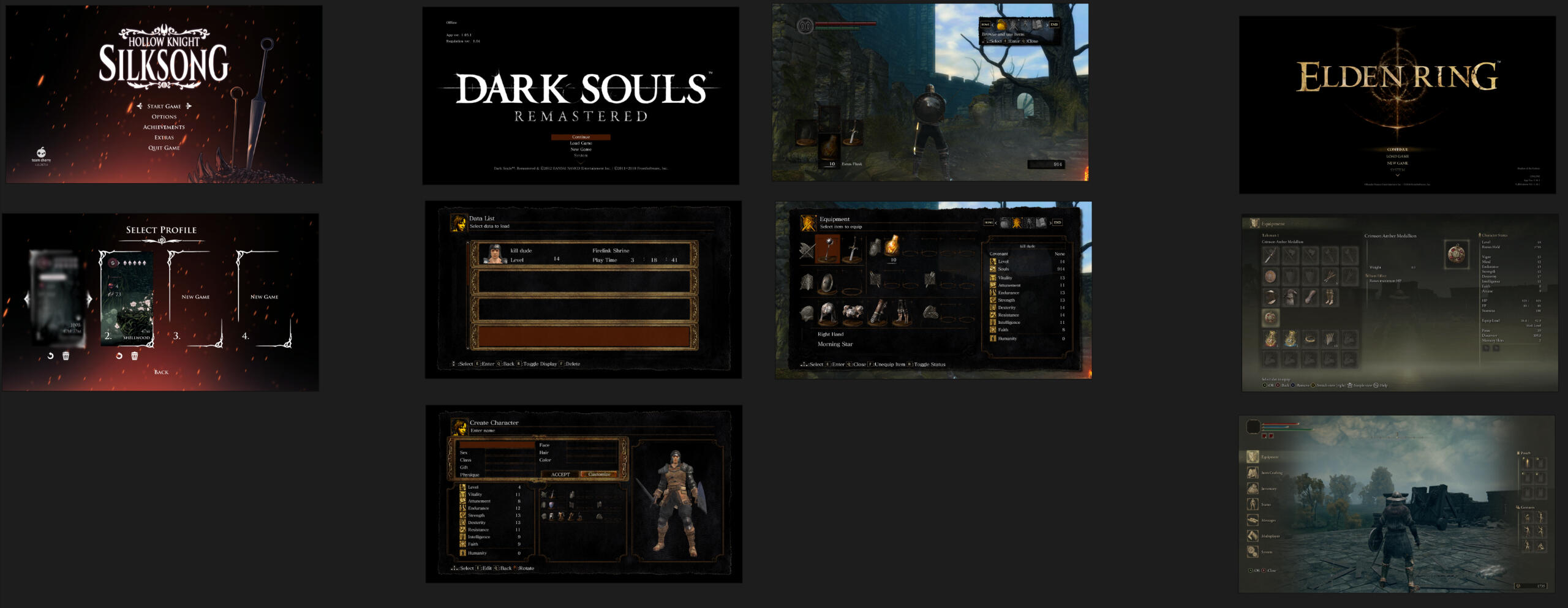
One change I'm making is to make the first screen a "Press any Button" screen instead of "Press Start". I've never really liked press start because it's now become the A button instead which is, quite clearly, not the Start button. This screen brings up a title card along with the main menu.
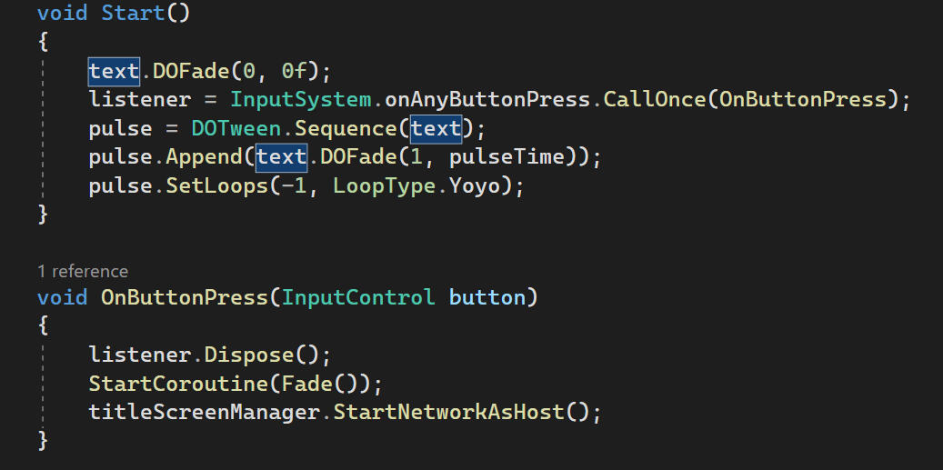
To keep with the theming of the game, I've made the colour palette violet and yellow, and am incorporating the ether conduits/white flowers into the graphic elements. I've only had 1-3 very minor iterations of each of these, so I'll just show what I've ended up with. All of these are made in Illustrator, so I can still edit the colours or vector art whenever needed.
The patterning inside boxes is only a subtle colour difference because they would interfere too much with text readability.


The layout of the character creation page has been overhauled. The character's name and class selection have been moved into a separate box instead of replacing the original buttons, and there's a new box which will be used to show the stat differences between classes. Currently not set up.
This took a while since all of these broke the original functionality in some way. I think it was worth it though, since it makes a lot more sense to use.
Pop-up windows now darken the background for improved clarity.
And all of the pages have been put into canvas groups so I can fade them in and out. All put together, the UI functions like this:
Aside from the fact that I don't think my graphic design looks very good, a little nit-picky issue I have is that there's no way to make a single text asset glow when selected. I can fake it with a sprite, but this will make the button graphic way more complicated to set up. Either way, I'd like some way to make the button selection a bit clearer.
Week 10
main menu ui
I've added the stats preview to the character creation page, as well as a fake glow behind selected text.
I also added some checks and pop-ups so the game can't start until a name and class have been selected.
Technically, only starting without a class will break the game, so the name check has been disabled for now. I just don't know if I will remember to enable it again so I'm writing this for my future self to see this when proofreading. Surely I won't forget it now.
In-game ui
The graphics were made with the same theming in mind as the main menu. The difference is that yellow is used more predominantly than violet as this is what the player will see when they are alive which fades to dark violet when they die.
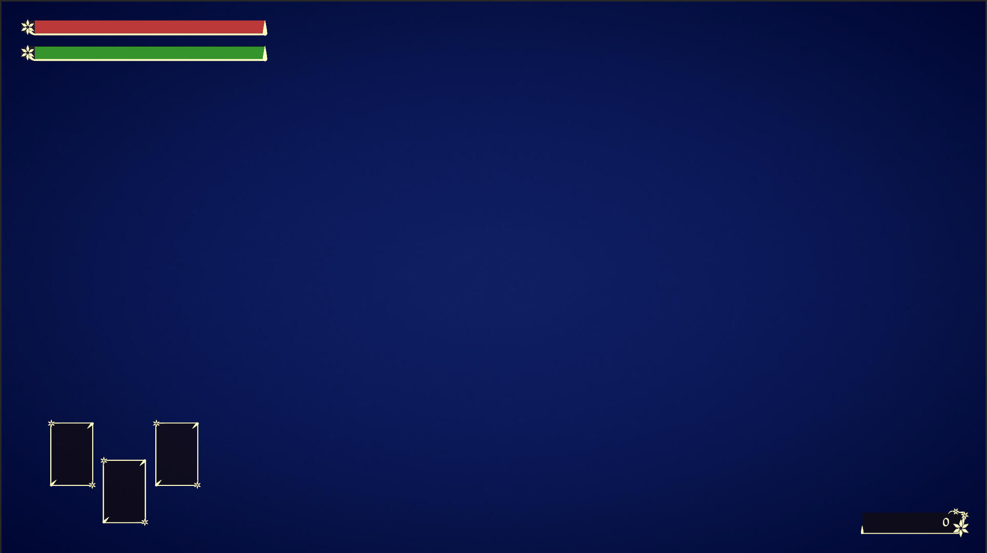
I didn't continue with this idea for in-game menus, as I just didn't like how they looked. Instead I opted to keep everything dark. Visibility is also significantly better so I'm okay it.
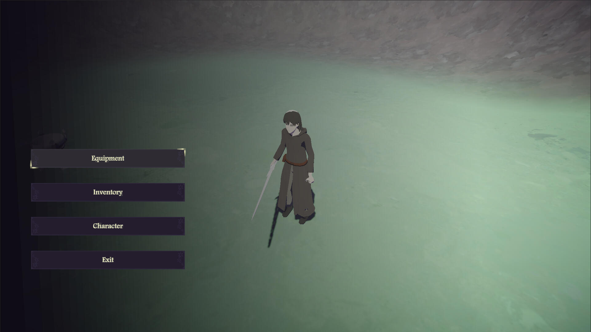
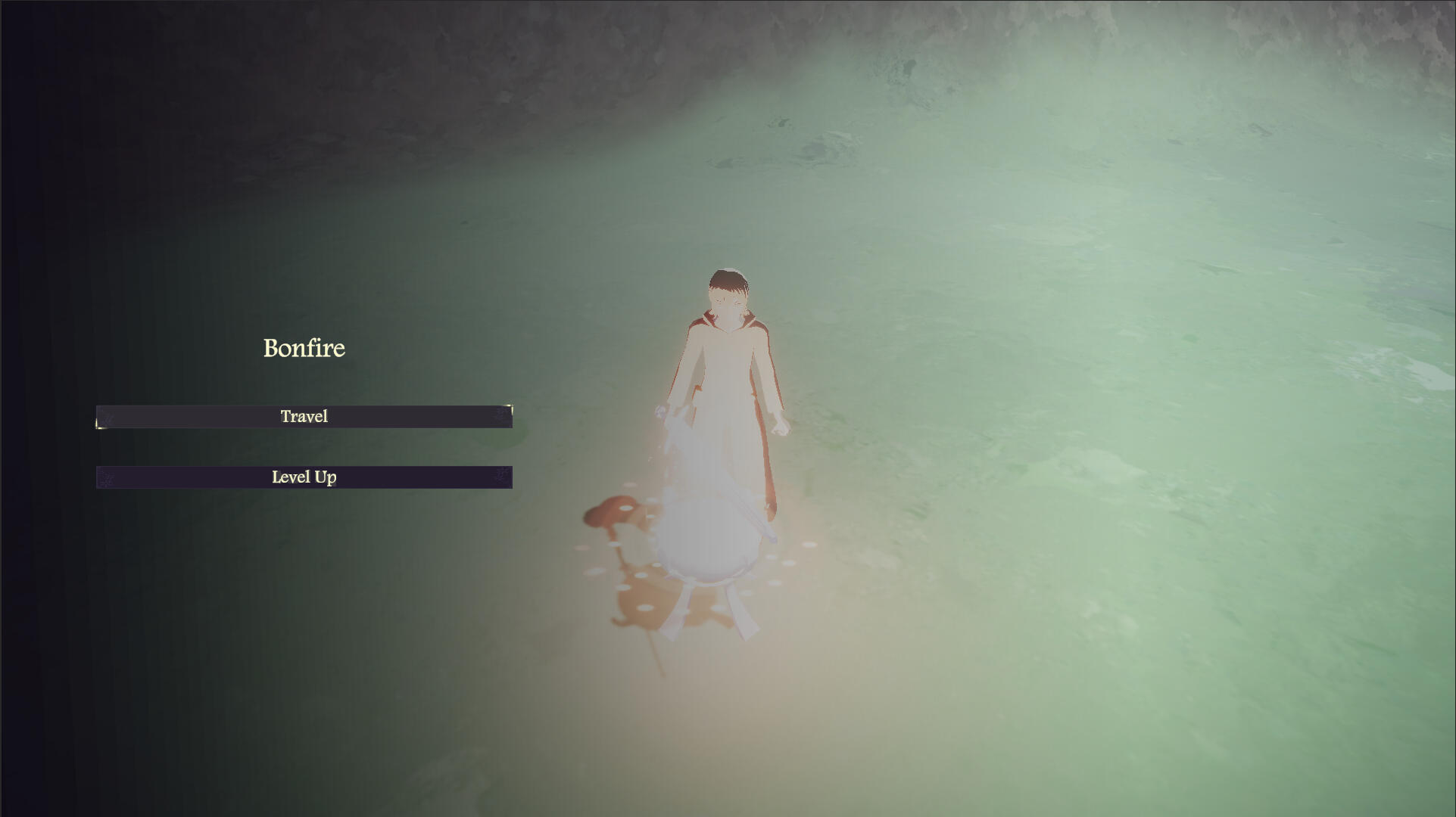
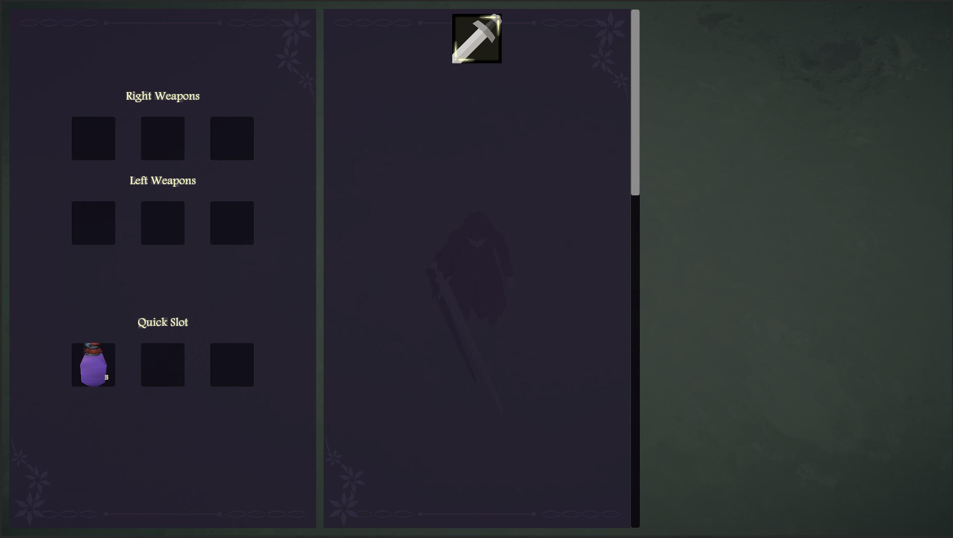
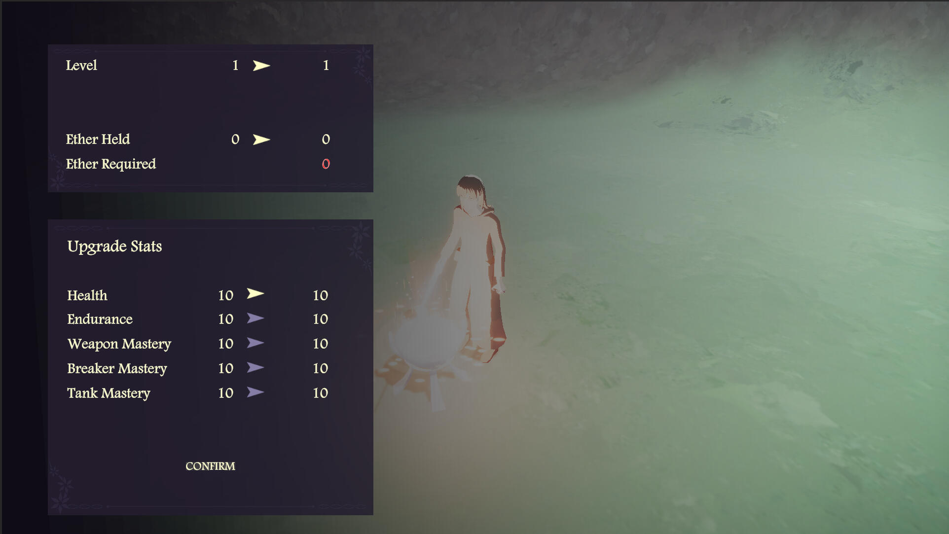
There's nothing to say, there were only 1 or 2 minor iterations for each element. I don't think I do anything particularly interesting with illustrator.
Physics updates
The EZSoftbone package includes support for external forces such as wind and gravity. With the addition of these, the character's hair now flows in the wind and bobs up and down when moving. This looks a lot more natural than before.
I also spent a few hours trying to stop the legs from clipping through the cloak, but no configuration of colliders or bone settings seemed to fix it. I think I'm just going to leave it as is until I have the time to try other solutions.
what if i was playing video games
Sometime in semester 1, I remember being told in class that we're allowed to just talk about the games we're playing, and that it is in fact encouraged. I forgot about this until now, so here's me talking about a game I've been playing.
Over the break I played Hollow Knight: Silksong, which I had been waiting for for 'some' years. I achieved 100% completion in 46 hours of playtime, and thought the game was great. I was really impressed by the attention to detail in all aspects of the game, and I thought the new movement and boss fights were really good. There are however a few things I'm not a huge fan of.1. A lot of bosses/enemies still have non-telegraphed/unreactable relocation, whether that be jumping, backstepping, or just random flight patterns. This was an issue I had with the original Hollow Knight as well and I would have liked to seen this addressed in some capacity, especially since a lot of enemies now deal 2 masks of damage on contact. I don't think this is necessarily bad game design, since it is possible to learn when a boss might reposition itself and where you should be to avoid it. I just don't like that you can be attacking a boss which appears to be idle, and suddenly take damage with no opportunity to react. This is mostly an issue because so many enemies in this game fly around unpredictably.2. Difficulty progression does not feel smooth. Silksong is a metroidvania so it's not exactly possible to stop players from going places they're not ready for, but I still think that some of the early game bosses were a bit overtuned. Additionally, I felt that the difficulty actually drops off as the game progresses. You get access to more tools, have likely upgraded your health, silk, and needle, and have more experience with the game's combat. I would expect the bosses to be harder in the late game, but to me they felt too easy compared to the early game. I did not use tools in most boss fights, and used the crest with the lowest DPS (reaper). The ending felt a bit underwhelming. (Spoiler ahead)
Attempt 1
Attempt 5
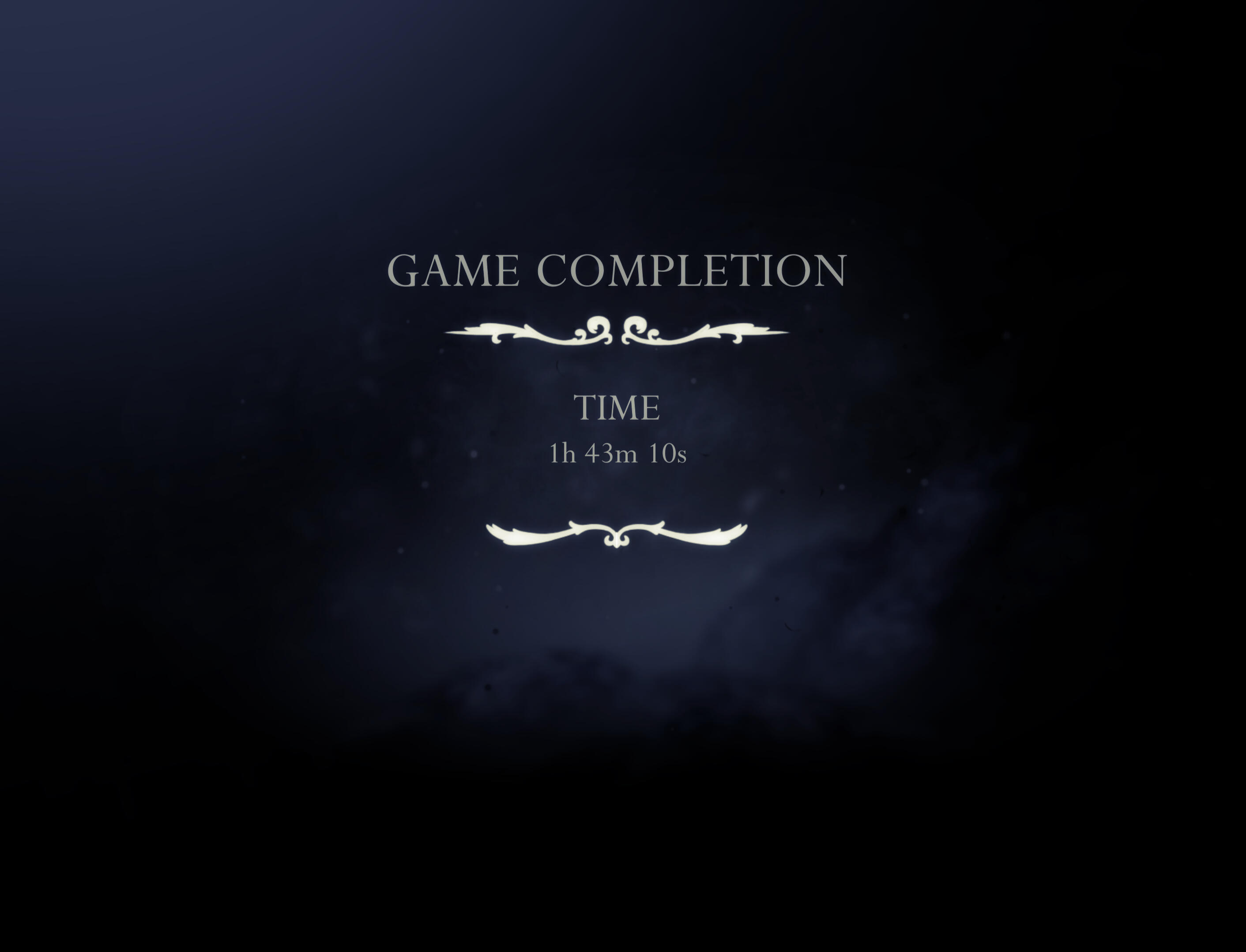
attempt 2
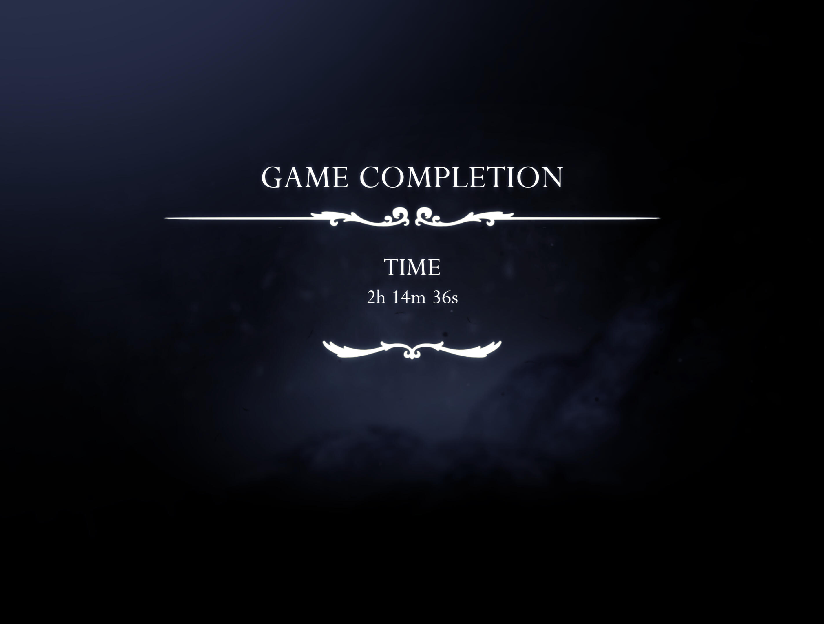
Attempt 24 (Current PB)
To be clear, these were the only 4 runs I completed, I didn't spend that much time playing. The takeaway from this is that I think that difficult games are fun and satisfying to get good at. I didn't decide I wanted to make a souls-like for no reason. Also! I think speedrunning is a really cool medium for skill expression, and I think it would be interesting to design my own games with speedrunning potential in mind.
Week 11
Ether Conduit
The ether conduits are going to be the checkpoints in this game. I modelled and rigged it in blender.
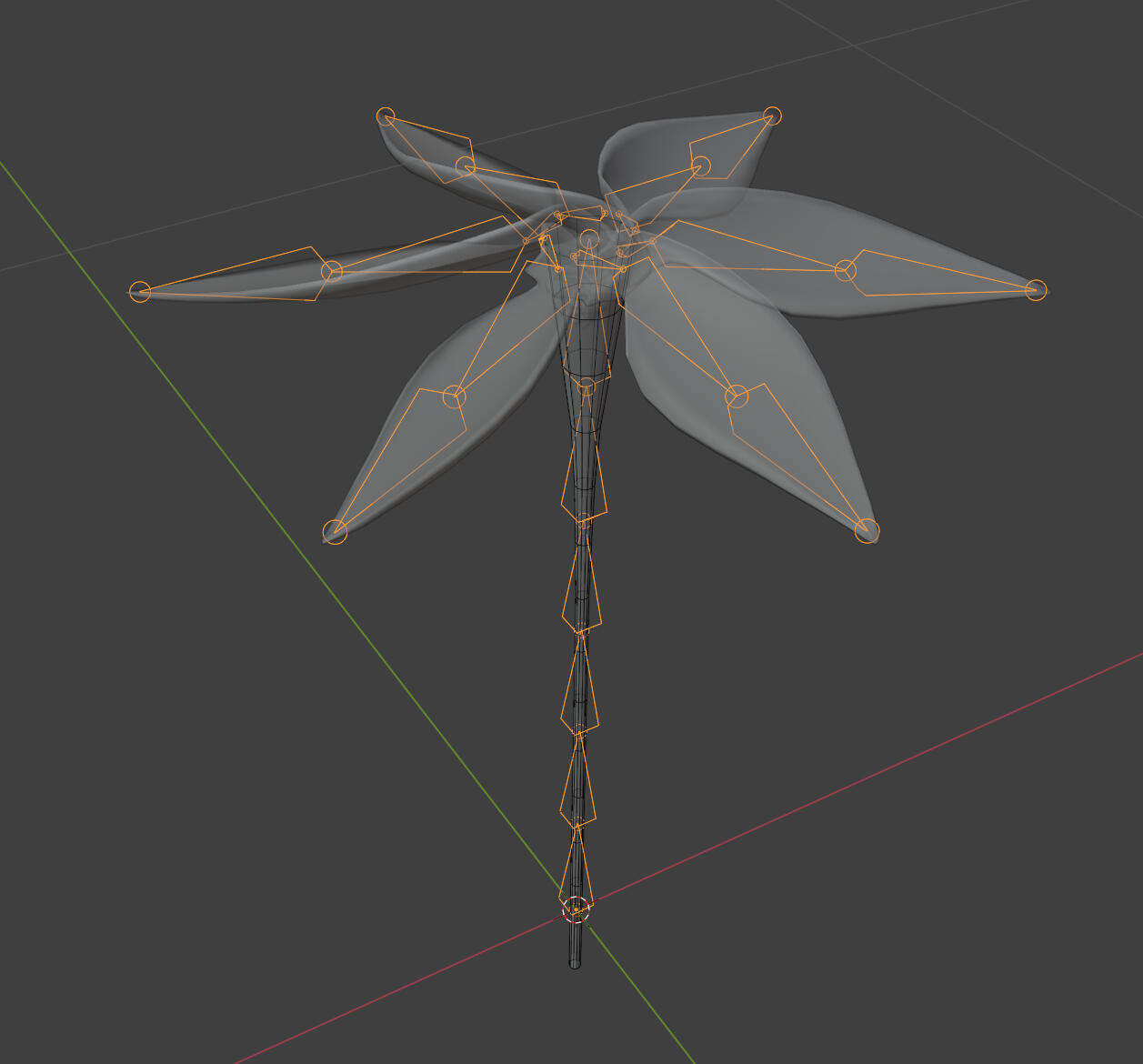
I decided to make the tepals longer in than my original design as I felt it still looked too much like a normal flower. There's a bit of an increase in the spacing and pointiness of the tepals which I think makes it look weirder.
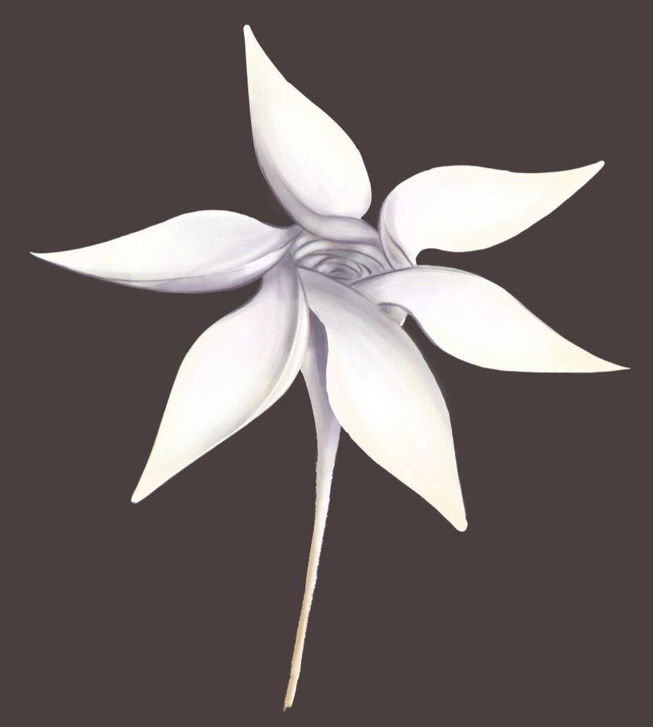
I've painted an emissive map to change the colours of the tips of each tepal when a checkpoint is activated. This is another tie-in with the life and death theming of the game.

A little detail I wanted to mention about the particle effect is that there are particles going both in and out. I'm not sure if people will notice this or pick up on what it means in regards to the cyclical flow of ether, but it's there and it's intentional.
VFX
This is a bit of polish the game has been needing for a while. I'm not new to particle system or VFX graph, but it has been a very long time since I last used it. I didn't feel confident going into this, but I'm overall satisfied with what I made.
impact/debris
Both the smoke clouds and debris particles were painted in Photoshop.

AOE Attack
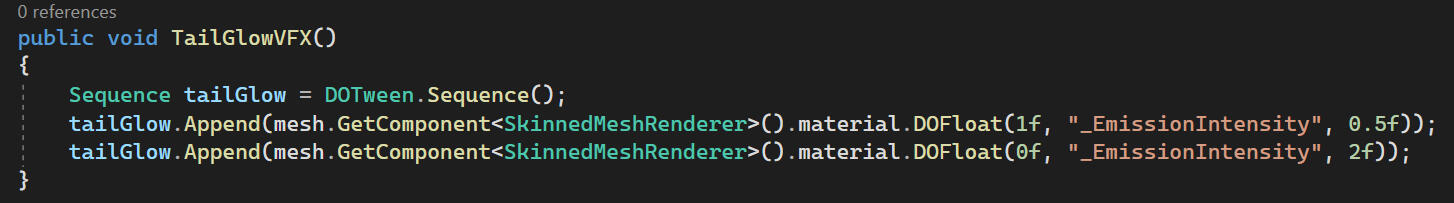
The tail glow effect is achieved with an emissive map and an animation event with DOTween Pro.
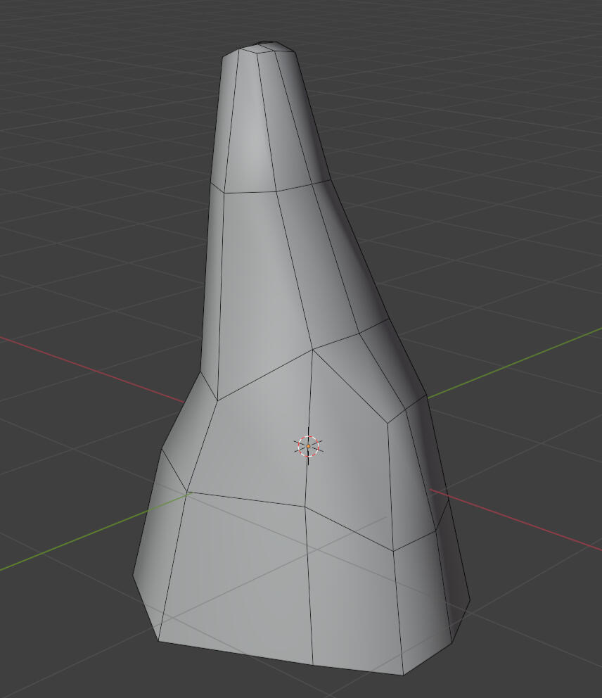
I intend to retexture the model at some point since it's not a colour match with the terrain.
Sword Trail
Death Dissolve
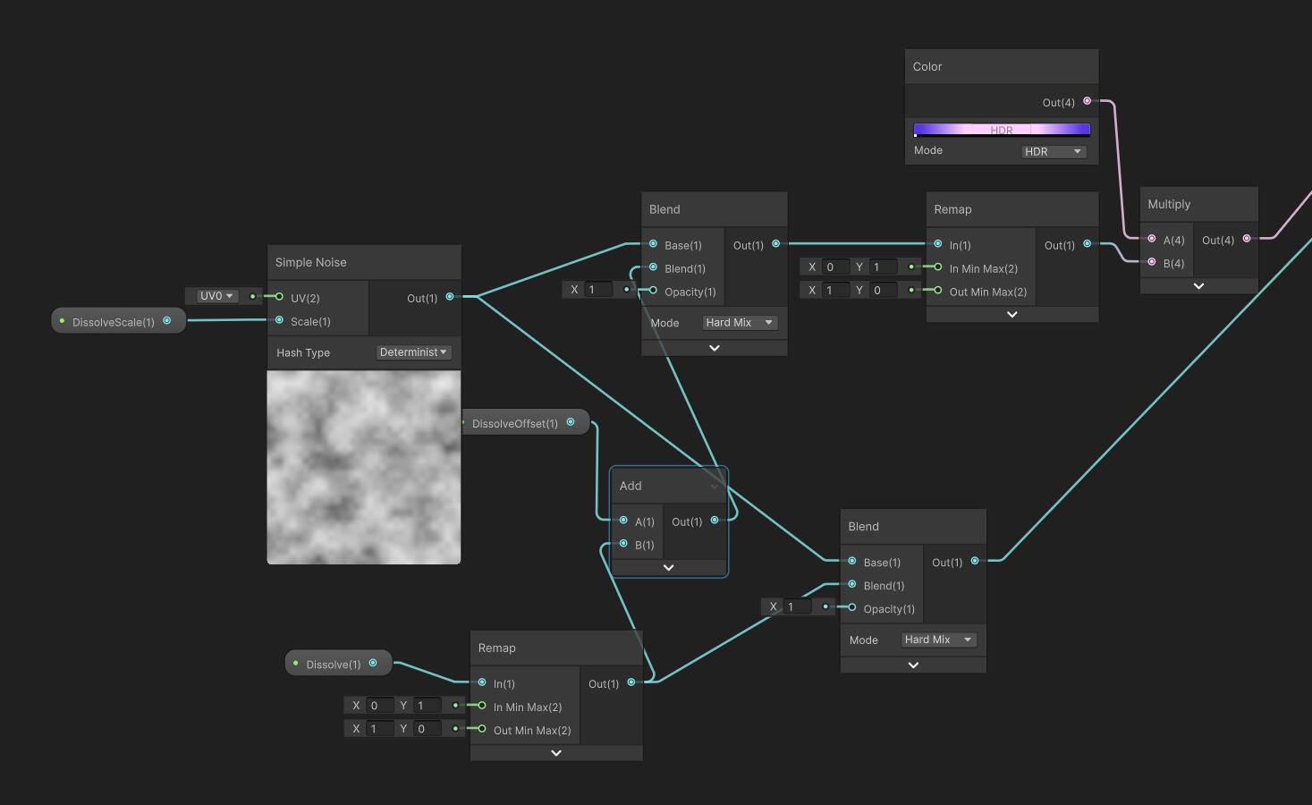
In addition to the particle effect, this needed a new shader feature.
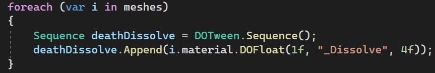
Playtesting FEedback
This time, alongside general feedback on the shaders/visuals/aesthetics, I also asked a more direct question on our feedback document:
"What do you think the theme is?"
I provided the actual theme hidden behind a spoiler and also asked if the theme made sense. I didn't get much feedback and the response I did get were a bit underwhelming.
1."Hard to tell what the visuals are going for due to basic environment being still in a greybox stage."
This is completely fair and understandable. For context, while one part of the playtesting area looks like this...
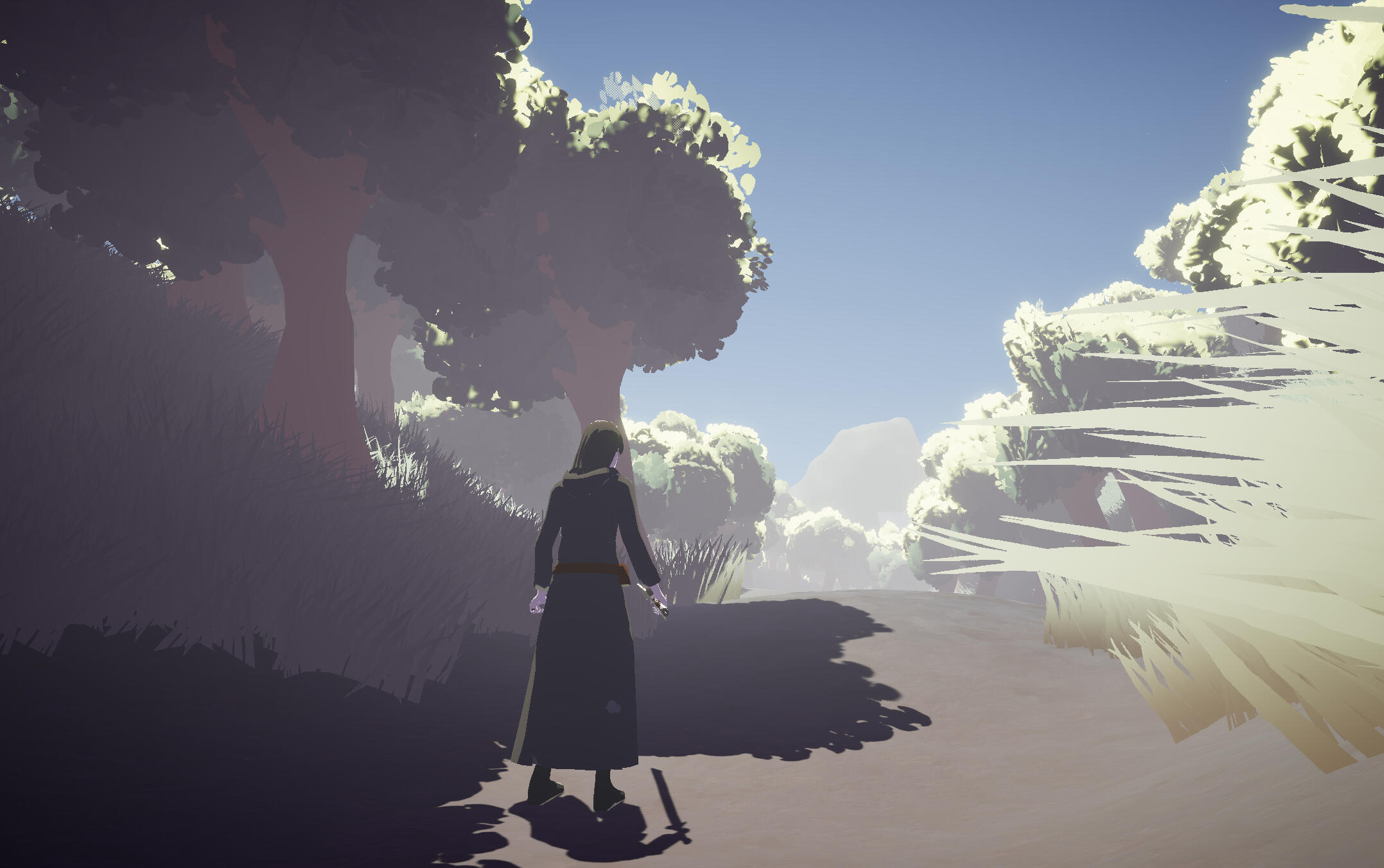
the rest of it still looked like this.
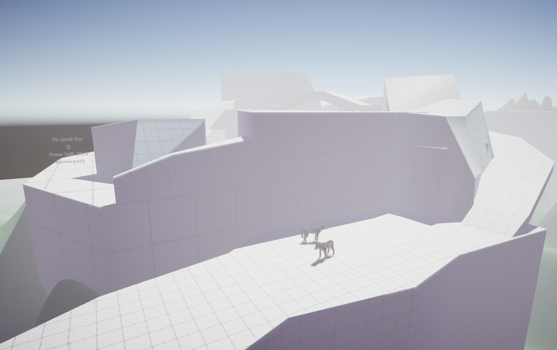
The level design was no longer my responsibility and is undergoing a big change, so this never moved on from a greybox. I had hoped my little section was enough, but unfortunately it wasn't. I also specified that I wanted feedback on the shaders on the document because I knew that the level was incomplete, but I think this was skipped over (possibly because it's not immediately obvious that everything has some custom shading going on, or that it's just hard to give feedback when the visual style isn't clear).
2. "I can see the theme but its not super obvious. I feel like some more character-based interactions with this theme like a death character could be cool."
This is the only response that says anything about the theme. No one actually answered the first part, but at least I got something. It's good to see that the theme does make sense with the visuals. Initially I felt a bit disappointed that it wasn't obvious, but on second thought I'm okay with that. I don't think most people would immediately see contrasting colours and think 'life and death', and it's more likely that as the theme would become more apparent as players learn more about the game. With this in mind, their suggestion about character interactions feels more plausible, though I personally don't think it's necessary (I also don't want to rewrite the story over this one suggestion). In a way, this is already planned in some way regarding the protagonist (mortal) and the Spirit Guardian (immortal).
3. "It lowkey reminds me of drakengard a mix of the ending scene in drakengard 3 and the main character from drakegard 1"
This is really interesting to me. I know for a fact I was drawing some inspiration from Nier (Spin-off series of Drakengard), but Drakengard somehow made it's way through instead. I can see the similarity between our main character and Caim from Drakengard 1, but I'm not entirely sure I see the link between this game's visuals and the ending of Drakengard 3. It's possible this was more directly in relation to the ether conduits and the flower, but the more direct inspiration for me was the lunar tears from Nier.
Drakengard 3 flower
Nier: automata lunar tears
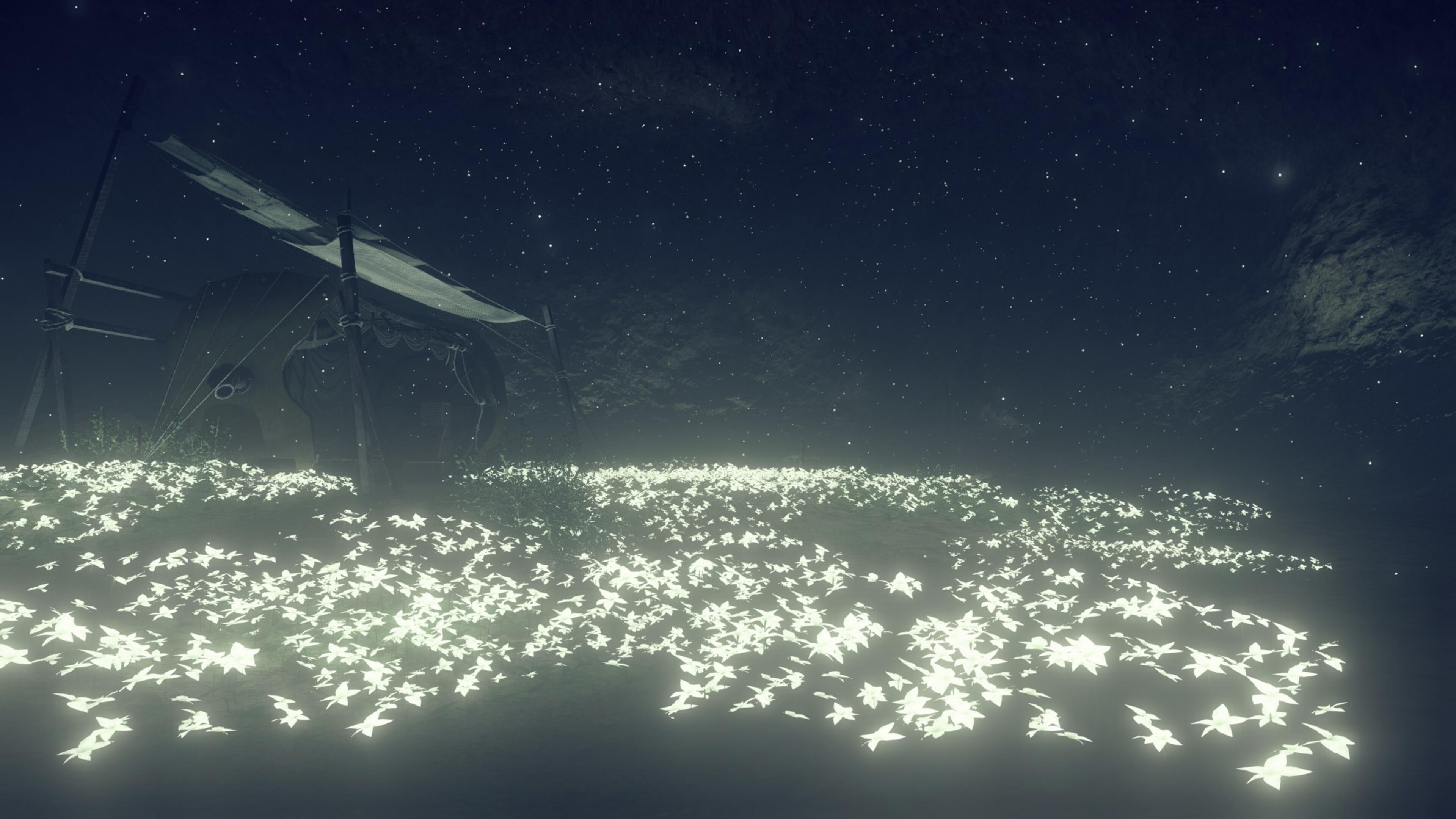
I can see how the two might have been subconsciously mixed together when I designed the ether conduit. I still think that in terms of colours and visual mood, my game is closer to the Nier series (low saturation) than the ending scene of Drakengard 3 (no saturation). Still, it's interesting that such a deeply rooted inspiration managed to show through with so little to work with. I honestly have no idea how they caught this.
4. "The cel shaded art style of the character(s) look great."This isn't critical at all, but I'm still happy to know someone likes my work.
In hindsight, I should've been a bit more mindful of the fact that there isn't that much time to playtest each game, so people probably wouldn't notice much unless I asked them very direct questions about everything. Now I can't tell if no one said anything about the shadow and light hues, or if no one actually noticed.
FACE SHADING FIX
I tried another shader trick to help with the face normals, by limiting the vertical angle of the main light. This is a trick implemented in Xenoblade Chronicles 3, which actually did make a decent improvement.
With the light limited to ±20o, the result is actually quite good, but there's still some awkward shading around the lips, and the shape of the shadows still just isn't what I wanted at first. Eventually I caved, and decided to bake and hand paint over a custom normal map.
Now the shape is correct. The shadow doesn't change shape smoothly as the light moves around, but this is a drawback I'm willing to accept. I'm being very particular about the shape almost always being a split down the middle to emphasise the 'life and death' theming. The light still hits the cheek on the other side as I felt that a full split looked a bit too cartoony/unnatural.
The intended result for each iteration was the same so I won't go over them all, but I would still like to show that this took far too many hours of my life.
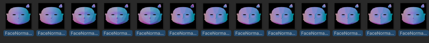
Also, I guess this is a good opportunity to mention that I've added shader support for both object-space and tangent-space normal maps. This didn't feel different enough to warrant its own section.
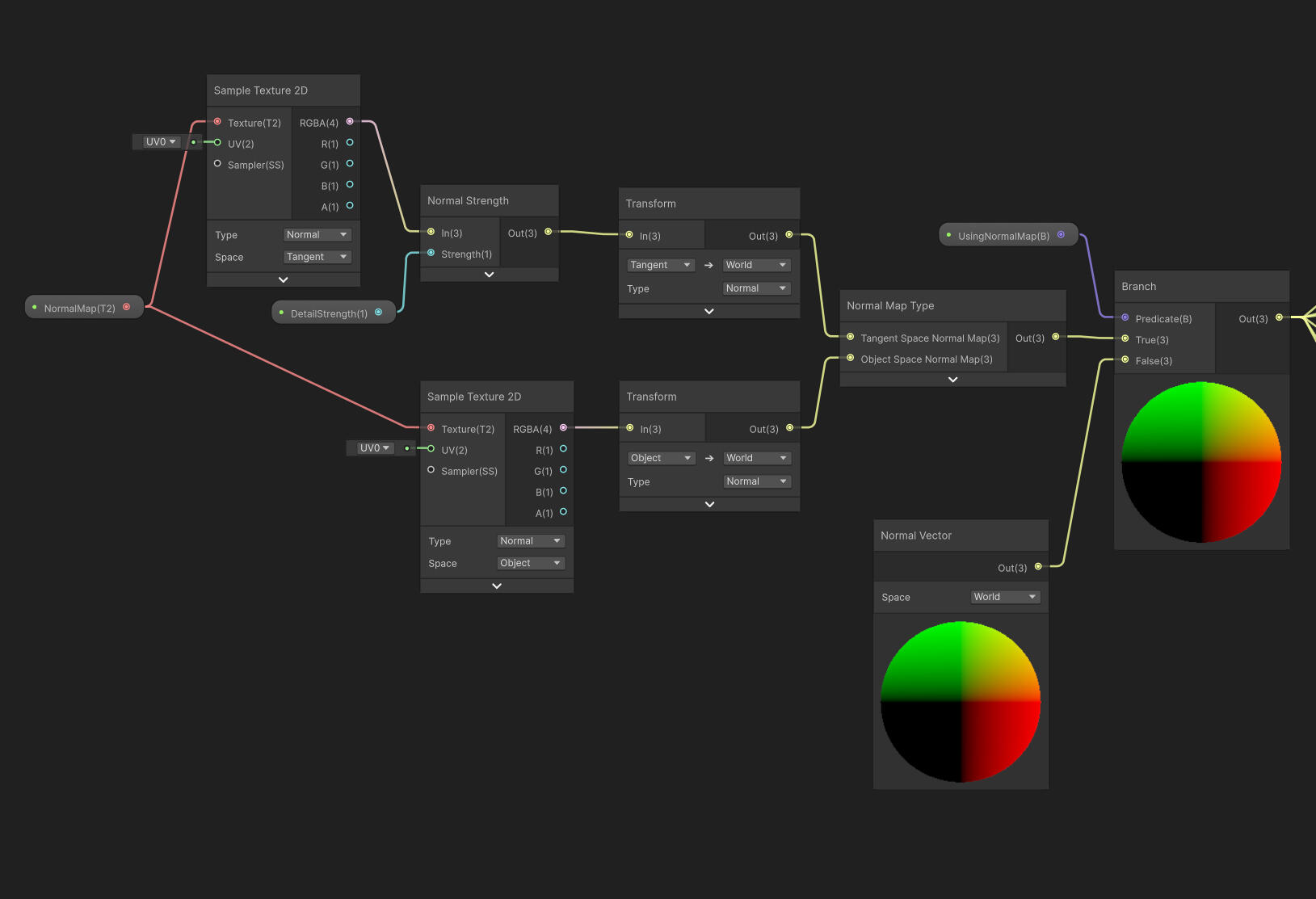
Week 12
Ether Conduit UI Update
Whenever the main character rests in-game, they are supposed to be dead while the world goes through another full ether cycle. I wanted to show this through the UI by giving these menus a solid background and appropriate particle effects.
I think this works, though the game is visible when the menus fade in and out. I'll come up with a workaround eventually. I also don't recall writing about it but I've added fade transitions for all menus, though it's not worth its own section. Honestly I don't even remember when I did it.
Enemy 2 rigging
Philip's got back to me with a model for a second enemy, and honestly I think he improved quite a lot. There were only a few minor things which needed cleanup, and overall the shape was pretty smooth.
Instead of using rigify like I did with the wolf, I made the rig myself.
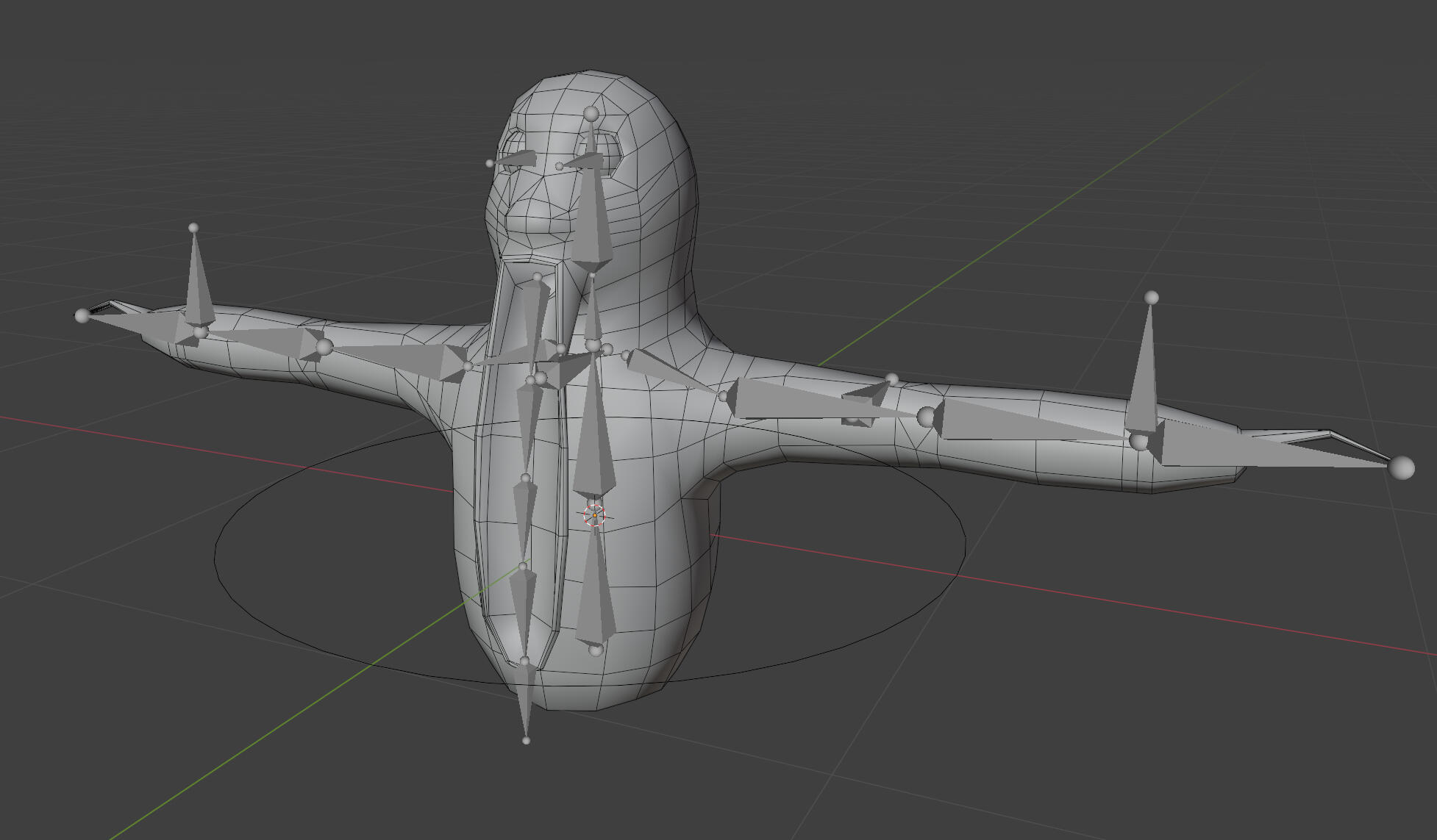
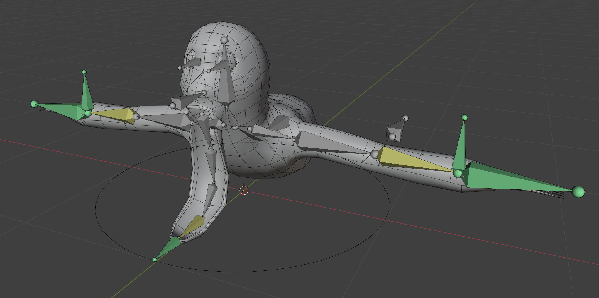
I've set it up with some simple IK controls since I know Philip is a beginner with animation. I changed the rest position to a more useful starting pose for new animations. I've given the animation responsibility to him, but I've agreed to be available to help or take over if necessary.
lock-on ui
I added a simple indicator when locking on to an enemy. It's felt weird to not have one and I'm a bit surprised no one brought it up in playtesting.
There's a delay to the UI image appearing because you would be able to see it moving to a new target in some situations. I'm not sure why this happened.
terrain rim lighting
As another last minute addition, I've added rim lighting to the terrain/basic URP shader. I've feel like the basic PBR look didn't really match up with the other assets for a while, so I added this to highlight details and edges. All of the cel-shaded objects have their smoothness set to 0, so I multiply by smoothness to stop this from interfering the cel-shading.
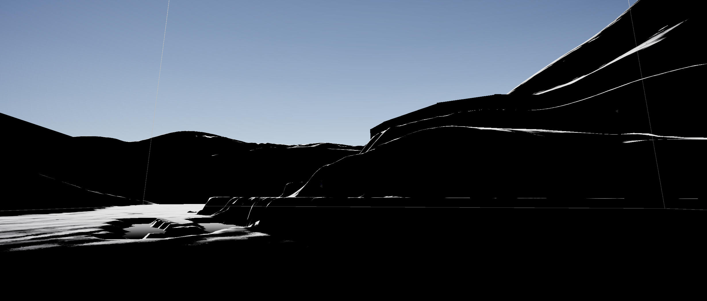
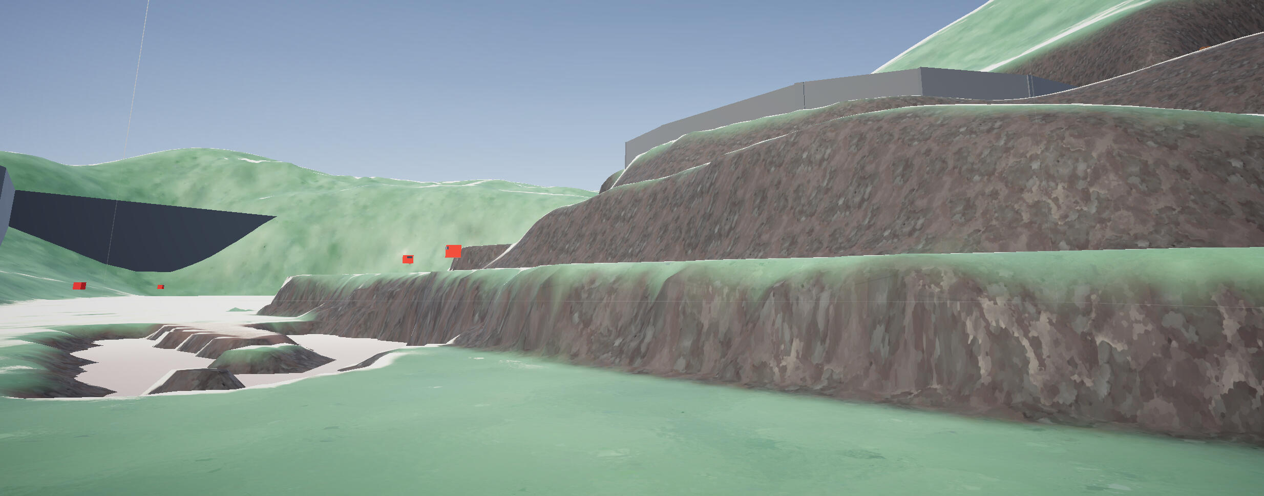
Week 13
Volumetric Fog
I don't really like how the default fog looks in Unity, and it doesn't really look like what I had envisioned. I added a fullscreen shader for volumetric fog with this tutorial by Technically Harry which uses depth and raymarching to draw a 3D noise texture, though I basically copied the whole thing to a tee.
Now I think this looks great, but my graphics card fans are now comically loud. The game is going to take a big hit in performance because of this, but I think the result is worth it.
Exponential
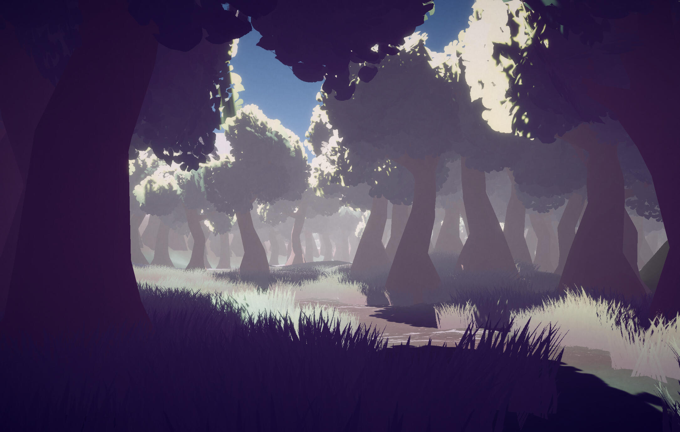
Volumetric

Interestingly, the amount of overdraw is vastly different between the two, with the default fog apparently redrawing some transparent pixels more than 500 times. I'm not sure how exactly Unity's fog implementation works, but as far as I can tell it seems like it's a part of the URP fragment shader. This is probably why it performs so much better despite the ridiculous overdraw.
Exponential
Volumetric
All of the performance testing was done at native 4K with the following system specs:
Ryzen 7 3700X (65W power limit, -75mV undervolt)
RTX 4070 (150W power limit, -85mV undervolt)
64GB 3200MT/s DDR4 RAMI had a hard time figuring out the actual performance impact of the volumetric fog. It seems to be inconsistent between runs, and also seems to depend a lot on the scene.
In a worst case scenario scene filled with foliage, and with the smallest step size on the volumetric fog, the performance difference is only around -8%.
Exponential
Volumetric + Exponential
However, in a scene with no visible foliage, framerates seemed to fluctuate between runs. No settings were changed with the volumetric fog. I'd imagine this gives a better idea of the performance difference, but strangely this ran worse than the horrible foliage overdraw scenario.
Exponential
Volumetric + Exponential
Volumetric + Exponential
Volumetric
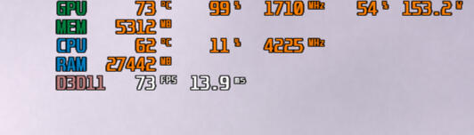
While I couldn't figure out the performance inconsistencies, I did figure out that the step size and distance had the biggest impact on performance. Given that the exponential fog has almost no impact on performance, I'm able to use both and significantly reduce the distance of the volumetric fog. The two work together well to make near fog look nice and cloudy, while far objects still fade into white.
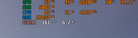
While I couldn't figure out the performance inconsistencies, I did figure out that the step size and distance had the biggest impact on performance. Given that the exponential fog has almost no impact on performance, I'm able to use both and significantly reduce the distance of the volumetric fog. The two work together well to make near fog look nice and cloudy, while far objects still fade into white.
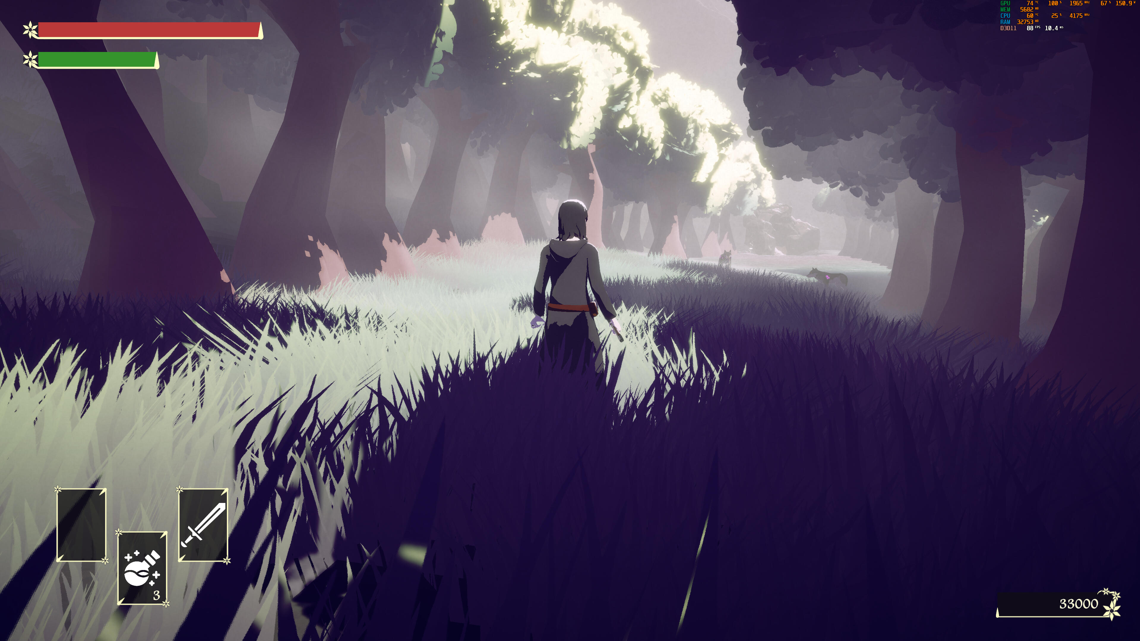
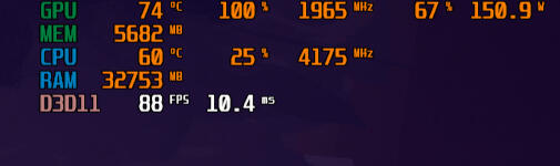
I'd say the performance is acceptable. Considering this is running at 4K on a high-midrange computer, I think the game would run fine on most computers, albeit with a lot of fan noise. It might be a good idea to add options for V-sync or a framerate limit to reduce power draw and fan noise.
Environment Detailing
I didn't keep track of my progress at all here, but in one sitting I have populated the environment with grass and trees, updated a couple terrain textures and sculpted some noise into the terrain. I'd love to be able to talk about what I was thinking but it was really just 'make it look good if possible'.
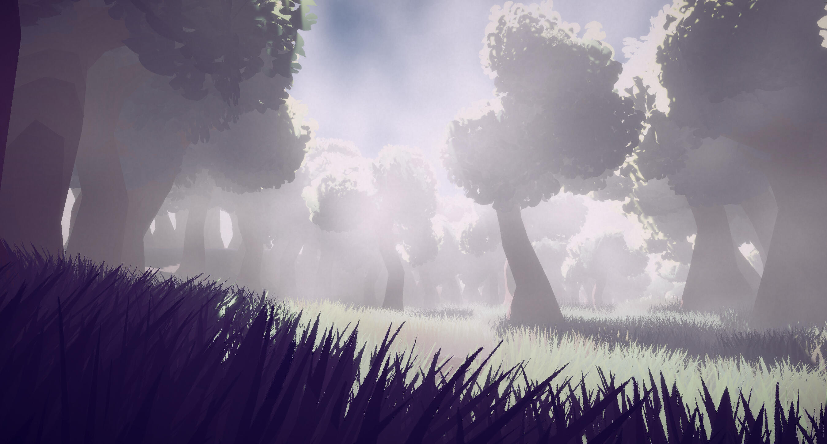
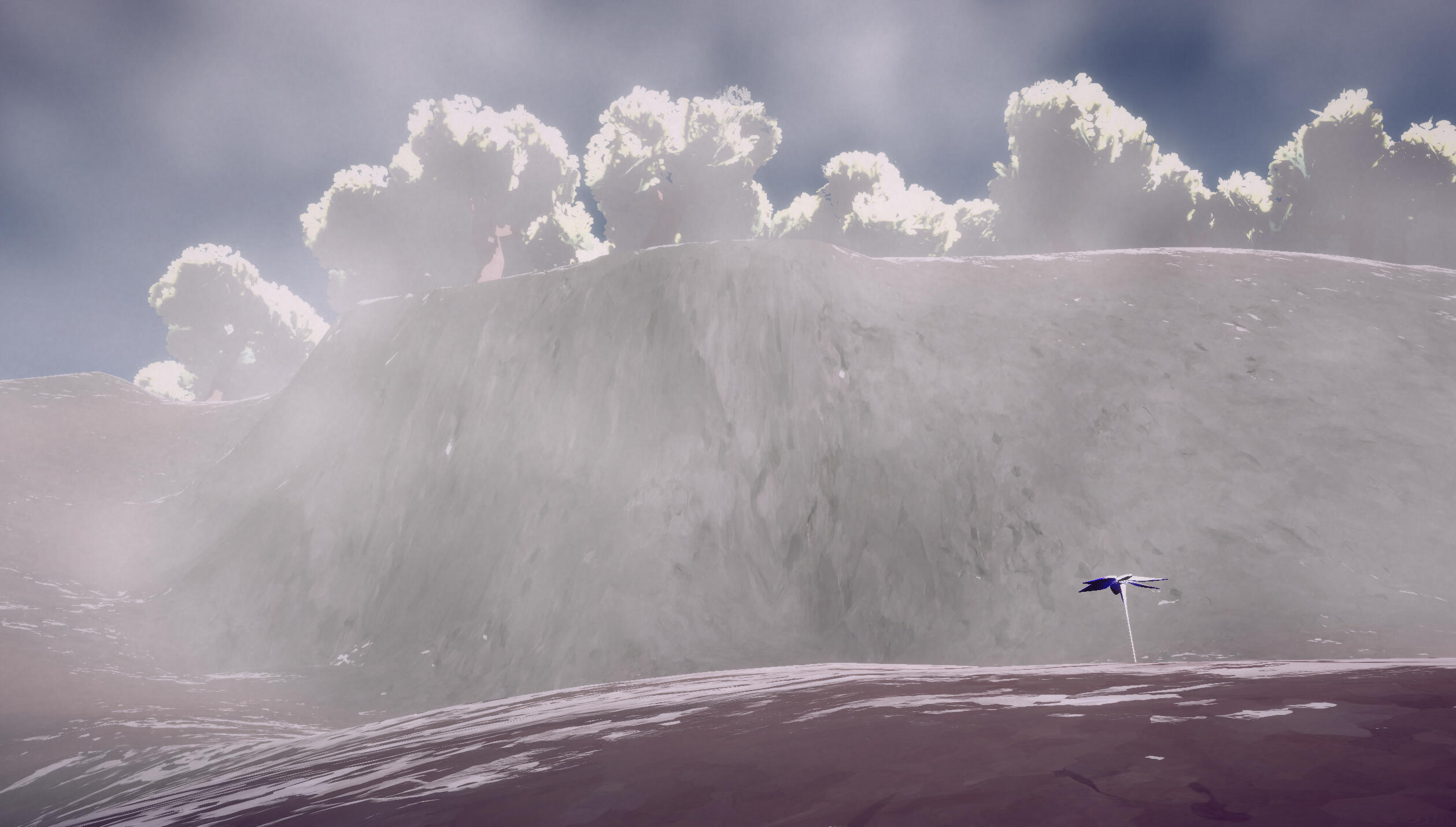
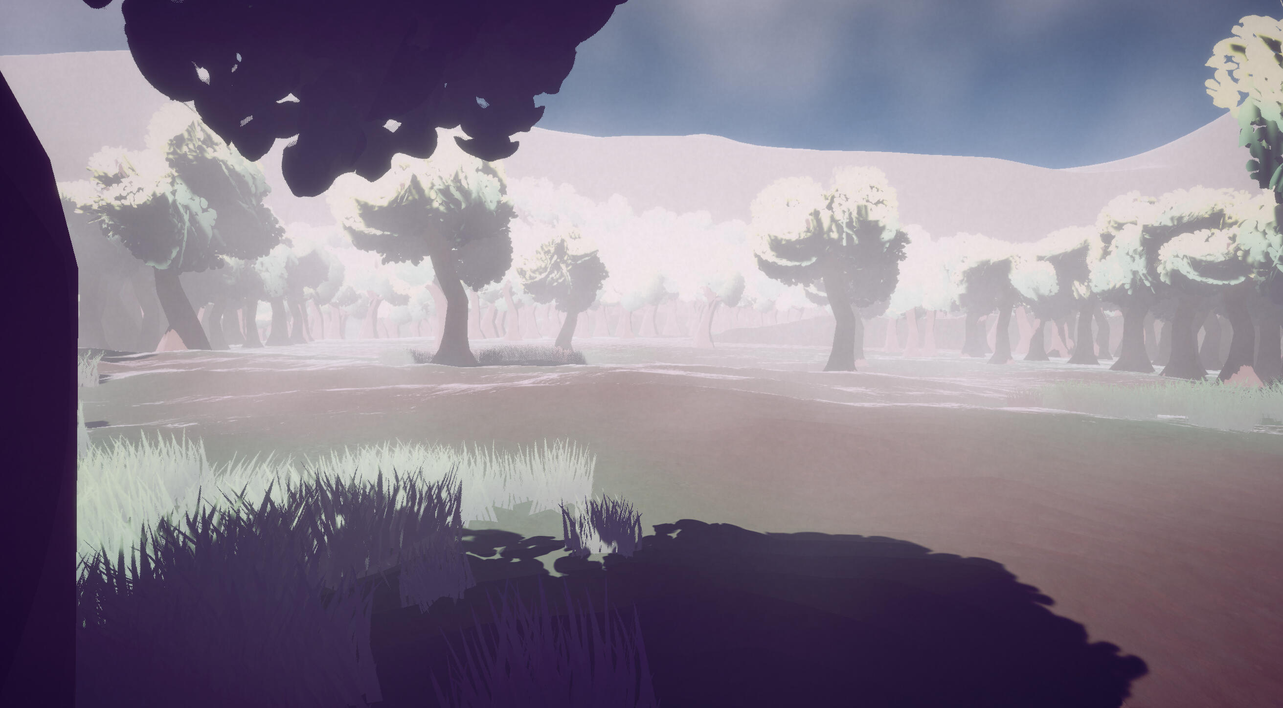
I'd say I'm quite happy with the result. There's very little variety in assets so everything looks a bit samey, and in the more open areas, the grass looks a bit sparse and out of place. BUT, I think the small places that look good do stand out, even if they're still a bit uninteresting. With some more varied assets and cool little details it could go a lot further, but that can wait for now. The shaders are absolutely carrying.
minor Optimisation
The addition of volumetric fog has been resulted in terrible performance on the main menu. I've added a small bit of code which switches the camera to a blank renderer which has brought framerates back to normal. This optimisation applies to both the main menu and the ether conduit menu. A neat bonus of this optimisation is that the screen now stays dark when switching between menus. This is important because the player is supposed to be dead, and it really wouldn't make sense if the player got glimpses of their character standing up alive and well.
Final Colour Changes
I haven't kept track of my progress as well as I should've, but, you've probably noticed that in every single week, the colours in the screenshots all look a little bit different. I have been quietly making minor adjustments all the time, and it's finally time to show what I've been up to.
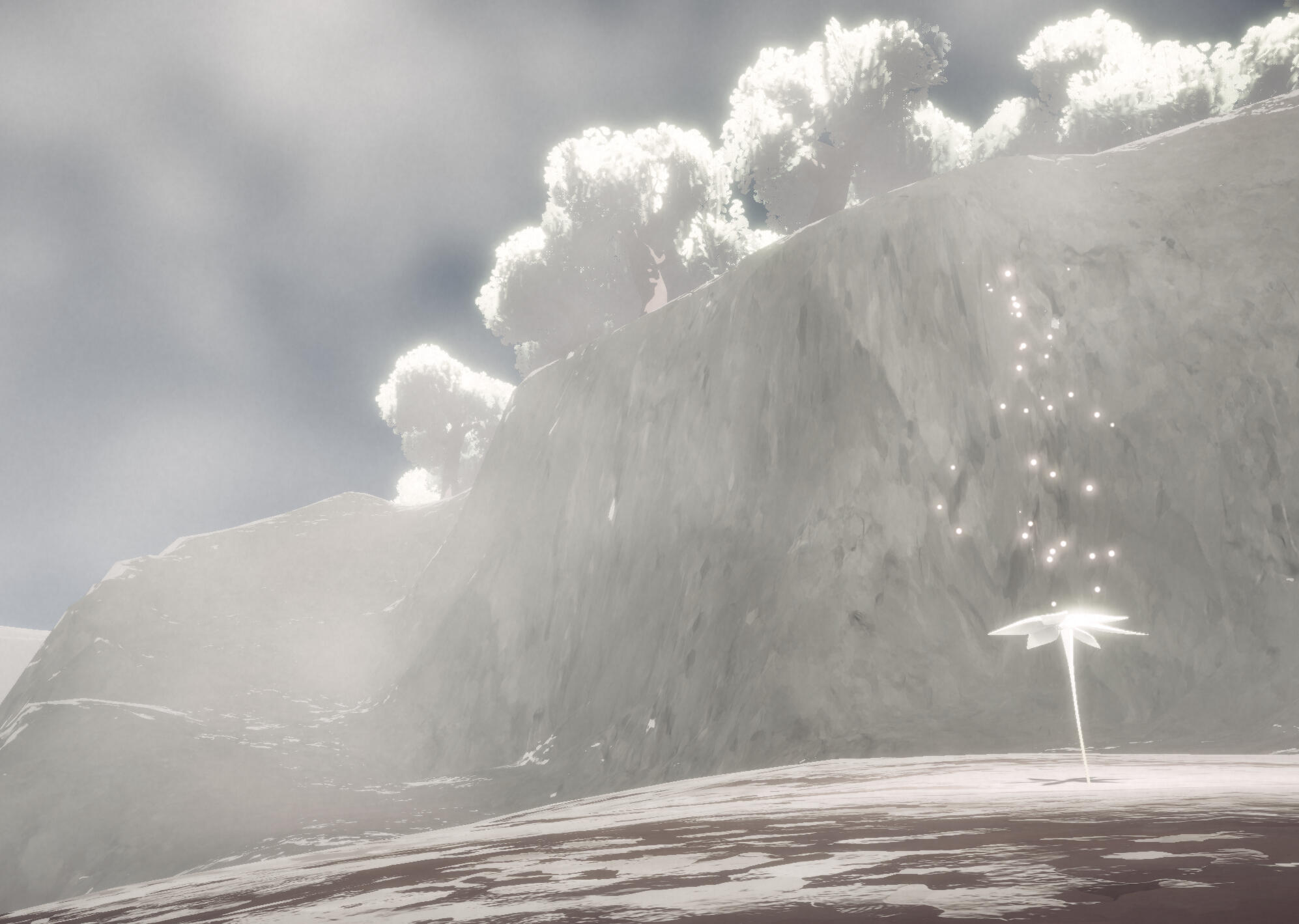
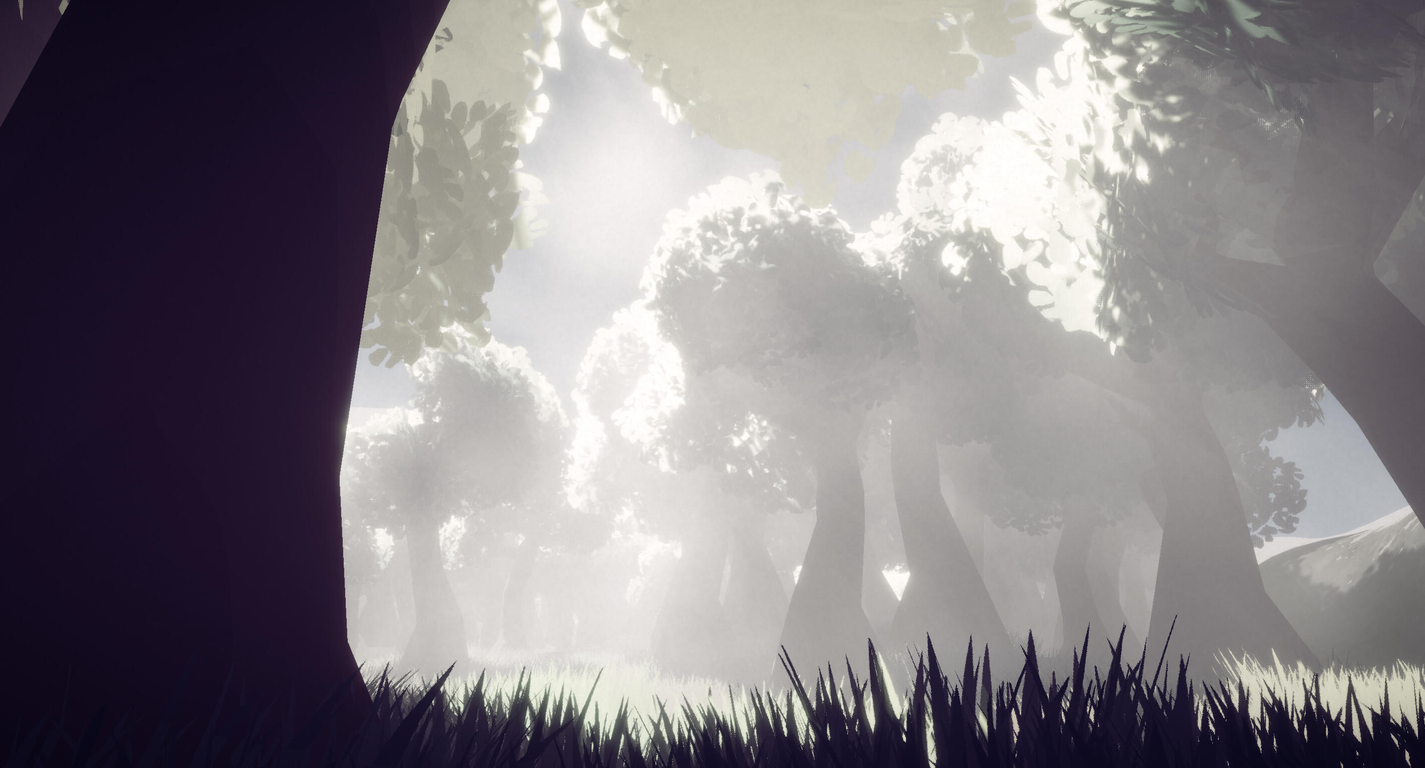
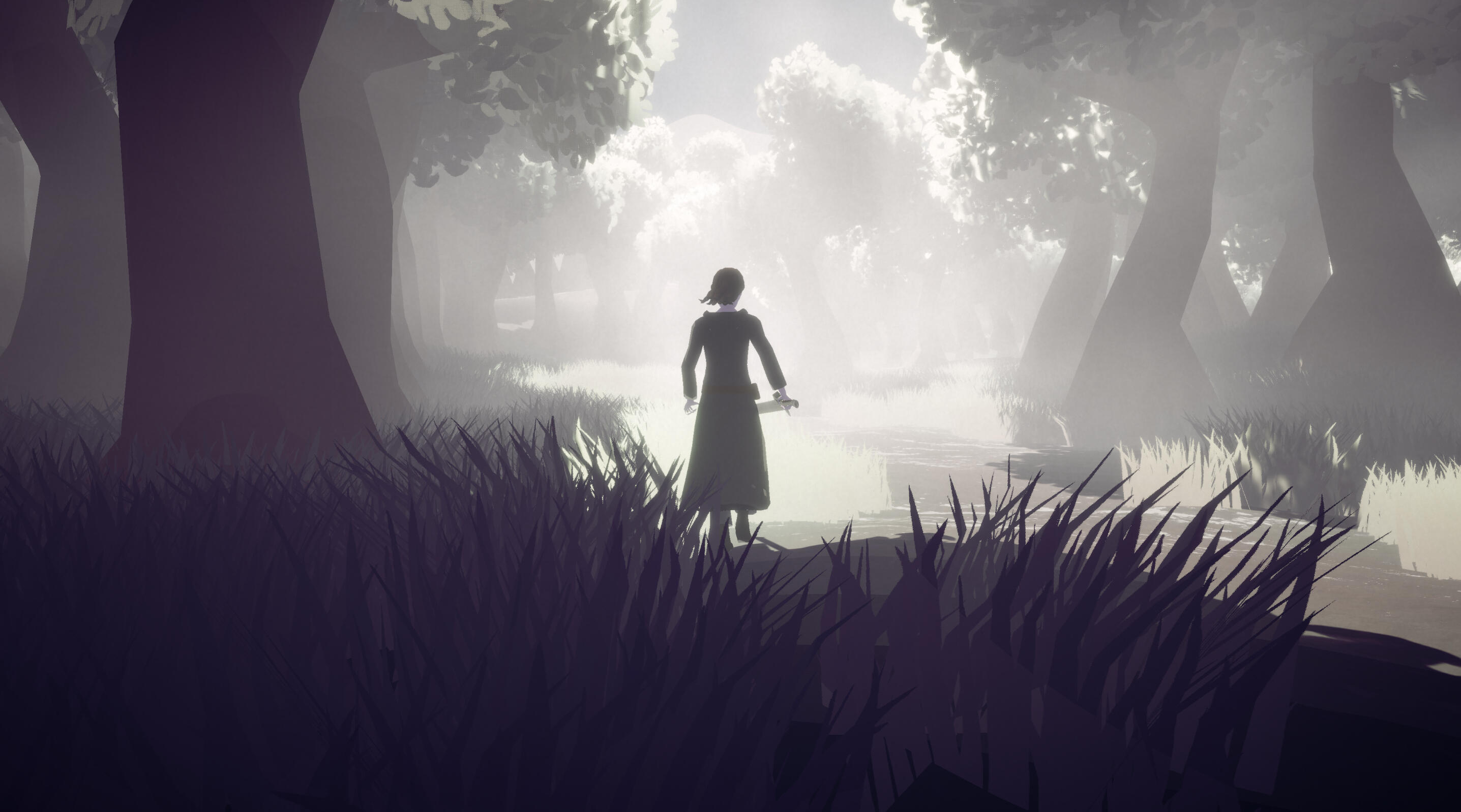
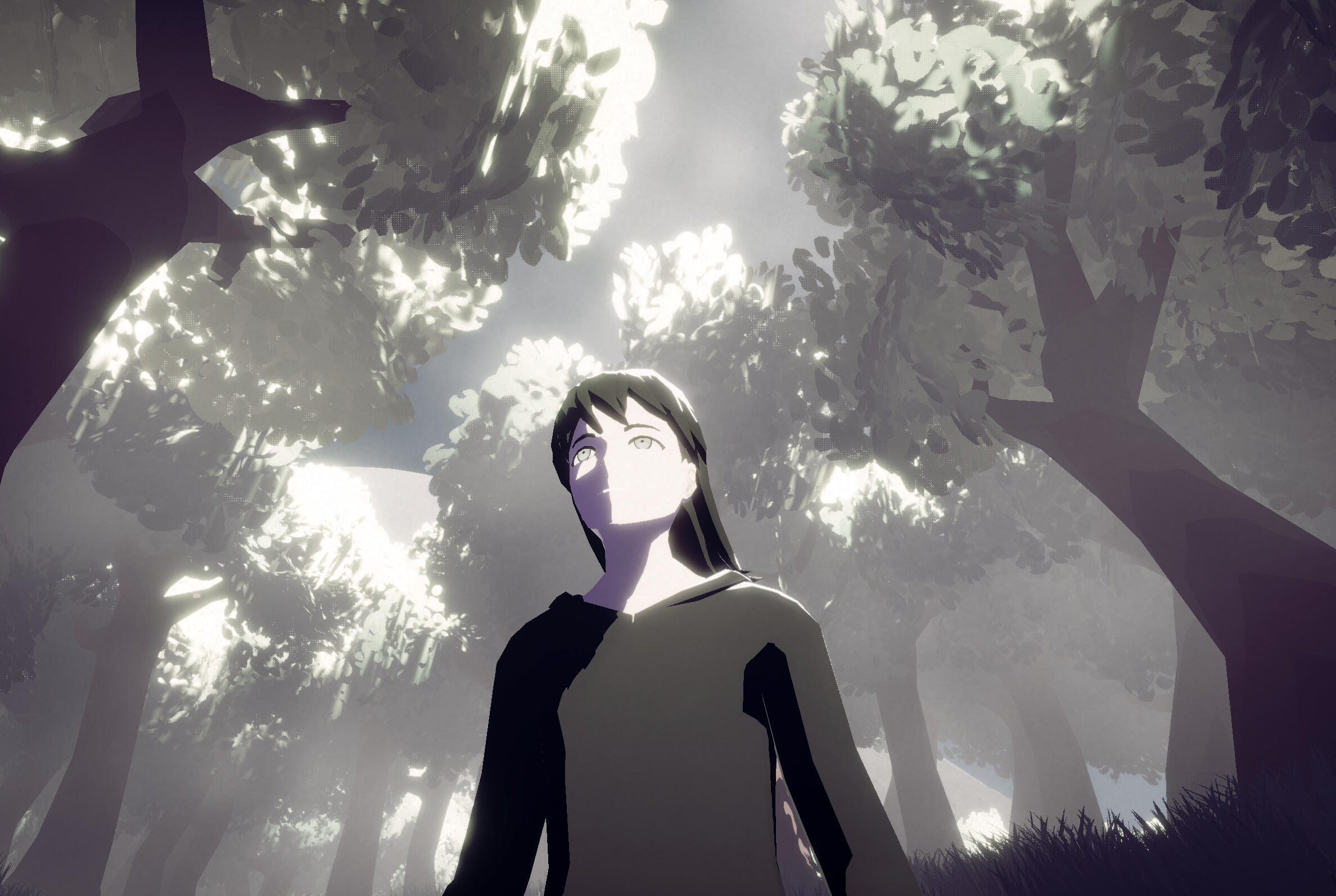
The final colour grade is much more desaturated than before, but there's still a clear difference in hue between light and shadow. There's also a much more perceptible sense of contrast in value. This has been brought on by the increase in brightness of the directional light, and the addition of volumetric fog, which made everything look a bit hazy. The most useful post-processing component has been 'Lift Gamma Gain', as it allowed me to adjust the hue and brightness of bright and dark areas with a good degree of separation.
When I adjusted the colour of the directional light to adopt a slight yellow hue, the colour of shadows also very noticeably shifted towards yellow. Although the shadows stil looked like purple/violet, they were still very distinctly 'off' to my eyes, so this basically saved my project.
II reduced the saturation so because I felt that earlier revisions were leaning a bit too much towards being colourful and fun. This just didn't fit with the game's themes and overall mood. The reduction in saturation also brings the colours much closer to black and white, enhancing the contrast in value. I also think that this will make the connections with life and death a bit more obvious, especially given that white and black are almost universally associated with life and death respectively. It could be argued that it would be more appropriate for my game's visuals to be black and white, but I think that this just wouldn't be very interesting. In my eyes, the faint yellow and violet hues are what makes my game look interesting.
Reflection
It feels incredibly strange to say that my undergraduate studies are ending, because after 3 years, I still don't really know what I can do, or what I even want to do. I entered university wanting to become a specialist in 2D game art, yet in the past 3 years I really haven't drawn all that much. I wish I could say that all that time has gone to developing another specialty, but it's just not really the case. I feel like I've become competent at everything that's been thrown at me, but I never improved enough for me to look at myself and confidently say that I'm good at what I do. This project was meant to help me shift the balance back towards specialisation, and it has definitely made a difference, but I've still come out of this more well-equipped as a generalist. To be clear, I'm not upset about this. It would be more accurate to just say that I feel a bit lost as to what I should do going forward.
Regarding this project, I think that the outcome of my work, doesn't really answer my research question. This isn't because there's no contextual backing, or because I don't like how it looks. It's because of my design process and its reliance on constant experimentation, which made it difficult for me to establish a clear direction, and difficult for others to give feedback. I did not get anywhere near as much feedback as I wanted, and I think that it isn't really fair for me to be the sole judge of my own success.
Whether I continue to experiment with the visuals or not, I think I would like to keep this project going through to completion.